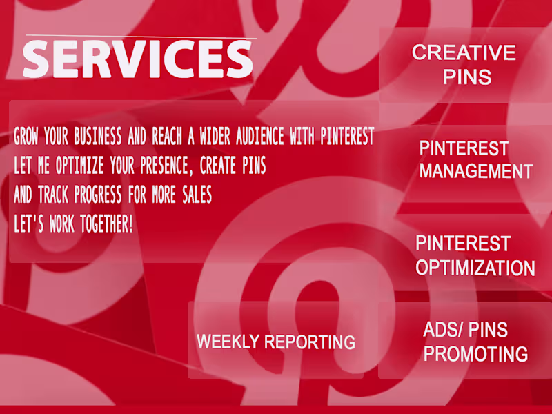
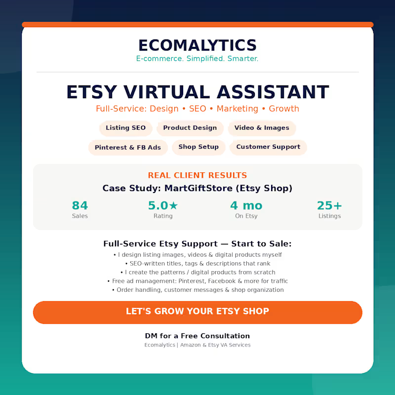
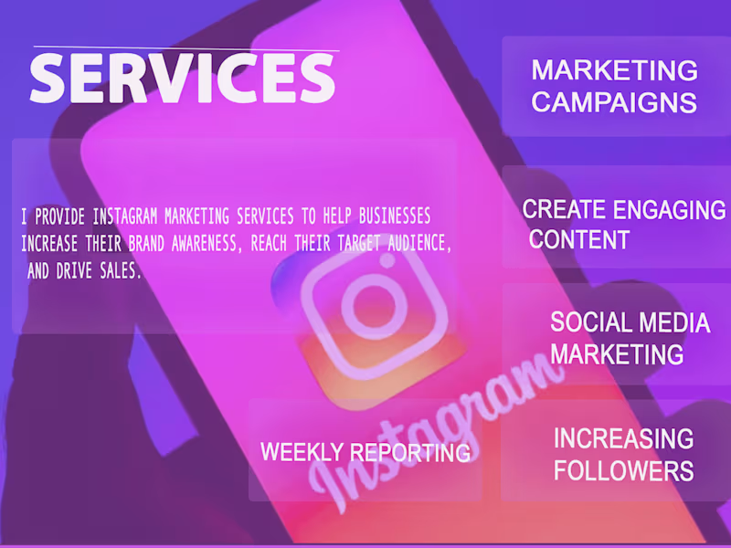
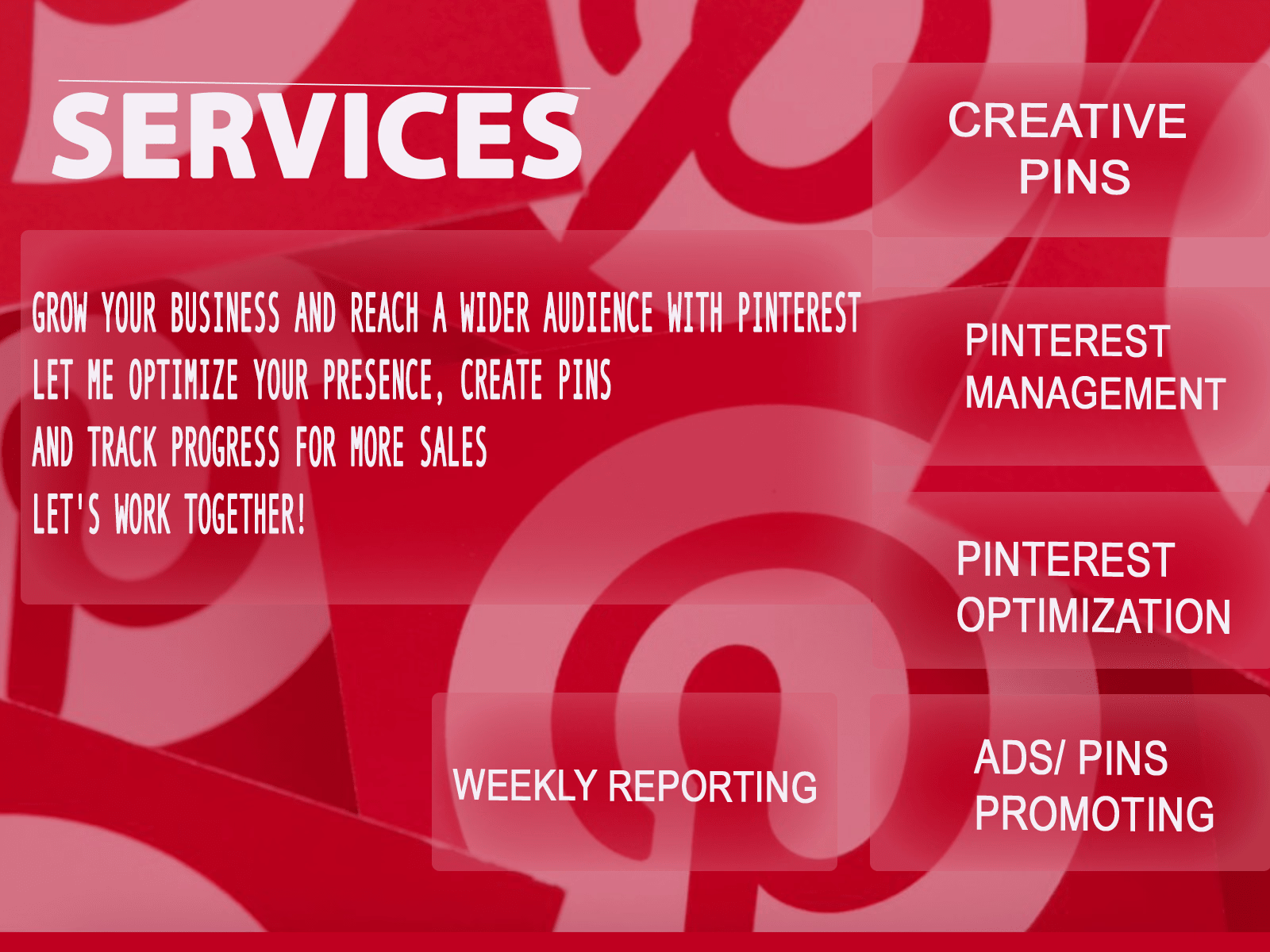
Freelancers using Pinterest in LahoreFreelancers using Pinterest in Lahore
CS student & designer automating the future with AI.
New to Contra
CS student & designer automating the future with AI.
Cover image for Since you mentioned Part 1
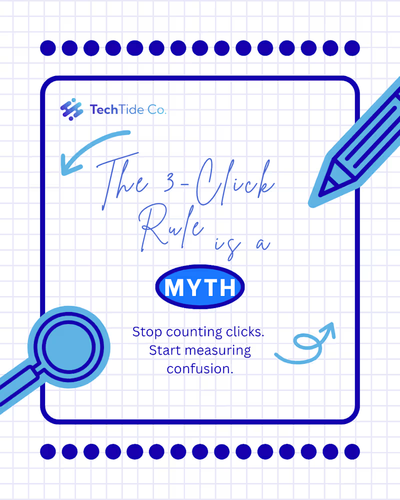
Since you mentioned Part 1 was about the "Psychology" and the "Problem," Part 2 needs to be about the "Solution" and the "Action." This makes you look like a designer who doesn't just point out flaws but actually knows how to fix them. Here is the professional English text for your Part 2 Contra post: Project Title: The "5 Confident Clicks" Framework – UX Case Study (Part 2 of 2) The Design Challenge: Following the psychological groundwork laid in Part 1, this second installment focuses on the practical execution of a high-conversion user journey. The challenge was to visualize a framework that balances speed with user certainty, ensuring that every interaction leads the customer closer to a "Confident Yes." My Creative Approach: In this concluding part, I transitioned from identifying myths to presenting actionable architectural solutions. My design strategy included: Framework Visualization: I designed the "5 Confident Clicks" roadmap, using a step-by-step visual flow to show how information should be staggered to prevent user overwhelm. Blueprint Detail: I maintained the blue-on-white technical aesthetic to ensure continuity from Part 1, signaling to the audience that this is a data-driven design solution. Clarity over Speed: I utilized custom icons and directional cues to demonstrate that "Certainty Converts." The design illustrates that a guided path, even if longer, significantly reduces cart abandonment. Conversion Optimization (CRO): The final slides focus on the "Visit" and "Contact" CTAs, transforming the educational experience into a direct lead-generation tool for the client. The Final Result: This two-part series serves as a comprehensive masterclass in modern UX. By the end of this installment, the viewer isn't just informed—they are equipped with a tangible framework to audit and improve their own digital storefronts. Series Conclusion: This completes the "Psychology of Conversion" series. While Part 1 challenged the status quo, Part 2 provides the roadmap for the future of digital interaction. “Mystery kills the sale. Certainty converts.”
1
51
Cover image for This project is the perfect
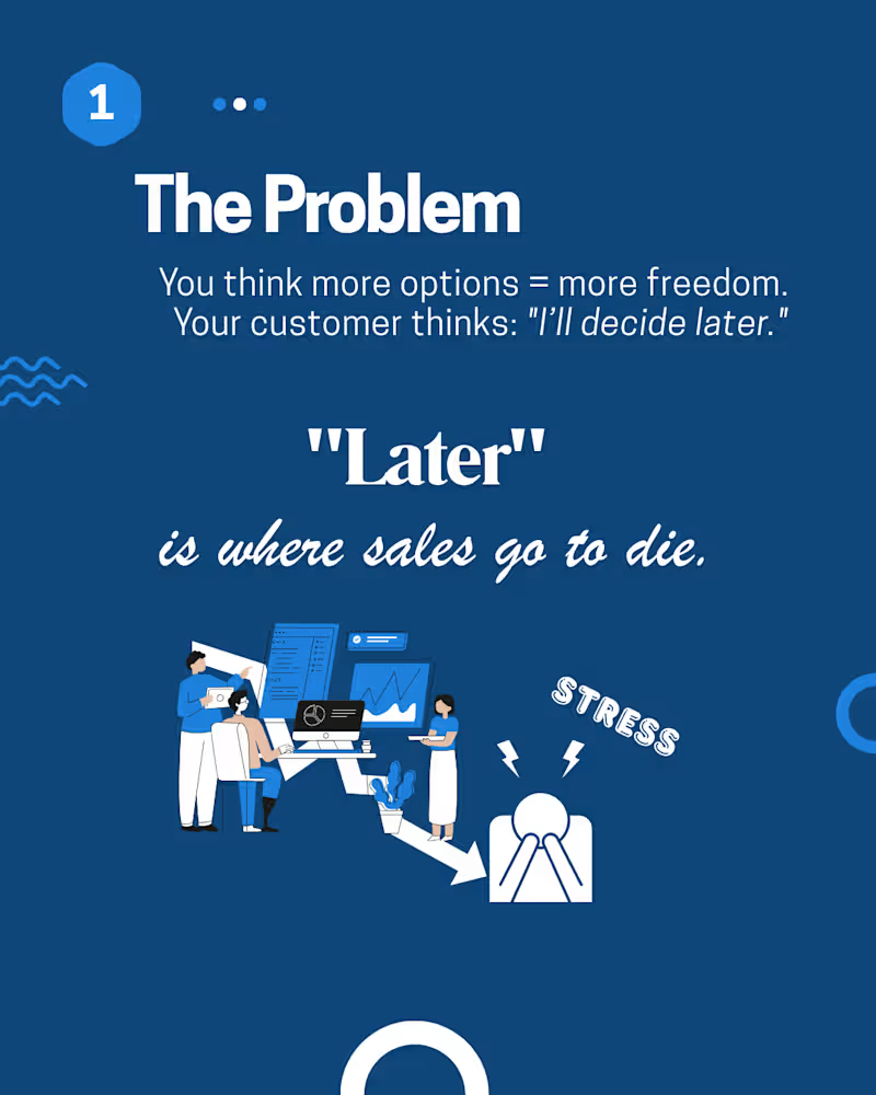
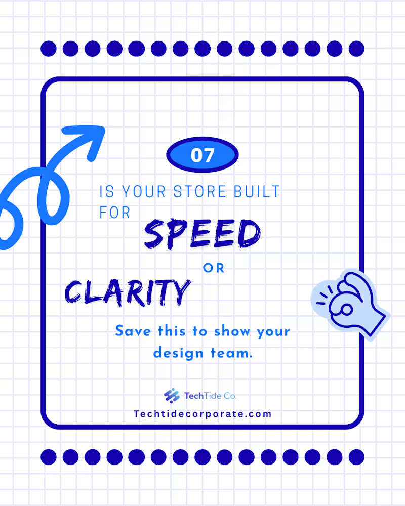
This project is the perfect example of UX Design Psychology. It challenges common misconceptions about sales funnels and digital interaction. Since you want to mention that this is only the first half of the series, we will build anticipation for the next post. Here is the professional English text for your Contra post: Project Title: The Psychology of Conversion – UX Case Study (Part 1 of 2) The Design Brief: The goal of this series was to educate founders and digital marketers on the hidden complexities of user experience. Instead of following the "fewer clicks = more sales" myth, this project explains why user certainty is the real driver of conversion. My Creative Approach: I utilized a clean, blueprint-inspired aesthetic to emphasize the "Engineering" side of design. Key elements include: Visual Myth-Busting: By using bold typography and contrasting "WRONG" vs. "WE PREFER," I created an immediate mental shift for the reader. The "Confident Clicks" Concept: I designed these visuals to explain that a longer path with clear guidance is better than a short path that leaves users confused. Blueprint Aesthetic: The blue-on-white grid layout reinforces the idea of "Building" and "Strategy," aligning perfectly with a professional B2B audience. Anticipation Loop: I structured the narrative to end on a cliffhanger, ensuring the audience is primed for the deep-dive solutions coming in the next installment. The Results: This first half of the project successfully establishes the "Problem" and the "Psychology" behind poor conversion rates. It serves as a lead-magnet, positioning the brand as an expert in behavioral UX design. Important Note: This is Part 1 of a two-part series. In this post, we uncover the flaws in traditional funnel thinking. Stay tuned for my next post, where I will reveal the "5 Confident Clicks" framework and how to apply it to your store.
1
47
Cover image for Project Title: Corporate Strategy &
Project Title: Corporate Strategy & Workflow Optimization Visuals The Design Brief: The goal of this project was to create an educational and persuasive social media series for TechTide Co. focusing on business optimization. I was tasked with visualizing complex concepts like "Checkout Flow Detox" and the difference between a "Scavenger Hunt" store versus a "Straight Line" customer journey. My Creative Approach: For this project, I adopted a Corporate Tech Aesthetic using a professional blue-and-white palette. My focus was on making abstract business concepts tangible through: Conceptual Illustration: Using flat-design characters and metaphors (like the puzzle-lightbulb) to symbolize problem-solving and collective intelligence. UX-Driven Copy Design: I highlighted phrases like "Scavenger Hunt" and "Straight Line" to create immediate cognitive contrast, helping the audience understand UX flaws instantly. Modern Minimalism: By using clean lines and plenty of whitespace, I ensured the focus remained on the "Call to Action" (Tag a Founder / Visit the Website), which is crucial for B2B lead generation. Information Architecture: I structured the slides to follow a logical "Problem → Stress → Solution" flow, guiding the viewer toward a feeling of clarity and resolution. The Results: The final delivery consisted of a premium carousel deck that positions the client as a thought leader in the corporate space. These visuals are optimized to build authority, simplify high-level strategies, and encourage professional engagement.
1
51
Cover image for Design High-Converting Fashion Promo Campaign for Growth
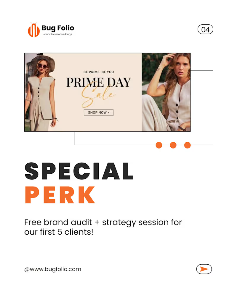
This new set of designs has a Fashion & Lifestyle vibe with a focus on Marketing Strategy (Offers, Sales, and Growth). It looks like a "Launch Campaign" or "Promo Kit." Here is the professional English text for your Contra post, focusing on your role as a Graphic Designer: Project Title: Fashion E-commerce Branding & Promotional Campaign Design The Design Brief: The goal of this project was to design a high-conversion promotional campaign for a fashion-forward brand. I needed to create a visual identity that felt premium yet accessible, focusing on driving "Growth" and "Sales" through clean, modern aesthetics. My Creative Approach: For this project, I moved away from abstract doodles and focused on High-Fashion Editorial Layouts. My design decisions included: Editorial Minimalism: Using a clean white base with bold, structured typography to give the brand a "luxury" feel. Strategic Call-to-Actions (CTAs): Designing the "Ready to Grow" and "Special Perk" sections to stand out using high-contrast orange tones, specifically aimed at increasing conversion rates. Lifestyle Integration: Carefully selecting and framing imagery to ensure the product (fashion) remained the focus while the text provided the strategic marketing value. Consistency Across Assets: Ensuring that the brand audit and strategy session offer looked cohesive with the "Prime Day Sale" visuals, creating a seamless user journey. The Results: The final delivery included a set of versatile marketing assets tailored for social media and web banners. These designs don't just look good—they are engineered to stop the scroll, build professional credibility, and convert cold traffic into loyal clients.
1
33
Maximizing social impact with expert strategy