



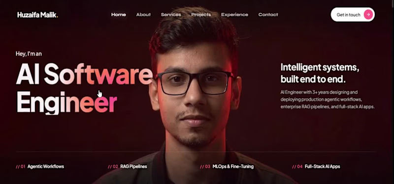
someone said "your portfolio sucks" and if you ask me that I care about some random opinions so YES I DO , a lot , I am a people pleaser , I love asking for my vulnerbilities , loopholes , issues and that's what I do , hear a random opinion , see what's incomplete or needs to be patched inside me and then I work on it and close the issue , my life is like a public github repo , people raise PR , post issues and a solo developrer and contributer in my life , I try to tackle each , and yes I love when someone mogs me , someone tells me where I am weak because I really wanted to be the one that's near perfect for evryone and we can't be perfect because it's a GOD ability and we are not GOD , and
I KNOW WHAT KIND OF ENGINEER I NEED TO BE , FOR YOU , FOR ALL OF US.
https://exhuzaifa.vercel.app/
Redeployed it with some animation and I need your OPINION guys , tell me what's wrong in it? tell me what needs correction , Tell me how can I be better , tell me am I doing good umm I need both validation and verification and for context I didn't make it from scratch and from the one I have copied will be here soon in my comment section claiming a copyright.
but it's not a shame to copy , every art , every cinematic shot , every beautiful painting is copied , everything is a reference of a reference of a reference of a reference , and rarely you founf an originality so yeah #exhuzaifa (https://www.linkedin.com/search/results/all/?keywords=%23exhuzaifa&origin=HASH_TAG_FROM_FEED) needs your opinion guys because sometimes you are the one who needs a change.
1
18


Kidocare (https://kidocare.webflow.io/) is a 16-page Webflow website built for daycare centers, preschools, and early childhood education providers. The site is designed to communicate safety, structure, and warmth to prospective parents, with the ultimate goal of driving more scheduled tours and enrollments. It uses a soft yellow and black color palette, blob-shaped badge accents, and hand-drawn outline details on photos to create a tone that feels playful yet trustworthy.
Key features:
Age-grouped program pages (Toddler through Pre-K)
Teacher/staff roster with individual profile pages
Daily routine and schedule breakdowns
Parent testimonials section
Recurring "Schedule a Tour" call-to-action throughout the site
CMS collections powering Programs and Blog content for easy updates
Work continues on:
Building and refining CMS collections (Programs, Teachers, Blog)
Structuring and styling remaining pages across the 16-page template
Adding interactions and responsive behavior
Polishing the visual design system (badges, photo treatments, typography)
Testing CMS content flow so non-technical staff can manage updates easily
2
281

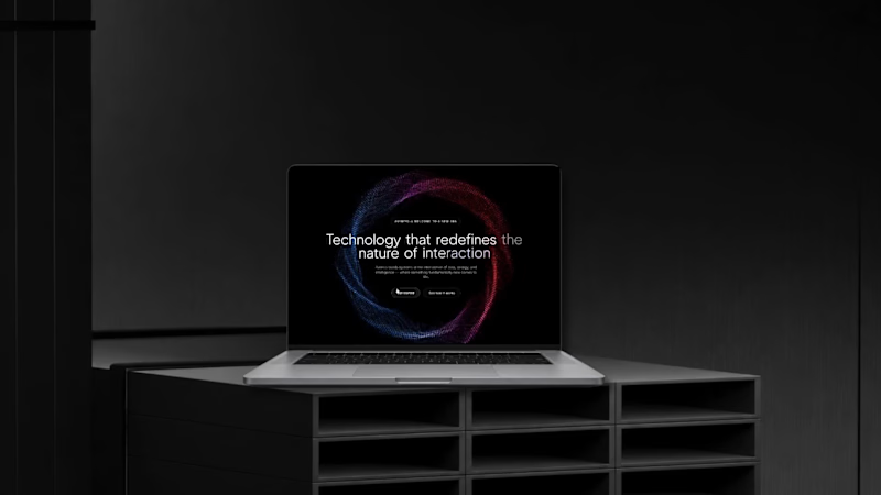
CLAUDE + GETLAYERS An immersive 3D particle experience featuring glowing blue and red energy effects, interactive particle morphing, and smooth scroll-triggered animations. Key features include dynamic particle rings, DNA-like structures, gravitational vortices, cinematic glow effects, fluid transitions, and responsive layouts. Built with HTML, Tailwind CSS, JavaScript, and Three.js for a futuristic, visually engaging web experience.
Key Features:
3D particle animations and morphing effects
Scroll-triggered transitions using GSAP ScrollTrigger
Glowing blue and red energy visuals
Interactive vortex and orbital particle formations
Smooth scrolling and cinematic transitions
Responsive design for desktop and mobile
GPU-accelerated rendering with Three.js
0
30
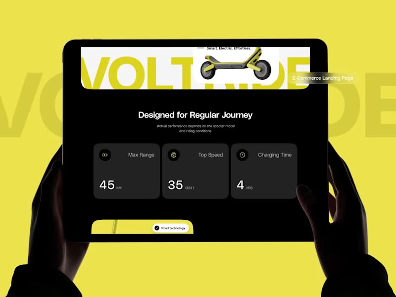
Electric Scooter – Modern Product Landing Page Design
We designed and developed a modern, visually engaging landing page for an electric scooter brand, combining bold visuals, clean UI/UX, and a conversion-focused user experience.
The goal was to showcase the scooter’s innovative technology, performance, and stylish design while creating a seamless experience that encourages visitors to explore the product.
Key Features:
Modern UI/UX Design: Clean layouts, bold typography, and engaging product visuals.
Product-Focused Experience: Dedicated sections highlighting the scooter’s design, technology, and performance.
Responsive Web Design: Optimized layouts for desktop, tablet, and mobile devices.
Conversion-Focused Layout: Strategically placed calls to action that guide visitors toward product exploration.
Intuitive Navigation: A smooth browsing experience that makes product information easy to discover.
Visual Storytelling: Thoughtful design elements that communicate the product’s identity and value.
The Goal: Create a visually compelling digital experience that presents electric mobility as modern, innovative, and accessible.
The Result: A sleek, responsive product landing page that combines strong visual storytelling with intuitive navigation and conversion-focused design to strengthen product presentation and encourage customer engagement.
1
0
19
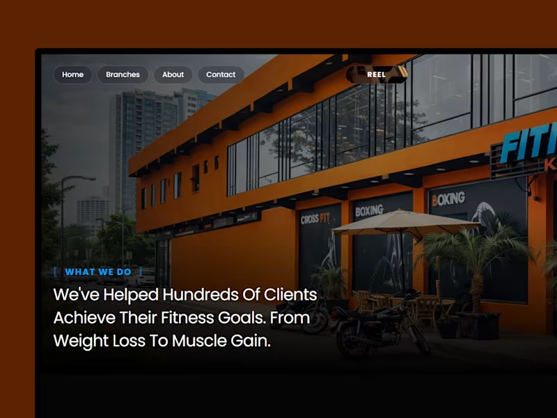
A full web build for a premium fitness brand operating multiple locations. The goal was to translate the raw energy of a high-performance gym into a digital experience that converts visitors into members. We led the entire cycle from strategy and UX architecture to visual design and development, delivering a cinematic dark-toned website that communicates brand strength from the first scroll.
0
231