Freelancers using Eventive in Lagos
Freelancers using Eventive in Lagos
Sign Up
Post a job
Sign Up
Log In
Filters
2
Projects
People
Victor Idowu
Lagos, Nigeria
Webflow Expert | Fast Sites That Rank & Convert
$5k+
Earned
2x
Hired
4.9
Rating
16
Followers
Expert
Follow
Message
Webflow Expert | Fast Sites That Rank & Convert
0
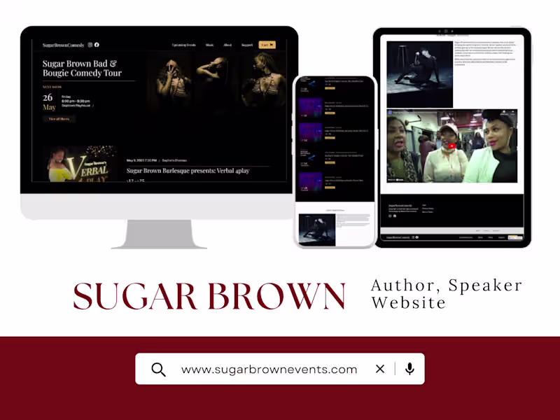
Sugar Brown Events Website (Booking and Entertainment)
0
3
1
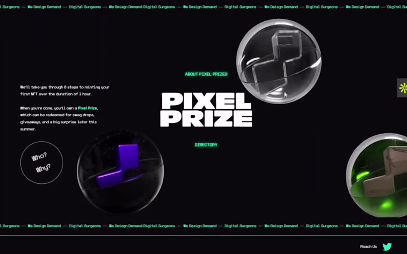
Pixel Prize NFT Website Development
1
8
0
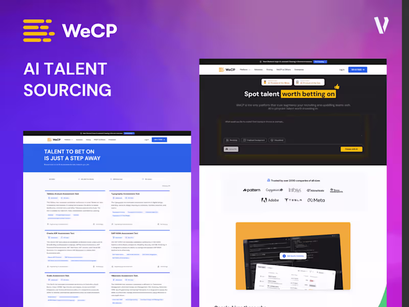
Responsive Ai SaaS Talent Assessment Website - WeCP
0
6
2
Niger Delta Sports Festival Official Website + Video Animation
2
10
Eventive
(1)
Follow
Message
ajao jelil
Lagos, Nigeria
UI/UX Designer for Startups | Clean, usable products
Follow
Message
UI/UX Designer for Startups | Clean, usable products
1
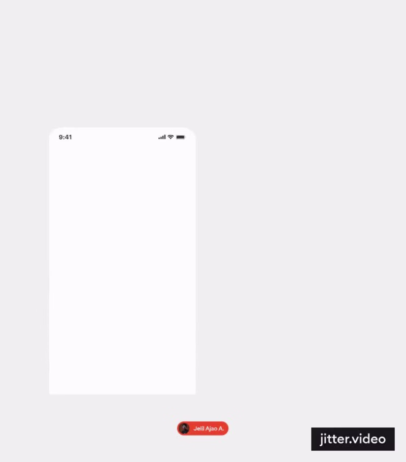
Event finder mobile app design animated in jitter
1
1
48
1
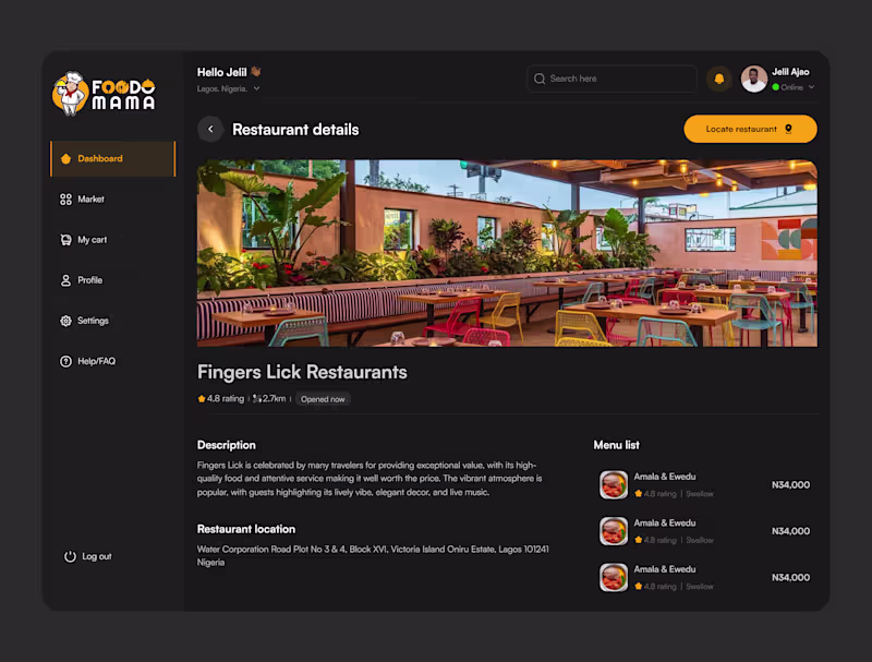
Project: FoodoMama — Restaurant Details Screen A dark-themed dashboard screen designed for a food delivery platform, focused on helping users explore restaurant details before ordering. Key deliverables: • Full restaurant profile layout (hero image, rating, distance, status) • Menu list module with pricing and item ratings • Location and description sections for trust-building • Consistent sidebar navigation across the dashboard Design approach: dark UI to highlight food photography, clear visual hierarchy, and quick-scan information blocks for fast decision-making. Tools used: Figma Available for similar dashboard, mobile app, or food-tech design projects.
1
1
15
0
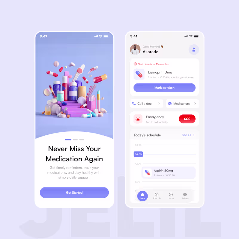
Medication Reminder App Concept 💊 Designed a clean and accessible healthcare mobile experience focused on helping users manage medications, track schedules, and access emergency support with ease. The design prioritizes: • Simplicity • Accessibility • Calm visual hierarchy • Elder-friendly usability Features: Medication reminders Schedule tracking SOS emergency access Doctor contact support Medication history Tools: Figma Role: Product Designer Available for healthcare, SaaS, fintech, and mobile product design projects.
0
9
1
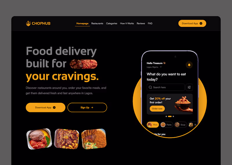
One color. That's all it took. 🟡 I designed this food delivery landing page for ChopHub and the entire visual language runs on a single primary color: amber. No complex gradients. No trendy glassmorphism. Just disciplined use of one warm, high-energy hue against a deep black surface. Here's the color strategy behind it: ✦ Amber = action. Every interactive element, buttons, active states, highlights, promo tags, lives in amber. Your eye always knows where to go next. ✦ Black = amplifier. Dark backgrounds don't just look premium, they make warm colors louder. The amber hits different on black than it ever would on white. ✦ Gray = support. Supporting text, inactive nav links, subtle UI elements, all in muted tones. They carry information without competing for attention. The result? A UI that feels energetic, focused, and on-brand without visual noise. This is color hierarchy in action. Not color variety. Not color trends. Just knowing where your primary color should live and protecting that space. If you're building a brand-forward product, try this: strip your design down to ONE primary color + neutrals. You'll be surprised how much cleaner and stronger it gets. 🛠 Tools: Figma 🎨 Palette: Amber #F5A623 + Near-black #0E0E0E 📱 Type: Food delivery app landing page Open to new projects. Hit Hire Me if you want a UI that works as hard as it looks. 🚀
1
1
32
Eventive
(1)
Follow
Message
Explore people