Freelance UX Designers in Kasaragod
Freelance UX Designers in Kasaragod
Sign Up
Post a job
Sign Up
Log In
Filters
2
Projects
People
Karthik Adiga
Kasaragod, India
My mantra is Clean, useful and used full.
New to Contra
Follow
Message
My mantra is Clean, useful and used full.
0
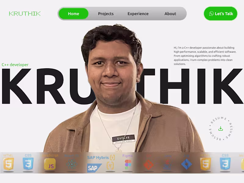
I designed and developed a personal portfolio website for Kruthik, a C++ developer specializing in embedded systems and vehicle communication technologies. The goal of the project was to create a strong personal brand while showcasing his technical expertise, projects, and professional experience in a clean and modern way. The design balances a bold developer-focused aesthetic with a structured layout that makes it easy for recruiters and clients to explore his work. The homepage introduces Kruthik with a large hero section, clear call-to-actions, and a concise overview of his skills and background. Key sections of the portfolio include: Featured projects with visually engaging project cards and detailed descriptions Experience timeline highlighting his role at Tata Consultancy Services and educational background About section focused on his passion for C++, embedded systems, and problem-solving Contact section with quick access to email, social profiles, and direct communication options Skills showcase featuring technologies such as C++, React, SAP Hybris, Figma, HTML, CSS, and JavaScript The interface uses strong typography, a minimal color palette, and modern card-based layouts to create a professional yet approachable experience. Green accent colors were used strategically to emphasize actions and reinforce the personal brand. This project demonstrates how a developer portfolio can effectively communicate both technical capabilities and personality while creating a memorable first impression.
0
10
0
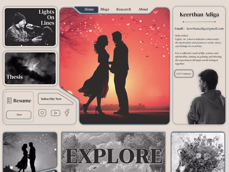
I designed a personal portfolio website for a writer and researcher to reflect their creative identity through an immersive, editorial-style experience. The goal was to move away from a traditional portfolio layout and create something that felt more like a visual journal—combining writing, poetry, research, and personal storytelling in a single space. The design uses a magazine-inspired grid with strong visual sections for featured work, blogs, research, resume, and personal introduction. Large imagery, serif typography, and muted tones were chosen to create an emotional and artistic atmosphere that matches the creator’s voice. Key highlights of the project include: A visually rich homepage with distinct sections for blogs, poems, research, and featured writing A personalized introduction area that builds a stronger connection between the creator and the audience A clean navigation structure that makes it easy to explore content while maintaining the artistic feel Integrated social links, newsletter subscription, and resume access to support both personal branding and professional reach A responsive and scalable layout designed to work across different screen sizes This project demonstrates how a portfolio can become more than just a collection of work—it can communicate personality, creativity, and the story behind the creator.
0
22
0
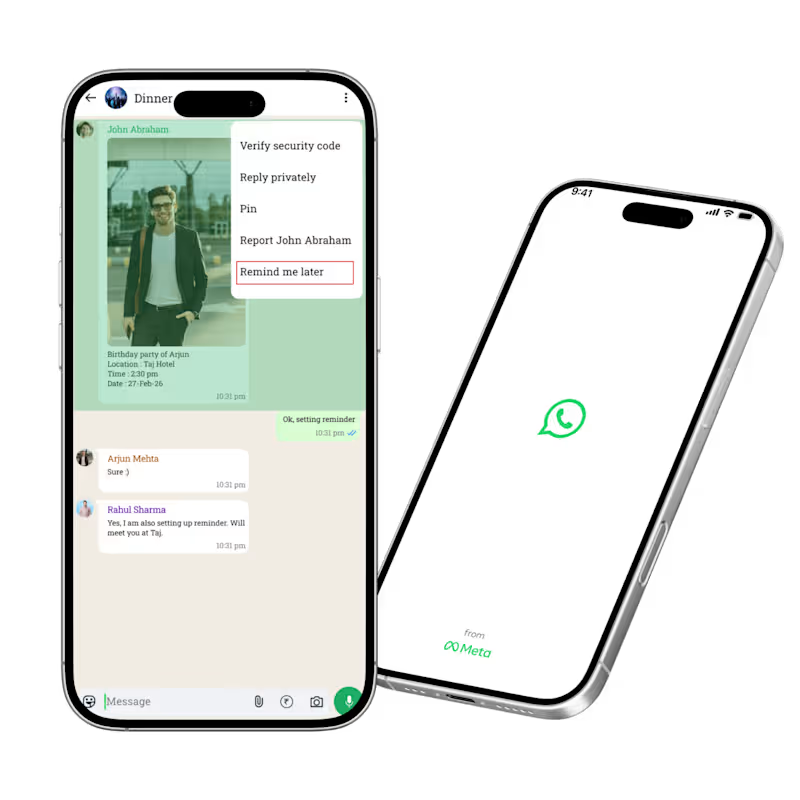
I redesigned WhatsApp by introducing a “Remind Me” feature that helps users save important messages and receive reminders at the right time. The problem was that important messages often get buried in busy chats, forcing users to rely on screenshots, starred messages, or external reminder apps. Through user research, I found that both professionals and students struggle to keep track of deadlines, meeting links, assignments, and follow-ups inside WhatsApp. To solve this, I designed a simple reminder flow directly within the app: Long press any message Select “Remind Me Later” Choose a date and time Receive a private notification linked back to the original message I also introduced a dedicated “Reminders” section where users can view, edit, and manage all saved reminders in one place. This redesign focuses on reducing cognitive load, improving productivity, and keeping users inside the WhatsApp ecosystem instead of switching to external note-taking or reminder apps. The final experience is lightweight, intuitive, and seamlessly integrated into WhatsApp’s existing interaction patterns.
0
28
0
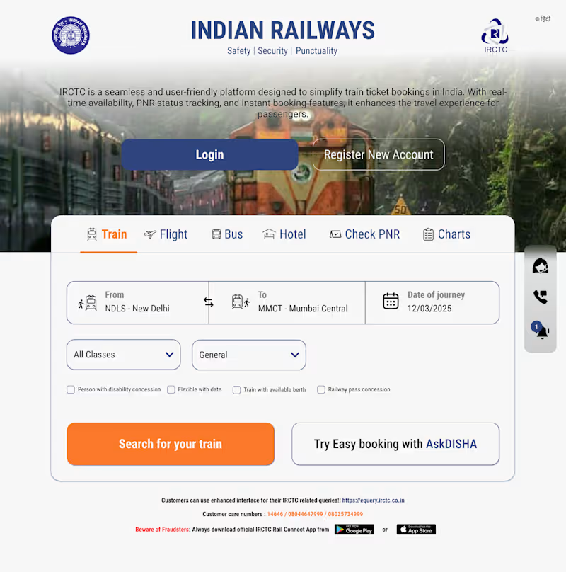
IRCTC Website Redesign I redesigned the IRCTC homepage to create a cleaner, faster, and more user-friendly experience for train ticket booking. The existing platform contains a lot of information and multiple actions on a single screen, which can feel overwhelming for users. My goal was to simplify the booking flow while keeping the most important actions immediately accessible. What I Improved Created a cleaner visual hierarchy with a stronger focus on the primary booking journey Simplified the train search section by making “From”, “To”, and “Date of Journey” more prominent Redesigned the navigation tabs for Train, Flight, Bus, Hotel, PNR, and Charts for quicker access Added larger, more accessible CTA buttons such as “Login”, “Register New Account”, and “Search for your train” Improved spacing, typography, and contrast to make the interface easier to scan Kept the familiar IRCTC branding while modernizing the overall look and feel Design Goals The redesign focuses on: Faster booking experience Reduced cognitive load Better accessibility and readability Mobile-friendly and scalable UI structure A more modern and trustworthy interface This concept redesign demonstrates how a government service platform can be transformed into a smoother and more intuitive digital experience without losing its core identity.
0
29
UX Designer
(4)
Follow
Message
Explore people