
Branding and Graphic Design
Branding and Graphic Design
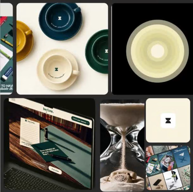
Most cafés are designed for people who want to be seen. I wanted to design one for people who’ve spent years not being seen.
Parents aged 38-52, with kids now grown, spent a decade making everyone else feel looked after. Nobody’s doing that for them anymore.
So the strategy behind Before started with one question: what would it feel like to be taken care of again?
The answer shaped every decision:
→ No clocks. The hourglass became the mark, a reminder that this is time that doesn’t need tracking.
→ Calm palette. Deliberately away from loud café energy and spa-café clichés.
→ A wall of memory and a note on every cup. Small rituals that bring the person back into focus.
Before anyone else, take care of yourself. That’s the whole brand.
Case study below 👇
https://contra.com/p/ZOcEeMYB-before-or-cafe-designed-for-parents?r=hoorain_arshad_h4kb4ubz
#BrandStrategy #BrandIdentity #Branding #CaseStudy
1
267
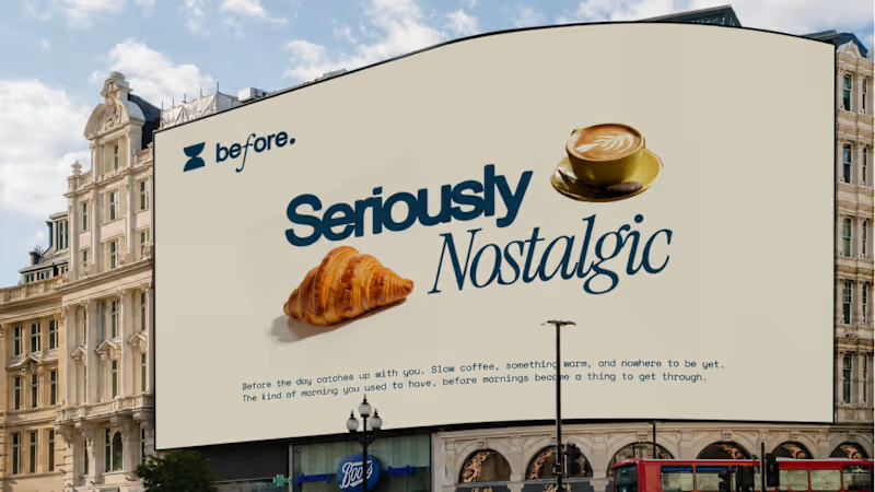
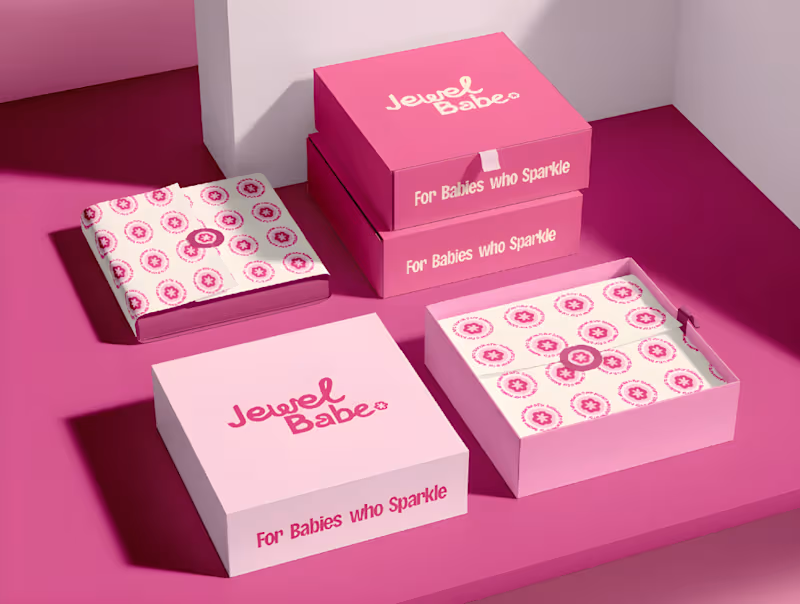
Most jewelry brands don’t have a logo problem.
They have a “who is this for?” problem. When KEESA Jewels came to me, the brief was [what they asked for]. But the real issue was "they looked like everyone else in the category"
So before opening Illustrator, I ran Discovery:
→ [Finding about the audience]
→ [Finding about competitors]
→ [Finding about what KEESA could own]
That led to the Direction: [one-sentence positioning].
Then Design:
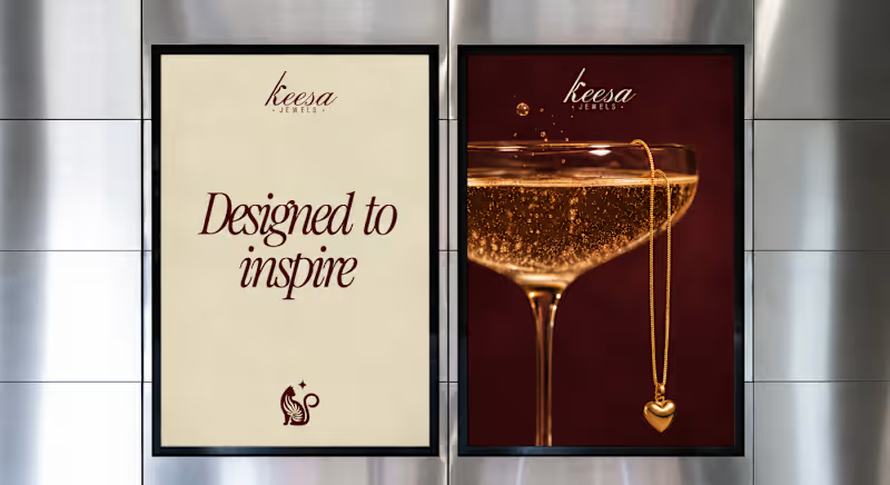
→ The mark: [A poised cat whose tail curls into the curve of the K, with a small star beside it. “Keesa” comes from киса (kisa), Russian for a kitten and a term of endearment, so the cat carries the name’s meaning. Ornamental, not cute.]
→ The palette: [Deep burgundy, warm ivory, and burnished gold. Burgundy brings richness and drama, ivory keeps it light and breathable, and gold carries the jewelry’s glow.]
→ The type: [A high-contrast italic script with the confidence of a serif, with a tall, slanted K as the hero, over widely tracked sans-serif “JEWELS” for structure.]
The result is a brand that feels celebratory without being loud, with imagery built from candlelight, champagne, and velvet instead of flat-lay shots, so the jewelry feels like part of a world, not a catalogue.
Full case study on Behance: [CASESTUDY (https://contra.com/p/WAZNBrPF-keesa-jewel?r=hoorain_arshad_h4kb4ubz)] What’s the one thing a jewelry brand should never compromise on? Tell me below.
1
318
