Freelancers using HTMLPub in Karachi
Freelancers using HTMLPub in Karachi
Sign Up
Post a job
Sign Up
Log In
Filters
2
Projects
People
Talha Yusuf
Karachi, Pakistan
Creative Designer for Premium Brands & Content Creators.
New to Contra
Follow
Message
Creative Designer for Premium Brands & Content Creators.
0
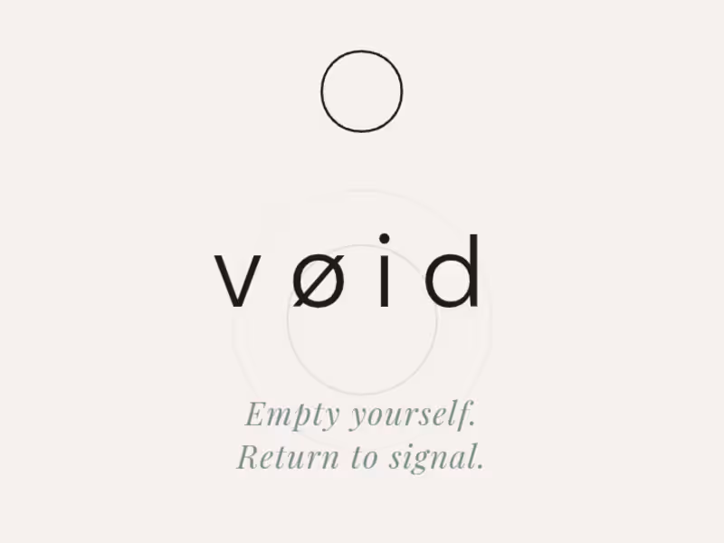
Project: VØID Brand Identity & Conversion Site. Speculative brand system, self-initiated: The brief I gave myself: Build a complete brand voice and site for a category that's usually either clinical (supplement brands) or soft (wellness brands), and prove I can hold a third tone restrained, precise, almost cold without it collapsing into either. What I built: Full identity system (typography hierarchy, voice doctrine, product narrative) plus a live conversion site. No template copy anywhere every line, including the brand voice rule itself ("clinical without being cold, spiritual without being soft"), was written to be load-bearing, not decorative. The constraint I set: No urgency language, no inflated stats, no stacked trust badges. Most DTC sites default to more proof points. I went the other way three steps, one product, one sentence per idea because the brand's whole premise is reduction, so the site had to physically demonstrate that, not just claim it. [https://voidui.netlify.app/]
0
24
0
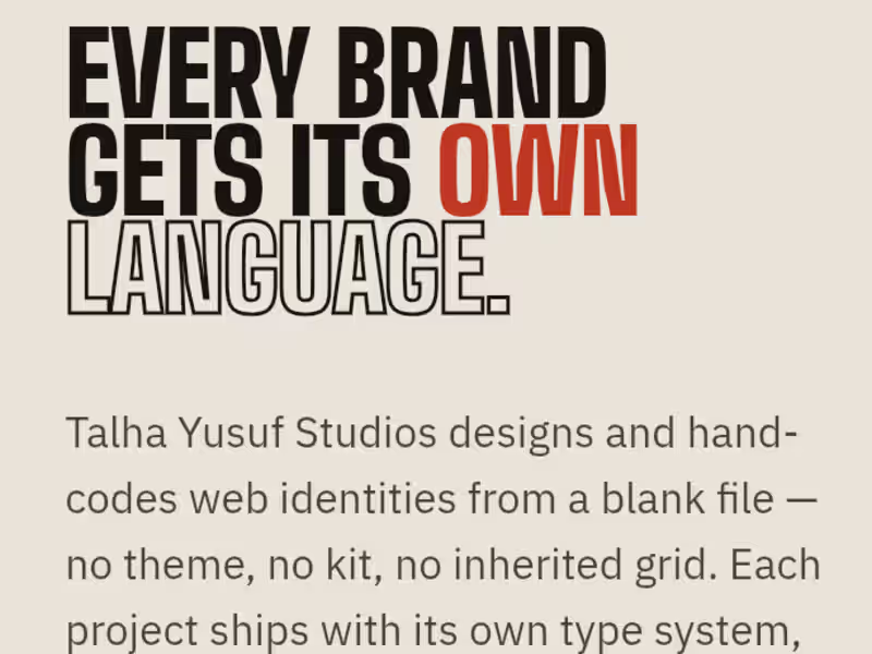
Case Study: Engineering a Zero-Template Agency Manifesto: Context & Strategy: Most agency portfolios rely on rigid templates, generic layouts, or bloated builders that dilute a brand’s unique identity. To launch Talha Yusuf Studios, the objective was to build a flagship portfolio that practices exactly what it preaches: an elite digital experience coded entirely from a blank file (file-zero) with zero shared components, zero themes, and absolute performance optimization. System Architecture: The Code: Built entirely from scratch using lightweight, high-performance semantic HTML and CSS, maintaining an exceptionally low page weight for instant global loading speeds. · The Interface: Engineered an unconventional, high-fashion editorial index that trades standard grid patterns for an original typographic layout and custom CSS-driven text marquees. · The UX Flow: Implemented deep-linked anchor routing (#index, #process) to give high-ticket clients frictionless, immediate access to live production assets and the agency's strategic framework. – The Value Delivered – · 100% Bespoke Positioning: Establishes an immediate premium contrast against competitors using standard page builders, positioning hand-coded architecture as a luxury asset. · Accelerated Client Onboarding: Integrates a structured four-stage brief progression directly into the viewport, moving prospective clients from discovery to project inquiry on a single page. · Live Proof-of-Concept: Serves as a live, fully responsive demonstration of pure frontend fluidity, proving design authority without hiding behind external plugins.
1
0
8
0
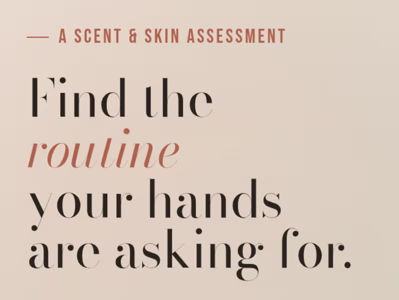
Gloved Hand Care Quiz Concept: A self-directed concept built to demonstrate interactive product-matching UX for a DTC pitch. Concept design and build created as a sample piece for a client application showcasing a guided quiz flow that matches users to a personalized hand care routine based on skin type, scent preference, and lifestyle. Built to demonstrate how interactive, personalization-driven UX can replace a standard product catalog for wellness/beauty DTC brands. Focus areas: quiz logic and flow design, conversion-oriented UX, and clean editorial product presentation. [https://quizconcept.netlify.app/]
1
0
28
0
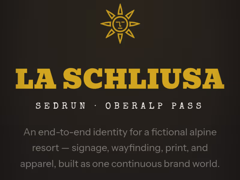
La Schliusa Comprehensive Brand Identity & Digital Editorial: Most digital designs feel sterile, cold, and entirely detached from physical reality. When building the visual universe for La Schliusa, the mandate was the exact opposite: translate the raw, physical sensory experience of an exclusive alpine retreat into a digital interface. No templates. No generic layouts. Every element was architected from the ground up to command luxury status. The Strategic Execution: - Physical-to-Digital Wayfinding: Designed a cohesive visual language that anchors everything from physical stone signage, bespoke dining menus, and custom staff apparel directly into a unified digital ecosystem. - The Atmospheric Pivot ("Why Warm, Not Cold"): Rejected the predictable, clinical blue-light aesthetics of standard modern web layout. Instead, engineered a custom color shifts across the interface using amber, deep charcoal, and rich cream tones to mimic the exact ambient lighting of an alpine sunset. - Elite Typographic Architecture: Implemented bold, high-contrast serif headers paired with precise spacing ratios to create a fluid, premium editorial layout that holds attention effortlessly. [https://la-schliusa.netlify.app/] The Result: A digital presence that doesn't just display information it establishes immediate cultural prestige and psychological status before a guest even steps onto the property.
1
0
35
HTMLPub
(1)
Follow
Message
Explore people