
Luxury Brand Designer | 8K Super HD | KISMAT Retail
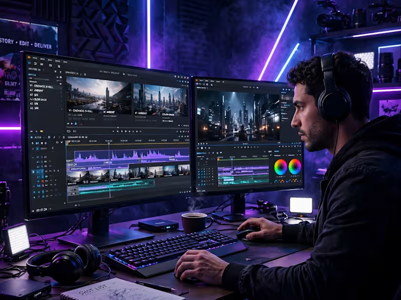
✨ VIDEO EDITING PRO ✨
PORTFOLIO • CINEMATIC • CREATIVE • PRECISE
for Contra
PORTFOLIO 2024 • AVAILABLE FOR FREELANCE PROJECTS
SERVICES:
CINEMATIC EDITING - Story-driven, smooth cuts, retention focused
MOTION GRAPHICS - Titles, lower-thirds, animations, kinetic text
COLOR GRADING - Cinematic, Teal & Orange, Luxury - Consistent brand look
SOUND DESIGN - Beat sync, music, SFX - High engagement
8K POST PRODUCTION - 1080p, 30fps, 8K Delivery - Ready for YouTube, Reels, Ads
What I do:
Video Editing Pro - Commercial, Cinematic, YouTube, Reels, Ads - Premium
Cinematic Editing - Aerial, Travel, Brand, Documentary - Polished
Post Production - Edit + Grade + Sound + Deliver - All in One
Recent Work:
YOUTUBE EDITING + THUMBNAIL - High CTR - Bold Thumbnail Design - Portfolio 2024
REELS / SHORTS VIDEO EDITING - High Retention - Portfolio 2024
KISMAT RETAIL - VIDEO PHOTO EDITING - All in One - Luxury Brand Premium 8K
10-sec Yacht Sample for $12,000 / 225 videos - 1080p, 30fps
15-sec Washing Machine Sample for $10,000 / 90 videos - 1080p, 30fps
CINEMATIC EDITING - Teal & Orange Grade - Drone Mountain Aerial - 8K
Tools: Premiere Pro, After Effects, DaVinci Resolve, CapCut, Blender - 8K Super HD
Available for $25-$50/hr - Video Editing Pro - Ready to start with 1 test video!
Portfolio: contra.com/nagdakiya_m
Service: $299 Luxury Brand - https://contra.[STRIPPED 72 bytes]
CONTACT: EDIT@VIDEOEDITINGPRO.COM (mailto:EDIT@VIDEOEDITINGPRO.COM) • @VIDEOEDITINGPRO
DM for video editing - Let's craft your story!
KISMAT RETAIL
1
8
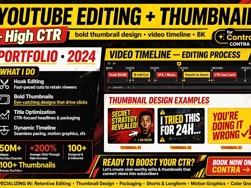
✨ YOUTUBE EDITING + THUMBNAIL ✨
High CTR -
bold thumbnail design • video timeline • 8K
for Contra
PORTFOLIO • 2024
READY TO BOOST YOUR CTR?
Let's create viral-worthy edits & thumbnails that convert views into subscribers
BOOK NOW ON CONTRA →
WHAT I DO:
Hook Editing
Fast-paced cuts to retain viewers
Bold Thumbnails
Eye-catching designs that drive clicks
Title Optimization
CTR-focused headlines & packaging
Dynamic Timeline
Seamless pacing, motion graphics, sfx
VIDEO TIMELINE — EDITING PROCESS:
Hook [0:00] → B-roll Cut → SFX / Music → Punch-in Zoom → CTA End Card
THUMBNAIL DESIGN EXAMPLES:
THUMBNAIL 01 - SECRET STRATEGY REVEALED! - 1.2M VIEWS
THUMBNAIL 02 - I TRIED THIS FOR 24H...
THUMBNAIL 03 - YOU'RE DOING IT WRONG!
RESULTS:
50M+ Views - YouTube Channels
+200% Average Click-Through Rate Increase
100+ Designed & Delivered
100+ Thumbnails Across YouTube
SPECIALIZING IN:
Retentive Editing • Thumbnail Design • Packaging • Shorts & Longform • Motion Graphics • Color Grade
What I do:
YouTube Editing - Longform, Shorts, Vlogs, Documentary - Retention focused
Thumbnail Design - Bold, CTR optimized, Brand consistent - Click-worthy
Packaging - Title + Thumbnail + Hook - Full video packaging
Recent Work:
REELS / SHORTS VIDEO EDITING - High Retention - Portfolio 2024
KISMAT RETAIL - VIDEO PHOTO EDITING - All in One - Luxury Brand Premium 8K
3D VIDEO EDITING - Motion Graphics - Immersive Visual
PRODUCT PHOTO EDITING - E-commerce - Luxury Perfume Bottle Gold Marble
Tools: Premiere Pro, After Effects, Photoshop, CapCut - 8K Super HD
Available for $25-$50/hr - YouTube Editing + Thumbnail - Ready to start with 1 test video + thumbnail!
Portfolio: contra.com/nagdakiya_m
Service: $299 Luxury Brand - https://contra.[STRIPPED 72 bytes]
DM to boost your CTR - Let's make your next video viral!
KISMAT RETAIL
1
8
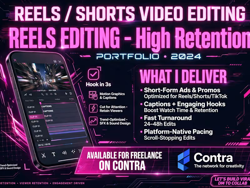
✨ REELS / SHORTS VIDEO EDITING ✨
REELS EDITING - High Retention
PORTFOLIO • 2024
AVAILABLE FOR FREELANCE ON CONTRA
HIGH RETENTION • VIEWER RETENTION • ENGAGEMENT DRIVEN
WHAT I DELIVER:
Short-Form Ads & Promos
Optimized for Reels / Shorts / TikTok
Captions + Engaging Hooks
Boost Watch Time & Retention
Fast Turnaround
24-48h Edits
Platform-Native Pacing
Scroll-Stopping Edits
How I edit for retention:
Hook in 3s - First 3 seconds me viewer ruk jaye
Motion Graphics & Captions - Animated captions, kinetic text, pop-ups
Cut for Attention • Retain Viewers - Fast cuts, no boring part
Trend-Optimized • SFX & Sound Design - Trending sounds, SFX, beat sync
What I do:
Reels / Shorts / TikTok Editing - Ads, Promos, Brand, Creator - Viral style
Short-Form Ads - E-commerce, Luxury, Product - CTR optimized
Captions + Hooks - Watch time badhao, engagement badhao
Recent Work:
KISMAT RETAIL - VIDEO PHOTO EDITING - All in One - Luxury Brand Premium 8K
3D VIDEO EDITING - Motion Graphics - Immersive Visual - Portfolio 2024
10-sec Yacht Sample for $12,000 / 225 videos - 1080p, 30fps
15-sec Washing Machine Sample for $10,000 / 90 videos - 1080p, 30fps
CINEMATIC EDITING - Teal & Orange Grade - Drone Mountain Aerial - 8K
Tools: Premiere Pro, After Effects, CapCut, DaVinci Resolve - 8K Super HD
Available for $25-$50/hr - Reels / Shorts Editing - 24-48h Delivery - Ready to start!
Portfolio: contra.com/nagdakiya_m
Service: $299 Luxury Brand - https://contra.com/s/mbgXP7rr-kismat-retail-luxury-e-commerce-brand-design-full-package
LET'S BUILD VIRAL - DM TO COLLAB!
KISMAT RETAIL - Contra - The network for creativity
1
23

✨ PORTFOLIO ✨
3D VIDEO EDITING - Motion Graphics
for Contra
CREATING IMMERSIVE 3D VISUAL EXPERIENCES • MOTION DESIGN • ANIMATION • POST PRODUCTION
PORTFOLIO 2024 • 8K READY WORKFLOW
What I do in this style:
3D COMPOSITING
Multi-layer editing • VFX integration • Realistic rendering
3D objects in real footage - Seamless, cinematic
MOTION GRAPHICS
Kinetic typography • Animated UI/UX • Particle effects
Titles, lower-thirds, product callouts - Eye-catching, brand-ready
VIDEO EDITING
Color grading • Transitions • Sound sync • Dynamic motion
Smooth cuts, beat sync, polished final
What I do:
3D Video Editing - Product, Tech, Brand, Commercial - Futuristic, premium
Motion Graphics - Intros, Explainers, Ads, Reels - High retention
VFX + Animation - 3D cube, particles, UI animation - 8K Delivery
Recent Work:
KISMAT RETAIL - VIDEO PHOTO EDITING - All in One - Luxury Brand Premium 8K
10-sec Yacht Sample for $12,000 / 225 videos - 1080p, 30fps
15-sec Washing Machine Sample for $10,000 / 90 videos - 1080p, 30fps
CINEMATIC EDITING - Teal & Orange Grade - Drone Mountain Aerial - 8K
WEDDING PHOTO EDITING - Premium - Couple Retouch
Tools: After Effects, Blender, Premiere Pro, Cinema 4D - 8K Super HD
Available for $25-$50/hr - 3D + Motion Graphics - Ready to start with 1 test video!
Portfolio: contra.com/nagdakiya_m
Service: $299 Luxury Brand - https://contra.com/s/mbgXP7rr-kismat-retail-luxury-e-commerce-brand-design-full-package
DM for 3D editing - Let's make your brand futuristic!
KISMAT RETAIL
1
20


Brand Identity & Visual Systems Designer
Brand Identity & Visual Systems Designer

SÓLUM — Beauty Brand Identity
A visual identity built around the idea of quiet science, natural materials, and everyday care.
For SÓLUM, I explored a minimal and grounded visual language that feels premium without becoming overly polished. From the identity and packaging to digital touchpoints and campaign applications, every element was designed to feel calm, tactile, and intentional.
The goal was simple: make skincare feel closer to nature, while keeping the science visible.
Brand Identity · Packaging · Art Direction · Digital · Campaign
0
110

JIVA — Premium Indian Kombucha Brand Identity
JIVA was built around a simple thought: Indian kombucha can feel premium, modern, and proudly rooted in where it comes from.
The challenge was to move away from the usual clinical or overly craft-market look and create a brand that feels like a global product with an unmistakably Indian soul.
The identity takes inspiration from Indian craft, traditional arches, and the natural movement of fermentation. The rounded dome-like symbol gives the mark a sense of warmth and heritage, while the flowing curves represent fermentation as something living, active, and constantly transforming.
The visual language keeps things minimal and refined, using earthy tones and a warm off-white to create a balance between tradition and modernity. The result is an identity that feels calm and premium, but still has character.
At the heart of JIVA is the idea of “Blend of Culture” — bringing together Indian heritage, natural fermentation, and contemporary design.
Alive. Authentic. Artisanal. Indian at heart.
Services
Brand Identity
Logo Design
Art Direction
Typography
Color Palette
Visual System
Packaging Design
Tools
Adobe Illustrator
Adobe Photoshop
Project Type
Branding / Visual Identity / Packaging
0
115

Natura — Natural Beauty Brand Identity
Natura started with a simple idea: natural skincare shouldn’t feel like a luxury that only a few people can afford.
I developed this brand identity around the feeling of calm, honesty, and connection with nature. The visual direction uses soft organic forms, flowing leaf-inspired curves, and a gentle color palette to make the brand feel natural without becoming overly rustic or predictable.
The logo was shaped around the movement of leaves and natural growth, creating a mark that feels soft, balanced, and easy to recognize. I paired it with warm neutrals, sage greens, deeper botanical tones, and a subtle blossom pink to bring a little warmth and personality into the system.
The goal was to create a beauty brand that feels clean, approachable, thoughtful, and trustworthy—something that feels natural without trying too hard to look “natural.”
Services
Brand Identity
Logo Design
Art Direction
Typography
Color Palette
Visual System
Tools
Adobe Illustrator
Adobe Photoshop
Project Type
Branding / Visual Identity
Full project: https://www.behance.net/gallery/252237679/Natura-Beauty-brand-branding
0
136
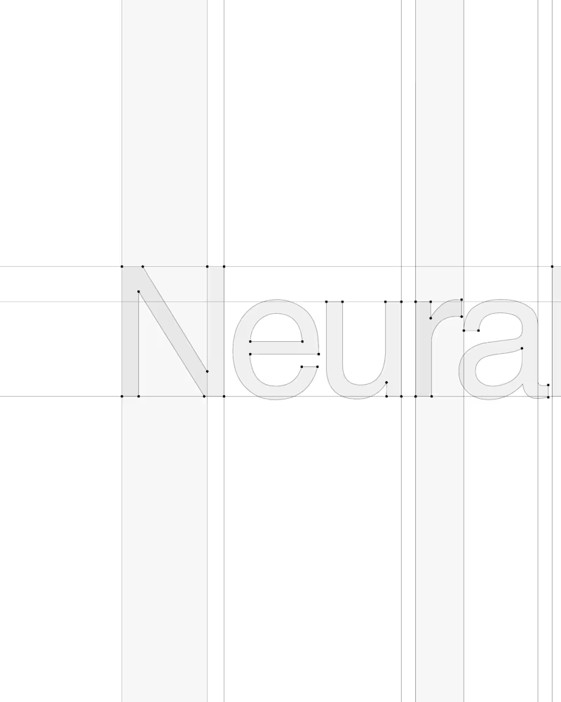
Neuralyn — AI Brand Identity.
A conceptual identity built around the idea of making artificial intelligence feel more natural, intuitive, and human.
From the wordmark and visual system to digital interfaces and campaign applications, the identity explores how an AI brand can feel intelligent and future-focused without relying on the usual futuristic clichés.
The result is a flexible brand system that connects technology with real human interaction — clear, confident, and built for a digital-first world.
Brand Strategy / Visual Identity / Art Direction / Typography / Digital Experience
#BrandIdentity #BrandDesign #VisualIdentity #ArtDirection #AIBranding #GraphicDesign #Typography #CreativeDirection #BrandStrategy #DesignInspiration
0
32

Video Editor & Motion Designer · 7+ yrs
I make SaaS & brand
Video Editor & Motion Designer · 7+ yrs
I make SaaS & brand
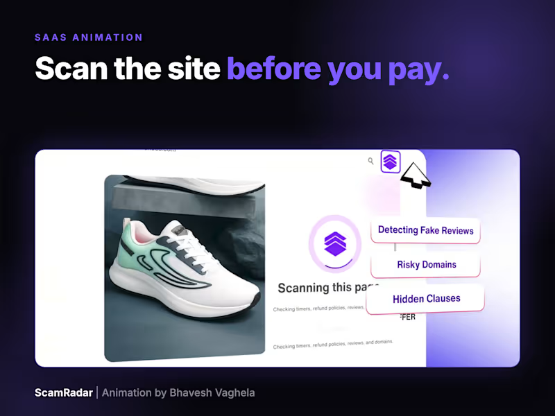
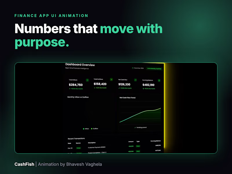
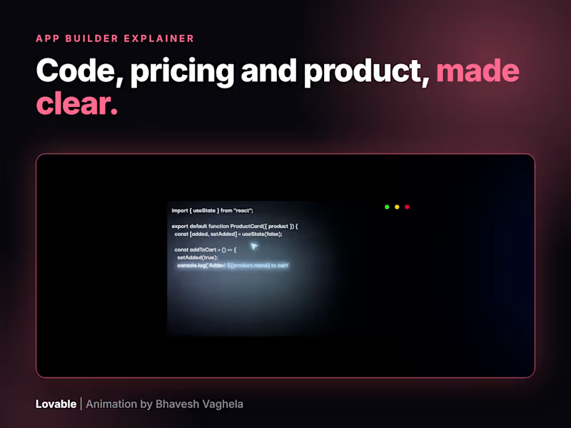
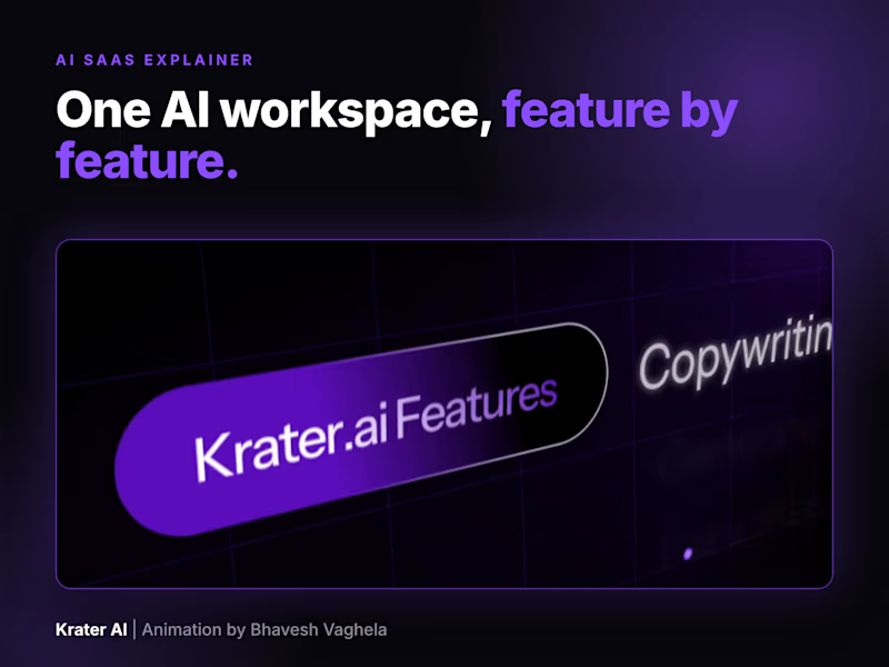

Crafting visual narratives that leave a lasting impact
Crafting visual narratives that leave a lasting impact


View more →

Passionate aspiring video editor

Punchy / hook-first
POV: your videos aren't underperforming, your edit is. 🎬
Cut, animated, and motion-designed this one start to finish — kinetic captions, custom illustrations, mockup overlays, all in Premiere Pro + After Effects.
Editing breakdown 👇
✂️ Clean subject cutout + dynamic backgrounds
🔤 Word-by-word animated captions
🎨 Custom motion graphics & illustrations
📱 Live phone-mockup data overlay
All edited in Adobe Premiere Pro + After Effects.
DM me if you want your content to look like this.
Short & clean (for a quieter, more premium feel)
Same message, sharper delivery.
Edited & motion designed by me — Premiere Pro + After Effects.
#videoeditor #motiongraphics
0
29

The blueprint for a premium podcast trailer. 🎬👇
Average edits get scrolled past. High-retention edits stop the thumb.
Here is how I designed this edit to maximize engagement:
Minimalist Typography: Clean, modern text animation that flows with the speaker instead of cluttering the screen.
Animated UI Elements: Custom graphics built out to visually map out complex ideas (like the engagement/monetization/retention breakdown).
Precise Pacing: Tight cuts and intentional framing changes that keep the energy high from start to finish.
If you’re a creator or business owner tired of average video quality and want to scale your podcast, reels, or digital marketing content with a highly polished look, let's collaborate.
💼 I’m currently taking on a few long-term monthly editing partnerships. Send me a DM with the word "GROW" and let’s talk about your project!
#VideoEditor #PodcastEditor #AfterEffects #PremierePro #ReelsEditing #MotionGraphics #ContentCreator #ShortFormContent
0
71

A great edit doesn't just cut out dead air—it actively commands the viewer's attention. 🧠👇
When editing this piece, my goal wasn't just to make it look clean; it was to maximize viewer retention using a structured post-production framework.
Here is a breakdown of the editor's perspective behind this asset:
Dynamic Framing: Notice the subtle, smooth digital zooms and framing resets. They occur precisely when the narrative shifts, preventing visual fatigue.
Seamless UI Animation: Instead of basic screen recordings, I built out clean user interface mockups and tracking pop-ups using After Effects. It keeps the educational elements highly scannable.
Pacing & Audio Layering: The transitions are driven by sound design cues, ensuring the audio and visual pacing are perfectly synchronized to maintain momentum.
If you are a creator, founder, or agency looking to scale your content with this exact premium, high-retention aesthetic, you don't need a button-pusher—you need a creative partner.
Let’s elevate your channel's post-production workflow.
📩 DM me "EDIT" or email me at rahulmemariya8@gmail.com (mailto:rahulmemariya8@gmail.com) to discuss your upcoming projects.
2
138


Visual & Brand Designer crafting meaningful identities
- $1k+
- Earned
- 12x
- Hired
- 5.0
- Rating
- 47
- Followers
Visual & Brand Designer crafting meaningful identities

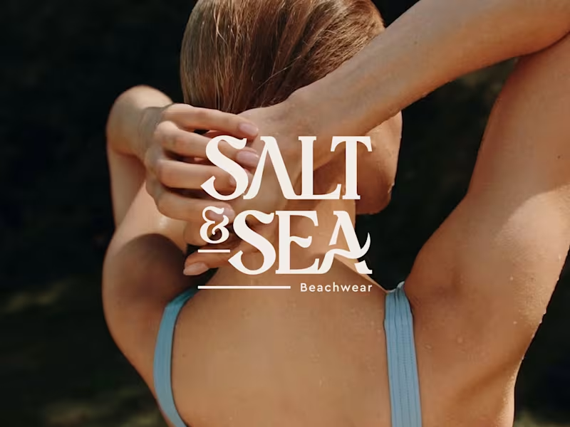
Brand identity for Salt & Sea, a beachwear label. Bold, elegant serif lettering with a playful ampersand, inspired by sun, salt, and the sea. Beachwear brand identity.
0
26
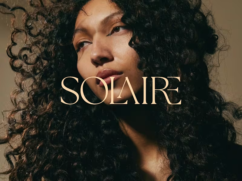
Solaire: Hair Care Brand Identity and Branding
As a hair care brand, Solaire believes that every curl deserves to be seen in its best light and treats hair care as a daily ritual rather than a routine. This philosophy forms the core inspiration for the brand's identity and packaging. An elegant serif logotype with interlocking letterforms, a warm sun-washed palette of cream, amber and deep brown, and intimate, light-drenched photography come together to create a feeling of quiet luxury and natural radiance.
0
119
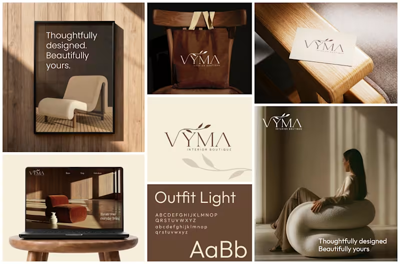
VYMA Interior Boutique — Brand Identity & Logo Design A refined brand identity for VYMA, a contemporary home décor and interior accessories boutique.
The visual direction combines minimalism, warm earthy tones, and timeless typography to create a sophisticated yet welcoming aesthetic.
The identity was inspired by the story of two interior designers and longtime friends coming together to create a thoughtfully curated space.
0
202

Fullstack Engineer & Project Manager
Fullstack Engineer & Project Manager


View more →

your friendly logo designer
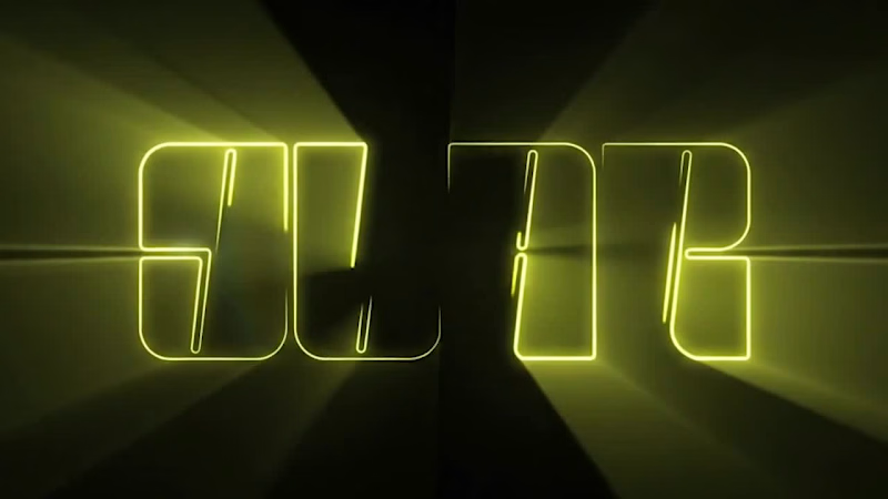
This is an animated version of the Star logo, created to bring the brand identity to life with a dynamic and engaging visual presentation.
0
52

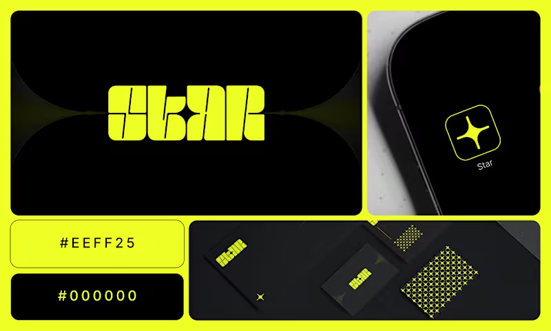
Star Logo For Solar Panel Brand
The client wanted a modern and memorable typography logo for their solar panel brand that communicates clean energy, sustainability, and innovation. The main goal was to create a simple yet meaningful visual identity that connects the brand with solar power and renewable energy. The key challenge was combining the concepts of a solar panel and the sun into a clean, recognizable symbol without making the logo look overly complicated. I addressed this by developing a minimalist design that uses the sun/star concept to represent energy and the solar panel element to communicate the brand’s industry. The final logo provides a professional, modern, and versatile identity suitable for digital platforms, marketing materials, and branding applications.
0
83

This is a minimalist investment-based company logo designed to reflect the client’s vision of incorporating upward and downward arrows into the concept. Based on the project brief, I creatively combined the arrows to form the initial “Z,” presenting it in a clean and modern minimalist style to achieve a balanced, professional, and visually impactful brand identity.
1
230