Your Daily PowerPoint Slide Design Master!
Your Daily PowerPoint Slide Design Master!



Web Developer | UI/UX| 3D Product Animation |
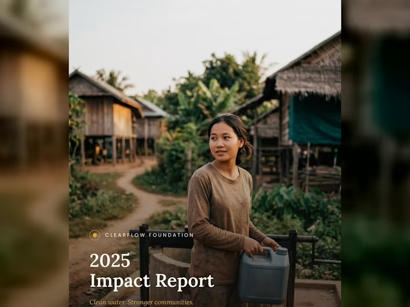
I designed a 25-page NGO Annual Impact Report for a non-profit called Clear Flow Foundation, and then created a short video reel to showcase the document's design, layout, statistics, and photography in an engaging, animated format.
STEY BY STEP 😊😍
1. Cover Page (1 Page)
Visual Style: Full-bleed, high-impact photo showing a community member carrying clean water in a rural village setting. Soft overlay for high-contrast typography.
Header / Logo: ClearFlow Foundation logo placed subtly at the top center/left.
Title: 2025 Impact Report
Subtitle: Clean water. Stronger communities.
2. Inside Cover / Brand Pattern (1 Page)
Visual Style: Elegant, custom line-art vector pattern representing water ripples, topographic lines, or fluid movement.
Content: Minimalist brand motif that serves as a visual palette cleanser before diving into the report content.
3. Table of Contents (1 Page)
Visual Style: Clean, grid-aligned typography with generous whitespace.
Content Breakdown:
01 — Executive Summary & Leadership Letter
02 — Who We Are & Mission Overview
03 — Our Impact (2025 Key Statistics)
04 — Program 1: Sustainable Water Infrastructure
05 — Program 2: Community Health & Training
06 — Community Voices & Field Stories
07 — Financial Transparency & Performance
08 — Acknowledgments & Strategic Goals
4. Letter from Director/CEO (1–2 Pages)
Headline: "Behind each statistic is a family no longer walking three hours for water."
Content Focus:
Opening: Acknowledging milestones achieved in 2025 across 38 villages.
Core Message: Emphasizing that long-term sustainability and local empowerment—rather than quick fixes—are the foundation of ClearFlow's work.
Sign-off: Warm closing remarks from Sophak Chan (Executive Director).
Sidebar / Image: Professional portrait of the director alongside a highlighted quote pull-out.
5. Who We Are / Mission Overview (2 Pages)
Headline: Our Mission
Core Narrative: > "ClearFlow Foundation exists to ensure every community has reliable access to clean, safe water—and the knowledge to maintain it long after we’ve gone."
Founding Context: Established in 2014, working alongside rural communities across Southeast Asia to combine infrastructure with local education.
Key Metric Highlights:
11 yrs operating in Southeast Asian communities.
3 provinces with active programs.
6. Section Divider — Our Impact (1 Page)
Visual Style: Full-page photographic cover showing clean water flowing from a newly installed filtration system, layered with section header styling.
Text: SECTION 03 — Our Impact
7. Impact Overview + Key Stats Spread (2 Pages)
Headline: 2025 At a Glance
Key Performance Indicators (KPI Grid):
12,400 — People gained access to clean water.
45 — New water points constructed.
38 — Villages reached across two provinces.
96 — Community health workers trained.
Sub-Section — Built to Last:
89% of water points fully operational after 5 years.
6,200 hours of hygiene education delivered.
0.4 km average distance to water (down from 3.2 km).
31% reduction in reported waterborne illnesses.
8. Program 1 Deep Dive: Water Infrastructure (2–3 Pages)
Headline: Where the Wells Went: Sustainable Engineering
Process Explanation: How sites are selected using a structured process evaluating distance, population density, and local readiness.
Program Metrics:
14 villages received their first-ever water point.
6 existing wells rehabilitated and upgraded.
3.5 mo average time from survey to completion.
100% of sites selected with community sign-off.
Testimonial Callout: "The pump is close enough now that my son fills a bucket before school and still makes it on time." — Village Parent, Kampong Thom Province.
9. Program 2 Deep Dive: Community Training (2–3 Pages)
Headline: Training That Stays Local
Core Focus: Building local autonomy by training residents directly in maintenance and sanitation management.
Program Metrics:
62% of trained health workers are women.
4 training modules per certification cycle.
18 ongoing peer-education groups active.
2 wks average certification training length.
Quotes & Data: Quote from a female community health worker on earning trust within her local village.
10. Community Story / Photo Spread (2 Pages)
Visual Style: A 2-page full-bleed photograph capturing children playing near a village green or field after receiving clean water access.
Minimal Overlay: A single narrative caption focusing on human impact rather than numbers.
11. Section Divider — Our Numbers (1 Page)
Visual Style: Serene landscape photo of rice fields and stilt houses at dawn with bold overlay text.
Text: SECTION 07 — Our Numbers
12. Financial Overview (2–3 Pages)
Headline: 2025 Financial Summary
Expense Allocation (Donut Chart/Breakdown):
72% — Program delivery (wells, filtration, training)
14% — Community education & staffing
8% — Administration
6% — Fundraising & operations
Financial Totals:
$482,000 Total Revenue
$398,500 Total Program Expenses
$83,500 Surplus reinvested into 2026 expansion
1,240 Individual and organizational donors in 2025
13. Donor & Partner Acknowledgments (1–2 Pages)
Headline: With Gratitude to Our Partners
Layout: Multi-column list categorizing individual donors, corporate sponsors, and institutional partners who made the year's work possible.
14. Looking Ahead / Future Goals (1–2 Pages)
Headline: Our Goals for 2026
Strategic Roadmap:
Expand into 20 new villages across two additional provinces.
Launch a women-led maintenance technician training track.
Reach 90% five-year operational sustainability across all water points.
Publish our first fully independent impact audit.
15. Closing Photo Spread (1–2 Pages)
Visual Style: Sunset photograph of a local resident looking across a peaceful landscape.
Text: "Thank you for making clean water possible."
16. Back Cover / Contact Info (1 Page)
Visual Style: Clean layout with subtle branding elements.
Content:
Contact email & website address.
Social media handles.
Designer sign-off block / Case study attribution.
If you would like to read the complete document, check out the link below:
https://drive.google.com/file/d/11wYbQoVzxaZNiWcNnYFLDqCluTZ-mTAI/view?usp=sharing
Like this kind of work? Feel free to reach out—let's create something tailored for your business!
0
213

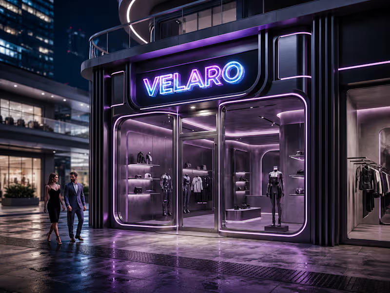
🚨 Big reveal on the skyline! 🚨
I build custom, animated, and fully responsive portfolio websites — no templates, no shortcuts, 100% built from scratch.
✅ Custom design tailored to you
✅ Fully responsive (Mobile / Tablet / PC)
✅ Modern UI/UX with smooth animations
Ready to unveil your own standout portfolio? Let's work together 👇
https://fiverr.com/createdbysaif
0
89
🖤 Velaro — Technical Architecture
🔗 Live Website
https://saif-velaro-clothing-brand.netlify.app
📌 Overview
Velaro is a single-page application (SPA) for a fashion/clothing brand, built with React + TypeScript, bundled by Vite, and styled with Tailwind CSS. The entire UI renders on one HTML page and updates dynamically as the user scrolls, searches, or interacts with the cart — no full page reloads.
The architecture follows a standard modern frontend pattern: a single entry point boots the app, a root App component composes independent section components, and a global context manages shared state (the shopping cart) across all of them.
⚙️ Build & Tooling Layer
These files configure how the project compiles, lints, and runs — they aren't part of the visible website, but control everything behind it.
vite.config.ts — Configures Vite, the build tool/dev server. Defines how .tsx/.ts files are compiled, how the dev server runs (npm run dev), and how the production bundle is generated (npm run build).
tsconfig.json — Root TypeScript config — points to the two more specific configs below via project references.
tsconfig.app (http://tsconfig.app).json — TypeScript rules specifically for the application code in src/ (JSX handling, module resolution, strictness, the @/ path alias).
tsconfig.node.json — TypeScript rules for Node-context files (like vite.config.ts itself), since those run outside the browser.
tailwind.config.js — Configures Tailwind CSS — defines the design system (colors, spacing, fonts) and which files Tailwind scans to generate only the CSS classes actually used.
postcss.config.js — Configures PostCSS, the tool that processes Tailwind's output and applies vendor prefixing/optimization during build.
eslint.config.js — Defines linting rules — catches code-quality issues, unused variables, and React/TypeScript best-practice violations during development.
package.json — Lists all dependencies (React, Vite, Tailwind, etc.) and defines the npm scripts (dev, build, preview).
package-lock.json — Locks exact dependency versions so the build is reproducible across machines.
.gitignore — Tells Git which files/folders to exclude from version control (e.g. node_modules, dist).
index.html — The single real HTML file. Contains a root <div> that React mounts into — everything else is injected by JavaScript.
dist/ — Auto-generated production build output (plain HTML/CSS/JS) created by npm run build. This is the folder actually deployed to Netlify.
node_modules/ — Auto-generated folder holding all installed dependencies (created by npm install, never edited manually).
🚪 Application Entry & Root
src/main.tsx — The true entry point of the app. Imports React, imports App.tsx, and mounts it into the <div> inside index.html. This is the first application code that runs.
src/App.tsx — The root component. Doesn't contain page content itself — instead it imports and arranges every section component (Navbar, Hero, About, etc.) in order, and wraps everything in the CartProvider so cart state is available app-wide.
src/index.css — Global stylesheet — imports Tailwind's base/utility layers, applied once at the root so every component can use Tailwind classes.
src/vite-env.d.ts — TypeScript type declarations for Vite-specific features (like importing images/CSS as modules) — lets TypeScript understand syntax that isn't standard JavaScript.
🛒 State Management
src/cart.tsx — Implements the CartProvider, a React Context that holds global cart state (items, quantities, totals) and exposes functions to add/remove items. Any component wrapped inside it (via App.tsx) can read or update the cart without prop-drilling.
src/data.ts — Static data module — likely product listings, collection info, or other content consumed by components like FeaturedCollection and Showcase, kept separate from UI logic.
🧱 Component Layer (src/components/)
Each file is a self-contained, single-responsibility UI section. App.tsx stacks them vertically to form the full page.
Navbar.tsx — Persistent top navigation — branding, menu links, and likely triggers for search/cart.
Hero.tsx — The primary landing banner — headline, tagline, and call-to-action (e.g. "Shop Collection").
HeroCanvas.tsx — A visual/animated layer paired with Hero.tsx — likely a canvas-based or decorative background effect behind the hero text.
FeaturedCollection.tsx — Renders a curated set of products, pulling structured data from data.ts.
About.tsx — Brand-story section — static content describing the label's identity.
Lookbook.tsx — A style/editorial gallery — visually presents outfits or campaign imagery.
Showcase.tsx — An additional highlight section, likely for a specific collection, drop, or promotional content.
Testimonials.tsx — Displays customer reviews/social proof.
Newsletter.tsx — Email capture form/section for marketing signups.
SearchOverlay.tsx — A modal/overlay component for in-site product search, toggled from the Navbar.
CartDrawer.tsx — A slide-out panel UI that reads from the CartProvider (cart.tsx) to display current cart items and totals.
Footer.tsx — Bottom-of-page section — links, contact details, social icons.
🔄 How It All Connects (Data Flow)
The browser loads index.html, which pulls in the compiled JS bundle.
main.tsx runs first and mounts App.tsx into the page.
App.tsx wraps all sections in CartProvider, so cart state is shared without passing props down manually through every component.
Each section component renders independently — some are purely static/presentational (About, Footer), while others are interactive and tied into shared state (CartDrawer, SearchOverlay).
Tailwind classes used throughout every component are compiled once into index.css based on what's scanned via tailwind.config.js.
On npm run build, Vite compiles and bundles all of this into optimized static files inside dist/ — which is what gets deployed to Netlify and served to visitors.
🧠 Why This Structure Works
Separation of concerns — each component owns one visual section; layout composition happens only in App.tsx.
Centralized state — cart logic lives in one file (cart.tsx) instead of being duplicated across components.
Data/UI separation — data.ts keeps content separate from rendering logic, making it easy to update products without touching component code.
Type safety — TypeScript configs enforce consistent typing across the whole src/ folder, catching errors before runtime.
Optimized output — the dev-only tooling (Vite, Tailwind, ESLint, TS configs) never ships to production; only the final compiled dist/ bundle is deployed.
0
91

StreamPro — Brand Website for a Live Event Broadcasting Studio
Live Website: saif-stream-pro-website.netlify.app (http://saif-stream-pro-website.netlify.app)
What I built😍
A fully responsive, mobile and web based single-page marketing website for StreamPro, a Brisbane-based live-streaming production studio that broadcasts memorial services, weddings, sports events, and community occasions. The site was designed and developed from scratch to establish a premium, trustworthy brand presence and convert visitors into booking inquiries — working seamlessly whether accessed from a phone, tablet, or desktop.
What it does🙌
The website guides visitors through a structured narrative — introducing the brand, building credibility, showcasing services, explaining the booking process, displaying social proof, and closing with a direct contact/quote form. It's built to load fast, adapt fluidly across mobile and web based environments, and feel as polished and reliable as the broadcast service it's selling.
Core concepts & techniques applied💯
Semantic document structure — content organized into meaningful, accessible sections rather than generic divs, improving both SEO and screen-reader usability.
Design system / design tokens — a centralized set of reusable variables (colors, gradients, typography, spacing) so the entire visual identity stays consistent and can be updated globally from one place.
Responsive, mobile-first layout design — fluid grids and breakpoints so the layout adapts smoothly across mobile and web based screens without needing separate versions.
Scroll-based interactivity — dynamic navbar states, scrollspy navigation (highlighting the active section as the user scrolls), and progressive scroll-reveal animations for content.
DOM manipulation & event handling — mobile menu toggling, animated statistic counters, and form interaction logic, all built with vanilla JavaScript (no frameworks).
Accessibility considerations — visible focus states, reduced-motion support for users sensitive to animation, and descriptive alt text on all imagery.
Brand identity integration — a custom 3D gradient logo mark and supporting visual graphics applied consistently across the navigation, hero section, and footer to reinforce brand recognition.
Conversion-focused UX — strategic placement of trust signals (stats, testimonials, direct phone contact) and a structured lead-capture form to turn visitors into inquiries.
Outcome🚀
A performant, framework-free static website that's lightweight, cheap to host, easy to maintain, fully mobile and web based responsive, and built entirely around fundamental web development principles — structure, styling systems, interactivity, accessibility, and conversion design.
0
227

Video Editing, Branding & AI Content for Growing Brands
New to Contra
Video Editing, Branding & AI Content for Growing Brands
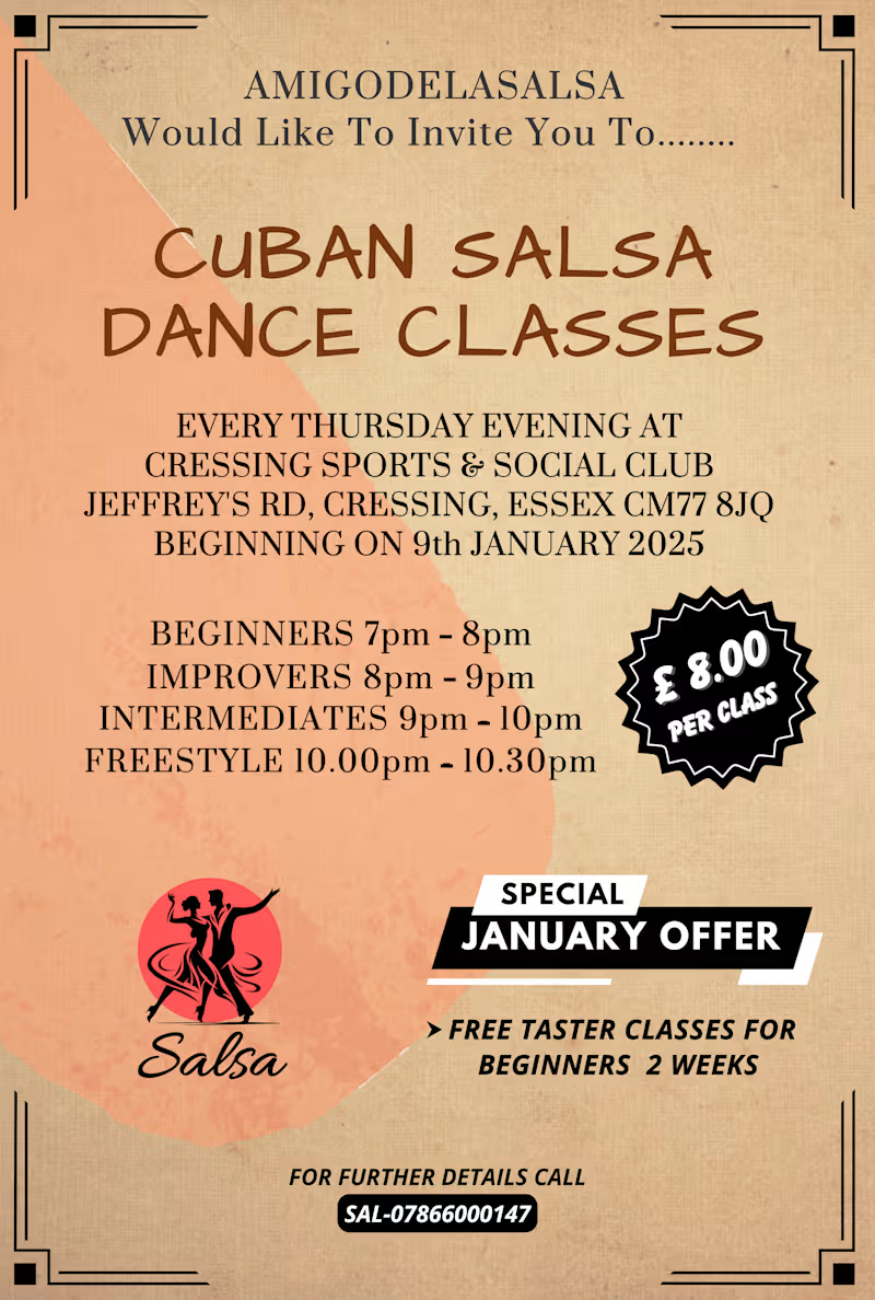
Designed a promotional poster for AmigoDeLaSalsa's weekly Cuban salsa dance classes in Cressing, Essex. The brief called for a warm, inviting look that would work both as a printed flyer and a social media post.
Used a vintage-cafe color palette (terracotta, cream, and dark brown) with ornate corner frames to give it an upscale, classic dance-hall feel while keeping the layout clean and easy to scan. Structured the info hierarchy so class times/levels, pricing, and the January promo offer are all instantly visible at a glance — key for a flyer people only look at for a few seconds. Added a starburst price badge and a bold "Special Offer" ribbon to draw the eye to the most conversion-driving details (price and free taster classes).
Deliverables: Print-ready poster + social media version
0
408




Graphic Designer | E-Book Formatting | Annual Report Design
Graphic Designer | E-Book Formatting | Annual Report Design
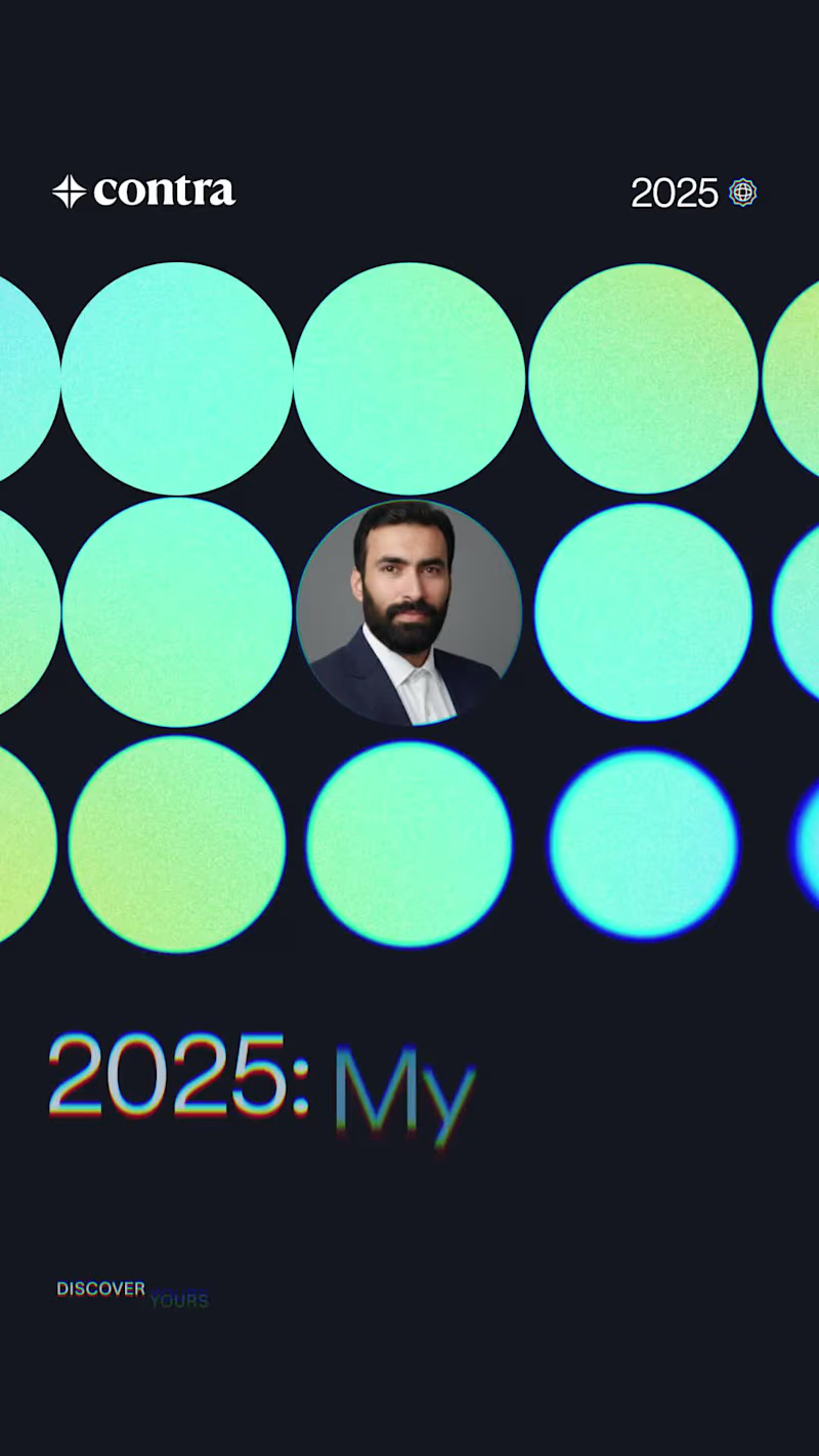
Reflection time! 🚀 I just received my 2025 Contra Condensed summary, and it’s been a year of incredible projects and creative growth. From brand identity to layout design, I’m proud of the work I’ve delivered for my clients this year.
Grateful for the opportunities and ready to take on even bigger challenges in 2026. Let’s build something great together!
#contracondensed #2025wins
0
70

Book Interior Design & Formatting Specialist | Print and Ebook Ready
I deliver expertly formatted book interiors that meet global publishing standards (Amazon KDP, IngramSpark, etc.). I specialize in crafting beautiful, readable layouts for novels, non-fiction, and corporate books using Adobe InDesign. My service includes professional typography, chapter styling, margins/trim size setup, and conversion to both print-ready PDF and clean, reflowable eBook formats (EPUB/MOBI). Get a book design that elevates your manuscript.
0
124
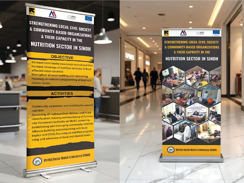
High-Impact Event & Exhibition Graphics | Standee, Backdrop, and Banner Design
I specialize in designing professional, high-resolution graphics for events, exhibitions, and advocacy campaigns. I deliver eye-catching designs for Roll-up Banners (Standees), Stage Backdrops, Banners, and Vinyl/Flex Prints that maximize visibility and clearly communicate your key message at a distance. I ensure all files are set up to precise dimensions and color specifications for flawless large-format printing and easy installation at your venue.
0
155
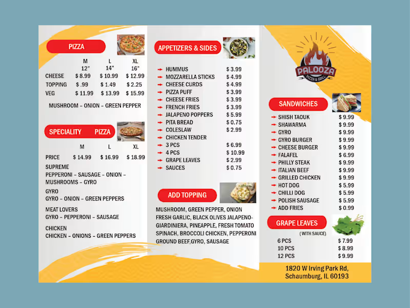
High-Impact Corporate Brochure Design | Print-Ready Sales & Marketing Collateral
Brochures are essential, tangible marketing tools. I specialize in designing and laying out engaging, on-brand brochures (Tri-fold, and custom booklets) that strategically guide your prospect through your product or service and drive a clear call-to-action. I deliver designs optimized for both print production and digital sharing.
0
118

Virtual Assistant, Data Entry Expert, Creative Designer
Virtual Assistant, Data Entry Expert, Creative Designer
View more →

LinkedIn Branding for HSE, Climate & Sustainability Leaders
New to Contra
LinkedIn Branding for HSE, Climate & Sustainability Leaders
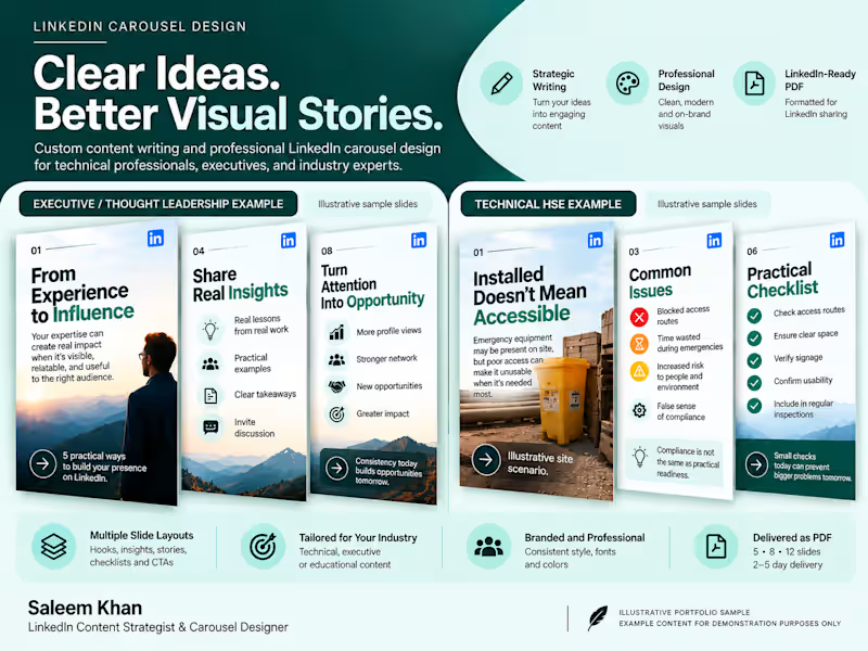
A LinkedIn carousel needs more than attractive slides. It needs a clear idea, a strong opening, and a logical flow that keeps readers interested.
This portfolio project showcases my approach to writing and designing professional LinkedIn PDF carousels.
What's included:
Content research and topic development
Strong opening hooks and clear slide-by-slide storytelling
Concise, audience-focused copywriting
Consistent visual design and typography
A ready-to-upload PDF carousel
The goal is to turn complex expertise into clear, useful content that professionals can understand, save, and share.
My focus includes technical professionals, HSE and sustainability leaders, consultants, and B2B experts.
Deliverable: A professionally written and designed LinkedIn PDF carousel.
1
78
A strong LinkedIn presence isn't built by posting randomly.
It needs clear positioning, useful content, consistent execution, and meaningful engagement with the right audience.
This portfolio project demonstrates a structured approach to LinkedIn content management for technical professionals, consultants, founders, and industry leaders.
The system includes:
Profile positioning: Aligning the headline, About section, and professional messaging with the target audience.
Content strategy: Defining content pillars, audience needs, topics, and publishing priorities.
Content production: Planning and creating LinkedIn posts, thought-leadership content, and PDF carousels.
Publishing calendar: Organizing content into a practical monthly schedule.
Engagement strategy: Identifying relevant conversations and opportunities to build professional relationships.
Performance review: Tracking available metrics and using insights to improve future content.
The objective
Help professionals turn their knowledge and experience into a consistent LinkedIn presence that supports credibility, recognition, and relevant business opportunities.
This is a portfolio demonstration of my proposed management framework, not a claim of verified client growth or campaign results.
1
1
78

Strong LinkedIn content starts with understanding the person behind the expertise.
This portfolio project demonstrates my approach to executive LinkedIn ghostwriting and content strategy for technical professionals, consultants, and industry leaders.
The process combines professional positioning, audience research, content planning, and clear, human writing.
What's included:
Audience and positioning analysis
Content pillars aligned with professional expertise
A structured 30-day LinkedIn content framework
Post ideas, hooks, and sample ghostwritten content
Practical calls to action that encourage relevant conversations
A consistent writing style that reflects the professional's own voice
My approach
Rather than filling a calendar with generic motivational posts, the focus is on turning real experience, lessons, opinions, and professional knowledge into useful content.
The goal is to help professionals communicate their expertise consistently and build recognition, credibility, and meaningful business relationships.
Portfolio type: Content strategy and ghostwriting demonstration.
1
64

A strong LinkedIn profile should do more than list job titles and experience. It should help the right people understand your expertise, credibility, and professional value.
This project showcases my approach to LinkedIn profile optimization and custom banner design, with a focus on clear positioning and a consistent professional identity.
What's included:
LinkedIn headline and About section optimization
Profile positioning and keyword alignment
Experience section refinement
Custom LinkedIn banner design
Clear messaging tailored to the target audience
The goal is simple: turn a static LinkedIn profile into a professional presence that communicates expertise and encourages relevant opportunities.
Specialization: HSE, sustainability, environmental management, and technical professionals.
1
74

Journey Maps, Infographics, Explainer Videos
Journey Maps, Infographics, Explainer Videos