
I help CPG get more Sales through Brand & Packaging design
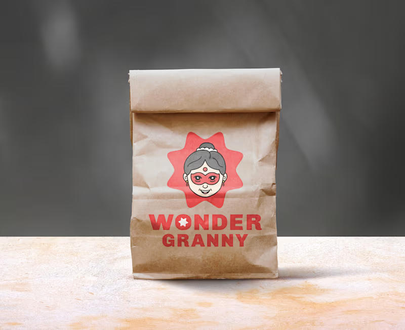
"WONDER GRANNY" Mascot Logo & Brand Identity Design ( full project link (https://app.notion.com/p/Full-Wonder-Granny-Mascot-design-3d92906b9a1680f39b5cffc3e173a88e?source=copy_link) )
Wonder Granny is a superhero-inspired grandma mascot created to give the brand a warm, playful, and distinctive character with a memorable personality
The design blends the familiarity of an Indian grandmother with a playful superhero twist
This combination provides the brand with a trustworthy feel while standing out from typical designs in that market
2
3
280


Content Strategist | SEO, Social Media & Web Content
Content Strategist | SEO, Social Media & Web Content
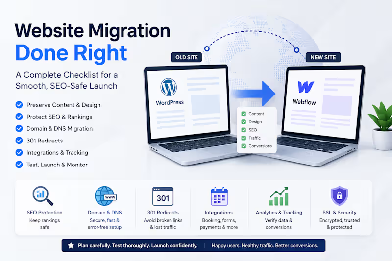
𝐖𝐞𝐛𝐬𝐢𝐭𝐞 𝐌𝐢𝐠𝐫𝐚𝐭𝐢𝐨𝐧 𝐈𝐬 𝐌𝐨𝐫𝐞 𝐓𝐡𝐚𝐧 𝐌𝐨𝐯𝐢𝐧𝐠 𝐂𝐨𝐧𝐭𝐞𝐧𝐭
A website migration can look simple on the surface: move the pages, connect the domain, and launch.
In reality, a successful migration involves much more than copying content from one platform to another.
Whether you're moving from WordPress to Kajabi, launching a new site on Webflow, or changing domains, several technical areas need to be considered.
1. 𝐏𝐫𝐞𝐬𝐞𝐫𝐯𝐞 𝐭𝐡𝐞 𝐜𝐨𝐧𝐭𝐞𝐧𝐭 𝐚𝐧𝐝 𝐬𝐭𝐫𝐮𝐜𝐭𝐮𝐫𝐞
Page content, headings, images, links, navigation, forms, and overall user experience should be reviewed carefully after migration.
2.𝐏𝐫𝐨𝐭𝐞𝐜𝐭 𝐒𝐄𝐎
A migration can affect organic traffic if URLs, metadata, headings, internal links, indexing, or redirects are handled incorrectly.
Before launch, it's important to understand which pages are indexed and which URLs receive search traffic.
3. 𝐏𝐥𝐚𝐧 𝐭𝐡𝐞 𝐝𝐨𝐦𝐚𝐢𝐧 𝐦𝐢𝐠𝐫𝐚𝐭𝐢𝐨𝐧
Changing a domain isn't simply pointing the domain to a new website.
DNS records, SSL certificates, domain verification, redirects, and propagation all need to be checked.
4. 𝐈𝐦𝐩𝐥𝐞𝐦𝐞𝐧𝐭 𝟑𝟎𝟏 𝐫𝐞𝐝𝐢𝐫𝐞𝐜𝐭𝐬
If an old URL changes, visitors and search engines should be directed to the correct new URL.
A proper redirect map helps prevent broken links and unnecessary loss of search visibility.
5. 𝐓𝐞𝐬𝐭 𝐭𝐡𝐢𝐫𝐝-𝐩𝐚𝐫𝐭𝐲 𝐢𝐧𝐭𝐞𝐠𝐫𝐚𝐭𝐢𝐨𝐧𝐬
Modern websites often depend on external platforms for booking, payments, memberships, forms, analytics, and automation.
An integration that appears correctly on the page may still fail during the actual user journey.
Testing the complete flow—from landing on the page to booking, checkout, confirmation, and tracking—is essential.
6. 𝐕𝐞𝐫𝐢𝐟𝐲 𝐚𝐧𝐚𝐥𝐲𝐭𝐢𝐜𝐬 𝐚𝐧𝐝 𝐜𝐨𝐧𝐯𝐞𝐫𝐬𝐢𝐨𝐧𝐬
Website traffic isn't enough. Businesses need to know whether important actions are being tracked correctly.
Analytics, conversion events, forms, booking actions, and other key events should be verified after launch.
7. 𝐃𝐨𝐧'𝐭 𝐬𝐤𝐢𝐩 𝐩𝐨𝐬𝐭-𝐥𝐚𝐮𝐧𝐜𝐡 𝐦𝐨𝐧𝐢𝐭𝐨𝐫𝐢𝐧𝐠
The migration isn't finished when the new website goes live.
The first few days should include checks for:
✦ Broken links
✦ Redirect errors
✦ Indexing issues
✦ Traffic changes
✦ Form submissions
✦ Booking/checkout problems
✦ Analytics and conversion tracking
✦ Mobile and desktop issues
𝐓𝐡𝐞 𝐫𝐨𝐥𝐞 𝐨𝐟 𝐀𝐈 𝐢𝐧 𝐰𝐞𝐛𝐬𝐢𝐭𝐞 𝐦𝐢𝐠𝐫𝐚𝐭𝐢𝐨𝐧𝐬
AI tools can make this work considerably more efficient.
They can help create migration checklists, review redirect mappings, explain DNS configurations, troubleshoot integration issues, generate testing scenarios, analyze SEO problems, and document the migration process.
But AI should be treated as an 𝐚𝐬𝐬𝐢𝐬𝐭𝐚𝐧𝐭, 𝐧𝐨𝐭 𝐚 𝐫𝐞𝐩𝐥𝐚𝐜𝐞𝐦𝐞𝐧𝐭 𝐟𝐨𝐫 𝐯𝐞𝐫𝐢𝐟𝐢𝐜𝐚𝐭𝐢𝐨𝐧.
DNS changes, redirects, analytics configurations, and live-site changes should always be tested carefully before and after deployment.
A successful website migration is ultimately about one thing:
𝐌𝐚𝐤𝐢𝐧𝐠 𝐭𝐡𝐞 𝐭𝐫𝐚𝐧𝐬𝐢𝐭𝐢𝐨𝐧 𝐢𝐧𝐯𝐢𝐬𝐢𝐛𝐥𝐞 𝐭𝐨 𝐭𝐡𝐞 𝐮𝐬𝐞𝐫 𝐰𝐡𝐢𝐥𝐞 𝐩𝐫𝐨𝐭𝐞𝐜𝐭𝐢𝐧𝐠 𝐭𝐡𝐞 𝐛𝐮𝐬𝐢𝐧𝐞𝐬𝐬 𝐛𝐞𝐡𝐢𝐧𝐝 𝐭𝐡𝐞 𝐰𝐞𝐛𝐬𝐢𝐭𝐞.
The best migration is the one where visitors continue browsing, booking, buying, and converting without even realizing that anything changed.
0
81
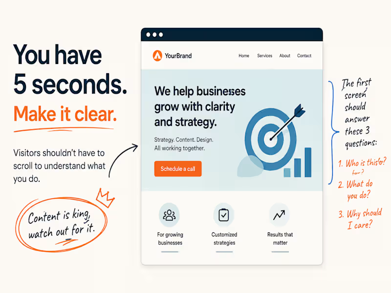
I've found myself really zeroing in on the first few seconds of a website lately.
It’s not about fancy animations, the colour scheme, or whether it looks super trendy.
My main question is always: 𝐂𝐚𝐧 𝐈 𝐠𝐫𝐚𝐬𝐩 𝐰𝐡𝐚𝐭 𝐭𝐡𝐢𝐬 𝐜𝐨𝐦𝐩𝐚𝐧𝐲 𝐚𝐜𝐭𝐮𝐚𝐥𝐥𝐲 𝐝𝐨𝐞𝐬 𝐫𝐢𝐠𝐡𝐭 𝐚𝐰𝐚𝐲?
If I have to scroll down to get it, that’s a red flag for me.
That initial section of a homepage really has a lot on its shoulders. It needs to give me enough of a clue about who they serve, what they offer, and why I should even bother sticking around.
Everything else can fill in the blanks later.
That first glimpse just needs to pique my interest enough to make me want to see more.
So yeah, that's a big part of how I judge a homepage.
𝐂𝐨𝐧𝐭𝐞𝐧𝐭 𝐢𝐬 𝐤𝐢𝐧𝐠 𝐡𝐞𝐫𝐞. 𝐒𝐞𝐫𝐢𝐨𝐮𝐬𝐥𝐲, 𝐩𝐚𝐲 𝐚𝐭𝐭𝐞𝐧𝐭𝐢𝐨𝐧 𝐭𝐨 𝐢𝐭.
1
1
179
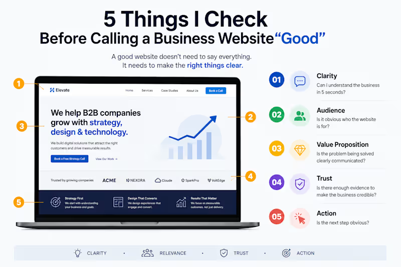
𝟓 𝐓𝐡𝐢𝐧𝐠𝐬 𝐈 𝐂𝐡𝐞𝐜𝐤 𝐁𝐞𝐟𝐨𝐫𝐞 𝐂𝐚𝐥𝐥𝐢𝐧𝐠 𝐚 𝐁𝐮𝐬𝐢𝐧𝐞𝐬𝐬 𝐖𝐞𝐛𝐬𝐢𝐭𝐞 “𝐆𝐨𝐨𝐝”
A website can look polished and still fail at its most important job: helping the right visitor take the next step.
Before I consider a business website effective, I look at five things:
Clarity — Can I understand the business in 5 seconds?
Audience — Is it obvious who the website is for?
Value — Is the problem being solved clearly communicated?
Trust — Is there enough evidence to make the business credible?
Action — Is the next step obvious?
A good website doesn't need to say everything.
It needs to make the right things clear.
#𝐖𝐞𝐛𝐃𝐞𝐬𝐢𝐠𝐧 #𝐔𝐗𝐃𝐞𝐬𝐢𝐠𝐧 #𝐂𝐨𝐧𝐭𝐞𝐧𝐭𝐒𝐭𝐫𝐚𝐭𝐞𝐠𝐲 #𝐖𝐞𝐛𝐬𝐢𝐭𝐞𝐒𝐭𝐫𝐚𝐭𝐞𝐠𝐲
2
1
171

Let the work do the talking..
Let the work do the talking..




Web & Product Designer

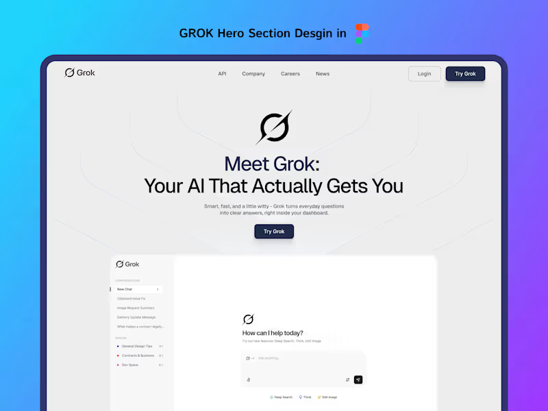

FullStack Expert WordPress| Shopify Webflow| HubSpot| Framer
- $25k+
- Earned
- 13x
- Hired
- 5.0
- Rating
- 42
- Followers
FullStack Expert WordPress| Shopify Webflow| HubSpot| Framer
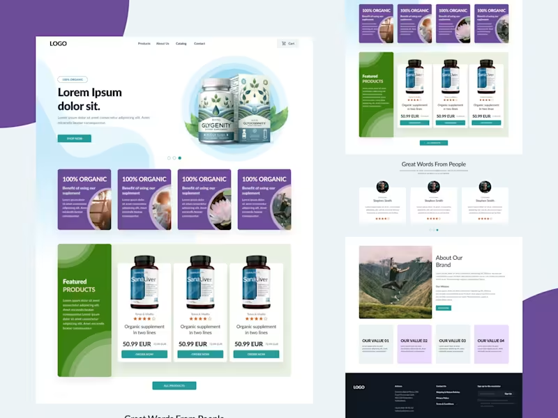
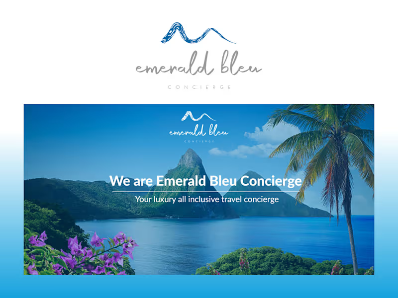
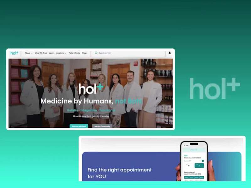

AI Agent & Full-Stack Developer for SaaS and E-commerce
- 5.0
- Rating
- 13
- Followers
AI Agent & Full-Stack Developer for SaaS and E-commerce

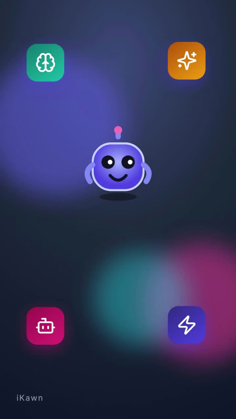
How LLMs Work – Animated Explainer Short
A 41-second vertical animated explainer that breaks down how large language models work. It covers next-word prediction, tokens, training on huge amounts of text, billions of weights, attention, generating one token at a time, and why hallucinations happen. The visuals are a friendly robot mascot, short punchy captions and playful motion graphics, built for Reels, Shorts and TikTok. Made with Hyperframe & Grok Bot.
0
83

Branding, Web & Product Design that converts
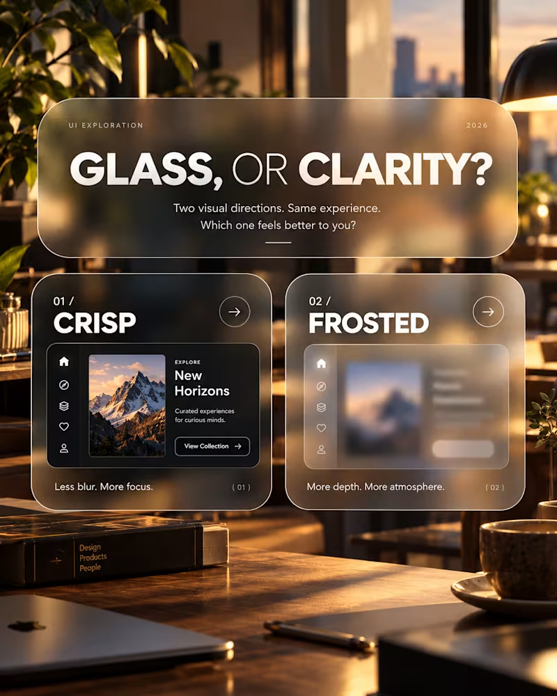
Glass, or Clarity?
An exploration of visual depth, contrast and interface clarity.
This concept explores two approaches to presenting the same interface: a crisp, sharply defined layout and a frosted-glass treatment.
The intention was to examine how surface treatments influence the overall character of a digital product, and where visual atmosphere begins to compete with usability.
Design considerations
Visual hierarchy and content legibility
Transparency, blur and depth
Contrast across layered surfaces
Choosing visual treatments that serve the product
The takeaway
Visual effects are most effective when they have a purpose. Aesthetic refinement matters, but it should never come at the expense of understanding or usability.
An ongoing exploration of the relationship between visual expression and functional design.
Which direction would you explore further, and why?
2
197
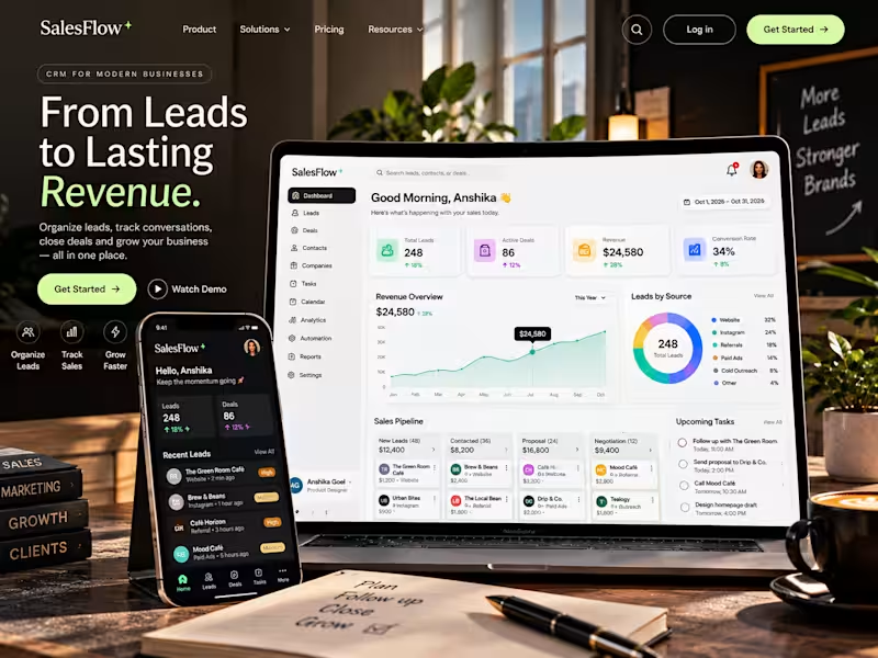
An AI-assisted CRM concept designed to simplify lead management, organize sales pipelines, and help businesses track opportunities from first contact to closed deal. Built around clear analytics, streamlined follow-ups, and a responsive interface.
2
3
721
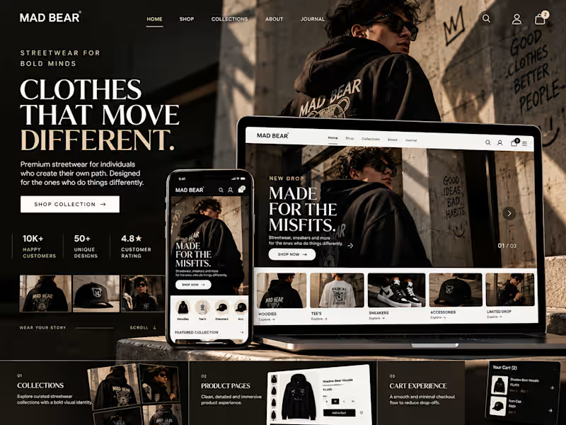
MAD BEAR | Streetwear E-commerce Website Concept
An editorial e-commerce concept for a bold streetwear brand, built around distinctive visuals, intuitive product discovery, and a seamless shopping experience.
The concept explores how strong brand storytelling, responsive layouts, curated product collections, and a streamlined checkout journey can help a fashion brand stand out, build customer trust, and encourage more purchases.
Focus areas: E-commerce UX, responsive web design, product discovery, brand identity, and conversion-focused shopping experiences.
Independent concept project created to explore a potential digital experience for MAD BEAR.
2
3
644
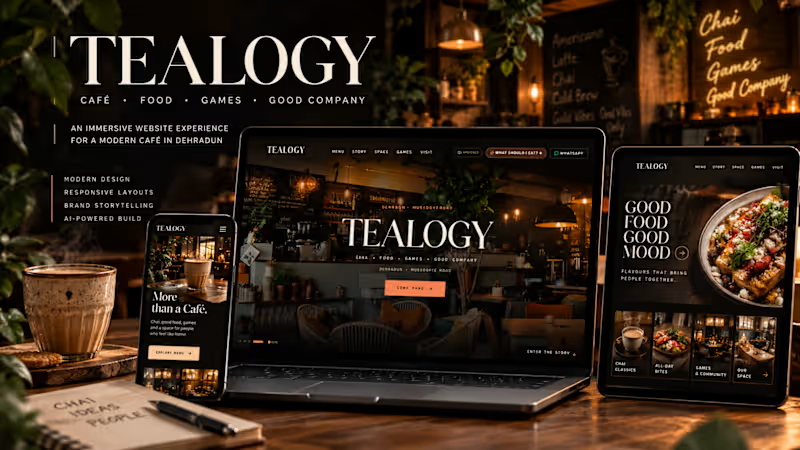
Tealogy | Immersive Café Website Concept
Reimagining a café’s digital presence through immersive visuals, bold typography, and an experience built around chai, food, games, and community.
This AI-assisted website concept explores how thoughtful visual storytelling and intuitive navigation can help a local café stand out, strengthen its brand identity, and encourage more visitors to explore its offerings.
Focus: Visual design, responsive experience, brand storytelling, and customer engagement.
An independent concept project, not commissioned client work.
1
494


