
Frontend Engineer – Webflow and Webstudio Expert

Frontend Engineer – Webflow and Webstudio Expert


Shopify Expert & Developer Theme Customization &Dropshipping
- 5.0
- Rating
- 7
- Followers
Shopify Expert & Developer Theme Customization &Dropshipping

Building a Shopify presale storefront for an anime party card game, from scratch
Independent creator based in LA came to me with a concept for an anime-inspired party card game a fast, "forbidden word" guessing game built for game nights and convention crowds and needed a full store built from zero to launch a presale campaign ahead of a physical production run.
No existing site, no theme, no product photography system in place. Built the entire storefront from scratch, designed specifically to convert cold convention/social traffic into presale orders.
What the build needed to do:
The product doesn't exist yet as a finished physical good it's a presale. So the entire site had to do the selling work a physical box normally does: explain the game in seconds, prove it's fun before someone's held a card, and create urgency around a limited-time presale price.
How I approached it:
Led with the hook, not the product. Homepage opens with the core tension of the game ("You know it. You just can't say it.") before ever showing pricing sold the experience first.
Built an interactive "try one card" section directly on the homepage. Instead of just describing gameplay, visitors can see a live example card with the answer and sealed words, so they understand the mechanic in seconds without reading a rules page.
Structured a numbered "How to Play" flow five clear steps, stacked for mobile, so someone standing in a convention line could learn the game in a few seconds of scrolling.
Built urgency into the presale pricing. Clear before/after pricing ($35 presale vs $39.99 after) directly in the hero and product block, plus a countdown-style presale framing tied to a real event (Dream Con).
Added founder/brand story section. For an independent creator brand with no existing trust signals, a short "made by an anime fan, for anime fans" section does real work building credibility before checkout.
FAQ section built to kill hesitation at the exact objections a presale creates is this trivia, how many players, when does it ship, is it officially licensed placed right before the final CTA.
Email capture built in for people not ready to buy immediately, so the presale traffic isn't wasted even when it doesn't convert same-visit.
The result: a full presale-ready storefront built from nothing, structured entirely around getting a stranger from "never heard of this game" to "preordered" inside one scroll.
1
158
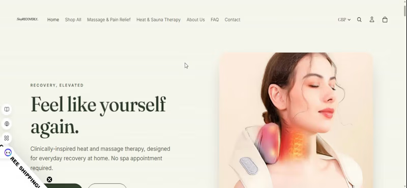
Building a brand-first Shopify store: Shoprecoverly
Here's how I approached building Shop recoverly a Dropshipping store brand.
Starting with positioning, not templates
Most stores in this category default to a clinical, "medical supply" look white backgrounds, blue accents, generic product shots. I wanted Shoprecoverly to feel like a self-care brand people are proud to buy from, not just a functional product page.
Design decisions:
Typography: paired Cormorant Garamond with Jost — a serif/sans combo that gives it an editorial, elevated feel instead of the usual ecommerce default
Palette: ivory and bronze instead of the typical white/blue pharmacy tones
Custom homepage layout designed around the brand story, not just a product grid
Logo design built to match the overall aesthetic
Where it stands
Homepage is live, with product photography and variant setup currently being refined as we prepare the store for traffic.
This is the part of the job I enjoy most — taking a category that usually looks the same everywhere and giving it an identity people actually connect with.
4
3
214

Case Study: VP.Design (http://VP.Design) — Luxury Automotive-Inspired Shopify Redesign
Rebuilt the storefront for VP.Design (http://VP.Design), a premium furniture and decor brand (engine coffee tables, Ferrari-inspired office chairs, automotive wall art) into a dark, cinematic luxury experience.
What I did:
Complete visual overhaul moving away from a generic template feel toward a dark, high-end aesthetic inspired by luxury watch and automotive brands
Built a scroll-driven hero experience full-bleed video intro, curtain-reveal loading sequence, and scroll-scrubbed animation using GSAP ScrollTrigger and smooth-scroll libraries
Designed custom sections for parallax product showcases, featured collections, and brand storytelling blocks
Shifted the sitewide palette to a graphite and bronze color scheme to match the premium product catalog
Integrated AI-generated video content into the design to reinforce the automotive/luxury theme
Fully mobile-responsive build, delivered on a tight deadline
Why it matters:
For a brand selling $30k+ statement furniture pieces, the site has to feel as premium as the product. This wasn't a template swap — it was a ground-up rebuild of the storefront's motion, pacing, and visual language to match brands like Jacob & Co. and Richard Mille.
🎥 Video walkthrough below.
#Shopify #LuxuryEcommerce #WebDesign #ShopifyDeveloper #MotionDesign
1
2
162

Case Study: GarageManStore Automotive Shopify Redesign
Redesigned the homepage and storefront experience for GarageManStore, a used/recycled OEM European auto parts retailer (Mercedes, BMW, Audi, Porsche, VW).
What I did:
Full homepage redesign on a custom Dawn theme
Built a "Currently Dismantling" vehicle showcase section with live arrival-date metafields
Designed vehicle cards for both the homepage slider and vehicle search results showing key details, arrival date, and clear "View Details" / "View Parts" CTAs
Refreshed the brand logo strip and tightened mobile responsiveness across the store
Kept the whole build inside Shopify's theme editor structure (Liquid + Dawn OS 2.0) for long-term maintainability
Why it matters:
For a parts marketplace with tens of thousands of SKUs, the challenge isn't just "make it pretty" it's making complex, high-volume inventory feel navigable and trustworthy at a glance. The vehicle-card system gives shoppers a fast way to scan what's available before drilling into individual parts.
Video walkthrough of the store below.
#Shopify #EcommerceDesign #ShopifyDeveloper #WebDesign #AutomotiveEcommerce
1
111

Shopify & Framer Designer | CRO Specialist

ClerkCall | Framer Website Design & User Experience
ClerkCall needed a modern website that instantly communicated professionalism, reliability, and trust to businesses looking for call center solutions. My goal was to create a high performing Framer website that not only looked premium but also converted visitors into qualified leads.
Using Framer, I designed a clean, responsive, and visually engaging website with a strong focus on user experience and conversion. Every section was carefully structured to communicate the company's services clearly, establish credibility, and guide visitors toward booking a consultation. The design features modern layouts, strategic call to actions, smooth interactions, and fast loading pages that create a seamless browsing experience across all devices.
My Contributions
• Custom Framer Website Design
• Premium UI & UX Design
• Landing Page Strategy
• Responsive Mobile Optimization
• Conversion Focused Layouts
• Interactive Animations & Micro Interactions
• Lead Generation Optimization
• Brand Identity & Visual Design
Outcome
The final result was a sleek, modern Framer website that positions ClerkCall as a trusted call center partner. The website combines premium aesthetics with strategic UX and CRO principles, helping visitors understand the value of the service quickly while increasing engagement and encouraging more consultation bookings
1
53


SIONIX | Premium Shopify Swimwear Store Design & CRO
SIONIX wanted a bold, fashion forward online store that reflected the confidence and energy of its swimwear brand.
My role was to design a premium Shopify experience that combined striking visuals with an intuitive user journey to elevate the brand and increase customer engagement.
I created a modern, editorial inspired design with immersive imagery, clean layouts, and premium typography that puts the products at the center of attention.
Every section was carefully structured to tell the brand's story while making it easy for customers to browse collections, explore products, and complete their purchase.
Alongside the visual design, I implemented CRO best practices to improve usability, strengthen trust, and create a seamless shopping experience across all devices.
My Contributions
• Premium Shopify Store Design
• Luxury UI & UX Design
• Homepage & Collection Page Design
• High Converting Product Pages
• Shopify Page Builder Development
• Mobile Responsive Optimization
• Conversion Rate Optimization (CRO)
• Brand Identity & Visual Direction
Outcome
The final result was a sleek, high end Shopify store that captures the essence of the SIONIX brand.
The website delivers a premium shopping experience, reinforces customer confidence, and provides a strong foundation for increasing engagement, conversions, and long term brand growth.
0
50

LizyWears | Shopify Fashion Store Design & UX
LizyWears wanted a premium online presence that reflected the confidence, elegance, and sophistication of its swimwear and lingerie collections. My role was to design a Shopify storefront that blended luxury aesthetics with a seamless shopping experience, allowing the products to take center stage.
I created a clean, modern interface with bold visual storytelling, refined typography, and carefully structured layouts that highlight every collection beautifully. The design was built to evoke emotion, strengthen brand identity, and guide customers effortlessly from discovery to checkout. Every detail, from the homepage to the product pages, was optimized for mobile responsiveness, intuitive navigation, and a smooth customer journey.
My Contributions
• Premium Shopify Store Design
• Luxury UI & UX Design
• Homepage & Collection Page Design
• Shopify Page Builder Development
• Mobile Responsive Optimization
• Product Page Design
• Brand Identity & Visual Direction
• Conversion Rate Optimization (CRO)
Outcome
The final result was a sophisticated Shopify fashion store that captures the elegance of the LizyWears brand while delivering an intuitive, high converting shopping experience. The design enhances customer confidence, showcases the collections with impact, and creates a premium digital experience that encourages engagement and drives more sales.
0
61

UX/UI Designer | Framer Developer | AI, Low-Code


UX/UI Designer | Framer Developer | AI, Low-Code

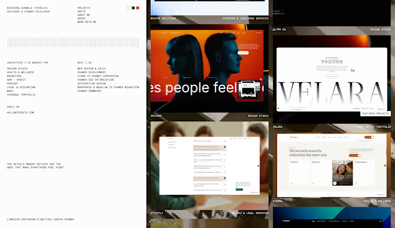
Project index page on my new portfolio ✨️
The only major page left is the project detail page.
The fact that I abandoned this for over a month after starting, then came back and completed almost 90% of the entire build in just 2 days, really goes to show that sometimes, all you need to accomplish something is seriousness.
Once I locked in, everything just moved. 😮💨
1
210
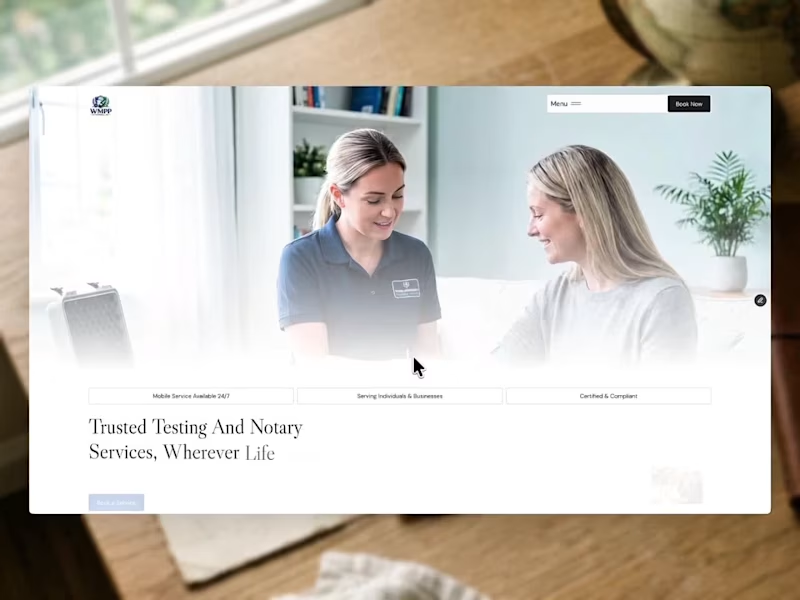
New project in the studio.
WMPP Enterprises, Inc needed one site to cover DNA testing, DOT compliance, notary, RON, apostille, estate documents and more.
Just finished building the hero section in Framer .
More soon. ⏳️
2
275
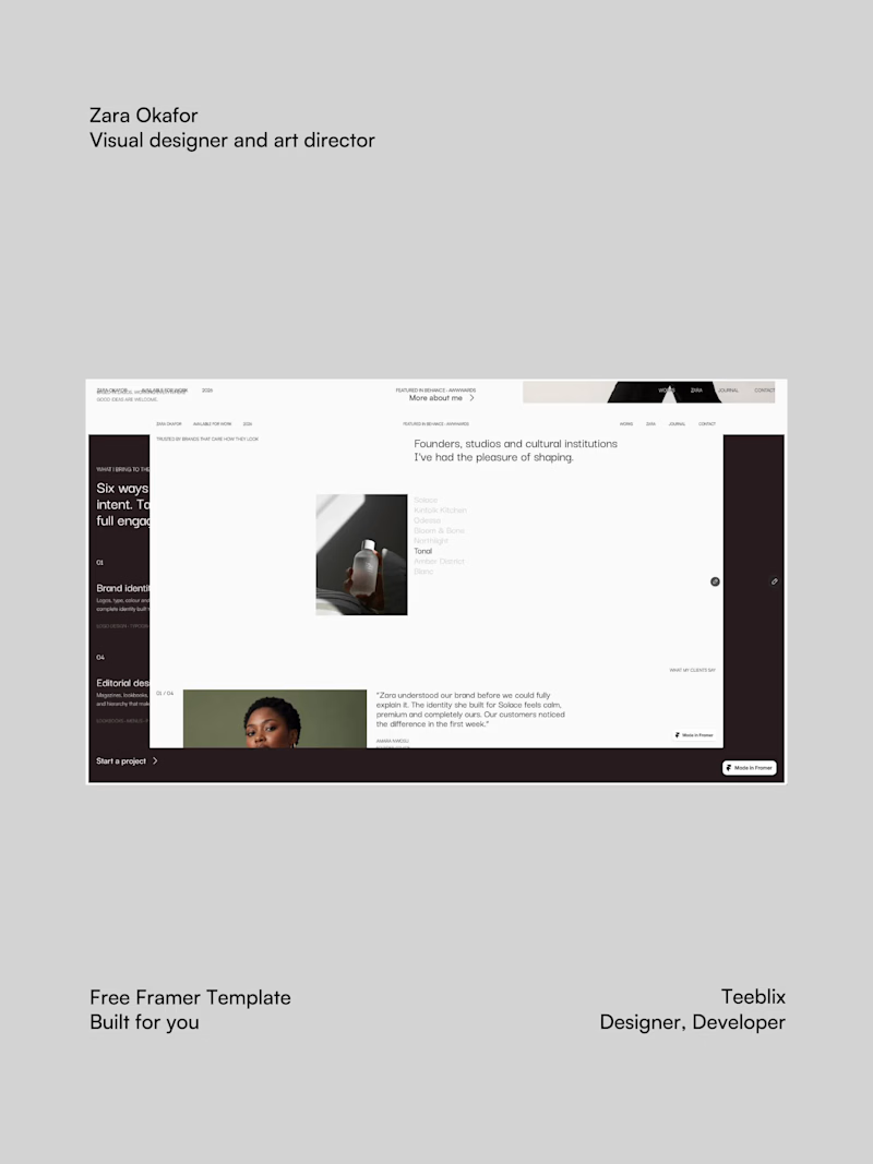
New template just landed: Zara Okafor ✨
A clean, editorial portfolio for visual designers and art directors who want their work to be remembered.
What's inside:
Big Darker Grotesque headlines with Satoshi Soft warm neutrals and space for the work to breathe CMS case studies and a journal Work index About, contact with FAQ and a 404 that doesn't feel like an error
Link in the comments. Happy New Month 🍃
1
3
216

Vibe Coding Developer | AI Web Apps & Automations


Holiday Challenge Submission – Replit
🎄 Secret Santa Generator Built with Replit Design Mode 🎁
I built a holiday-themed Secret Santa Generator using Replit Design Mode, turning a festive UI into a fully working web app.
✨ What it does:
Enter participant names (one per line)
Instantly generates random Secret Santa matches
Ensures no one is assigned to themselves
Copy or download results for easy sharing
The goal was to create a simple, clean, and joyful experience that makes holiday gift exchanges effortless.
Built entirely with Replit Design Mode for the #HolidayChallenge2025.
Happy holidays! ❄️🎅
2
158

