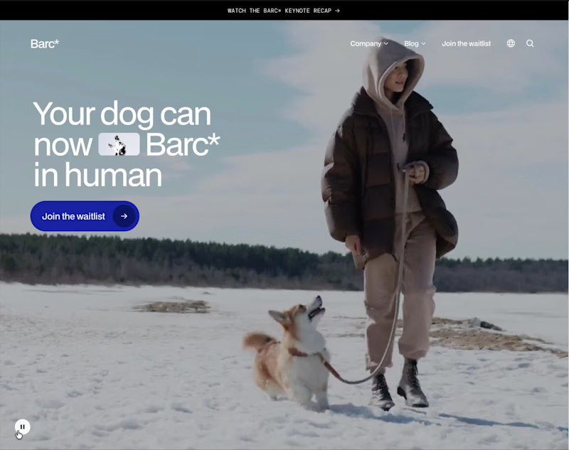
Web Design Projects in Ho Chi Minh CityWeb Design Projects in Ho Chi Minh CityThis website is a playful, high-concept landing page for Barc* – a fictional wearable that translates your dog’s barks into human language. The whole experience leans into humor and satire, treating the product like a serious tech launch while constantly undercutting it with jokes, from lines like “Barc* to the future” to questions about whether your dog’s 2am barks are for a man in the house or just existential dread.
The page is structured like a polished SaaS or hardware startup site: a bold hero section, clear value propositions, a simple three-step “how it works” flow, feature highlights, specs, and tiered membership pricing. Microcopy does most of the storytelling—benefits such as understanding your dog better, enhancing your bond, increasing safety, and extending your dog’s life are all delivered with a wink. Elements like 250+ celebrity voices, “no support for small dogs” on cheaper tiers, and tongue-in-cheek FAQs reinforce the comedic tone.
Visually and structurally, it feels like a real brand: multiple CTAs to join the waitlist, repeated sections for emphasis, and a clean layout that reads quickly. Only near the end does the site reveal that Barc* isn’t a real product but a concept from a Framer course, making the whole experience a smart parody of modern product marketing while still showcasing strong UX, copy, and visual design skills. Designing OVA: Translating Sound into Motion
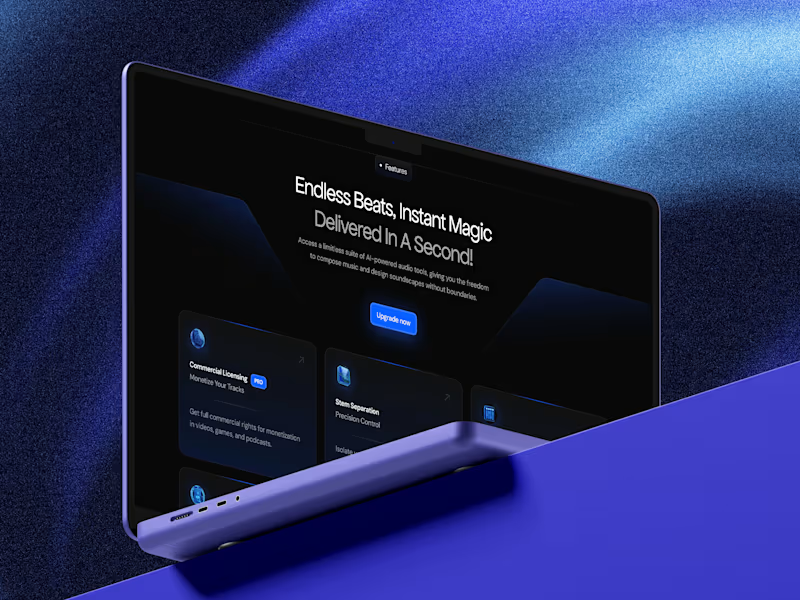
Designing the visual identity and web experience for OVA was all about taking something completely invisible: sound, AI, and futuristic energy, to give it a bold, tangible visual form.
The Idea & Inspiration
It all started with one simple question: What does sound look like when it moves? I wanted to capture that magic spot where human emotion meets generative AI. Drawing inspiration from real-time audio visualizers and fluid dynamics, every gradient, wave, and curve in this system was built to mimic audio ripples moving through space.
The Challenges and solutions:
Making Static Graphics Feel Alive: Audio is pure motion, but static screens can easily feel flat. The trick was creating visual rhythm through fluid shapes and high-contrast gradients so the identity felt energetic without needing heavy video files that bog down site performance.
Futuristic, But Still User-Friendly: AI branding can quickly slide into generic sci-fi tropes. To keep it grounded, I paired an electric blue and neon purple palette with clean, spacious UI, readable typography, and straightforward navigation.
Putting the Tech Together: Embedding custom 1440px canvas layouts, interactive Spline 3D scenes, and responsive Framer builds into a seamless portfolio view took a lot of trial, error, and breakpoint tweaking but getting that full-width desktop feel was totally worth it.
At its core, OVA is a minimal, modern showcase of what happens when design, music, and artificial intelligence hit the exact same frequency.