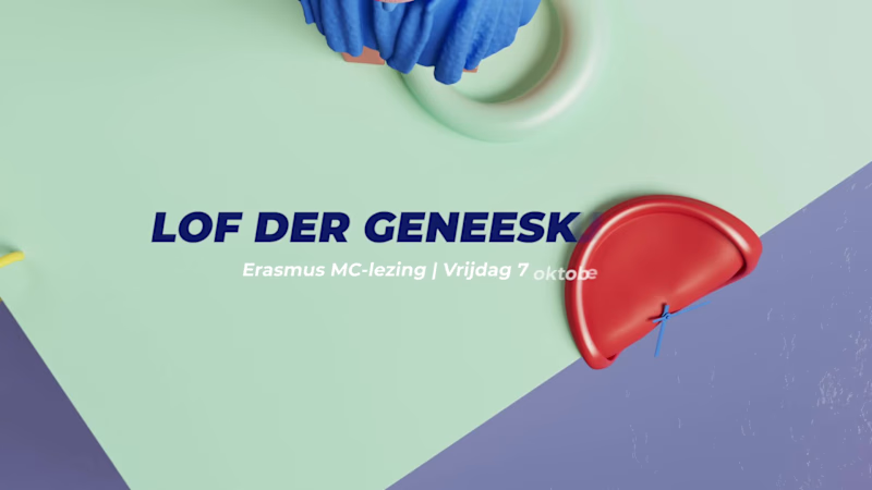
Projects using Cinema 4D in HelmondProjects using Cinema 4D in HelmondHappy Horizon is a creative marketing company operating across multiple strategic business pillars. One of these pillars focuses on Development & Technology, addressing complex digital challenges through innovation, engineering and scalable solutions. To communicate this expertise within a live event setting, Happy Horizon commissioned the creation of a dedicated showreel.
Brief & Strategic Challenge
The objective of the project was to develop a concise yet expressive showreel that would promote the Development & Technology pillar within a limited runtime of 1 minute and 10 seconds. The animation was intended for continuous playback on a large-scale LED screen (5 × 3 metres) as part of a branded event stand. As audio could not be relied upon in this environment, the narrative needed to be fully comprehensible without sound; placing a strong emphasis on visual clarity, rhythm and hierarchy.
Concept Development & Script Structuring
The process began with a collaborative brainstorming session alongside the marketing team. Together, we defined the core narrative and messaging framework of the showreel. Based on this session, a high-level script structure was shaped and subsequently finalized. This phase marked the primary point of collaboration within the project.
Visual Translation & Storyboarding
Following script approval, the responsibility for translating the narrative into a visual language lay entirely with me. I developed a dedicated sub-style that aligned with Happy Horizon’s existing brand identity while distinctly supporting the Development & Technology pillar. This included the full visual concept, compositional logic and a detailed storyboard that defined sequencing, rhythm and visual hierarchy throughout the showreel.
Animation & Final Production
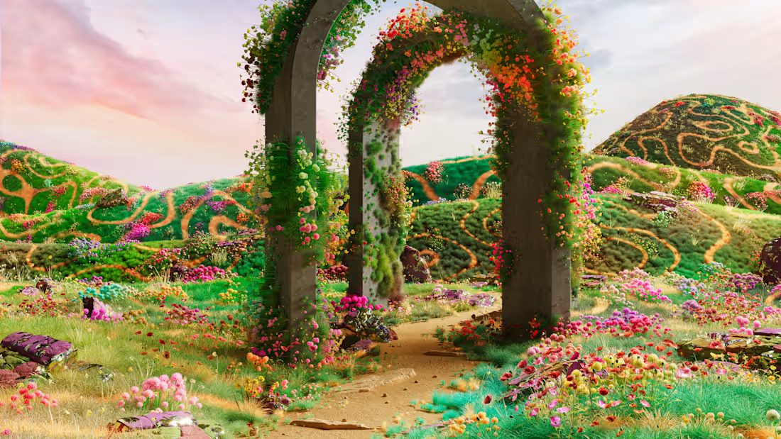
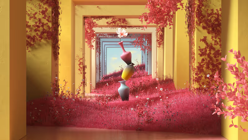
Based on the approved storyboard, I started animating the complete showreel. The animation focuses on dynamic motion, fluid transitions and carefully structured compositions to express guidance, progress and technological clarity. Through abstract visual metaphors and directional movement, the showreel positions Happy Horizon as a partner capable of navigating complexity and creating a clear horizon for its clients. The final result functions as both an aesthetic statement and a highly legible brand asset optimized for repeated, soundless viewing. ProfiPets specializes in tailored, grain-free nutrition for dogs, with future ambitions to expand into cat food. The founders approached me with a clear challenge: their existing visual identity no longer reflected the quality, care and personality of their product. They sought a refreshed, more professional brand expression; one that felt vibrant, contemporary and aligned with the emotional world of modern pet owners.
Strategic Foundation
Following an initial audit of their brand assets and positioning, I conducted audience research to understand the expectations, emotional triggers and aesthetic preferences within the premium pet-care market.
From this research, a chromatic system was developed that could appeal equally to pets (through high-contrast, behaviourally informed hues) and their owners (through warm, trustworthy tones). This dual focus created the foundation for an identity that feels playful yet credible: a balance crucial to the category.
Conceptual Direction
During the concept phase, I explored how the brand could express its core promise: personalised nutrition rooted in expertise. The turning point came when analysing the structural repetition within the name ProfiPets: the two “P’s” offered a natural geometric pairing. These mirrored forms became the basis for a distinctive emblem that visually unites dogs and cats within a single mark.
In this emblem, the mirrored “P’s” subtly reference the silhouettes of both animals, symbolising the brand’s commitment to serving multiple species with equal attention and care. As an abbreviation of the company name, the emblem is both mnemonic and emotionally resonant.
Visual Identity System
The emblem is constructed on the same geometric logic as the chosen type family, ensuring coherence across the visual system. Despite its playful character, the mark retains structural precision, reflecting the balance of warmth and professionalism at the heart of the brand.
Its rounded forms introduce a soft, cheerful tone, making the identity approachable and friendly. In contrast, the geometric underpinning provides clarity, stability and a high-quality presence. This duality allows ProfiPets to position itself as both caring and expertly crafted: a brand rooted in affection while driven by precision.
Outcome
The resulting identity gives ProfiPets a recognisable, scalable and future-proof visual system. It supports their current dog-food offering while seamlessly accommodating their upcoming expansion into cat nutrition. The refreshed brand is confident, consistent and ready to grow with them.