Projects using Clipchamp in HaarlemProjects using Clipchamp in HaarlemHow to Design a Floating Glassmorphism Hero Section?
This UI design breakdown explores utilizing abstract layered shapes, modern typography, and clean asymmetric layouts to take your web design projects to the next level. Perfect for UI/UX designers, web developers, and digital creators looking for fresh web layout inspiration. This design showcases a creative approach to a blog or digital growth website's primary hero section. Below is an analytical breakdown of its UI/UX components:
Layout Structure & Composition
The Asymmetric Grid: The layout breaks away from standard, rigid website grids by employing two main card blocks overlapping a dynamic background.
Floating Mechanics: The design uses a visual layering technique where content blocks "float" over multi-colored geometric pills and shapes in the background, giving the layout physical depth and a three-dimensional feel.
Visual Style & Aesthetics
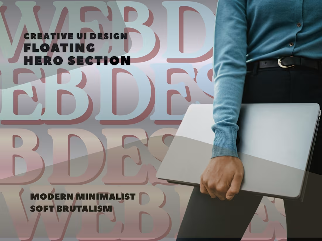
Modern Minimalist-Soft Brutalism: Combining thin, clean borders on cards with heavy typography and a playful background lends it a trendy, modern tech-blog appearance.
Muted Color Palette: The background utilizes semi-transparent pastel tones (soft blues, sage greens, warm yellows, and lilacs). These colors complement rather than distract from the main readability zone.
Typography & Hierarchy Heading Block: The left card contains a prominent, bold serif heading reading "Digital Growth Blog: Website Trends and News for Success." The choice of a strong serif face adds editorial credibility to a tech-forward layout.
Body Copy: A clean, legible sans-serif font is used for the sub-text and secondary content on the right, ensuring information architecture balances high-impact headers with easy-to-read descriptions.
UI Elements & Accents
Card Containers: Content is separated into two elevated glass-like cards featuring subtle drop shadows and crisp micro-borders.
Background Pill Elements: Soft, rounded rectangular shapes of varying opacity float behind the text cards to direct user eyes down and across the screen dynamically.
🚀 Available for freelance projects. Click the "Message" button on my profile to get in touch directly through the Contra platform. 🎯 Scrolling up web design widget- UI Design
Explanation of the UI Design: The video focuses entirely on displaying visual design demonstrations. The video demonstrates several layout structures and animation mechanics tailored for landing page interactions. Here is a breakdown of how the UI design elements operate within this structure.
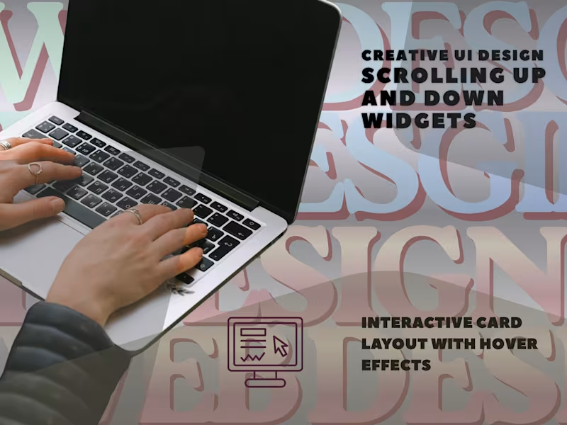
Interactive Card Layout with Hover Effects
The design utilizes a multi-column, grid-like card layout to present distinct subjects (e.g., "Website Development Strategies," "Website Content Creation," "UI-UX for Websites," etc.). When a user hovers over a container, a "See More" call-to-action (CTA) widget surfaces dynamically.
Floating Widgets and Scroll Control
Contextual Layering: The "See More" indicator appears as a rounded or stylized overlay badge that follows the user's cursor or glides subtly into view within its designated card constraint.
Scroll Animation: As the user scrolls up or down through the grid, these visual elements shift using smooth transition easing. This adds a layer of depth (parallax-like effect) that makes the interface feel highly interactive without cluttering the viewport.
Click-Through Redirection to Landing Pages
Clicking on any of the "See More" interactive widgets immediately triggers a seamless, animated page transition. The system redirects the user directly to a specialized landing page optimized for that specific topic. For instance, clicking on the "Website Content Creation" module redirects to a dedicated landing page featuring a bold hero header: "Master Website Content Creation: Engage, Inform, Inspire."
This technique minimizes friction, guiding the visitor directly from an informational grid to a conversion-focused section of the site. You can view the full design behavior and transitions directly in the video here: scrolling up the web design widget UI design.
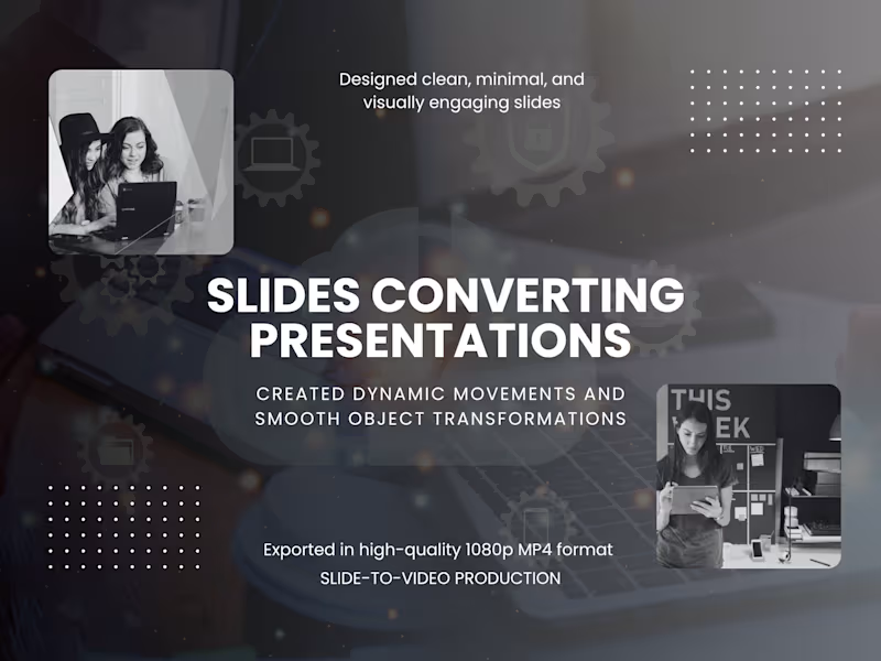
🚀 Available for freelance projects. Click the "Message" button on my profile to get in touch directly through the Contra platform. 🎯 Slide-to-Video Production Converting PowerPoint Presentations to Video Format
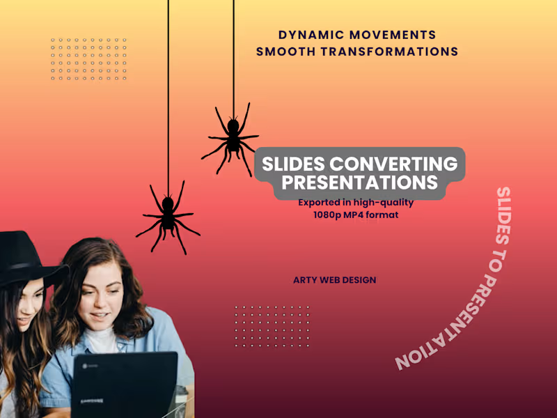
Developed well-structured slide decks in 16:9 widescreen format specifically tailored for video conversion and YouTube upload, focusing on simplicity, strong visual hierarchy, white space, and cohesive design.
Built progressive storytelling through carefully timed animations that guide viewers step-by-step through the content.
Mastered the Animation Pane to coordinate animation order, duration, and interactions on each slide.
Applied advanced animation methods to produce fluid, cinematic movements and content transformations.
Used consistent slide transitions to create smooth and professional continuity from one slide to the next.
Recorded synchronized voiceover narration, including annotations where beneficial.
Integrated background music and sound effects with proper balancing and editing for an enhanced audio experience.
Performed thorough rehearsal sessions to align all visual and audio elements for natural, engaging pacing.
Exported complete projects as high-resolution 1080p MP4 videos with embedded timing and audio, optimized for YouTube.
This approach enabled me to convert presentations into polished, dynamic slide-to-video productions.
🚀 Available for freelance projects. Click the "Message" button on my profile to get in touch directly through the Contra platform. 🎯