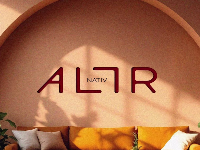
Crafting experiences at intersection of design & technology
Crafting experiences at intersection of design & technology
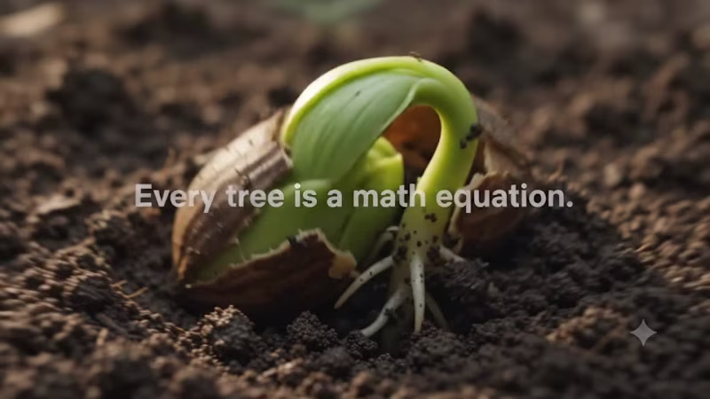
"AI Brand Commercial Creator"
"AI Brand Commercial Creator"
Fashion Designer|Print & Surface Design|Happy Design Studio
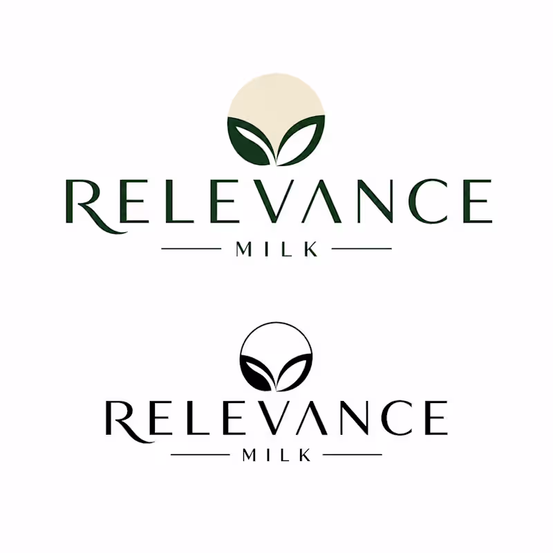
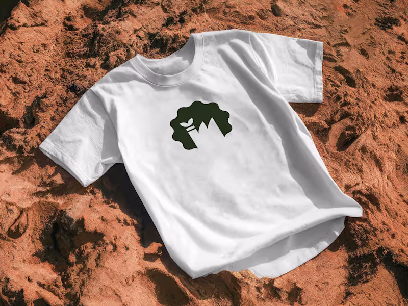
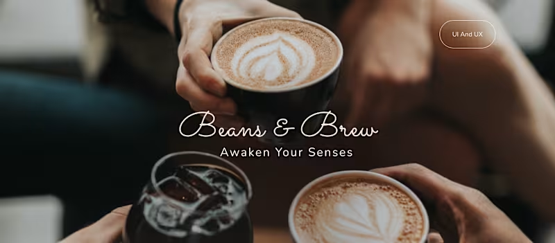
Creative Director for Brand Identity & Visual Design
Creative Director for Brand Identity & Visual Design

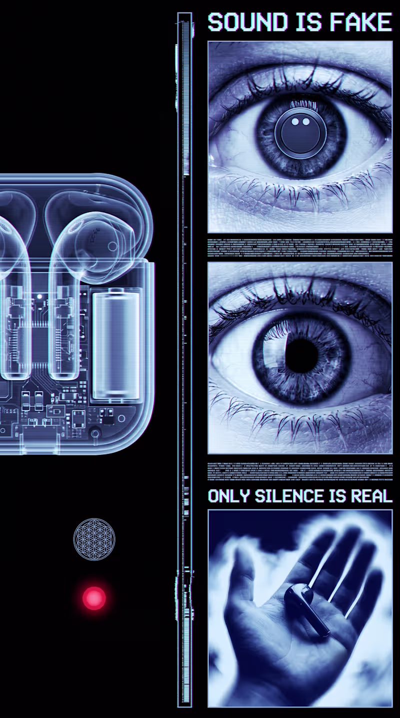
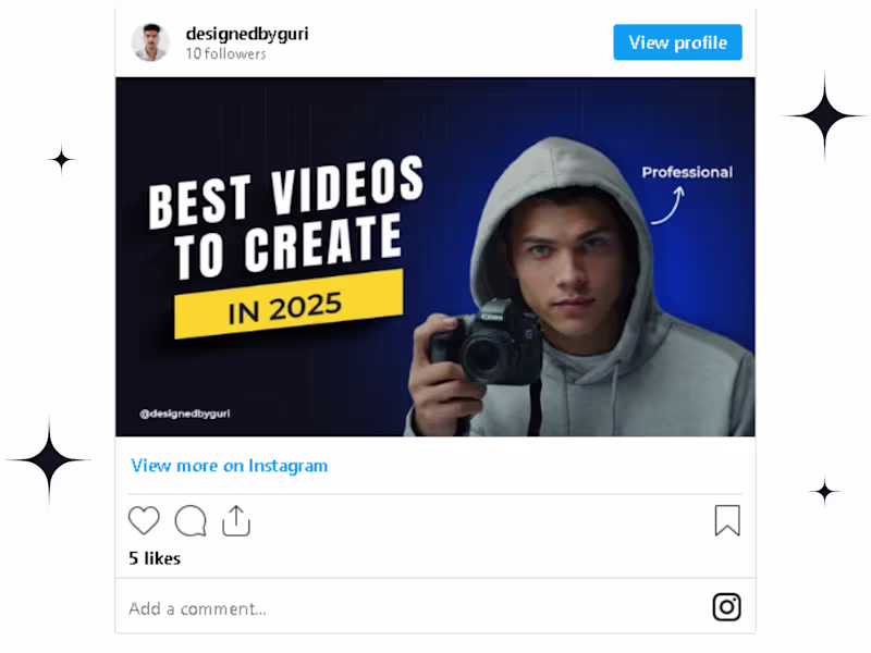
Designing scroll-stopping social media visuals that go viral
Designing scroll-stopping social media visuals that go viral

View more →
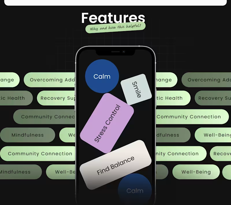
Senior UX Strategist | 10+ YOE Full-Cycle WeApp Specialist ✨
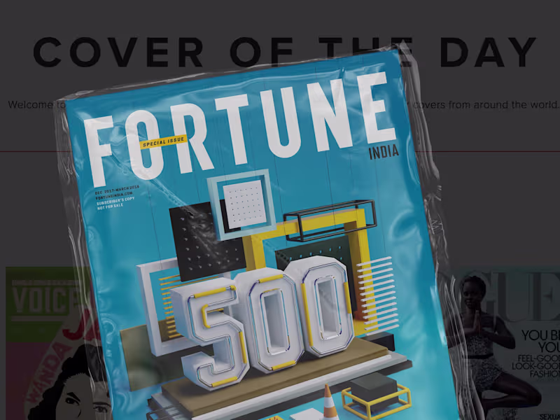
Brand apart from time
Brand apart from time


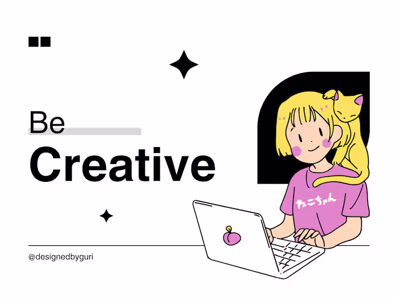
Versatile Canva Designer for Your Unique Needs
Versatile Canva Designer for Your Unique Needs


View more →