Ulta is a mexican beauty brand. I search for their web page and found out it was kinda heavy in terms of visual information.
With the redesign, I made every section has blank spaces so the images and texts can breathe, also, stablishing a clear color palette and making it more visual kind. The use of blue color makes the accent parts more highlighted (also, its complementary color). I preserve the original webpage images so it stays the same fundamental information.🙌
What you think? How does it look?
0
116
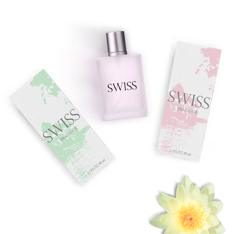
This has been one of the most complex and time-consuming projects I’ve undertaken—largely due to the packaging composition, the fine-tuning of details, and the final arrangement, which alone required nearly four hours of work to achieve the end result. While it is, in essence, a fragrance brand, in practice it proved to be a new and complex challenge.
1
757

Captivating Creatures is a project I worked on for a client whose zoo focuses exclusively on reptiles. This particular concept was ultimately rejected, but it was an exciting opportunity to explore bold visuals and creative storytelling inspired by the fascinating world of reptiles.
Even though it didn’t make it to the final stage, it pushed me to experiment with composition, textures, and color in a really fun way.
2
21
183