Bento design exploration for my own agency website.
I wanted to make the “Why choose us” section feel more visual, premium, and easy to scan.
Focused on clean cards, soft purple branding, and a modern layout that presents multiple ideas without feeling crowded.
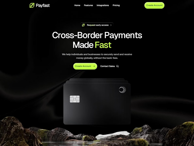
Just finished this cross-border payments landing page in Framer
Went with a dark futuristic direction, bold typography, neon accents, and a premium visual feel to make the product feel modern, trusted, and high-converting.
Built to make fintech feel simple, fast, and bold.
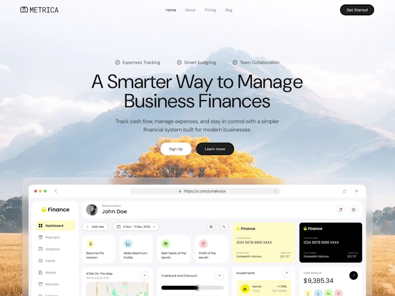
Metrica — Finance SaaS Landing Page Design
Designed a clean, modern landing page concept for Metrica, a finance management platform built for businesses that want better control over cash flow, expenses, budgeting, and team collaboration.
The goal was to create a calm, trustworthy visual direction using soft mountain imagery, clean typography, and a premium dashboard preview that instantly communicates clarity, control, and confidence.
Design focus:
Modern SaaS layout, finance dashboard UI, strong hero section, soft visual storytelling, and conversion-focused CTAs.
Available for SaaS, fintech, AI, and startup website design projects.