Freelancers using Canvas in Finland
Freelancers using Canvas in Finland
Sign Up
Post a job
Sign Up
Log In
Filters
2
Projects
People
Mati Design
pro
Finland
Creating functional and beautiful designs 💡
4.8
Rating
6
Followers
Follow
Message
Creating functional and beautiful designs 💡
1
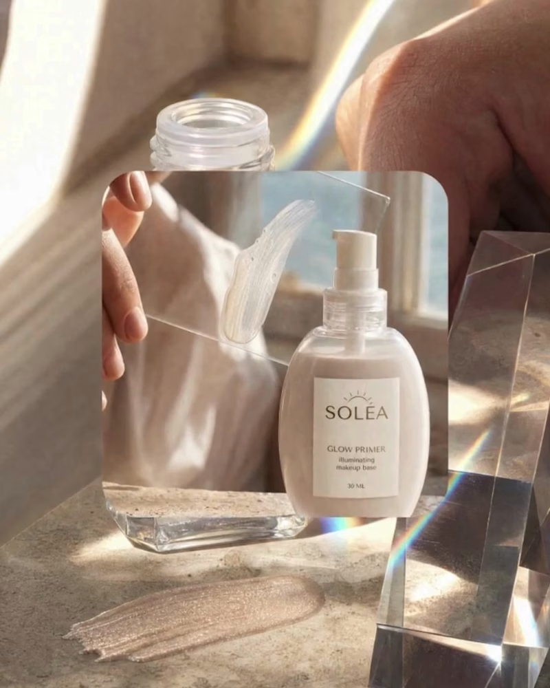
For this project, I wanted to strip away the noise and let clean, intentional design drive the narrative. The goal for Solea was to bridge the gap between high-end luxury and everyday functional beauty. I developed a cohesive design system centered around custom editorial typography, balanced negative space, and a grounded color story. The result is a flexible visual ecosystem built to scale across both physical print and digital touchpoints. I’m currently refining this case study for my portfolio and would value your feedback: how well does the layout balance the product's premium feel with readability?
1
1
65
1
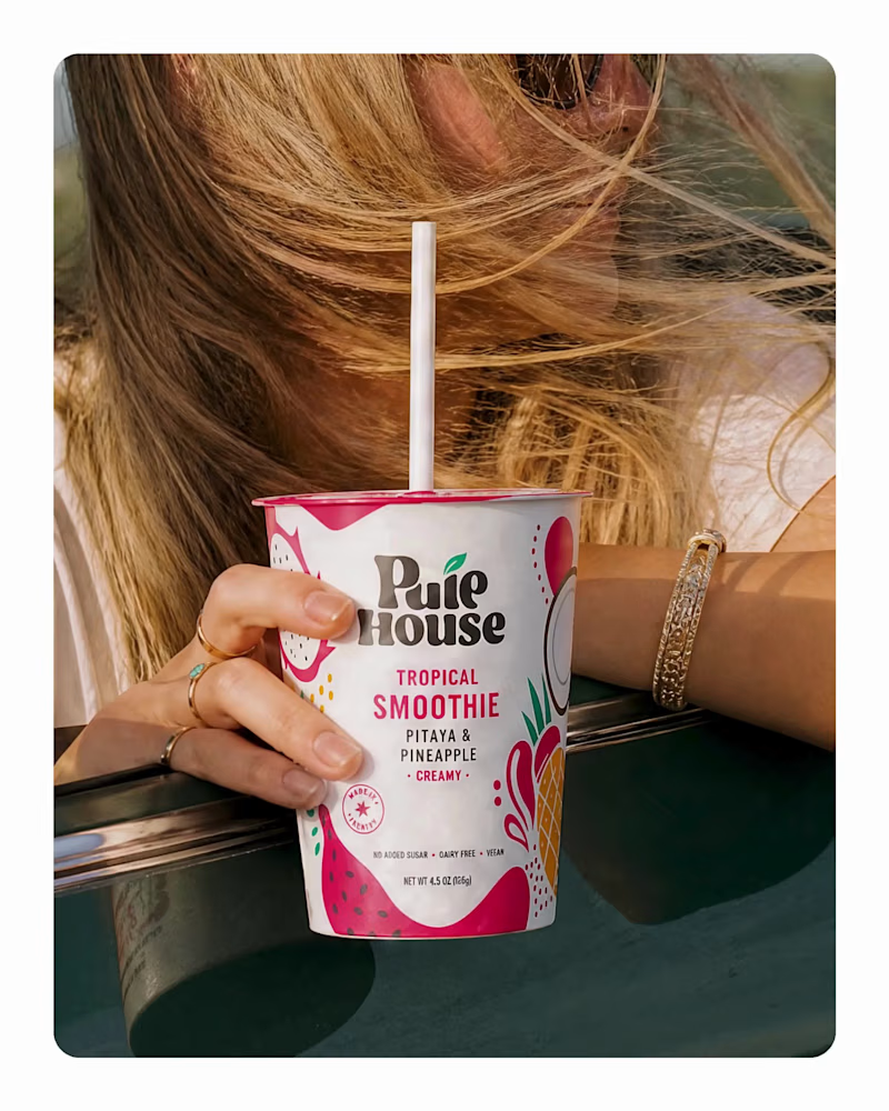
Brand Identity Showcase: Pulp Smoothie Sharing my latest branding project for Pulp Smoothie—a modern visual identity crafted to elevate brand recognition in a competitive beverage landscape. The objective was to translate natural freshness into a cohesive visual language. Through custom typography, a fruit-inspired palette, and streamlined graphic elements, the design captures both energy and authenticity across print and digital media. Open for Critique: As I refine this case study, I’d love to hear your professional thoughts: How effectively does the color strategy communicate freshness? Is the typographic hierarchy balanced across packaging and digital mediums? Any feedback on system cohesion or composition is deeply appreciated!
1
39
0
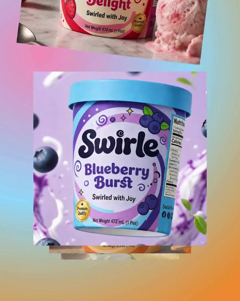
Packaging Design & Visual Strategy | Swirle Ice Cream Designing the packaging for Swirle meant creating a physical product experience that instantly captures attention in a crowded freezer aisle while conveying the craft behind the cream. The Packaging System Container Architecture: Engineered clean, high-impact pint layouts optimized for 360-degree shelf visibility and seamless brand recognition from any angle. Flavor Color-Blocking: Developed a systematic, high-contrast color strategy to differentiate flavors clearly while maintaining strong brand unity across the entire product lineup. Hierarchical Information Design: Structured ingredient lists, flavor names, and nutritional callous to ensure key details remain effortless to read on curved surfaces. How does the visual structure and color balance hold up across the packaging series? I’d appreciate your professional feedback and insights on this direction.
0
28
3
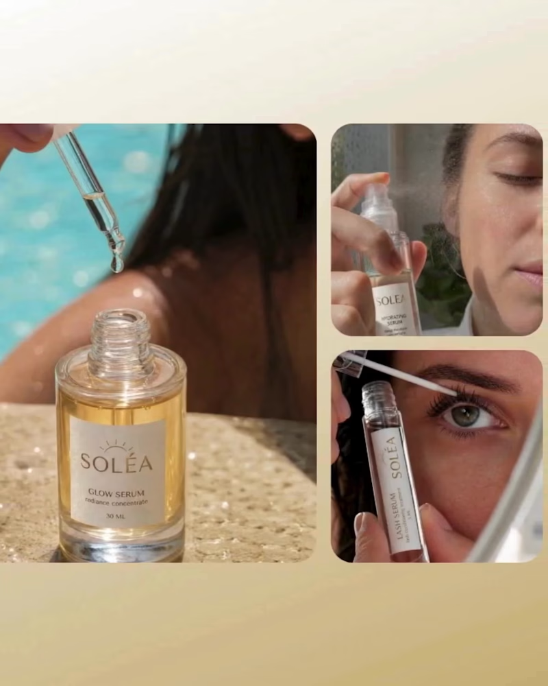
Solea — Makeup Brand Identity Super excited to share a recent design project! For Solea, I wanted to create a brand identity that feels clean, warm, and effortless—like that natural glow we all aim for. I focused on pairing sophisticated typography with rich, earthy tones to keep the vibe polished without feeling overly stiff or complicated. What do you think of the final look? Would love to know your thoughts or any feedback!
1
3
119
Canvas
(1)
Follow
Message
Explore people