
Department of Landscape Architecture at The University of Sheffield – Logo (2014–2020)
Process: At its most abstract and minimalist, landscape architecture is about manipulating and structuring space. The negative space between the shapes in the logo is intentionally manipulated to define the landscape. The design has a ‘wild’ aesthetic, reflecting the hands-on nature of landscape architecture. The logo communicates the department’s creative, non-linear side. Seven abstract shapes represent Sheffield’s seven hills. The shapes are enclosed within a square, symbolizing a landscape architect’s role in bringing order to chaos.
0
566

Department of Landscape at The University of Sheffield – Brochures for UG and PG Study
Part of The Department of Landscape Architecture rebranding. I wanted colours that could communicate the vibrancy and energy of the students and the people that work there. Also inspired by the aesthetics in colourful landscapes. The brochure is in a sleeve, the modified Gotham type is a die cut out, to reinforce the 'Shape Your World' message.
0
474
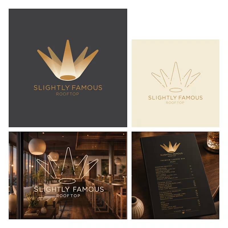
Concept for a Rooftop Bar
The brief was to create something that reflected the bar's concept, that everyone receives the red-carpet treatment. For a few hours, every guest feels like they’re the most important person in the room. The mark is five spotlights converging from above, their beams forming the silhouette of a crown, merging two ideas with one shape.
0
162

Interior Designer Logo
Concept for a small Interior Designer business. This idea is a result of exploring how an interior designer could be represented without falling in to cliche. As part of that process, I came across the Bowerbird the only animal that arranges its environment purely for aesthetic reasons, selecting objects by colour and composition. The colour choices are a response to the brief, for wanting a brand identity that was 'feminine and not afraid of colour,' so I went all-in with this idea in mind. The geometric shapes that make up the bird convey the language of design.
0
103