


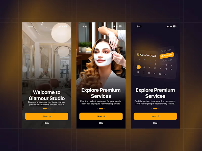
A premium mobile experience designed for modern beauty and wellness services. This concept focuses on creating a luxurious first impression while guiding users smoothly through service discovery and booking.
The onboarding experience highlights:
↳ Elegant, high-end visuals that reflect a premium salon atmosphere
↳ Clear and engaging messaging to introduce services and value
↳ Smooth step-by-step onboarding flow for better user guidance
↳ Integrated scheduling preview to showcase easy appointment booking
↳ Strong call-to-action with a clean and minimal interface
↳ The design blends warm tones, soft gradients, and refined typography to evoke a sense of luxury and ↳ comfort—ensuring users feel confident and relaxed from the very first interaction.
Tools used: Figma
Style: Elegant, modern, luxury-focused
Feedback and thoughts are always appreciated! 💬
3
2
194


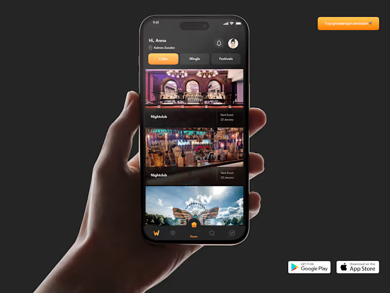
Quest Dashboard That Makes $
This client runs a gamified neighborhood app. When I joined the project, people loved the idea but skipped most events, so sponsor and ticket revenue stayed flat.
I began with a simple UX review of the sign‑in flow and first screen. The key issue: actions were hidden under icons.
I redesigned the layout with large event cards and direct “Join Event” buttons. UX point: clear visual hierarchy so eyes go from stats to events to chat. Early numbers show more event joins.
Need a dashboard like this? DM me.
4
3
168

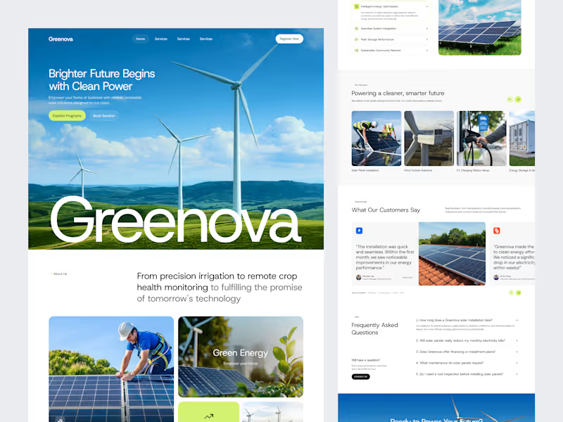
Billiards Website Landing Page Design
I recently completed a modern, user-focused landing page design for a billiards equipment brand (Kuwait Pro Center).
The design follows UX laws, uses a dark premium theme with gold and green accents, and highlights categories, featured products, services, and brand trust sections.
I handled the full UI/UX layout, visual design system, and responsive structure in Figma — making it ready for development.
Tools Used: Figma, UX Design Principles, Visual Hierarchy, Grid Layout.
Deliverable: Fully designed Figma landing page.
0
61





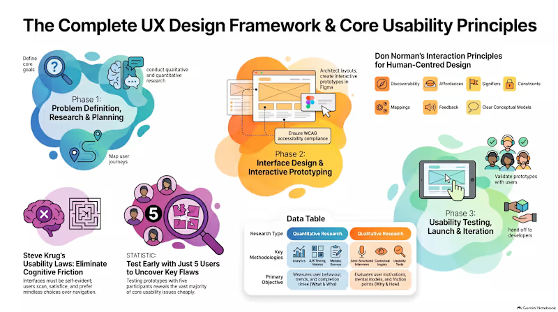
How I Structure a Data-Driven UX Research Process That Drives Results 🎯
Great user experiences aren't built on guesswork—they're rooted in human-centered evidence. Here is the lean, 4-phase UX research framework I use to uncover real user needs and validate designs:
1. Discovery & Empathy (Uncovering the "Why")
Goal: Understand human behaviors, mental models, and pain points before jumping to solutions.
Qualitative Methods: Semi-structured user interviews, contextual inquiry, and review mining.
Quantitative Methods: Funnel analytics audit (drop-off points) and targeted online surveys.
Deliverable: Initial Insights Summary & Opportunity Area Map.
2. Synthesis & Strategy (Defining the Right Problem)
Goal: Turn raw research notes into actionable strategy.
Methods: Affinity mapping, card sorting (for Information Architecture), and "How Might We" (HMW) problem framing.
Deliverables: Data-backed User Personas & End-to-End User Journey Maps.
3. Evaluative Testing (Testing Early & Often)
Goal: Catch friction points on prototypes before engineering teams write code.
Methods: Moderated/Unmoderated remote usability testing using the Think-Aloud Protocol (testing with 3–5 targeted users per round).
Deliverable: Usability Test Findings & Prioritized Fixes Matrix.
4. Post-Launch Iteration (Continuous Optimization)
Goal: Measure live performance and continuously improve.
Methods: A/B testing, user feedback monitoring, and conversion tracking.
Deliverable: Post-Launch UX Audit & Growth Recommendations.
✨ Why this approach works: Research eliminates assumptions early, saving development costs and ensuring every design decision directly serves both user needs and business goals.
📩 Looking to validate your product idea or fix conversion friction in your app? Let’s collaborate on your next project!
0
59