UI Design Projects in Dhaka DivisionUI Design Projects in Dhaka Division🤖 AIChatbot – High-Converting SaaS Landing Page
Project Overview
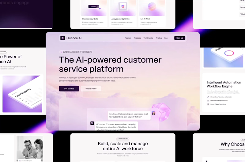
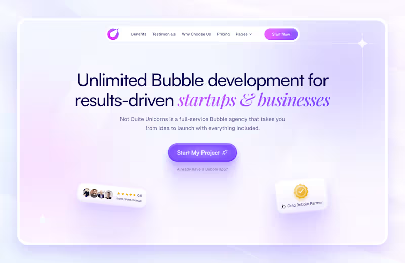
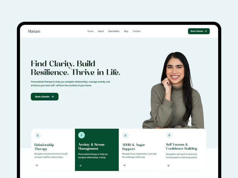
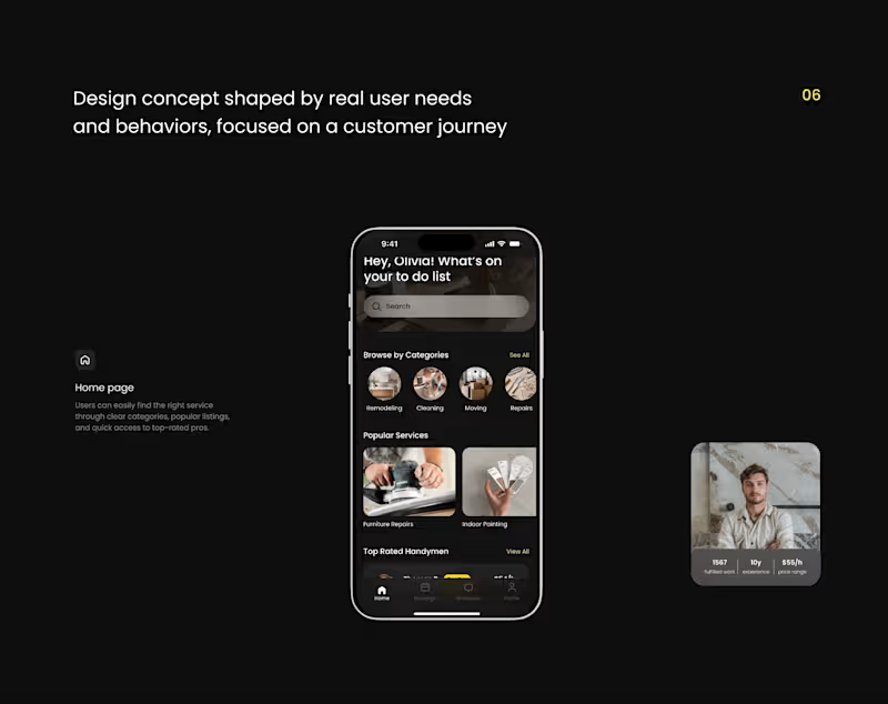
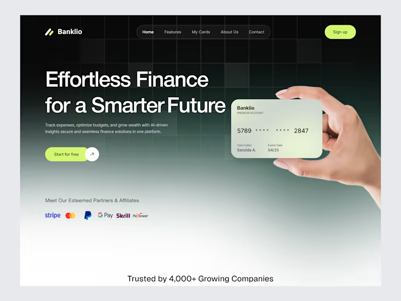
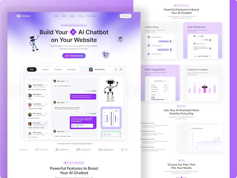
A complete, conversion-focused B2B SaaS landing page designed for a next-generation No-Code AI Chatbot platform. The core goal of this project was to take complex technical AI features and present them through an intuitive visual narrative that drives instant sign-ups and free-trial activations.
The entire layout is structured with a strict user psychology flow—moving from an attention-grabbing hero section directly into structured feature grids, behavioral workflows, analytics proof, and transparent pricing.
💻 Key Design Highlights & UX Architecture
Product-Led Hero Section: Blends bold typography with interactive 3D elements and a clear product dashboard preview, allowing users to visualize the software immediately.
Feature Grid & Layout Hierarchy: Designed clean, balanced grid structures for "Powerful Features" (Instant Setup, Smart Responses, Visitor Engagement) utilizing generous white space and micro-dashboards.
Visualized Analytics & Social Proof: Integrated clean graph UI elements and a subtle logo marquee to build instant trust with tech founders and product managers.
Conversion-Driven Pricing Structure: A clear, modern pricing section optimized to minimize friction and guide users smoothly toward the "Get Started" CTA.
🛠️ Tools & Design System
Tools Used: Figma
Deliverables: Pixel-perfect responsive web layouts, scalable auto-layout components, and consistent typography scales.
💡 Need a high-converting, modern landing page or a custom SaaS dashboard for your tech startup?
Let’s collaborate to turn your platform idea into an elite digital product. Send a direct message right here on Contra to start today!