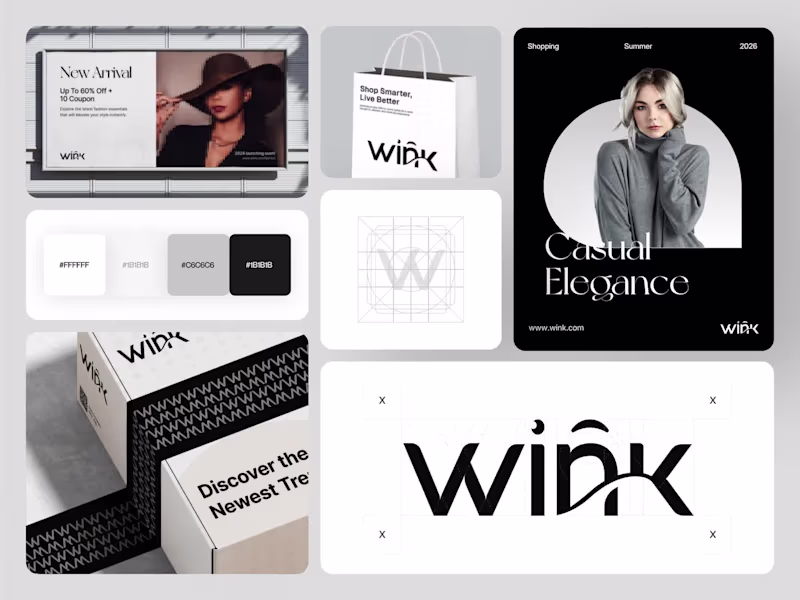
Visual System Designer Projects in DhakaVisual System Designer Projects in DhakaA modern fashion e-commerce brand designed to feel editorial, minimal, and instantly covetable across every surface it lands on.
Designed in Figma with a pure black and white system, a custom geometric wordmark with a signature wink detail, and an understated-luxury visual language that owns every touchpoint. Billboard advertising, shopping bags, mailer boxes, editorial campaign cards, and logo construction grids the same identity holds elegance at any scale.
The monochrome palette of pure white, warm gray, and deep black does the heavy lifting timeless and fashion-forward without ever feeling trend-dependent.
"Shop Smarter, Live Better. Casual Elegance." That's not just the tagline. That's the brief we designed from.
Would love to hear your thoughts on the brand direction. 👀
Brand Identity | Fashion Branding | Ecommerce | Packaging Design
Tools: Figma, Jitter Silhou | Sportswear Brand Identity & Visual System Design
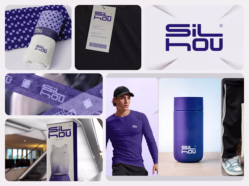
Most sportswear brands either copy the big three or go so minimal they disappear on a retail shelf. The identity never holds from a hang tag to a flagship store display.
We designed Silhou's full brand identity system for a sportswear label that needed a geometric, performance-driven visual language strong enough to carry across apparel, accessories, packaging, and retail environments.
𝗪𝗵𝗮𝘁 𝘄𝗲 𝗳𝗼𝗰𝘂𝘀𝗲𝗱 𝗼𝗻
Wordmark Design: "SiL HOU" in a custom geometric sans-serif with a split layout, upper and lower case mixed deliberately, creating a mark that reads as a logo shape, not just a name.
Brand Color System: Deep navy purple and white are two colors held consistently across every touchpoint from towel weave to retail box.
Apparel Mockups: A long-sleeve performance top in navy with a chest wordmark and black cap identity tested on the body at a lifestyle photography scale.
Hang Tag & Label: A barcode hang tag on black ribbed fabric brand detail is present at the smallest product touchpoint.
Towel & Resistance Band Mockups: A woven wordmark pattern on a gym towel and resistance band identity extended into training accessories without losing legibility.
Retail Box & In-Store Display: A tall product box with a full wordmark and apparel visual packaging designed for retail shelves and e-commerce unboxing.
Tote Bag: Canvas tote with "Aligned. Shaped. Outlined." tagline and large wordmark brand voice and visual identity carried into everyday use.
Built for sportswear startups, activewear labels, and athletic lifestyle brands entering retail or DTC markets.
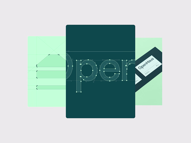
Tools: Figma, Jitter OpenHaus | Healthcare Brand Identity & Signage System Design
Most healthcare brands feel clinical and cold before a patient walks through the door. The visual identity does nothing to reduce anxiety or communicate that care is actually accessible here.
We designed OpenHaus's full brand identity system for a healthcare provider that needed to feel open, trustworthy, and human from a street-level billboard to a second-floor wayfinding sign.
What we focused on
Logo Construction: A house icon built from a roofline and three stacked bars; a geometric grid is visible in the construction slide, and every anchor point is deliberate and documented.
Wordmark & Typeface: "OpenHaus" in a custom rounded sans-serif letterform with Bezier curves shown at full zoom, a typeface built for legibility at signage and screen scale.
Brand Color System: Deep teal and mint green on white, clinical enough to signal healthcare and warm enough to signal welcome.
Outdoor Billboard Mockup: A street-level poster with medical staff photography and the "Immediate Care. Anytime." tagline, brand voice, and visual identity tested at pedestrian scale.
Architectural Wayfinding Sign: A wall-mounted frosted lightbox with "2nd Floor" directional and OpenHaus wordmark identity extended into the physical space patients navigate daily.
Built for healthcare clinics, urgent care providers, medical startups, and hospital networks that need a brand patients trust before they step inside.
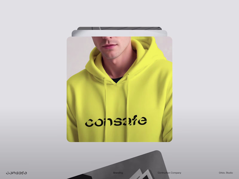
Tools: Figma, Jitter Consafe | Construction Company Brand Identity Design
Most construction companies use the same hard-hat-and-crane logo that makes every firm look identical on a job site hoarding or a fleet vehicle. The brand never communicates scale, trust, or quality before a single conversation happens.
We designed a full visual identity system for a construction brand that needed to feel structural and authoritative, built to hold across signage, workwear, vehicles, and digital.
𝗪𝗵𝗮𝘁 𝘄𝗲 𝗳𝗼𝗰𝘂𝘀𝗲𝗱 𝗼𝗻
Wordmark & Icon Mark: Bold geometric logomark built from structural forms angles and weight that reference construction without being literal about it.
Brand Color System: Deep charcoal, safety orange, and white are three colors that work on dark site hoardings, hi-vis workwear, and clean digital surfaces.
Site Hoarding Mockup: Full-scale construction hoarding with brand-applied identity tested at the scale where it matters most.
Vehicle Livery Mockup: A branded fleet truck or van with a wordmark and color blocking moving a brand presence across every job site.
Hard Hat & Workwear Mockup: Logo on PPE and site uniform brand consistency from the boardroom to the build.
Stationery & Business Card: Letterhead, card, and envelope identity held at the smallest touchpoint.
Built for construction firms, civil engineering companies, property developers, and building contractors that need a brand that looks as solid as the structures they build.
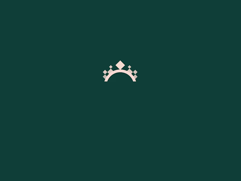
Tools: Figma, Jitter Luxe Charm | Luxury Jewelry Brand Identity & Social Media Design System
Most jewelry brands use the same white-background product shots that make every piece look identical on a feed. Nothing communicates the feeling of wearing the jewelry, just the object sitting alone on a surface.
We designed Luxe Charm's full brand and social content system for a luxury jewelry label that needed editorial photography direction, a rich color palette, and packaging design that all felt like the same world.
𝗪𝗵𝗮𝘁 𝘄𝗲 𝗳𝗼𝗰𝘂𝘀𝗲𝗱 𝗼𝗻
Brand Color System: Deep teal green, champagne gold, and black are three colors held across packaging, social cards, logo marks, and campaign photography.
Hero Campaign Card: "Jewelry That Charms, Moments That Last" in editorial serif type over a teal and diamond-pattern background brand tagline and product photography composed as one visual.
Logo Mark: Minimal crown icon in gold on teal built for embossed packaging, social avatars, and watermark use.
Packaging Mockup: A dark teal gift box with a gold crown emboss and ribbon physical brand touchpoint matching the digital identity.
Editorial Photography Direction: Two model portraits with statement earrings and necklaces, with the "Sparkle with Confidence, Shine with Luxe Charm" tagline integrated directly into the image.
3D Precious Metal Asset: Gold sculptural jewelry render with "Crafting Stories in Precious Gems" campaign visual for hero banners and paid ads.
Tools: Figma, Jitter Trendly | Fashion Brand Identity & Apparel Visual System
Youth fashion brands trying to reach a Gen-Z audience get trapped between looking too corporate or too chaotic. A brand identity that needs to live on a t-shirt, a social card, and a campaign poster simultaneously without losing its personality at any scale is harder to build than it looks.
The Solution:
We designed Trendly, a bold fashion brand identity built on electric blue, lime green, and coral with a rounded bubble wordmark that feels playful without losing structure. The mark lives comfortably on apparel, campaign photography, and digital UI with the same energy at every touchpoint.
What we focused on:
Wordmark: Rounded, bouncy "Trendly" lettering with a smile-curve baseline immediately readable on a white tee or a dark digital background.
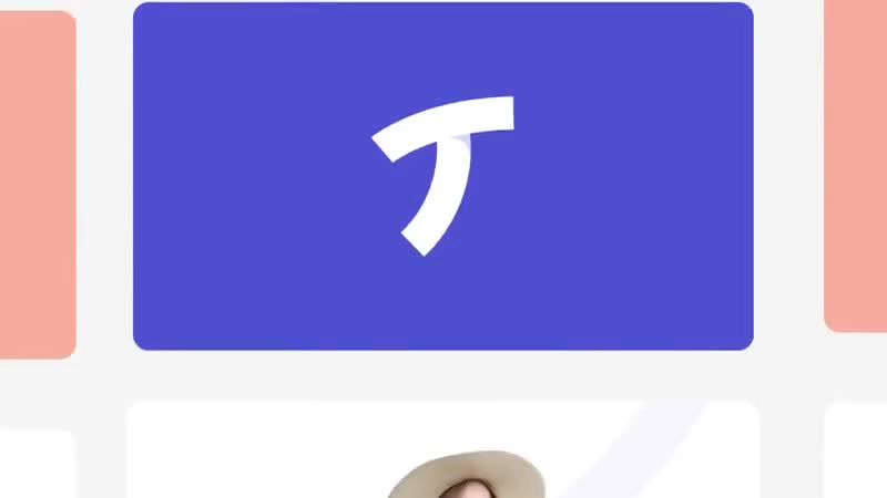
Logo Mark: Minimal "T" letterform with a curved foot distinct enough to stand alone as an icon without the full wordmark.
Color System: Electric blue, lime yellow-green, and coral peach; high contrast, high energy; built for digital-first environments.
Apparel Mockup: White t-shirt with blue The Trendly wordmark identity was tested on the product it was built for.
Campaign Card: Model in blue denim against lime background with "Step Into The VibeSphere" tagline and hashtag brand voice carried into content format.
Tagline Direction: "Step Into The VibeSphere" specific, cultural, and ownable; not generic fashion copy.
Tools: Figma
#FashionBranding #BrandIdentity #GenZDesign #LogoDesign #ApparelBranding #VisualSystem #OrbixStudio Zenvia | Natural Luxury Skincare Brand Identity & Packaging System
Problem:
Wellness skincare brands struggle to communicate both luxury and nature simultaneously most lean so hard into organic aesthetics that they lose premium appeal, or go so high-end that the natural story disappears entirely. The result is a brand that attracts neither the conscious consumer nor the luxury buyer.
The Solution:
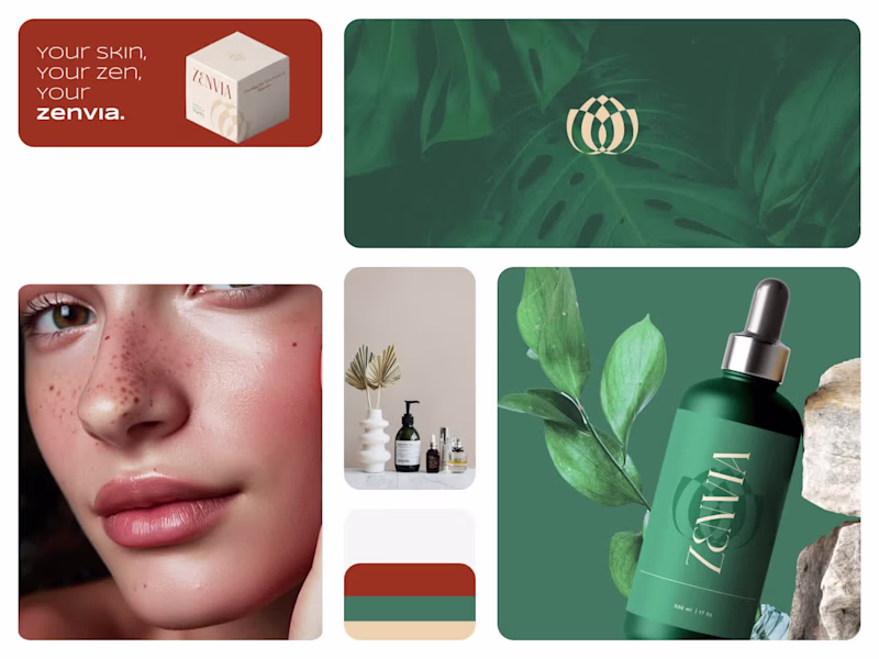
We designed Zenvia, a natural luxury skincare brand identity built on deep forest green, warm terracotta, and cream a color system that holds both worlds without compromising either. The interlocking oval logo mark and high-contrast gold wordmark communicate refinement, while botanical photography and stone product staging keep the natural narrative grounded and real.
What we focused on:
Logo Mark: An interlocking double-oval symbol in gold reads as both botanical and geometric; premium without being cold.
Color System: Forest green, terracotta orange, and warm cream across packaging and brand materials nature and luxury occupying the same visual space.
Wordmark: High-contrast serif "ZENVIA" in cream on deep green elegant at large scale, legible on dark packaging.
Product Packaging: Dark green dropper bottle with logo mark and wordmark label, staged against stone and tropical leaves product and environment telling the same story.
Box Packaging: Cream cube with geometric pattern and "Zenvia" wordmark clean structural packaging that earns its place on a premium retail shelf.
Tagline Application: "Your skin, Your zen, Your Zenvia" in terracotta brand voice that is personal, calm, and ownable.
Tools: Figma
#BrandIdentity #LuxurySkincare #NaturalBeauty #LogoDesign, #PackagingDesign #BeautyBranding #VisualSystem #OrbixStudio