
UX-led product design & dev agency for b2b saas and AI

UX-led product design & dev agency for b2b saas and AI
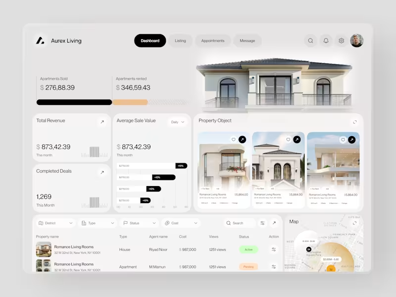
Real estate dashboards are usually built for data entry. Aurex Living was built for decision-making.
$873,42.39 total revenue. 1,269 completed deals this month. $276K sold, $346K rented. Property cards, agent tracking, map view, average sale value trending +10% - every number a real estate operator actually needs, on one clean white canvas.
Check it out (https://dribbble.com/shots/27350201-Aurex-Living-Real-Estate-Dashboard-Design)
12
17
2K
Most people set a budget once and forget it exists until it's too late.
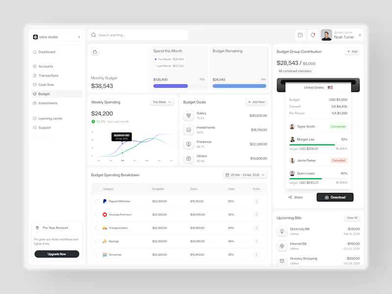
This dashboard was designed to fix that. Weekly spending at $24,200, up 12.5% from last month. Monthly budget at $38,543 with 75% already allocated. Budget goals tracked by category salary, investments, freelance, and others each with a completion percentage and a dollar target that makes progress visible before the month ends.
The group contribution panel takes it further. Four members. One shared budget of $5,000. Taylor completed. Morgan at 70%. Quinn at 45%. Jamie cancelled. A collaborative finance tool that makes shared budgeting feel as clean as personal budgeting should.
Upcoming bills electricity, internet, grocery listed before they hit. A spending breakdown table that shows exactly what was budgeted, what was spent, and how much is left in every category.
This is what budget management looks like when the design treats users like they actually want to be in control of their money.
Does this feel like a dashboard that would change how a team manages their finances together? 👇
Designed by Orbix Studio
Tools: Figma
#DashboardDesign #FintechUI #BudgetApp #UIDesign #WebDesign #ContraFreelance #ProductDesign #SaaSUI
11
31
3.7K
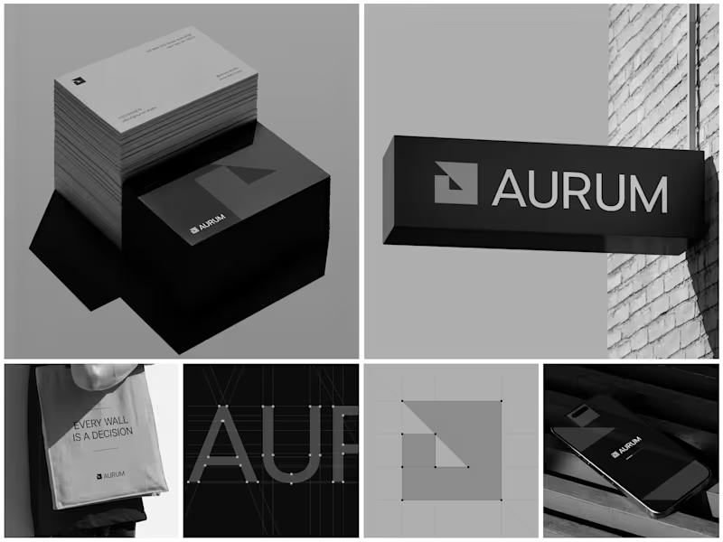
Aurum - Brand Identity System
When Aurum came to me, they had a name and a vision a studio that wanted to feel deliberate, architectural, and unapologetically bold in every space it touched. No logo, no system, just a line that stuck with me from our first conversation: "every wall is a decision."
That phrase became the seed for the entire identity. I started with the simplest possible geometry a square split by a triangle and built the mark from a strict construction grid so it would hold its proportions at any size, from a business card to a building-mounted sign. Once the mark was locked, I stripped the palette down to black, white, and grey. No color to hide behind just contrast, shadow, and negative space doing the work.
From there, the system grew outward: letterpress-style stationery with generous shadow and texture, exterior signage designed to read cleanly against brick and daylight, a minimal mobile app screen, and a tote bag that turned the brand's own tagline into a quiet piece of merchandise. Every touchpoint had to pass the same test does it still feel like Aurum at this scale, in this material, from this distance?
The result is an identity that's confident without shouting restrained enough for a business card, strong enough for a wall.
Curious how I'd approach building out a system like this for your own brand want to talk through it?
9
25
1.7K

UI/UX Designer | Fintech, EdTech, SaaS, B2B & B2C Designer
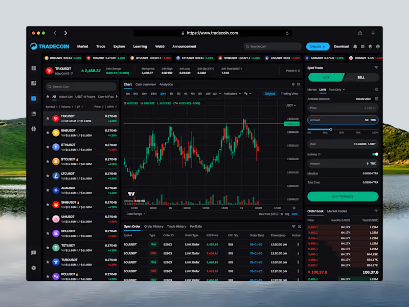
Tradecoin is a crypto trading web platform that helps users track the market and trade with confidence. This shot shows the Spot Trading screen in Buy mode, designed to let users analyze the market and place a buy order in one workspace.
The coin list on the left lets users switch pairs quickly, while the center holds a candlestick chart with timeframes, indicators, and volume. In Buy mode, the right panel turns green and shows Market, Limit, and Post Only orders, amount controls, and a live order book. Open orders, order history, trade history, and portfolio sit below the chart.
The Challenge
Trading screens can feel crowded and risky. Users switch between charts, order forms, and order books, and it’s easy to confuse a buy with a sell.
The goal was to create a focused trading experience with clear Buy and Sell states, so users always know what action they’re taking and can place orders with confidence.
Key Features
→ Green Buy mode with clear color feedback
→ Live ticker with top trading pairs
→ Coin list with search, filters & watchlist
→ Pair stats: price, 24h change, high, low & volume
→ Candlestick chart with timeframes & indicators
→ Market, Limit & Post Only order types
→ Amount slider with instant cost calculation
→ Iceberg order option
→ Max Buy & Total Cost details
→ Real-time order book & market trades
→ Open orders, history & portfolio tabs
1
70
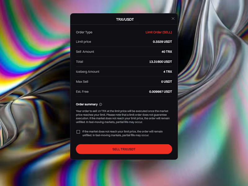
Tradecoin is a crypto trading web platform that helps users track the market and trade with confidence. This shot focuses on the Order Confirmation modal, which lets users review every detail of a limit sell order before they commit.
Placing a trade is a high-stakes moment. Users can make costly mistakes when order details are unclear or when they don’t fully understand how a limit order behaves.
The goal was to create a clear, trustworthy confirmation step that shows all order details, explains the risks, and helps users confirm with confidence.
I provide:
> UI/UX & Product Design
> Mobile App UI/UX Design
> Web & SaaS Design
> Landing Page & Website Design
> UX Research & User Flow
> Wireframing & Prototyping
> Design Systems & UI Components
> UX Audit & Usability Improvements:
> Responsive & Design QA
> MVP & Product Design
> Branding & Visual Design
> Pitch Deck Design
3
119

UI/UX Designer — Web Designer & Developer in Figma/Webflow

UI/UX Designer — Web Designer & Developer in Figma/Webflow
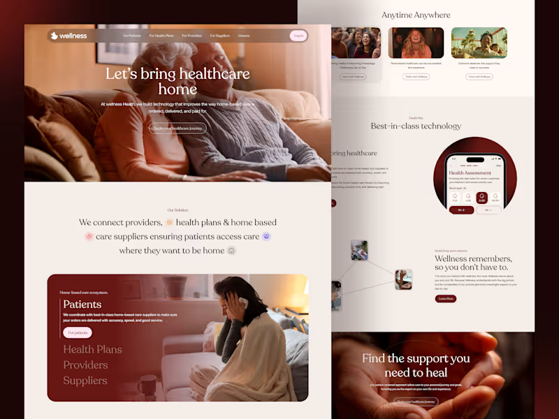
Healthcare - Wellness Website | Medicare Landing Page
We designed a clean, modern, and accessible healthcare website tailored for homecare medical services, medicare services, wellness clinic, and health care providers. This landing page concept was built with a patient-first approach and supports seamless experiences for doctors, hospitals, clinics, and health plans.
Key Features:
~ Doctor and Clinic to manage profiles, services, and appointments.
~ Health care suppliers and medicine distributors.
~ Medicare and health plans targeting patient engagement.
~ Patients booking, doctor appointments and accessing care fast.
~ Doctor and health care providers.
4
7
357
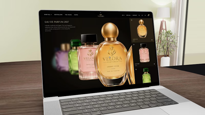
Luxury Perfume E-commerce Website Design
An elegant online storefront for luxury fragrance brands.
This design brings together refined typography, dark visual styling, gold accents, and immersive product displays to create a distinctive fragrance shopping experience.
Designed for premium beauty retailers, independent perfume brands, and businesses looking to elevate their digital storefront.
Services: E-commerce Website Design, UI/UX Design, Web Design, Product Presentation.
1
47
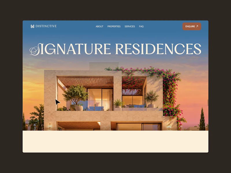
DISTINCTIVE — Luxury Real Estate Website Design
A real estate website concept exploring premium property presentation through refined UI/UX, architectural visuals, and responsive layouts.
Designed by Seative Digital’s R&D Team.
3
89
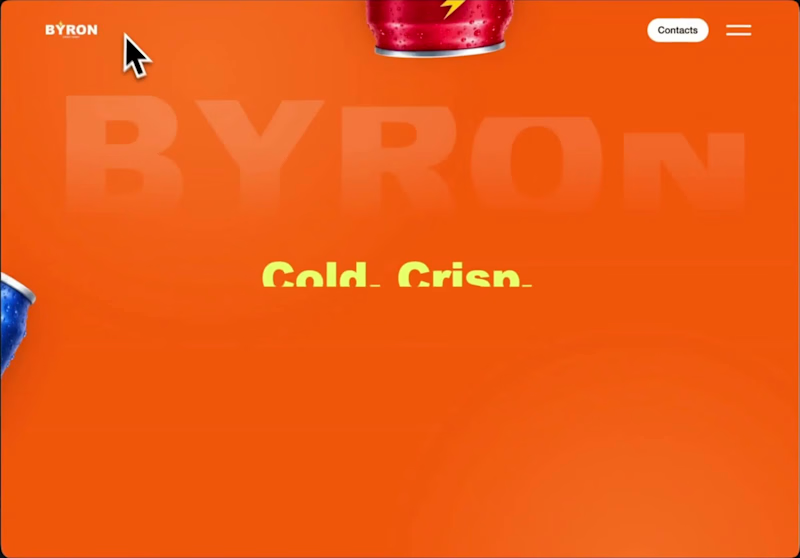
Byron - Energy Drink eCommerce Website
A vibrant digital storefront built around bold product visuals and five distinctive flavors.
The experience features interactive product selection, colorful layouts, and a structured shopping journey designed for beverage brands.
Focus: eCommerce UI/UX, Product Presentation, Website Design.
1
50

Only 3 Slots Left - Get 30% Off Your First SaaS Project.
- $1k+
- Earned
- 67
- Followers
Only 3 Slots Left - Get 30% Off Your First SaaS Project.

Healthcare products often focus on functionality first.
But trust is built through experience.
Nurein’s branding motion was designed to make healthcare communication feel calmer, clearer, and more human through structured motion storytelling.
The system combines:
• Bento-inspired identity motion
• Logo animation
• Real-time doctor suggestion visuals
• Minimal healthcare aesthetics
• Precision-focused transitions
Every movement was designed to reinforce clarity, accessibility, and emotional reassurance - not just visual polish.
Because strong healthcare branding should help users feel confident before they even interact with the product.
Building a healthcare, SaaS, or AI product?
We help brands create motion systems, visual identities, and scalable digital experiences that convert trust into engagement.
🌐 taqwah.agency (http://taqwah.agency) | 📩 hello@taqwah.agency (mailto:hello@taqwah.agency)
4
8
287
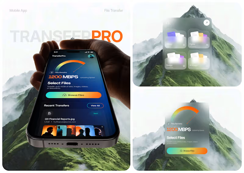
TransferPro - Designing a Faster, Clearer File Transfer Experience
Large-file workflows don't need to feel heavy.
For TransferPro, we explored a mobile product experience that brings file transfer, cloud storage, activity tracking, and content sharing into one focused interface.
The design direction combines:
• High-visibility transfer status
• Clear file organization
• Recent activity tracking
• Centralized cloud storage
• Fast access to shared content
• A futuristic dark visual system
The challenge wasn't simply making a file transfer app look modern.
It was creating an experience where users can immediately understand what is transferring, how fast it is moving, and what happened recently.
That's where thoughtful product UX makes a difference.
Building a SaaS, cloud platform, or mobile product that feels more complicated than it should?
👉 Work with Taqwah to turn complex workflows into clear, scalable product experiences. DM us to start your project.
🌐 taqwah.agency (http://taqwah.agency) | 📩 hello@taqwah.agency (mailto:hello@taqwah.agency)
#ProductDesign #UIUX #MobileAppDesign #SaaSDesign #UXDesign #DigitalProduct #AppDesign #FileSharingApp #FileTransfer #Taqwah
4
7
347
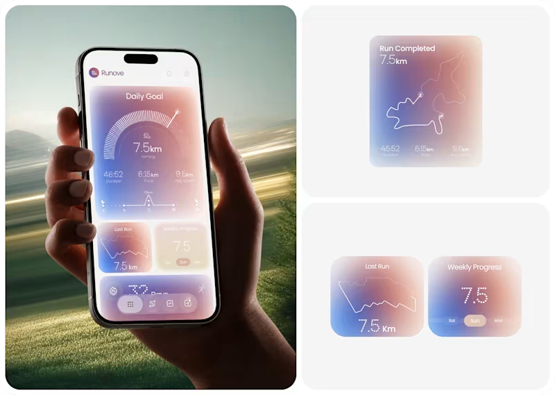
Runove - A Minimal Running App Designed Around Performance & Progress
Runove explores how a running app can turn performance data into a focused and approachable experience.
The product experience brings together:
• Daily running goals
• Distance, pace & duration
• Average speed
• Weekly progress
• Running streaks
• Completed route visualization
The design direction uses soft gradients, rounded surfaces, subtle depth, and structured data visualization to keep the experience calm while giving performance metrics a clear visual hierarchy.
The goal is simple: Less friction. Better visibility. A more intentional fitness experience.
If you're building a fitness app, health platform, sports product, or data-heavy mobile experience, Taqwah can help you transform the product idea into a polished, user-focused UI/UX system.
Have a product in mind? Let's discuss the UX, structure, and visual direction needed to bring it to life.
🌐 taqwah.agency (http://taqwah.agency) | 📩 hello@taqwah.agency (mailto:hello@taqwah.agency)
4
7
495
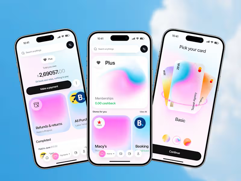
ZEVA - A Fintech Experience Designed Around Everyday Money
Most finance apps focus heavily on transactions.
ZEVA explores what happens when financial management becomes part of a broader everyday experience.
The product combines:
• Payment and purchase management
• Outstanding payment visibility
• Refund and return tracking
• Shopping and selected stores
• Cashback benefits
• Card selection
• Personalized card customization
The design challenge was to bring these different behaviors together without making the experience feel overloaded.
The result is a clean, premium mobile interface where financial management, rewards, shopping, and personalization work as parts of one product experience.
Good fintech UX isn’t about adding more features. It’s about making complex financial actions feel easier to understand.
Building a fintech app, payment platform, banking product, or financial dashboard?
Taqwah can help you transform your product idea into a polished, scalable UI/UX experience - from product structure and user flows to high-fidelity interface design.
Start your next product design project with us.
🌐 taqwah.agency (http://taqwah.agency) | 📩 hello@taqwah.agency (mailto:hello@taqwah.agency)
3
9
620

UI/UX Designer | Framer and Wix Studio Expert
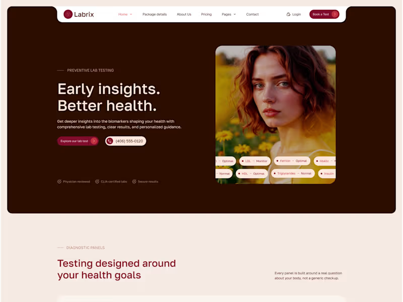
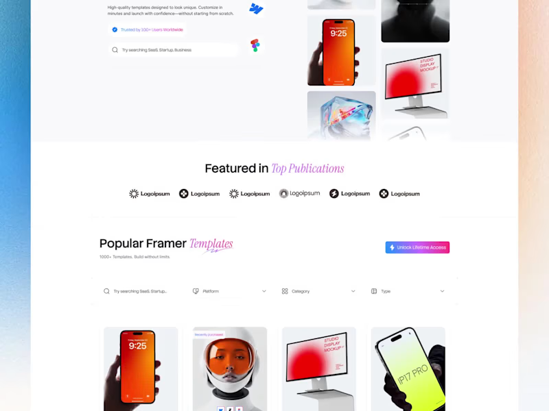
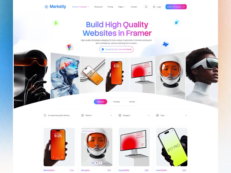
💎 Marketly — FREE Framer Template for Digital Marketplaces
Showcase templates, digital assets, creators, reviews, and products with a clean, conversion-focused design.
✨ 3 Homepage Variations
📱 Fully Responsive
⚡ Framer Optimized
🎨 Easy to Customize
🛍️ Product & Marketplace Pages
💬 Reviews & Social Proof
📝 Blog & CMS Ready
Best of all — Marketly is FREE to remix in Framer.
https://framer.link/vfhaC9h
Perfect for template sellers, digital creators, agencies, design studios, and digital asset stores.
👉 Remix it for free and start building your marketplace today.
#Framer #FramerTemplate #FreeFramerTemplate #FramerMarketplace #WebDesign #NoCode #DigitalMarketplace #UIUX #WebsiteTemplate
0
94


Logo & Brand Identity Designer
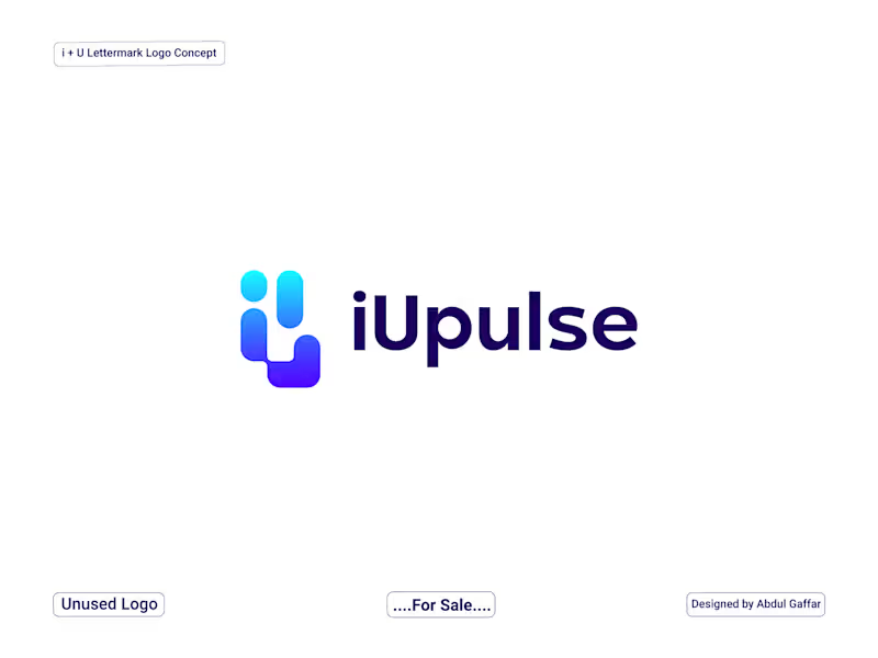
iUpulse Logo - Modern HealthTech Logo Design.
iUpulse is a premium, minimalist, and smart logo concept designed for futuristic HealthTech and Fitness platforms. The visual monogram creatively blends the letters 'i' and 'u' with geometric, pill-shaped data components.
The left element symbolizes a human/user silhouette, while the adjacent bar signifies digital tracking and data flow. Combined with the word "Pulse," the brand perfectly embodies real-time health monitoring, connectivity, and modern medical technology. The vibrant cyan-to-purple gradient gives it a cutting-edge, tech-forward vibe, making it ideal for mobile apps, smart wearables, and SaaS platforms.
3
260
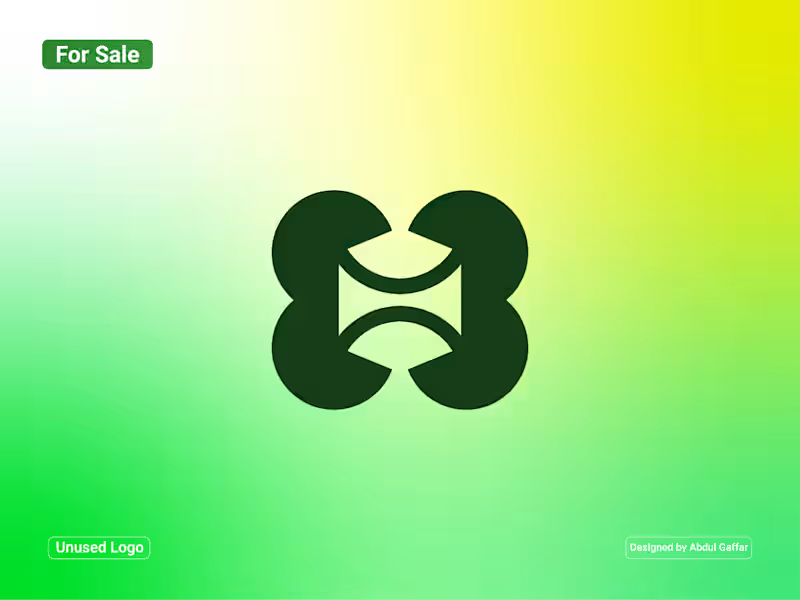
H Lettermark Logo.
A distinctive H lettermark created through four bold, rounded geometric shapes. The symmetrical composition uses carefully balanced curves and negative space to form an abstract interpretation of the letter H. Its interlocking structure creates a sense of connection, harmony, and continuity, while the smooth shapes give the design a clean and contemporary appearance.
The concept is suitable for technology companies, creative studios, architecture firms, fashion labels, consulting businesses, and modern corporate ventures.
Unused Logo for Sale: This logo concept is available for purchase. If you're interested in using it for your business, feel free to contact me.
2
66
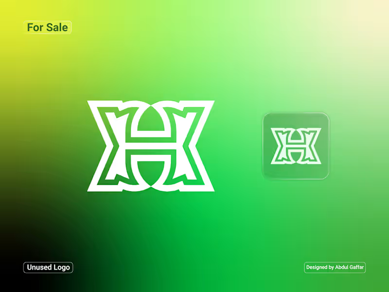
Abstract H Lettermark Logo.
A bold and distinctive H lettermark created through a combination of interlocking geometric shapes and symmetrical forms. The design features a layered structure with clean outlines and balanced proportions, giving the symbol a strong architectural appearance. The vibrant green gradient adds a fresh, modern touch, while the compact emblem version makes it adaptable across different applications.
Suitable for technology companies, architecture studios, construction businesses, creative agencies, engineering firms, and modern corporate ventures.
Unused Logo for Sale: This logo concept is available for purchase. If you're interested in using it for your business, feel free to contact me.
3
99
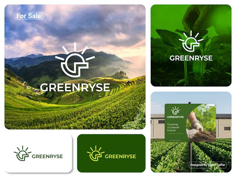
GREENRYSE – G Lettermark, Sun Logo Design, Sustainable Agriculture.
Introducing GREENRYSE, a modern logo concept inspired by nature, agriculture, and the power of growth. The symbol combines a geometric letter G with a rising sun, representing new beginnings, natural energy, and a brighter future for agriculture.
The presentation explores how the logo works across different backgrounds and applications, including agricultural landscapes, product imagery, and outdoor signage. Its clean geometric structure and fresh green color direction create a natural yet professional look.
Designed for agricultural companies, organic farming businesses, crop production, sustainable agriculture, and modern agritech ventures.
5
8
1.4K

Fullstack Dev: Detailed & Design-Focused Expert
Fullstack Dev: Detailed & Design-Focused Expert

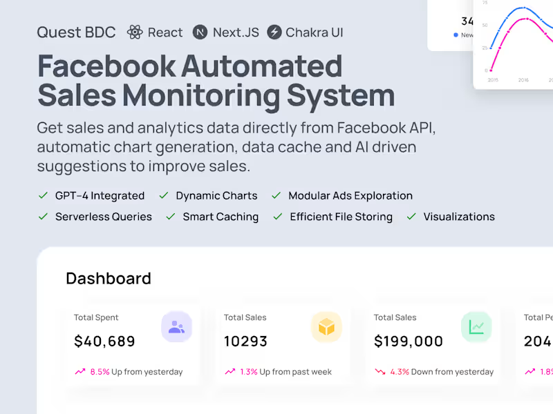
View more →