UX-led product design & dev agency for b2b saas and AI

UX-led product design & dev agency for b2b saas and AI

We brought this fully functional gamified location app to life with a focus on play and real-world exploration.
From a complex list of gamification requirements to a seamless experience that makes stepping outside feel like loading into a game.
𝗧𝗵𝗲 𝗰𝗼𝗻𝗰𝗲𝗽𝘁:
A location-based social app that puts the player back in the driver's seat. It features a real-time 3D isometric city map, XP and Coin rewards tied to real movement, and a visual hierarchy that turns your neighborhood into a quest zone worth exploring.
We wanted to move away from the flat, utility-first design of traditional map and event apps and build something that actually feels exciting to open every day.
Really proud of how the sky-blue isometric world, floating 3D buildings, and glassmorphism filter tabs create a sense of adventure and discovery from the very first screen.
Curious what you think about the UI direction. 👀
UX Design | Gamification | Mobile App | Location Based
1
342

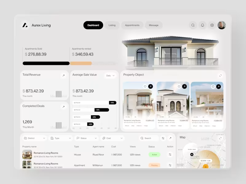
Real estate dashboards are usually built for data entry. Aurex Living was built for decision-making.
$873,42.39 total revenue. 1,269 completed deals this month. $276K sold, $346K rented. Property cards, agent tracking, map view, average sale value trending +10% - every number a real estate operator actually needs, on one clean white canvas.
Check it out (https://dribbble.com/shots/27350201-Aurex-Living-Real-Estate-Dashboard-Design)
12
17
2K
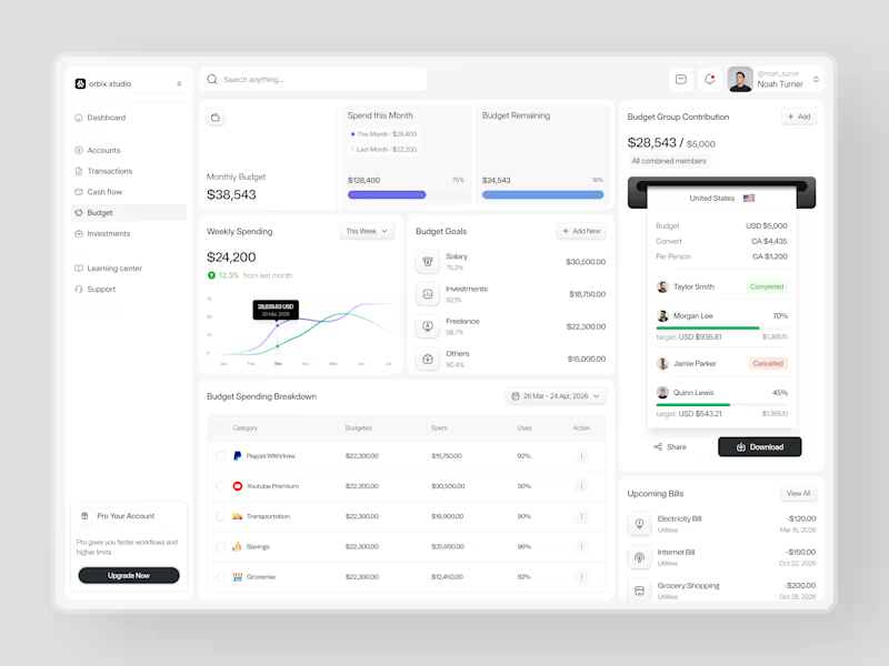
Most people set a budget once and forget it exists until it's too late.
This dashboard was designed to fix that. Weekly spending at $24,200, up 12.5% from last month. Monthly budget at $38,543 with 75% already allocated. Budget goals tracked by category salary, investments, freelance, and others each with a completion percentage and a dollar target that makes progress visible before the month ends.
The group contribution panel takes it further. Four members. One shared budget of $5,000. Taylor completed. Morgan at 70%. Quinn at 45%. Jamie cancelled. A collaborative finance tool that makes shared budgeting feel as clean as personal budgeting should.
Upcoming bills electricity, internet, grocery listed before they hit. A spending breakdown table that shows exactly what was budgeted, what was spent, and how much is left in every category.
This is what budget management looks like when the design treats users like they actually want to be in control of their money.
Does this feel like a dashboard that would change how a team manages their finances together? 👇
Designed by Orbix Studio
Tools: Figma
#DashboardDesign #FintechUI #BudgetApp #UIDesign #WebDesign #ContraFreelance #ProductDesign #SaaSUI
11
31
3.7K

I Design & Build for Founders, Brands, Startups via UX & AI.
- 54
- Followers
I Design & Build for Founders, Brands, Startups via UX & AI.
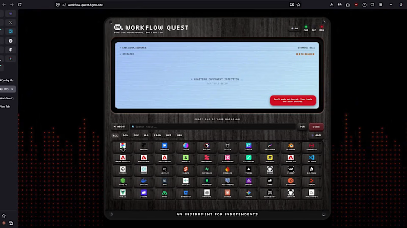
Workflow Quest - An Instrument for Independents.
The Problem
Independent creators and freelancers are overwhelmed by Tool Sprawl, Dashboard Fatigue, and AI Anxiety. Late-night questions like “Am I using the right stack?” or “Is my workflow future-proof?” go unanswered because traditional audits feel like soul-crushing admin work.
The Solution
Workflow Quest transforms dry workflow auditing into a ritualistic, joyful performance — like playing a synthesizer with your operational DNA.
I designed and prototyped a fully interactive, skeuomorphic instrument inside Figma that mimics a high-end Roland JD-Xi hardware unit: desaturated dark wood chassis, physical button depth, glowing indicator LEDs, CRT screen with authentic scanlines, and Web Audio feedback.
How it works
BOOT - Power on with the big red ENGAGE button.
ROLE - Choose your primary operating profile (Designer, Developer, Founder, Marketer, Creator, Hybrid).
SEQUENCE - Build your stack by tapping up to 16 tools from categorized grids with live search. Real-time strand counter and cap enforcement.
CALC - Hit launch and watch the kernel processing sequence with a 140 BPM audio build-up.
RESULTS - Receive your Human Workflow Index (HWI), matched archetype (e.g. Digital Craftsman, Velocity Operator), estimated hourly rate (realistic & capped), and full verified tool stack.
Action Bento - Export/Share, post directly to Discord community, view Leaderboard, get personalized “Missing Strand” suggestions, market-demand insights, AI prompt copy, and leveling tips.
Standout Details Built in Figma
Complete 6-state machine with smooth transitions
Responsive mobile-first layout with locked rows for neurodivergent clarity
Interactive tool sequencer with synergy potential and hard 16-strand limit
Real-time terminal readouts and compiler-style processing log
Beautiful shareable Datacard output (example attached)
Integrated Discord community button for instant sharing & connection
Insight panels that teach optimization and combat AI anxiety
Why this matters
It turns your tool collection from a chaotic list into a visible extension of your craft and identity. It rewards intentional stacks, proves human + AI leverage, and gives creators a prestigious badge they actually want to share.
Live Prototype: https://workflow-quest.figma.site
(https://workflow-quest.figma.site)Figma Community: https://www.figma.com/community/file/1649685026382544146/workflow-quest-an-instrument-for-independents
X Post: https://x.com/mdrafat007/status/2067863323270684849?s=20
Linkedin: https://www.linkedin.com/posts/mdrafat_mohammad-rafat-mdrafat007-on-x-activity-7473629527621939201-W8jM?utm_source=share&utm_medium=member_desktop&rcm=ACoAAA2IV08BNAmBNxKdKo9nZ14s-Y0ftTR1gYs
This project is a love letter to independent builders - blending hardware nostalgia, gamification, digital wellness, and career leverage into one addictive instrument. It’s production-ready in spirit and deeply fun to use.
Extremely open to feedback from the judges and Figma community. If it resonates, I’d be thrilled to see it out in the wild helping other independents.
Built For Independents, Built For You 🔥
#ConfigMakeathon #Figma #Skeuomorphism #WorkflowDesign #CreatorEconomy #IndieHacking
7
5
913
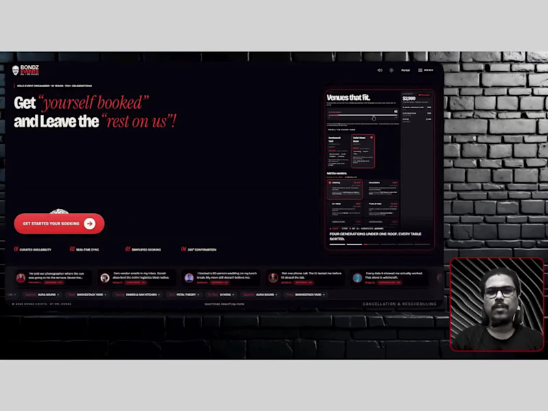
Planning a milestone event shouldn’t feel like running an air traffic control tower from your inbox.
You know the drill: you want to celebrate a wedding, corporate events, milestone birthday, or anniversary. You find a venue you love, but their open Saturday doesn't work for the caterer. You scramble to find another date, but now the caterer is booked. Three weeks, nine different vendor quotes, and 30 back-and-forth emails later, you’re exhausted before the party even starts. The worst.
So I built Bondz Events. The problem I wanted to solve: eliminate multi-vendor booking chaos and turn high-touch event planning into a synchronized, single-sitting digital experience.
See it in action here: https://bondzevents.lovable.app
The booking canvas lets clients pick their vibe, select a venue or home setup, and assemble their curated vendor dream team, from live grill catering and craft lighting to DJs and cinematics. Behind the scenes, an intelligent 75-day multi-calendar availability engine checks everyone's schedules simultaneously. A date turns green only if the venue, Mr. Bondz, and every single selected partner are 100% available, zero double-booking, zero post-deposit cancellations. Everything wraps up with a high-contrast digital signature pad and with 360° confirmation feedback the moment you tap to lock in your deposit.
Behind the curtain, the dual-sided Owner's Portal keeps the entire ecosystem in sync. Mr. Bondz has a master command center to monitor live revenue, confirmed dispatches, and incoming requests. Meanwhile, partners have their own dedicated view to inspect work orders and toggle blackout dates that update front-end client availability in real time.
Built and deployed natively with Lovable and engineered with Web Audio synthesis and editorial visual.
Less phone tag for the client, zero scheduling conflicts for the vendors.
The celebration is bespoke. Locking it in shouldn’t be a headache. 🥂
See Social posts:
X: https://x.com/mdrafat007/status/2105906188852539804?s=20
LinkedIn: https://lnkd.in/p/gqiMf_he
See the demo walk through and the build process below.
2
2
608
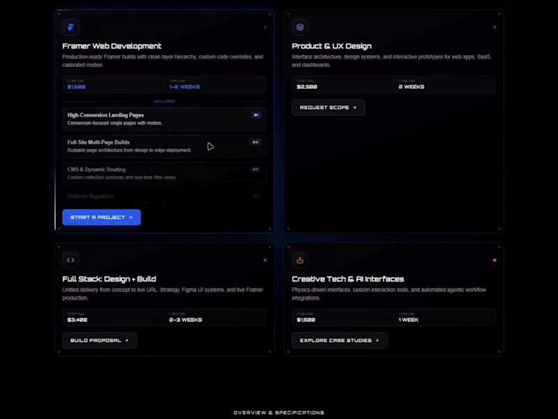
Most portfolio and agency service sections have a conversion problem: they're either a boring list of bullet points or a clunky table clients scroll right past.
When clients visit your site, they only want to know 3 things fast:
1. What you do?
2. What’s included?
3. Your rate & timeline?
So, I built a plug-and-play Universal Service Card component for Framer Creators to resolve this.
Hover on desktop (or tap on mobile) to smoothly reveal deliverables, starting rates, and turnaround times with zero layout shift.
• Dark-mode luxury design with subtle glows
• Shows full scope without cluttering your page
• 100% editable in Framer's sidebar (no code needed)
• CTA for each service category
• Drop into your site and publish in 2 minutes
Upgrade your service section before your next client pitch.
👉Copy the Component on Framer Marketplace: https://framer.link/YC4C8L3
0
277
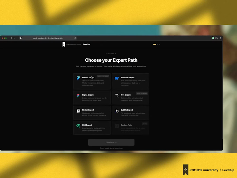
Designed a product for Contra that doesn’t exist yet for the independents.
LevelUp from Contra University - Learn the skill. Earn the badge. Get the client. (https://contra.com/p/27rRAW2O-level-up-edtech-platform-design-for-contra-university?referralExperimentNid=DEFAULT_REFERRAL_PROGRAM&referrerUsername=mdrafat_bondz)
A free 42-day sprint that turns freelancers into verified Contra Experts.
• AI-powered personalized roadmap
• Accountability partner
• Public learning journal
• Verified Expert badge on your Contra profile
Not a mockup. A fully working prototype.
Not just a concept. A complete business case.
→ Why this makes Contra stronger
→ Why freelancers with this badge charge significantly more
→ Why this gives Contra a clear advantage over every other platform
From the memorable AI terminal animation to the full dashboard and the Learn → Earn → Active + Passive flywheel, every detail was carefully crafted to strengthen Contra’s entire ecosystem.
Would love your honest thoughts on this concept.
Detailed case study + live prototype 👇
Prototype: https://contra-university-levelup.figma.site
(https://contra-university-levelup.figma.site)Case Study: Check it out (https://contra.com/p/27rRAW2O-level-up-platform-design-for-contra-university)
#LevelUp #ContraUniversity #contralabs #ProductDesign #BuildInPublic
15
17
1.7K

UI UX Designer • Website, Mobile & Web App • Figma Expert
- 44
- Followers
UI UX Designer • Website, Mobile & Web App • Figma Expert

Most habit apps fail, not because the features are bad, but because nothing rewards users for showing up.
We just designed a gamification system for a habit-changing app, and here's the thinking behind it:
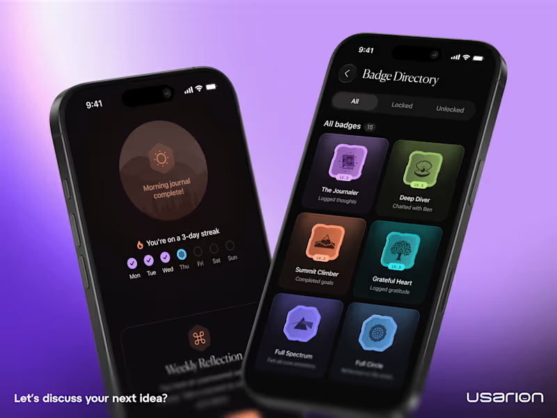
When someone logs a habit for 3 consecutive days, they earn a Bronze Spark badge. At 7 days, Silver. At 14, Golden. At 21, Diamond.
Sounds simple. That's the point.
The psychology is straightforward, variable reward schedules and visible progress markers are two of the most reliable drivers of repeated behavior. When users can see their streak history, see the next badge within reach, and feel the weight of breaking a chain they've built, they come back.
From a business perspective, this is retention design. Every additional day a user stays active increases their lifetime value and their likelihood of upgrading, referring others, or leaving a positive review.
A few design principles we followed:
→ Show progress, not perfection. The timeline shows both earned and upcoming badges.
→ Keep it calm. Muted tones for the app, vibrant tones for the rewards. The badge should feel like the highlight of the screen.
→ Make the next milestone visible but not stressful. The partially revealed Diamond Spark creates healthy aspiration.
Gamification isn't about making an app "fun." It's about aligning user goals with product goals. When done right, both sides win.
Curious what gamification patterns have worked for your products?
Let's discuss.
2
1
234
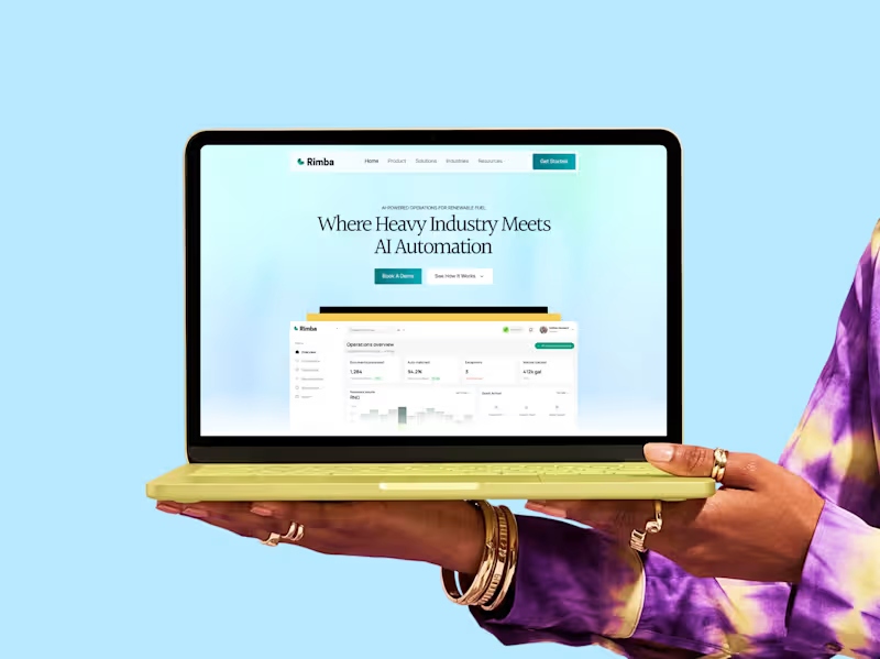
Rimba: AI Automation for Energy & Industrials
Rimba is an AI automation platform for Operations, Supply Chain, and Compliance teams in energy and industrials. Built for Oil & Gas, Power & Utilities, Mining & Metal, Supply Chain and Logistics, Chemicals, and Manufacturing.
For this project, I designed the brand and product interface to turn complex, high stakes workflows into something clear and easy to trust. The result is a system that feels as solid and dependable as the industries it serves.
If you are looking for a designer who can bring clarity to complex products, I would love to work together.
Book a free call: https://cal.com/jayuiux/30min?overlayCalendar=true
1
2
170

Real Estate Attorney Website Design for Brian Gormley, ESQ
Brian Gormley is a real estate attorney who also works as a business mentor, workshop leader, and public speaker. He came to us needing a website that could serve two audiences at once: clients looking for legal representation, and professionals looking to book him for mentorship or speaking engagements.
We designed a site built around clarity and trust. The hero section introduces Brian immediately with bold typography and a confident portrait, then guides visitors into clear paths based on what they're looking for
1
4
176

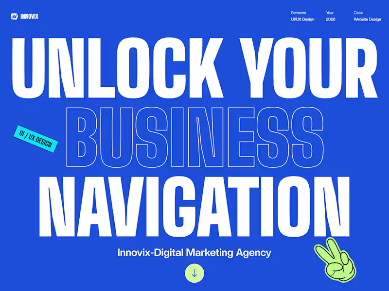
Digital Marketing Agency Website Design, UI/UX Services
Designed a premium website for a digital marketing agency offering SEO, Paid Ads, AI Visibility, and Web Development. Dark aesthetic, strategic CTAs, and clear service communication built to drive business inquiries.
What I Built:
High-fidelity UI designs with responsive layouts for mobile, tablet, desktop. Interactive prototypes, design system documentation, and conversion-optimized CTAs.
Services I Provide:
- Website UI/UX Design (SaaS, Agency, E-commerce)
- Landing Page Design (high conversion focus)
- Design System Creation
- Interactive Prototypes
- Responsive Design
Perfect For:
Digital marketing agencies, SaaS platforms, and service-based businesses that need websites that convert.
2
3
237

Expert UI/UX Designer with 10 Years of Experience
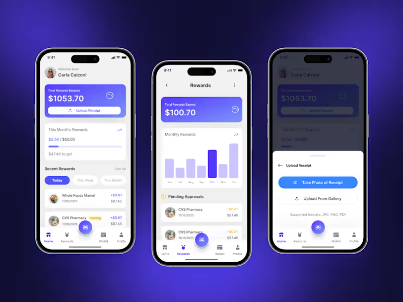


Product Design Partner for SaaS & AI teams
Product Design Partner for SaaS & AI teams