Freelance Financial Advisors in Dhaka
Sign Up
Post a job
Sign Up
Log In
Filters
2
Projects
People
Abdul Awal
pro
Dhaka, Bangladesh
Webflow, Framer, Astro, WordPress & Shopify Agency | UI/UX
New to Contra
Follow
Message
Webflow, Framer, Astro, WordPress & Shopify Agency | UI/UX
0
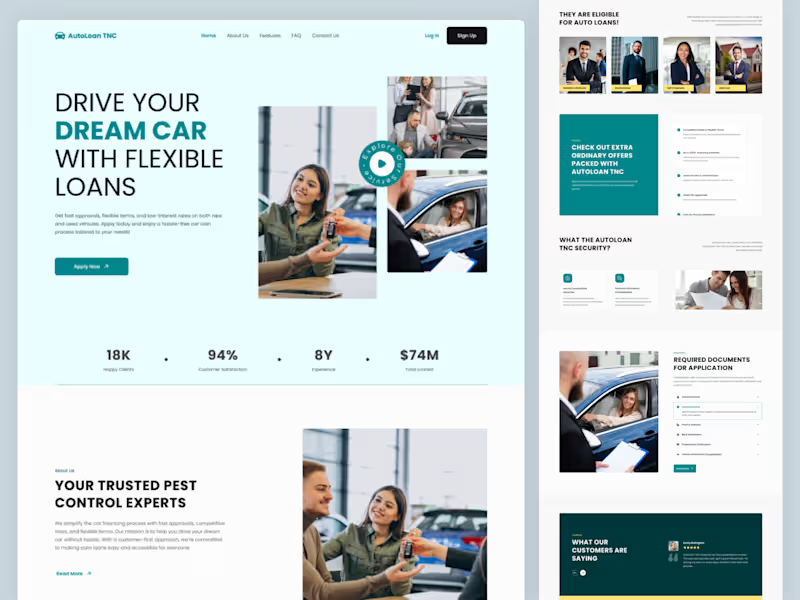
AutoLoan TNC - Professional Services Website Template
0
6
0
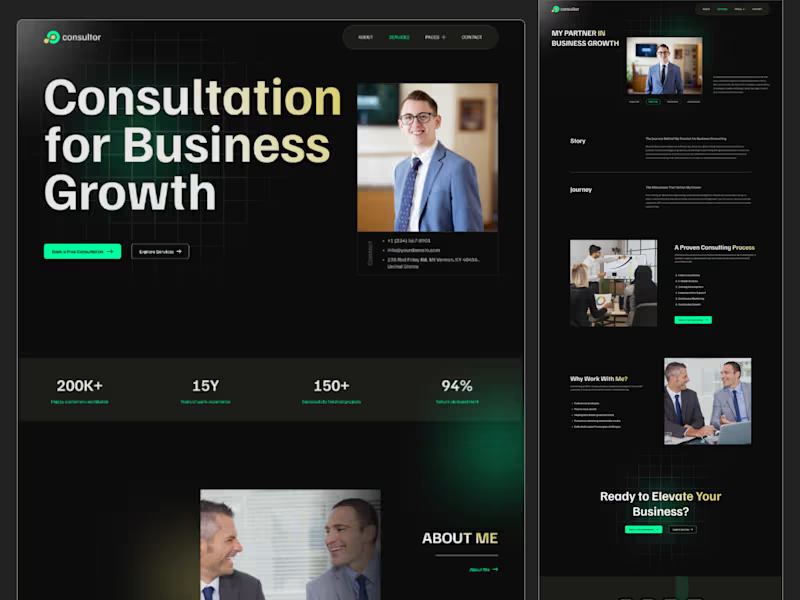
Consultor - Portfolio & Agency Website Template
0
7
0
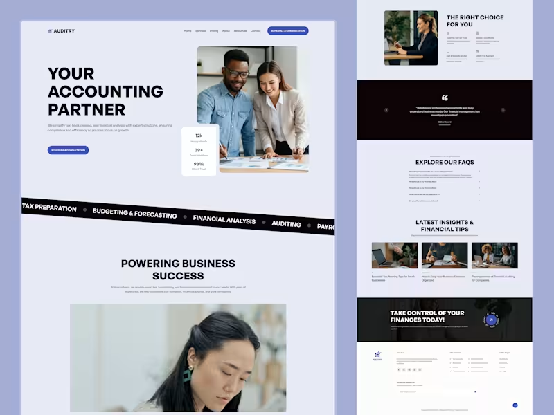
Finance & Accounting Website Design - Auditry
0
4
1
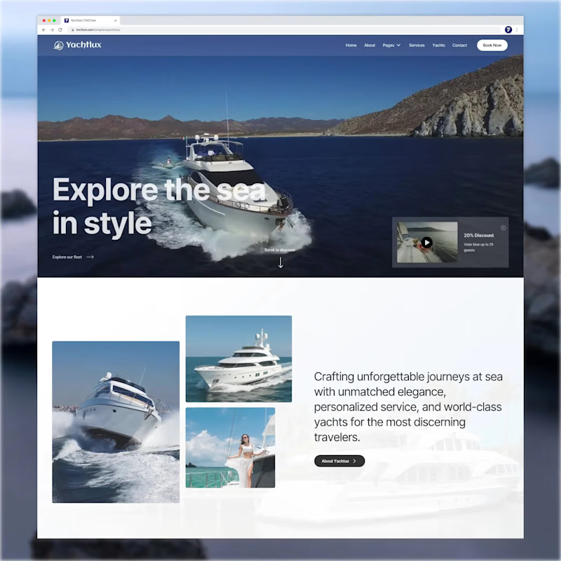
Luxury Yacht Rental Business Website template created as Figma, Webflow, Astro, Framer versions.
1
253
Financial Advisor
(3)
Follow
Message
MD Emdadul Ahsan
Dhaka, Bangladesh
Logic-Driven UX Design with Attention to Detail
Follow
Message
Logic-Driven UX Design with Attention to Detail
0
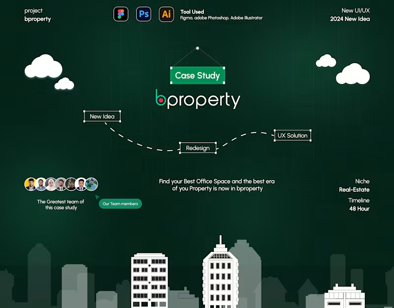
bproperty Reimagined: A UI/UX Revolution Case Study
0
3
0
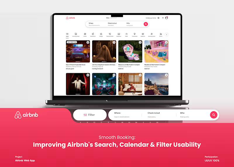
Improving Airbnb's Search, Calendar & Filter Usability :: Behan…
0
3
0
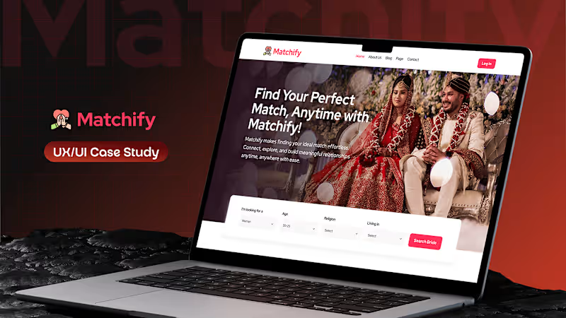
Matchify Case Study Redefining the Matrimony Experience :: Beha…
0
5
0
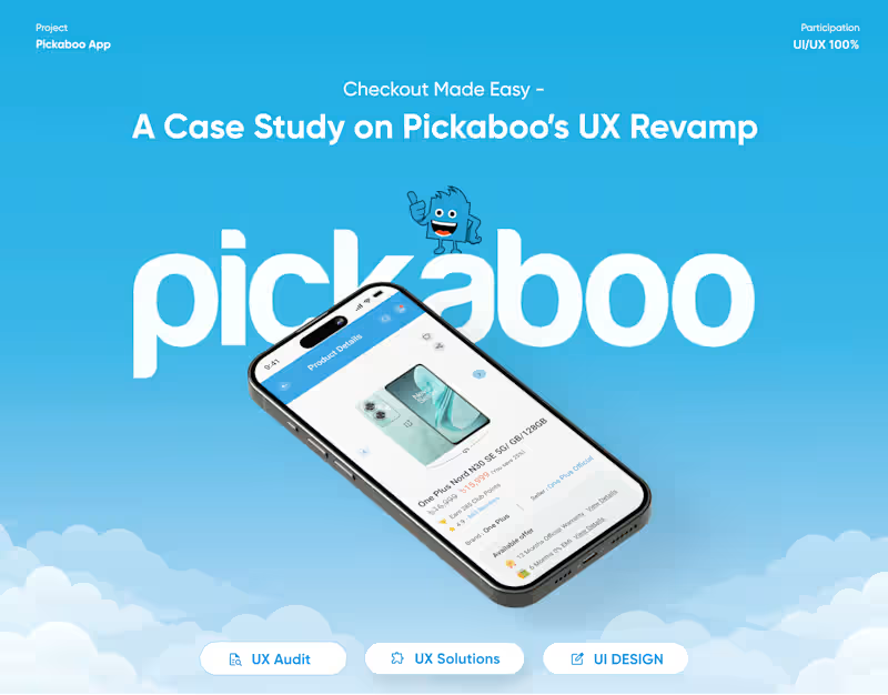
Pickaboo’s UX Revamp Case Study
0
4
Financial Advisor
(2)
Follow
Message
Orbix Studio
max
Dhaka, Bangladesh
UX-led product design & dev agency for b2b saas and AI
$25k+
Earned
1x
Hired
199
Followers
expert
Follow
Message
UX-led product design & dev agency for b2b saas and AI
8
Banking apps scatter your controls everywhere. This one doesn't. Payno was designed to close that gap. Not just with numbers - but with clarity. Dashboard overview: balance, recent activity, spending breakdown. Card management: virtual and physical unified. Spending controls: front and center, not buried. The dashboard handles the daily view - your balance, recent transactions, card status, and quick actions. The spending screen goes deeper - category breakdown, monthly limits showing spent vs available, and transaction insights. The card management screen pulls it all together - unified card control, payment options, and activity history in one clean panel. Three screens. Every financial question answered before it's asked. This is what banking UI looks like when it treats users like adults who want control, not just data. Does this feel like a fintech app that would actually change how someone manages their money? 👇 Designed by Orbix Studio (https://www.orbix.studio/) · See full view 👉 https://www.behance.net/gallery/255260777/Payno-Finance-Solution-Orbix-Studio-Mobile-App Tools: Figma
3
8
408
17
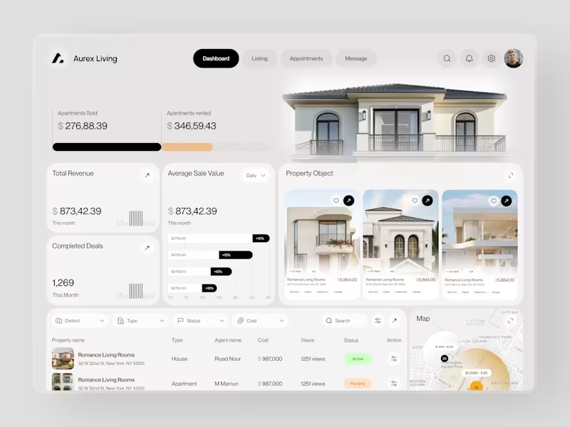
Real estate dashboards are usually built for data entry. Aurex Living was built for decision-making. $873,42.39 total revenue. 1,269 completed deals this month. $276K sold, $346K rented. Property cards, agent tracking, map view, average sale value trending +10% - every number a real estate operator actually needs, on one clean white canvas. Check it out (https://dribbble.com/shots/27350201-Aurex-Living-Real-Estate-Dashboard-Design)
12
17
1.8K
31
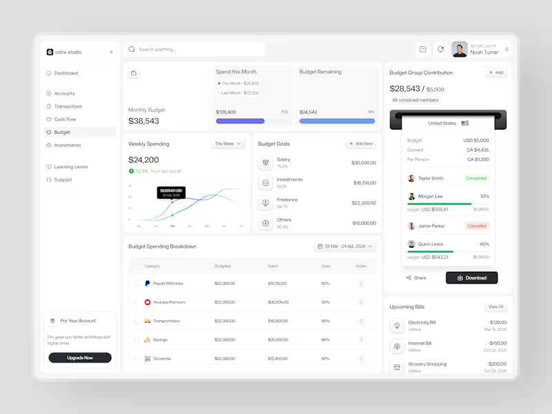
Most people set a budget once and forget it exists until it's too late. This dashboard was designed to fix that. Weekly spending at $24,200, up 12.5% from last month. Monthly budget at $38,543 with 75% already allocated. Budget goals tracked by category salary, investments, freelance, and others each with a completion percentage and a dollar target that makes progress visible before the month ends. The group contribution panel takes it further. Four members. One shared budget of $5,000. Taylor completed. Morgan at 70%. Quinn at 45%. Jamie cancelled. A collaborative finance tool that makes shared budgeting feel as clean as personal budgeting should. Upcoming bills electricity, internet, grocery listed before they hit. A spending breakdown table that shows exactly what was budgeted, what was spent, and how much is left in every category. This is what budget management looks like when the design treats users like they actually want to be in control of their money. Does this feel like a dashboard that would change how a team manages their finances together? 👇 Designed by Orbix Studio Tools: Figma #DashboardDesign #FintechUI #BudgetApp #UIDesign #WebDesign #ContraFreelance #ProductDesign #SaaSUI
11
31
3.5K
25
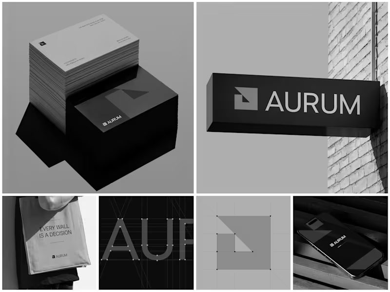
Aurum - Brand Identity System When Aurum came to me, they had a name and a vision a studio that wanted to feel deliberate, architectural, and unapologetically bold in every space it touched. No logo, no system, just a line that stuck with me from our first conversation: "every wall is a decision." That phrase became the seed for the entire identity. I started with the simplest possible geometry a square split by a triangle and built the mark from a strict construction grid so it would hold its proportions at any size, from a business card to a building-mounted sign. Once the mark was locked, I stripped the palette down to black, white, and grey. No color to hide behind just contrast, shadow, and negative space doing the work. From there, the system grew outward: letterpress-style stationery with generous shadow and texture, exterior signage designed to read cleanly against brick and daylight, a minimal mobile app screen, and a tote bag that turned the brand's own tagline into a quiet piece of merchandise. Every touchpoint had to pass the same test does it still feel like Aurum at this scale, in this material, from this distance? The result is an identity that's confident without shouting restrained enough for a business card, strong enough for a wall. Curious how I'd approach building out a system like this for your own brand want to talk through it?
9
25
1.6K
Financial Advisor
(1)
Follow
Message
Mimi Akter
Dhaka, Bangladesh
Grow my UX UI/web design abilities a little more each day
Follow
Message
Grow my UX UI/web design abilities a little more each day
3
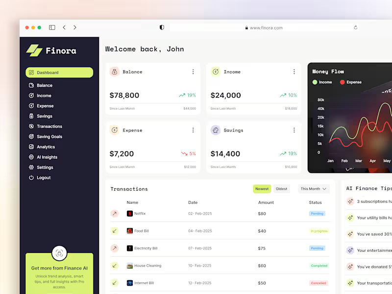
Smart Finance Dashboard UI – Modern Personal Budget Take control of your finances with this modern Finance Management Dashboard UI! Designed for seamless personal budgeting and expense tracking, this dashboard features intuitive navigation, real-time data visualization, and customizable analytics. The clean, minimal interface ensures users can easily monitor spending, set savings goals, and analyze financial trends at a glance. I focused on a user-centric design process, prioritizing accessibility and clarity to empower users of all backgrounds. Interactive charts, smart notifications, and a responsive layout make this dashboard perfect for both web and mobile platforms. Whether you’re a fintech startup or a solo saver, this design delivers both style and substance. Drop your thoughts below!
2
3
173
4
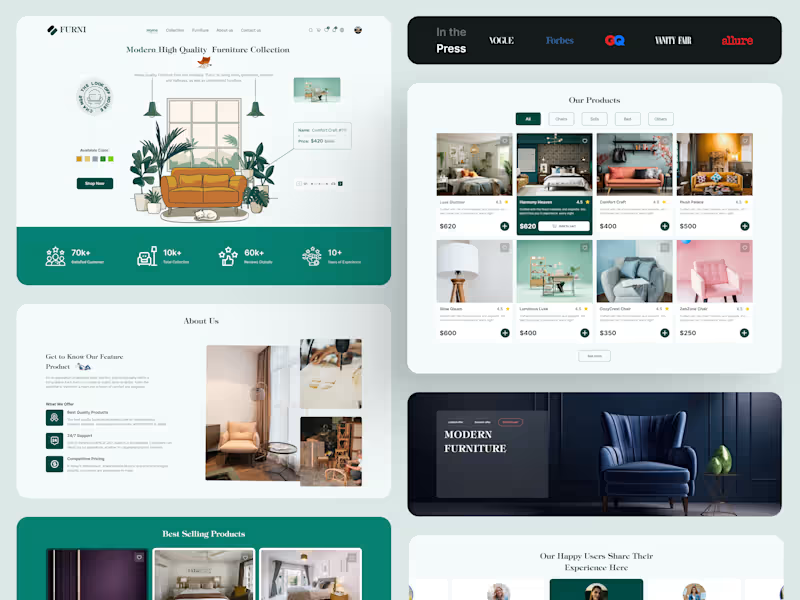
Minimal, Modern & Made to Last – Furniture UI Design
4
4
183
4
Full Restaurant Website UIUX Design
4
4
218
4
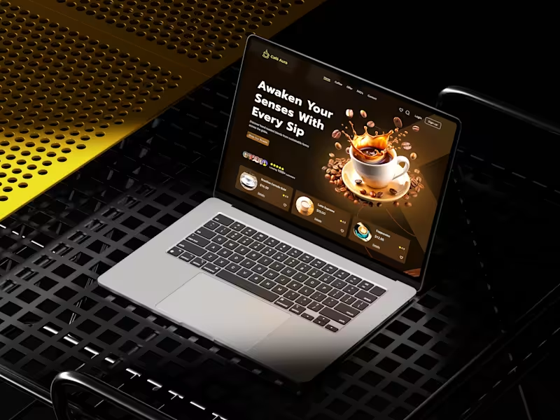
Coffee Website Design Concept
4
4
164
Financial Advisor
(1)
Follow
Message
Md Washik Mannan
Dhaka, Bangladesh
QuickBooks & Xero Advisor | ACCA | 10+ Years

Follow
Message
QuickBooks & Xero Advisor | ACCA | 10+ Years

0
Xero Setup & Custom COA, Products, Contacts
0
137
0
QuickBooks Loan Amortization
0
180
0
QuickBooks Fixed Asset Management
0
141
0
QuickBooks Bank & Card Reconciliation
0
149
Financial Advisor
(6)
Follow
Message
Rajib Miah
Dhaka, Bangladesh
UI/UX Designer | Fintech, EdTech, SaaS, B2B & B2C Designer
16
Followers
Follow
Message
UI/UX Designer | Fintech, EdTech, SaaS, B2B & B2C Designer
0
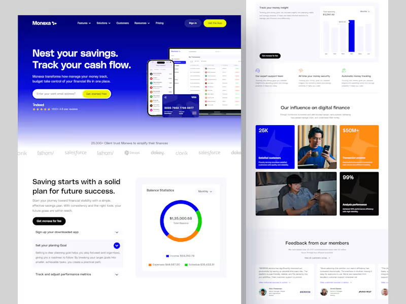
Monexa – Finance Management Landing Page.
0
2
0
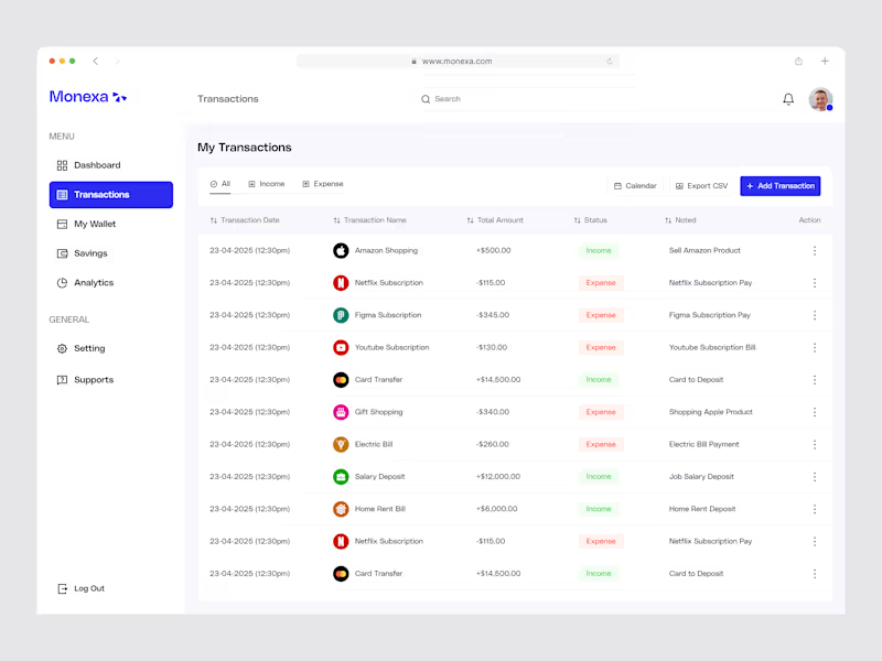
Monexa – Personal Finance Application.
0
1
4
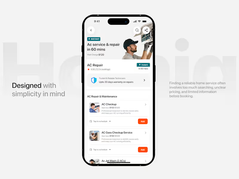
Homiq is a mobile home services platform that makes everyday home maintenance easier and more convenient. The experience helps users quickly discover nearby services, explore trusted professionals, understand pricing, and book services without going through complicated steps. The homepage focuses on fast service discovery, while the service detail experience provides important information such as ratings, pricing, availability, warranty, and service options before booking. The Challenge Finding a reliable home service often means too much searching, unclear pricing, and limited information before you book. The goal was to create a simple, trustworthy, and easy-to-navigate experience that helps users move from discovering a service to booking it with confidence. Key Features → Location-based service discovery → Quick service search → Popular & categorized services → Ratings & booking information → Clear service pricing → Instant service availability → Warranty & trust information → Flexible service scheduling → Add multiple services before booking
4
122
1
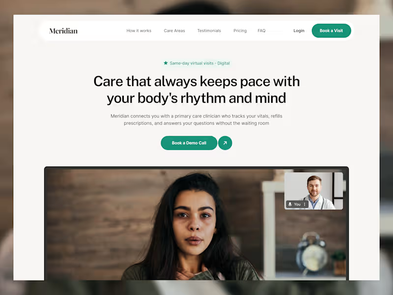
Telehealth Healthcare Platform — UI/UX Design A clean, modern, and user-friendly telehealth website designed to make healthcare simple, accessible, and comfortable. The experience helps users connect easily with trusted healthcare professionals, book virtual appointments, and receive personalized care from home. The platform provides a smooth and reliable digital healthcare experience, helping patients get the care and support they need without the stress of a traditional clinic visit. Key Metrics Upcoming Appointments — View and manage scheduled healthcare visits. Medications — Track medicines, doses, and refill reminders. Messages — Stay connected with doctors and healthcare teams. Health Overview — Get a quick view of your overall health and progress. Health Records — Keep important medical information organized in one place. Vital Tracking — Monitor key health measurements and changes over time.
1
173
Financial Advisor
(2)
Follow
Message
Murad Hossain
Dhaka, Bangladesh
UI/UX Designer crafting modern, conversion-focused digital e
New to Contra
Follow
Message
UI/UX Designer crafting modern, conversion-focused digital e
0
Finance Mobile App
0
2
0
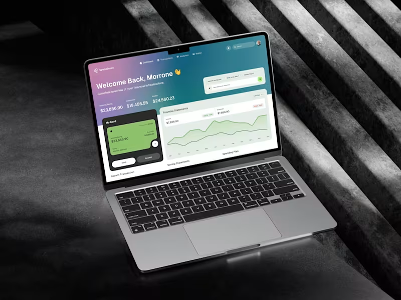
SpendSense AI – Smart Finance Dashboard
0
1
0
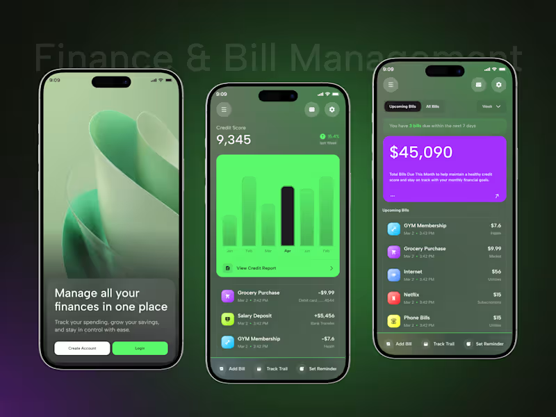
Personal Finance & Bill Management Mobile App
0
2
0
Smart Personal Finance Mobile App Concept
0
2
Financial Advisor
(13)
Follow
Message
Explore people