Web Designer & Framer Expert | Landing Pages, 3D & Motion

Web Designer & Framer Expert | Landing Pages, 3D & Motion
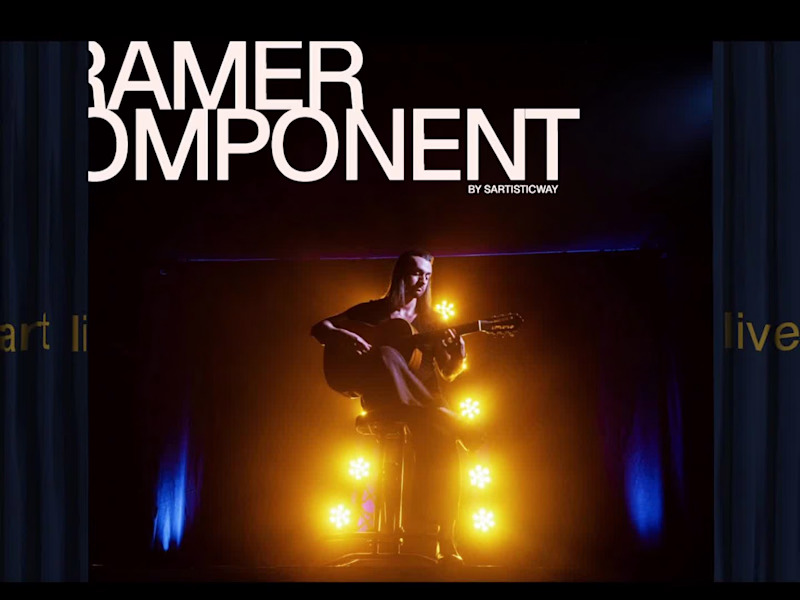
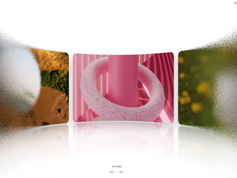
A little grain. A little distortion. A whole lot of interaction. ✳️
Introducing Grainy Carousel — an interactive Framer Code Component I've been building.
I wanted to explore how far a simple horizontal carousel could go when combined with motion, texture and optical effects.
So I brought together:
→ 7 predefined visual styles + custom mode
→ Infinite scrolling with auto-play and drag interaction
→ Procedural grain distortion
→ Adjustable blur effects
→ Concave & convex lens refraction
→ Extensive customization through the Properties panel
One component. Multiple visual directions. Endless ways to experiment.
Built for creative portfolios, digital agencies, editorial websites and immersive landing pages.
Grainy Carousel is now available on Contra.
🔗 Check it out, explore the variations and let me know which style is your favourite.
To integrate in your project, purchase it from here: https://contra.com/products/dg9gbcuK-3-d-grainy-carousel-interactive-framer-code-component
I'm also open to collaborating with teams and founders looking to bring distinctive interactions, motion and 3D experiences into their websites.
Have an interesting web experience in mind? Let's build it.
#Framer #InteractionDesign #CreativeDevelopment #MotionDesign #WebDesign
2
5
617
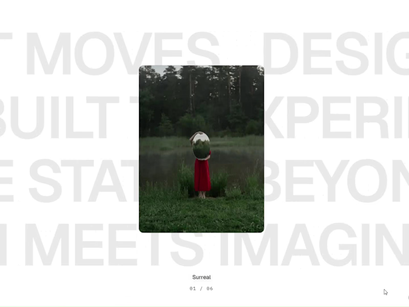
Introducing Fluid Cards — make your designs move.
I’ve been working on something new: Fluid Cards, an interactive Framer component designed to turn static images into a more expressive visual experience.
Think fluid card deformations, sequential flipping animations, scrolling headline tickers and customisable motion — all inside Framer.
What's included:
Fluid, 3D-inspired card deformation
Sequential card-flipping animations
Single-row and multi-row headline tickers
Customisable typography, captions and card links
Adjustable lighting, shadows and motion settings
Flexible controls directly inside Framer
Built for creative portfolios, agency websites, landing pages and visual storytelling.
No complicated setup. Just add the component, customise it and make your layouts move.
Explore Fluid Cards:
🔗 Live demo: https://fluidcards.framer.website/
🛒 Get the component on Contra: https://contra.com/products/ROSwJ0ag-fluid-cards-interactive-framer-component
I'd love to see what you create with it!
#Framer #FramerComponents #InteractionDesign #MotionDesign #CreativeDevelopment #WebDesign #NoCode
2
2
550
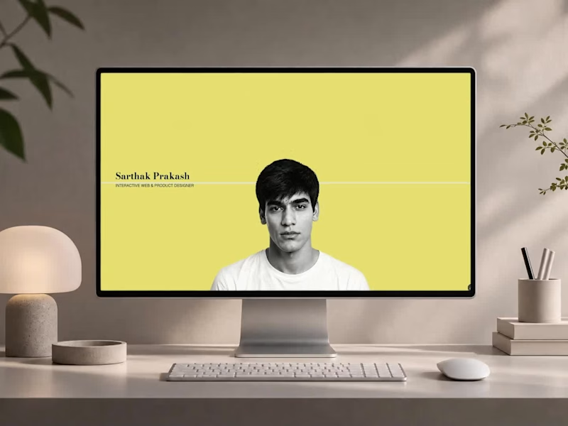
Why I built a 3D mini-game for my design portfolio 👾👇
When I set out to redesign my portfolio, I knew a standard grid of case studies wouldn't cut it. With 4+ years of experience across product interaction, WebAR, and UX design, I needed a space that actually demonstrated what I can build.
So, I built Sartisticway, an immersive web experience developed entirely in Framer.
Here is what I focused on:
🧵 Scroll-Driven Storytelling: Custom SVG paths that dynamically "untangle" as you scroll, guiding the narrative.
🚀 Gamified Skill Discovery: Instead of reading a list of tools, users play "Skill Run"—a custom 3D WebGL mini-game where they pilot a ship to discover my tech stack.
📱 Zero Performance Compromise: Cinematic 3D motion and micro-interactions that run at a smooth 60fps across all breakpoints.
I’ve just published the complete breakdown of my design and development process on Contra. If you are a founder or team looking to build products at the intersection of art and emerging technology, let's talk.
📌 Check out the full case study here (https://contra.com/p/kglEkNA2-immersive-3-d-web-portfolio-design-and-development?referralExperimentNid=DEFAULT_REFERRAL_PROGRAM&referrerUsername=sarthak_prakash_z5j95nca)
🕹️ Play the portfolio (https://sartisticway.in/)
🛠️ Build your own immersive site with Framer
(https://framer.link/sartisticway)✅ Check out other Framer-build experiences: Classical Dance (https://nrityamohana.in/) | Finance (https://sartisticway.in/jbr)
#FramerDeveloper #ProductDesign #UXUI #CreativeTechnology #ContraIndependents #HireMe #WebExperience
2
1
542


Motion Designer | Rive+ Lottie+ AE
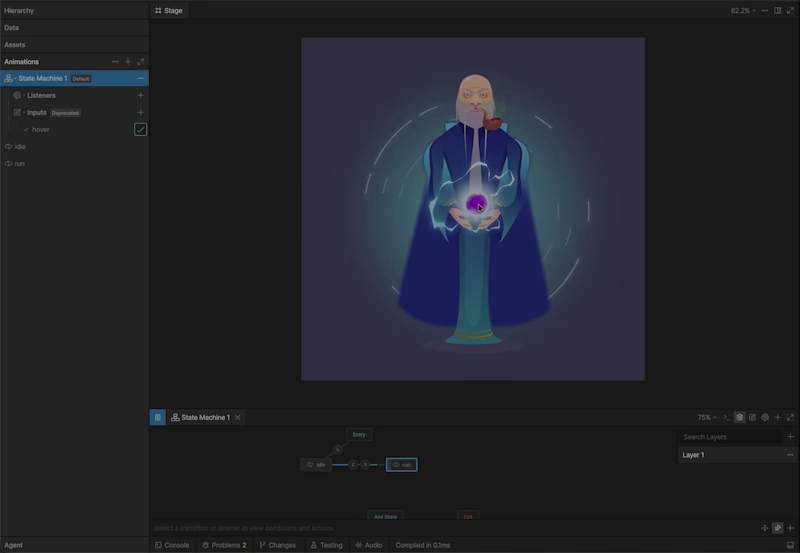
Every time I open Rive (https://www.linkedin.com/company/rive-app/), I learn something new—and I'm amazed by the possibilities this tool offers. Just click on the circle and phew, watch the magic happen.
Excited to dive deeper into Rive and bring these motion principles into other product experiences!
You can play with this on the Rive Marketplace:
https://lnkd.in/gXxcMpPy
(https://lnkd.in/gXxcMpPy)#rive (https://www.linkedin.com/search/results/all/?keywords=%23rive&origin=HASH_TAG_FROM_FEED) #motiondesign (https://www.linkedin.com/search/results/all/?keywords=%23motiondesign&origin=HASH_TAG_FROM_FEED) #uxmotiondesign (https://www.linkedin.com/search/results/all/?keywords=%23uxmotiondesign&origin=HASH_TAG_FROM_FEED) #VFX (https://www.linkedin.com/search/results/all/?keywords=%23vfx&origin=HASH_TAG_FROM_FEED) #productdesign (https://www.linkedin.com/search/results/all/?keywords=%23productdesign&origin=HASH_TAG_FROM_FEED) #UIdesign (https://www.linkedin.com/search/results/all/?keywords=%23uidesign&origin=HASH_TAG_FROM_FEED)
0
342
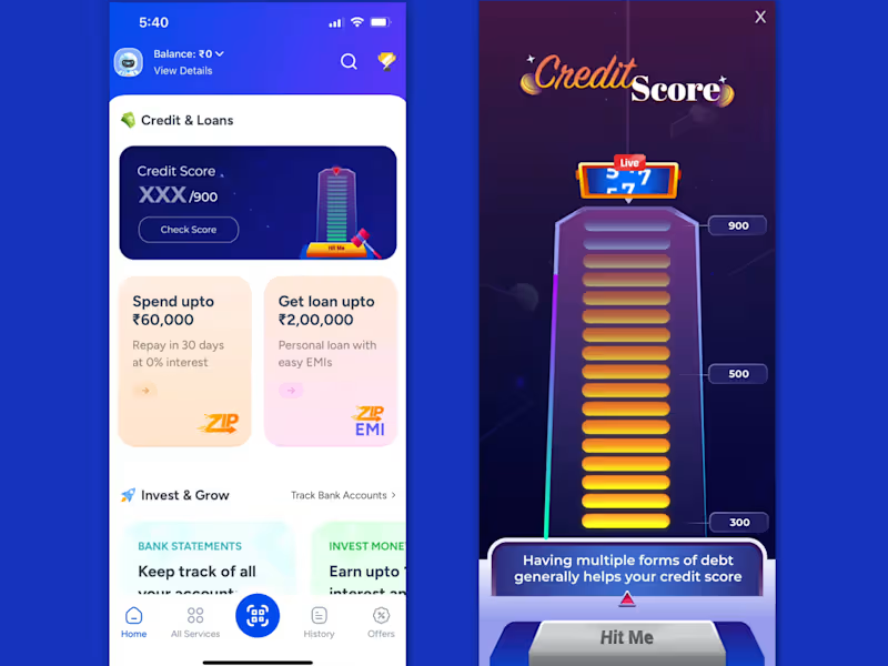
Hammer Arcade Machine – Credit Score Fetching
A playful, game-inspired motion experience designed for MobiKwik’s credit score fetching journey. Since fetching can take 6–30 seconds, the hammer arcade concept builds anticipation and keeps users engaged while their score is being retrieved.
The experience combines delightful animation with trivia questions that educate users and challenge common credit-score misconceptions. Built with Lottie compatibility, the score, timing, and animation duration can be dynamically controlled by developers based on the fetching time.
1
232
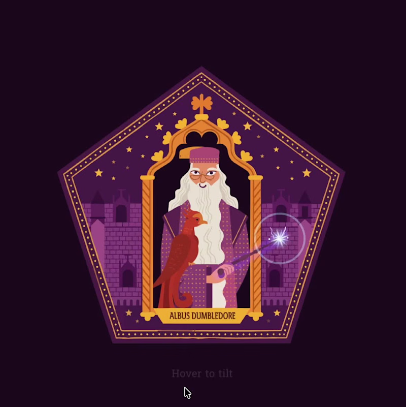
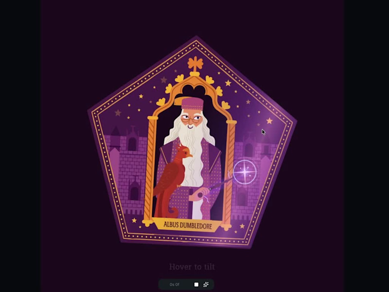

I design and build distinctive Websites for professionals.
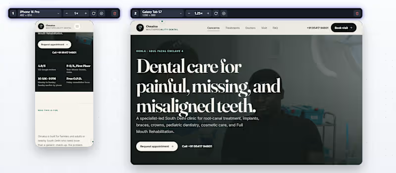
Dental Clinic — Premium Website Experience : Reimagining what a modern dental clinic website can look like.
Instead of following the typical medical-template aesthetic, I explored a cleaner and more editorial visual direction with refined typography, generous spacing, expressive layouts, subtle motion, and a more human approach to the overall experience.
Every section was designed to feel intentional—from the first impression to services, patient trust, and appointment conversion.
PREVIEW LINK: omaisadentistry.vercel.app (https://omaisadentistry.vercel.app)
TELL ME IN THE COMMENTS HOW IT IS ??
1
177
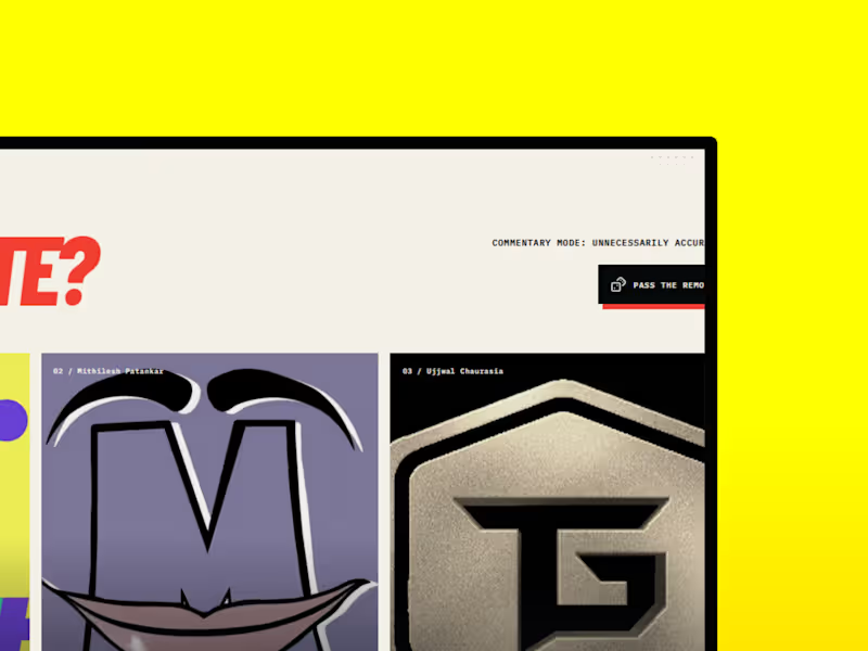
HOMEYS — A Digital Experience Built Around Creator Culture
HOMEYS is a self-initiated website concept created to explore how a creator collective could translate its personality, energy, and content ecosystem into a modern digital experience.
Instead of building a traditional creator website, I focused on creating something immersive, visual, and dynamic , combining bold typography, interactive motion, transitions, content-driven layouts, and a strong visual identity.
The goal
Create a digital home that feels as energetic as the creators themselves while still maintaining a polished, premium interface.
What I worked on
Creative Direction
Developed the overall visual language, composition, typography, color system, and interaction direction.
UI/UX Design
Designed the page structure, visual hierarchy, content sections, responsive layouts, and user flow.
Motion & Interaction
Added animated transitions, scroll interactions, hover states, movement, and other micro-interactions to make the experience feel alive.
Frontend Development
Translated the visual concept into a responsive, interactive website with a focus on performance and smooth interaction.
Design direction
The experience was intentionally built around:
• Bold typography
• High-impact creator visuals
• Dynamic transitions
• Interactive sections
• Strong visual hierarchy
• Responsive layouts
• A modern creator-first aesthetic
PREVIEW LINK: https://homey1.vercel.app/
This project was created as an exploration of how creator brands can move beyond social platforms and build a distinct digital identity of their own.dynamic,
2
220
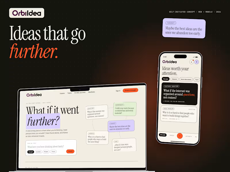
OrbiIdea: Brand + Web & Mobile UI Concept: A self-initiated concept for a social platform where people share unfinished ideas, challenge them together, and turn the best ones into projects. OrbiIdea is a self-initiated product and brand concept: a place where ideas are the main character, not a feed slot.
The problem: Great thoughts are scattered across feeds, comment threads and group chats, so they’re hard to rediscover and rarely get built on.
The idea: An idea-first network built around discovering, discussing, developing and creating. Every idea has its own page with lineage, evidence, open questions and forks, with attribution for every contributor.
What I designed:
• Web and mobile UI (landing, Explore, idea page, Create, Topics, Activity, Profile)
• Sign up and sign in, empty states, notification dropdown, loading screen
• A visual identity system: paper, ink and vermilion palette, editorial serif type, idea stamps, dashed “idea threads” and hard offset shadows.
1
71

UI/UX Designer | Artist | Writer



Senior UX Designer
Senior UX Designer




Webflow, Web Animations Expert & UI Designer
Webflow, Web Animations Expert & UI Designer


Waitlist Experience for a coming running apparel brand - Riverrun . Done in threejs , webgpu , modified shopify backend. Art directed, designed, developed the whole experience to capture early interest on upcoming products. All interest gets saved to shopify customers dashboard of the clients store.
1
1
70


🎨 Freelance UX & Product Design Specialist.🚀
🎨 Freelance UX & Product Design Specialist.🚀



View more →

Graphic Designer, Video Editor, Presentation designer
Graphic Designer, Video Editor, Presentation designer