Freelancers using Procreate in Cleveland
Freelancers using Procreate in Cleveland
Sign Up
Post a job
Sign Up
Log In
Filters
2
Projects
People
Abir Odeh
Cleveland, USA
Logos, brand systems, and shelf-worthy book covers
5.0
Rating
6
Followers
Follow
Message
Logos, brand systems, and shelf-worthy book covers
0
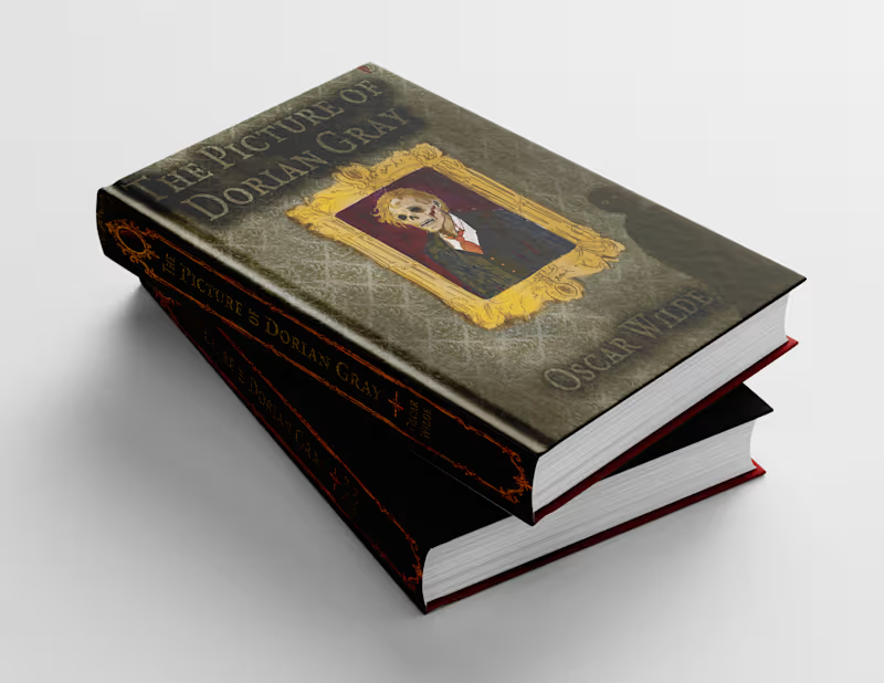
For the mockups, I wanted to see if the cover held onto the feeling I was aiming for: beautiful enough to draw you in, unsettling enough to make you look twice. Here’s the finished Picture of Dorian Gray hardcover from a few angles. What detail draws your eye first?
0
39
1
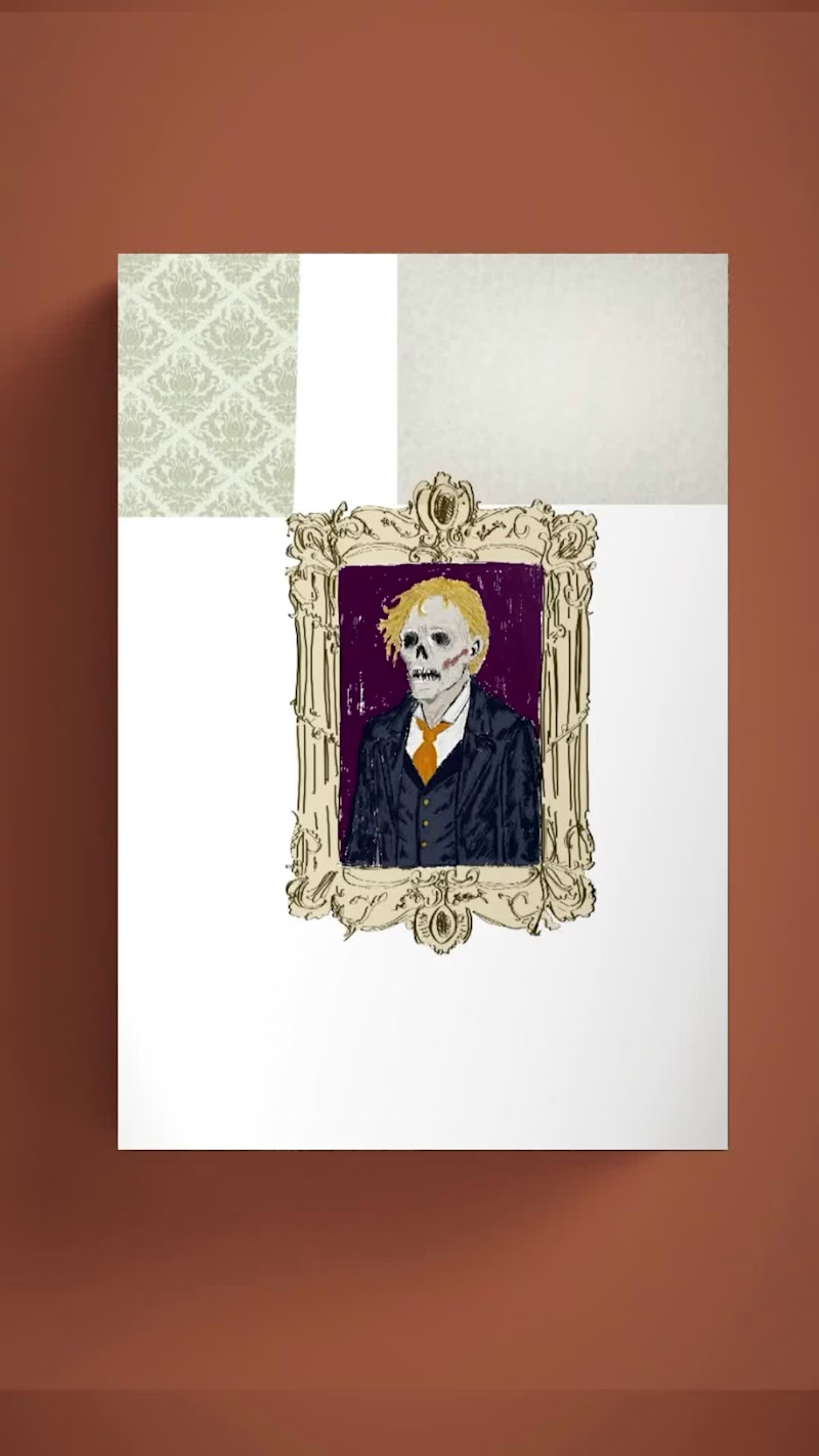
I shared the finished Picture of Dorian Gray cover earlier. This reel shows how I built it, one layer at a time, on the hardcover. Seeing the wallpaper, frame, figure, and textures appear separately makes me notice what each one adds to the story. Which detail does the most work for you?
2
1
44
2
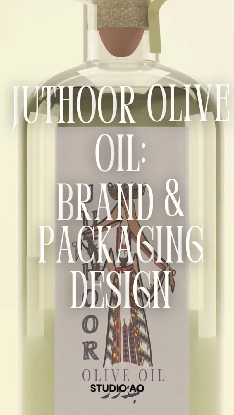
A small behind-the-scenes look at the Juthour Olive Oil identity. This video shows part of the logo illustration process, from the initial drawing to seeing the mark applied on one of the packaging mockups. Since the full brand identity has already been shared, I wanted this post to focus more on the craft behind the mark and how it begins to live on the product. Sometimes the smallest details in a logo are what help the whole brand feel more grounded, intentional, and connected to its story.
2
217
0
Reimagined cover for The Picture of Dorian Gray by Oscar Wilde. The whole book turns on one idea: Dorian stays young and beautiful while his portrait quietly rots in his place, absorbing every sin. The painting becomes a mirror of who he really is while his outward appearance remains untouched. So I flipped the usual setup. The decaying figure lives inside the gilded frame, while Dorian himself becomes the shadow in the corner—faceless, reduced to two pale eyes watching what he’s become. That’s the part of the story I wanted on the shelf. Everything else builds around that idea: sickly green damask wallpaper for a Victorian drawing room gone to rot, a hand-drawn gold frame to represent beauty and vanity, and a restrained color palette where the only real color comes from the red of his tie and the blood. I then layered in distressed textures to make the cover feel less like a design and more like an object that’s been hanging in that house for far too long. The Picture of Dorian Gray is one of my favorite books of all time, so this was an especially fun project to bring to life.
0
221
Procreate
(8)
Follow
Message
Gaia Whitehead
Chattanooga, USA
Creative Graphic Designer for Playful Branding
Follow
Message
Creative Graphic Designer for Playful Branding
0
Real estate ad :Behance
0
7
0
Bee's Fiber arts Banner and Logo : Behance
0
3
0
Digital Illustration Project
0
4
View more →
Procreate
(3)
Follow
Message
Emily Wilson
Athens, USA
It’s all in the details
Follow
Message
It’s all in the details
0
Logo Challenge
0
6
0
Logo for a local business
0
5
0
Handmade by Emily
0
34
0
East TN Funko
0
10
Procreate
(5)
Follow
Message
Explore people