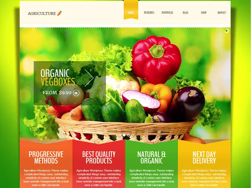
Projects using Figma in Chattogram
Projects using Figma in Chattogram
Sign Up
Post a job
Sign Up
Log In
Filters
2
Projects
People
Message
0
sabbir hossien
pro
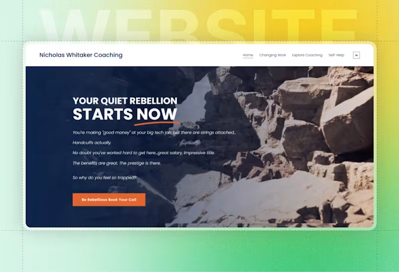
Nicholas Whitaker Personal Brand & Website Revamp
0
5
Message
0
Imran Hosen Sajib
pro
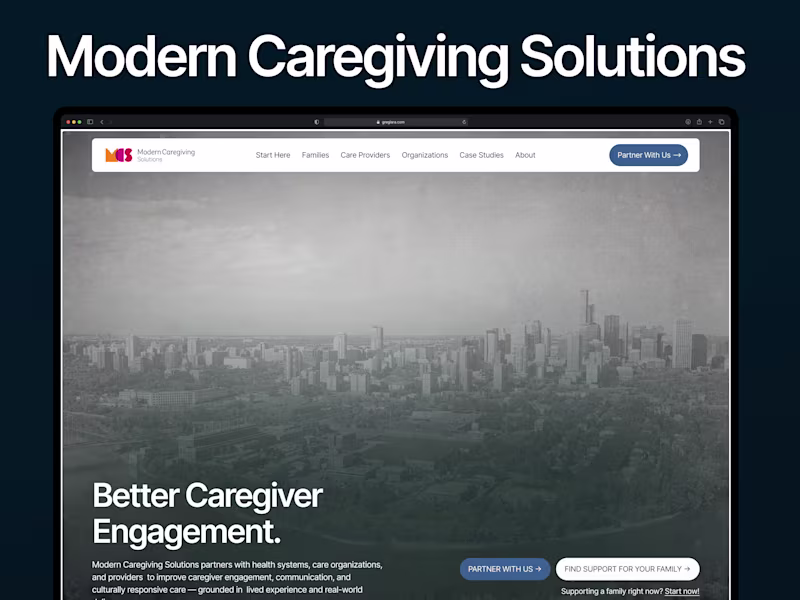
Moderncaregiving Website Redesign
0
2
Message
0
Muhammad Sharf Uddin
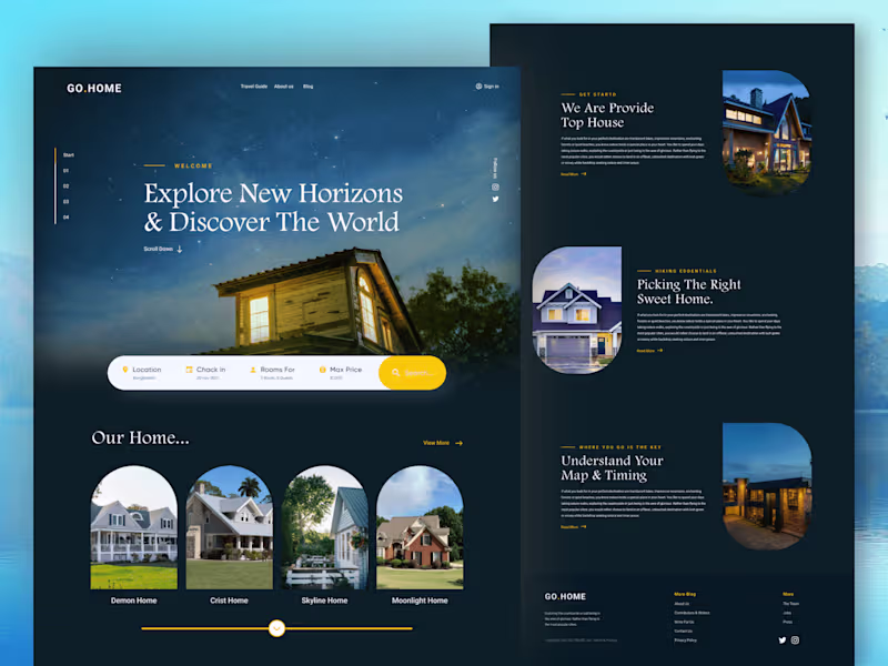
Real Estate Landing Page | Figma
0
12
Message
8
Md Wahidul Islam Murad
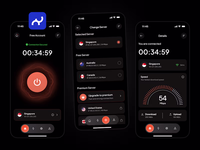
Do you use a VPN? If yes, rate the app design.
6
8
287
Message
0
Mahin Rahman
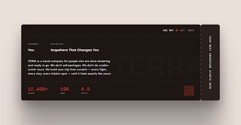
TERRA — Boarding Pass About Section (Framer Component) DESCRIPTION: Every landing page has an about section. Most of them look exactly the same. A headline. A paragraph. Maybe a photo. Nobody reads it. TERRA's about section is a boarding pass. PASSENGER: You DESTINATION: Anywhere That Changes You That one reframe changes everything. Instead of telling users about the company — it puts the user inside the experience before they've even booked. You're already the passenger. The destination is already yours.
0
42
Message
1
Riaz Uddin
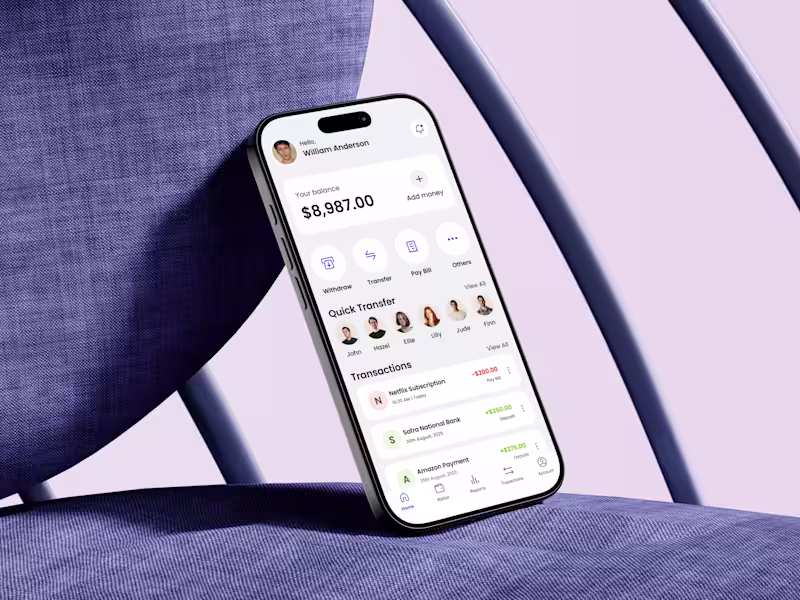
Designing a fintech eWallet home screen is not about showing features—it’s about reducing anxiety. When I started this design, my first question was simple: What does a user need to feel confident within the first 3 seconds? That insight shaped every decision. The balance is placed front and center, not buried, because financial clarity builds trust. Primary actions like Withdraw, Transfer, and Pay Bill are surfaced immediately to reduce cognitive load and eliminate hesitation. No scrolling, no guessing. Quick Transfer is intentionally visual. Faces over names reduce decision time and make money movement feel human rather than transactional. Transactions follow a clear hierarchy with color-coded feedback, helping users instantly understand money in vs money out without reading details.
1
133
Message
2
Farhan Mubin @ RenameLayer
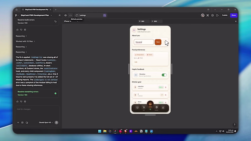
Every recipe app asks what you want to cook. I never know that. I know what's in my kitchen. So I built SlopCook (https://slopcook.figma.site). ADD what you have in your kitchen closet. It tells you what you can make based on those. 🧺 The Cooking Page has a fridge with magnets and stickers. Drag things around. Tap a card and watch the fridge open into cooking mode. Oh u can also add your image to put in the fridge if you want. ⏱️ Cooking page is distraction free. Step by step guides. Timer on each step so you don't burn your spices (I used to do that. A LOT) Built as a PWA so it works on any device. Not a programmer. 150+ prompts. Zeroooo tools outside Figma Make. It actually surprised me. How easy the uiux is + superb consistent This is what I wanted to exist. So I made it. Thank you 😃 @Contra HQ @Figma
3
2
139
Message
0
Md Ahnaf Quayum
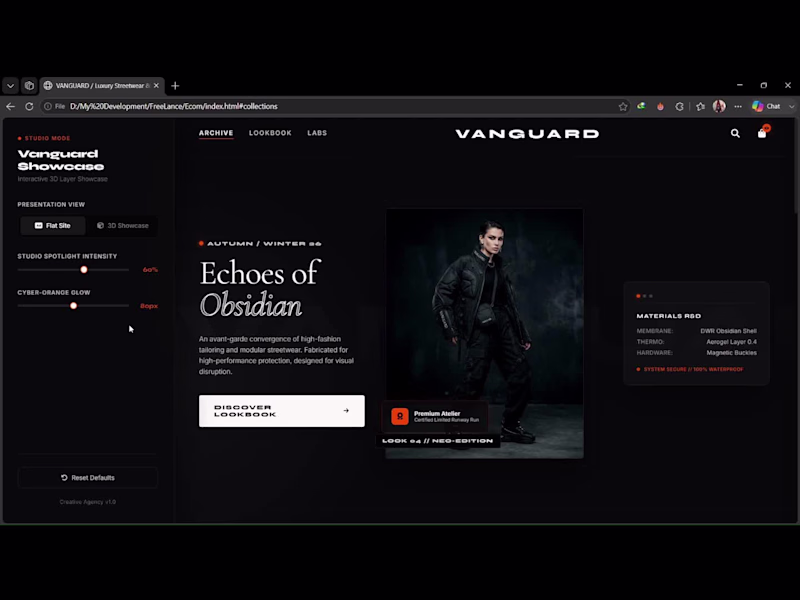
Vanguard is an agency-grade, high-fidelity UI/UX design and frontend development showcase of an ultra-premium, cutting-edge e-commerce Single Page Application (SPA) layout engineered for a luxury high-end fashion and streetwear brand. Built to push the boundaries of modern web layouts, Vanguard blends an editorial fashion-house aesthetic with highly complex, interactive client-side engineering. The application features a custom zero-refresh SPA client router, glassmorphic UI elements, and a hardware-accelerated 3D Interactive Perspective Showcase Mode that transforms the entire flat interface into a tilted isometric canvas responding dynamically to cursor movement on the Z-axis. Designed and developed with a performance-first mindset, Vanguard uses raw, optimized code to handle advanced graphics, seamless loading transitions, and layout customizers smoothly without relying on heavy enterprise frameworks or sacrificing layout precision.
0
20
Message
0
Kakon Ghosh
growwd Branding
0
5
Message
5
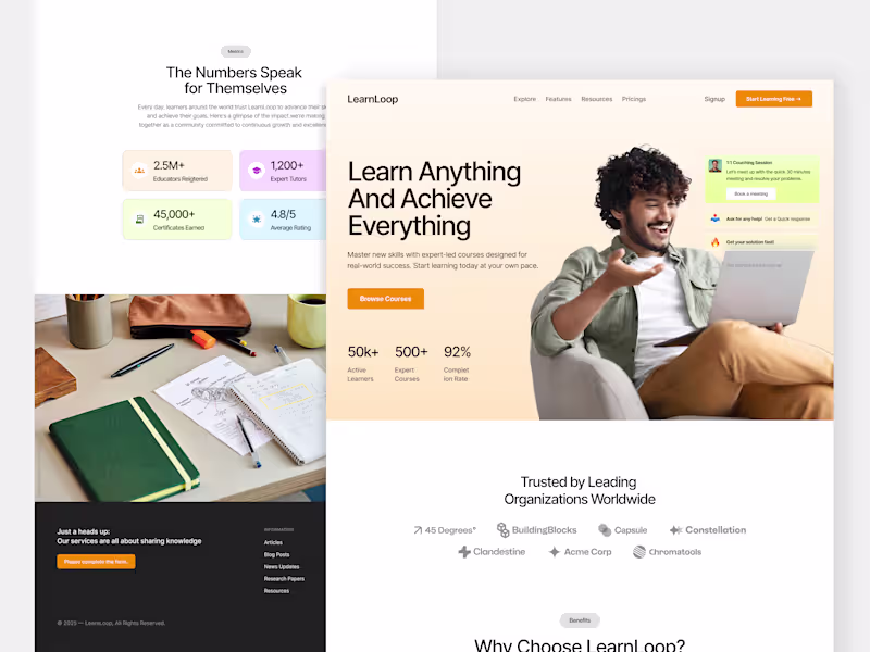
Sadman Sakib
Introducing LearnLoop – Smart, Seamless, and Built for Better Learning! We designed LearnLoop to empower educators and learners with a clear, modern interface and effortless navigation. From structured learning paths to fast, responsive design — LearnLoop makes every learning journey simple, engaging, and impactful. Here’s what we focused on: → Learner-Centered UI → Clean, Minimal Layout → Fast & Responsive Experience → Easy Content Management
2
5
80
Message
0
Mahedi Hassan
Landing page visual
0
5
Message
3
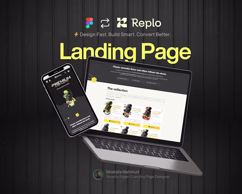
Mostafa (Shopify Expert)
Designed a high-converting Shopify landing page for Wellness brand transitioning to direct-to-consumer sales.
2
3
172
Message
0
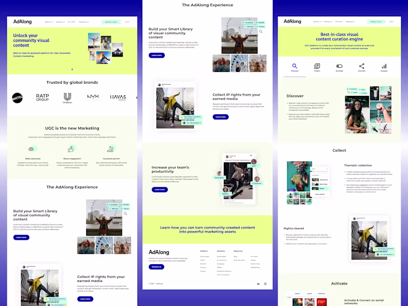
G M Samrat Ali
High-Performance SEO-Optimized Website for Adalong
0
0
Message
0
Md Ziauddin Bablu
Webflow Website for Web design agency
0
19
Message
0
Saeed Adnan
NZXT Keyboard Commercial
0
3
Message
1
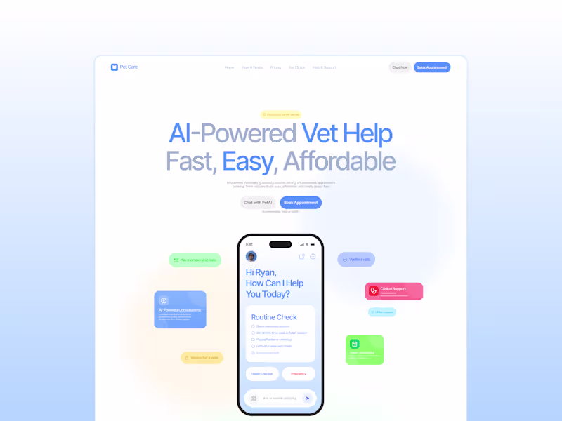
Md Riasad
PetAI
1
1
Explore projects