Freelancers using Final Draft in Cape Town
Freelancers using Final Draft in Cape Town
Sign Up
Post a job
Sign Up
Log In
Filters
2
Projects
People
Nimi Pretorius
Cape Town, South Africa
Building brands people feel something for
$1k+
Earned
5
Followers
Follow
Message
Building brands people feel something for
0
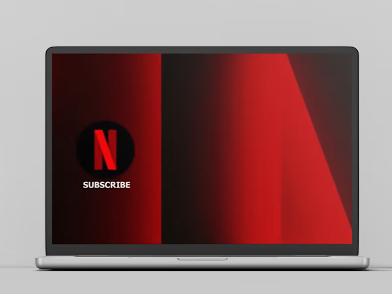
NETFLIX Writing for Netflix: on what happens when advertising discipline meets global storytelling One liner Scriptwriting and creative collaboration with a global creative team for a Netflix production. THE STORY Some projects you can't say much about. This is one of them. What I can tell you is that I was invited to collaborate with Netflix's global creative team on a scriptwriting project, working alongside writers and producers from across the world. It was one of those experiences that quietly shifts something in the way you think. About pace. About precision. About the specific weight of a word in a script versus a word in an ad. About what it means to write for an audience of millions who have chosen, in a world of infinite distraction, to give you their full attention. I brought to that room everything I had learned from 20 years of writing for brands: clarity of intent, economy of language, and an instinct for the emotional truth inside a brief. The discipline of advertising, where every word costs money and every second counts, turns out to be surprisingly good training for everything else. I took home something I hadn't expected: a renewed belief in simplicity. That the hardest thing in any medium is to say exactly what you mean and nothing more. And that when you get it right it feels not like an achievement but like an inevitability. Which is of course exactly how the best work always feels. WHAT IT TAUGHT ME That good writing is good writing, whatever the medium. And that the perspective you bring to a room matters as much as the skill you bring to the page.
0
201
0
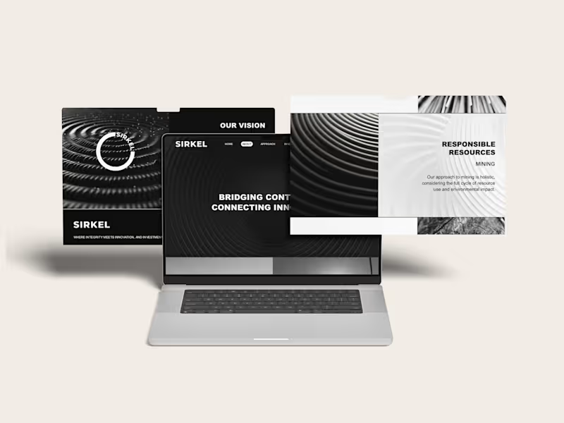
SIRKEL Closing the loop: brand strategy, creative direction and copywriting for a global investment venture Brand strategy, naming, creative direction, visual identity, website and copywriting for Sirkel Ventures, an investment business working across renewable energy, mining and global markets. THE STORY Sirkel was built around a simple idea: seemingly separate opportunities are often part of something much bigger. The business works across industries, markets and geographies, connecting capital, expertise and opportunity. I wanted the brand to make those connections visible. That led naturally to the idea of the circle, and to Sirkel. From there, I built the visual and verbal world around movement, connection and impact. Circles, ripples, loops and repeating forms became a way to show how one investment can create effects far beyond its starting point. The language followed the same thinking. “Bridging continents. Connecting innovators.” “Embracing diversity and creating opportunity.” “Join our Sirkel of change and impact.” The result was a bold, stripped-back identity that could move comfortably between mining, renewable energy and investment without belonging too obviously to any one of them. WHAT IT TAUGHT ME That a good brand idea can do more than hold a business together. It can help make sense of a business that operates across very different worlds. And that sometimes the simplest shape gives you the biggest world to build from.
0
92
0
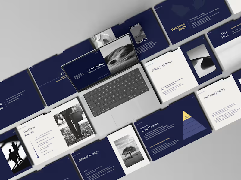
ARNO KEMP The room behind the decision: brand strategy, creative direction and copywriting for an executive coach Brand strategy, positioning, creative direction, visual identity and copywriting for executive coach Arno Kemp. THE STORY Leadership gets lonelier the more senior you become. By the time someone reaches the top of an organisation, they’re usually very good at looking like they know what they’re doing. But behind the decisions, the meetings and the performance, there’s another conversation happening. The one about whether the role still fits. What comes next. And the things you can’t necessarily say to anyone else in the room. That was the territory I wanted to build Arno Kemp’s brand around. I kept coming back to the space before the visible decision. The thinking, doubt and uncomfortable honesty that happens privately, before a leader walks back into the room. That led to the central idea: “The room behind the decision.” From there I built a visual and verbal world that felt intelligent, quiet and assured. Less like traditional executive coaching and more like a private conversation between two people who understand the stakes. The writing followed the same principle. The role used to fit. This isn’t confusion. It’s consequence. What leaders stop saying out loud. You’re still performing. That’s not the same as fitting. The idea carried through the identity, presentation material, social content and wider brand system. WHAT IT TAUGHT ME That the most interesting thing about a service isn’t always what happens in it. Sometimes it’s the moment that makes someone realise they need it. And that when you’re speaking to accomplished people, you don’t need to tell them how to lead. You need to show them that you understand what leadership feels like.
0
61
0
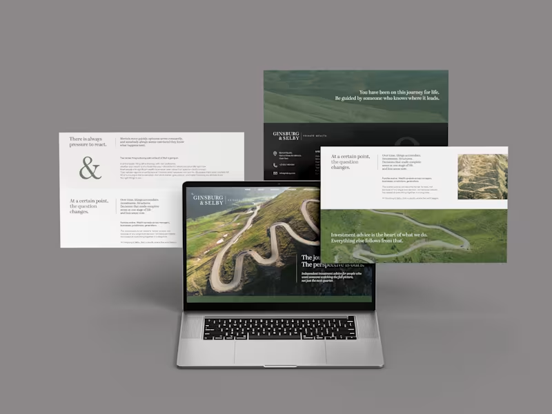
GINSBURG & SELBY The journey is yours. The perspective is ours: brand strategy, creative direction and copywriting for an independent wealth firm Brand strategy, creative direction, visual identity, website and copywriting for an independent private wealth business. THE STORY Money is personal. And the more of life you've lived, the more complicated the decisions around it can become. Ginsburg & Selby had been advising people on those decisions for nearly thirty years. I wanted the brand to feel like that. Experienced, calm and thoughtful, without falling into the usual world of wealth management clichés. I kept coming back to the idea of a journey. By the time someone sits down with a wealth adviser, they've already travelled quite a long way. They've built businesses, raised families, made good decisions and probably a few bad ones. They're not looking for someone to take over the journey. They're looking for perspective on what comes next. That led to the central thought: “The journey is yours. The perspective is ours.” From there I built the visual and verbal world around roads, paths and changing perspectives. The ampersand became an important part of the identity too. It gave me a simple way to talk about the relationship at the heart of the business: client and adviser, experience and perspective, what has been and what comes next. I also wanted the writing to feel unusually unhurried for financial services. Held, not hurried. Knowing what not to change is as hard as knowing what to. You only take this journey once. We have taken it many times. The idea eventually found its way into everything from the website and identity to business cards, outdoor, digital screens, social and print. WHAT IT TAUGHT ME That sometimes the best way to make a financial brand feel more credible is to make it feel more human. And that experience doesn't need to announce itself loudly. Sometimes it can simply say: I've seen this road before.
0
68
Final Draft
(1)
Follow
Message
Explore people