Projects using Adobe Suite in British Columbia
Projects using Adobe Suite in British Columbia
Sign Up
Post a job
Sign Up
Log In
Filters
2
Projects
People
Message
9
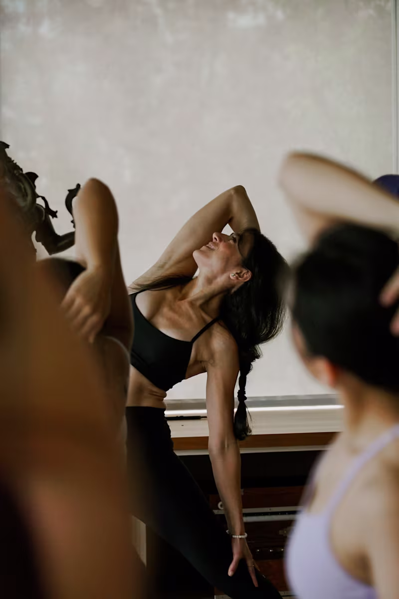
Georgia Mashford
Alo Yoga | Photography
9
131
Message
1
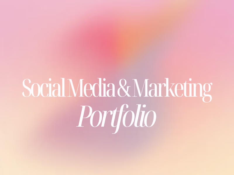
Camila Pichardo
pro
Social Media & Marketing Manager Portfolio
1
17
Message
0
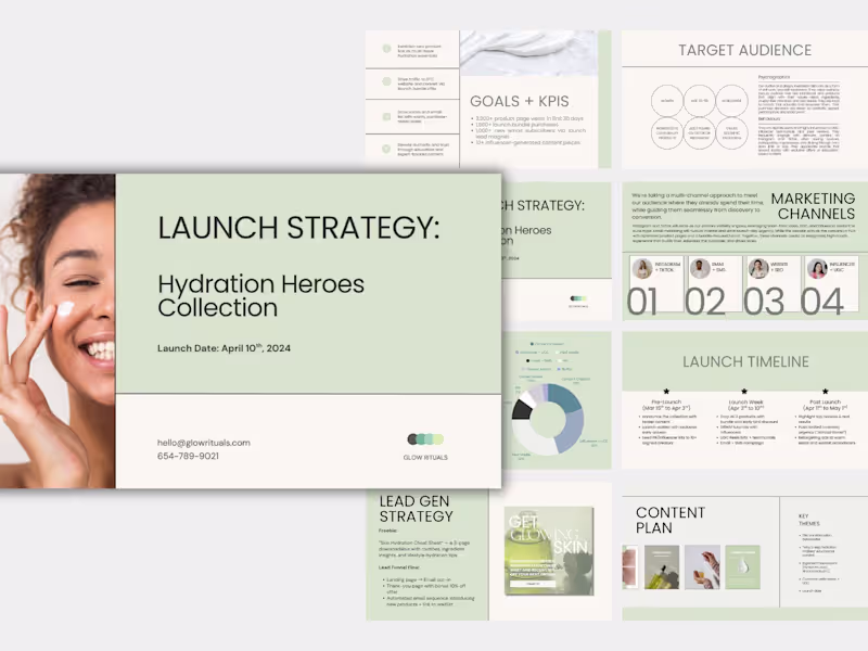
Allie Betts
Glow Rituals Product Launch Campaign Strategy
0
14
Message
0
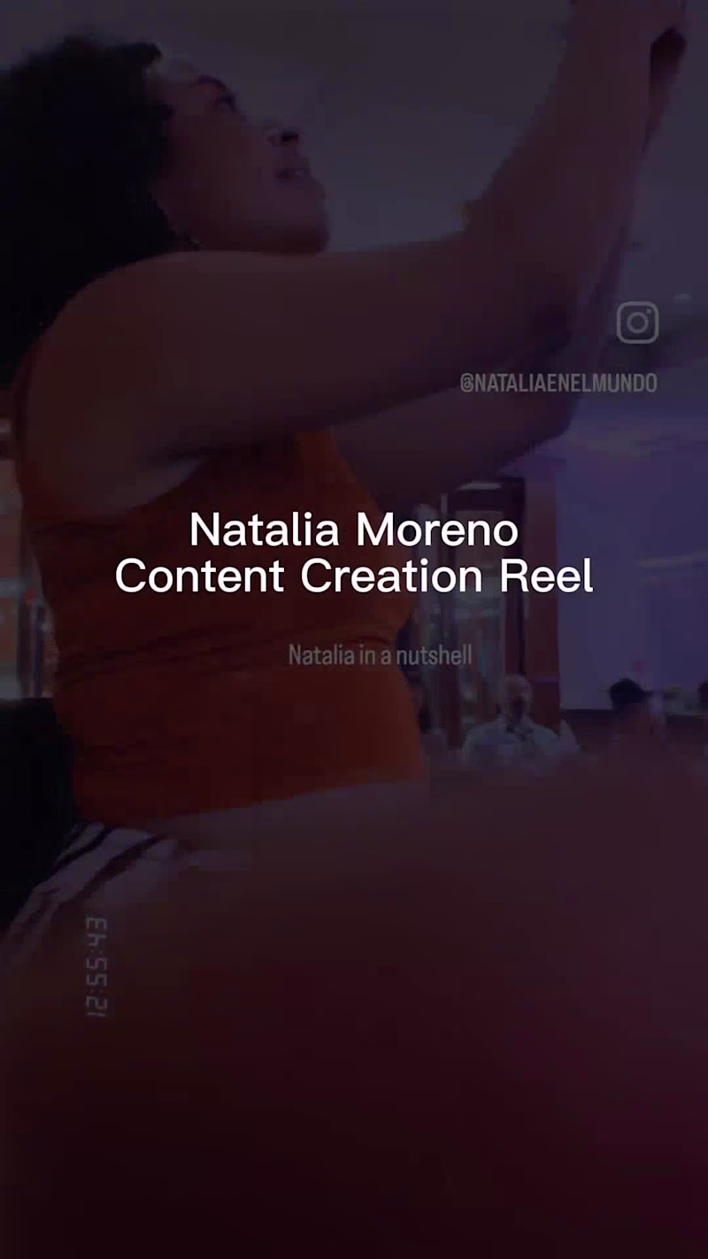
Natalia Moreno Arias
Engaging Video and Visual Content Creation
0
4
Message
1
Yulia Romanova
pro
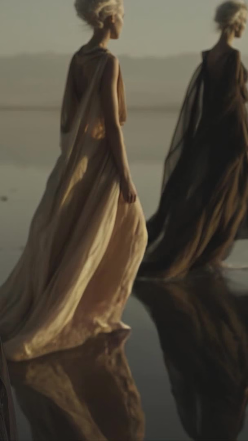
A vertical adaptation of my project The Way, edited into 90-second reels for Instagram. The Way (https://on.contra.com/9wHtP9) is an AI-driven fashion film that explores the duality of light and dark through a high-fashion visual narrative. The goal was to reinterpret mythic themes of unity and transformation via generative media. I developed the concept, visual style, full script, character and environment design; generated all imagery and animation using AI; produced voice-over, lip-sync, original music, and final edit; and refined each scene iteratively to achieve consistent tone, motion, and emotion.
1
161
Message
0
Anna Sobieniak
pro
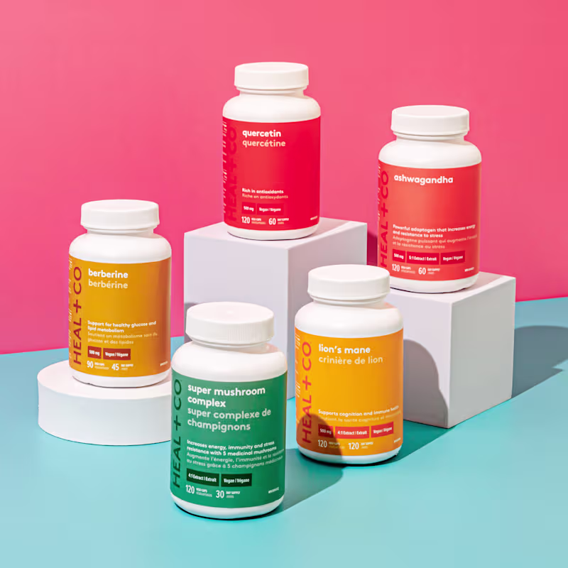
Heal & Co. Packaging & Brand Design
0
2
Message
0
Diana Castaneda
pro
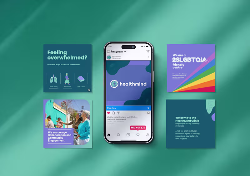
Brand, Web, and Social Design for Counselling Clinic
0
8
Message
0
Sav Holmes
Popup Advice | Podcast
0
5
Message
0
Leonardo Suarez
Abby Connect - Sample
0
3
Message
0
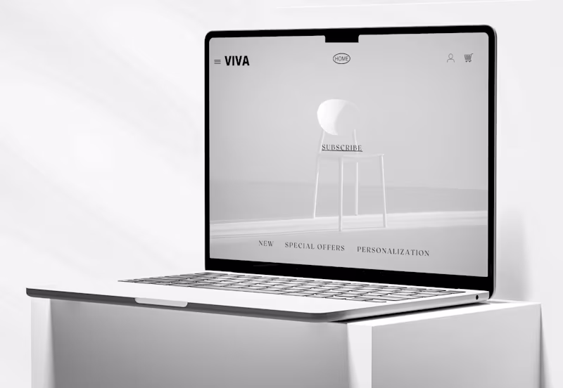
Vanguard Creative Agency
Web Collection★Website Design
0
8
Message
0
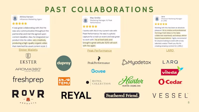
Ato Essandoh
UGC for Brands
0
4
Message
0
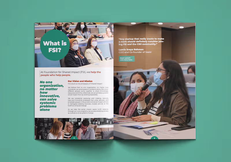
Erika Makino
Foundation for Shared Impact
0
4
Message
0
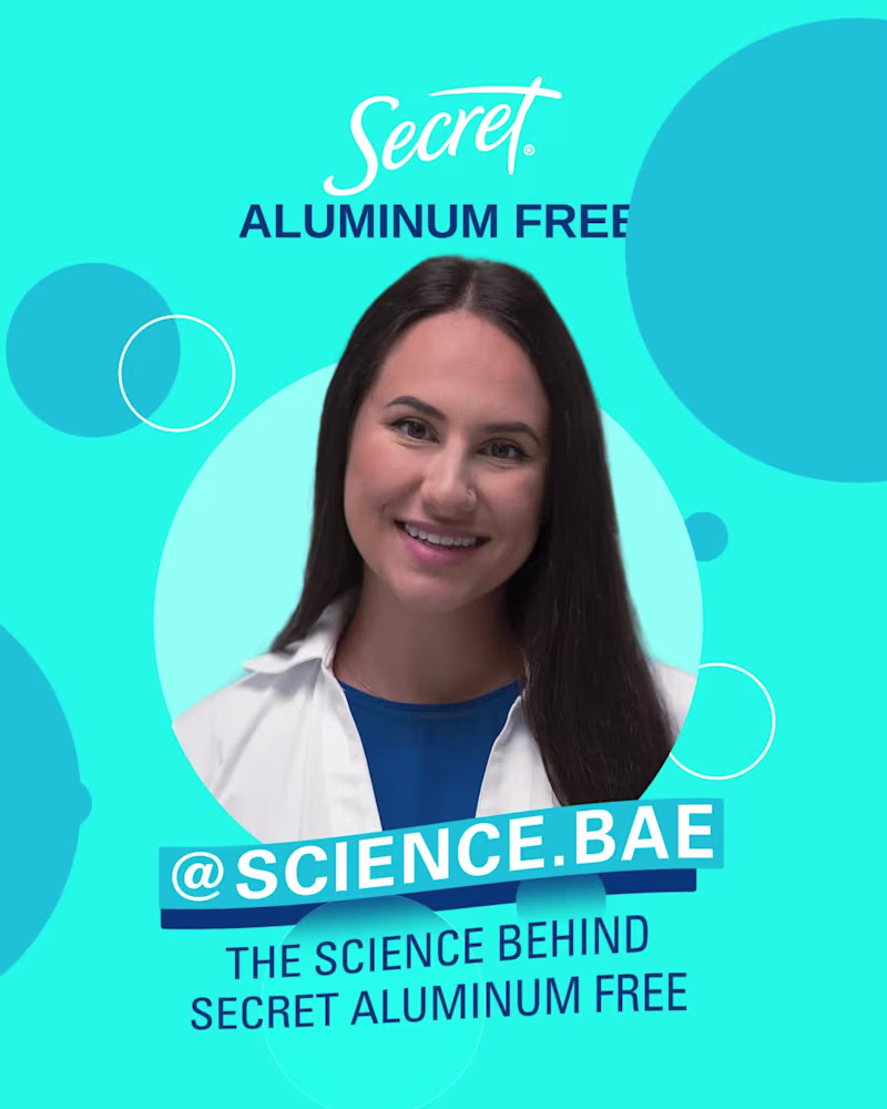
Sonia Bashash
Secret's Aluminum Deodorant
0
3
Message
0
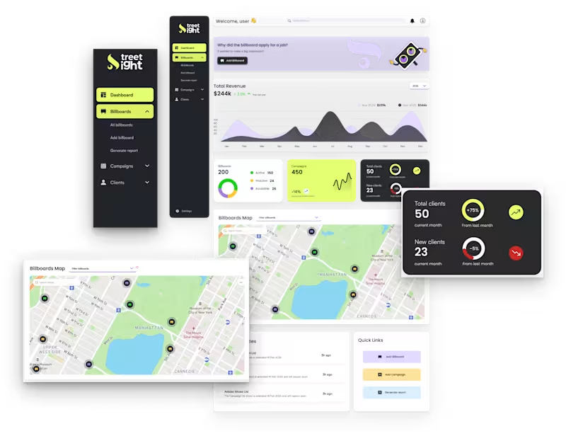
Mashiur Rahman
B2B CRM Web Application
0
0
Message
0
Amy Richardson
UVic Barbell Club Social Media
0
1
Message
0
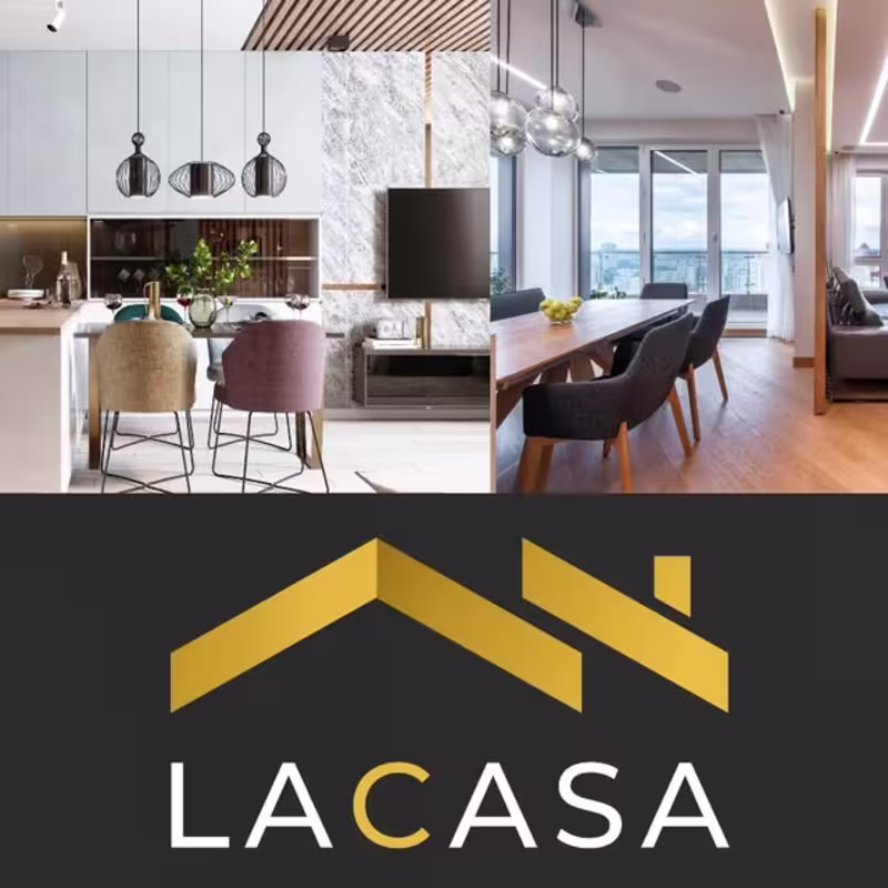
Mohamed Karouf
LACASA REMODELING
0
4
Explore projects