
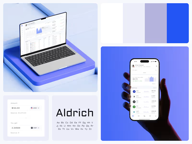
Crypto Portfolio Dashboard
Blue means one thing here: the range you are looking at.
The value chart is a row of thin gray bars, and only the selected date range fills in blue. You read the period that matters and keep the months around it as context.
The phone carries the same chart above the holdings list. Each coin gets its own small bar chart between the name and the amount, so you can scan the whole portfolio for movement without opening a single coin.
Trading screens get busy fast. This one stays light and calm, so the numbers lead: total value, realized and unrealized P&L and open positions, all on one screen.
Designed by the Hue & Machine team.
#Crypto #Fintech #DashboardDesign #TradingPlatform #DataVisualization #UIDesign #ProductDesign #WebApp #MobileDesign #FigmaDesign
73
134
6.3K

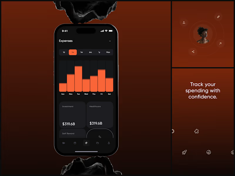
Expense Tracker
The dark UI isn't aesthetic. It's functional. When you're reviewing weekly spending at 11pm, your eyes need low-strain contrast that still makes the data pop.
The category cards sit below the chart for a reason. The chart answers "how much did I spend this week?" The cards answer "where did it go?"
Finance apps either look sterile or playful. This needed to feel like neither - it needed to feel powerful. Like your money is being managed by something that takes it seriously.
"Track your spending with confidence." Confidence. That word choice shaped every design decision.
#MobileDesign #UIDesign #Fintech #AppDesign #DarkUI #DataVisualization #ProductDesign #iOSDesign #ExpenseTracker #FigmaDesign
2
5
1.5K

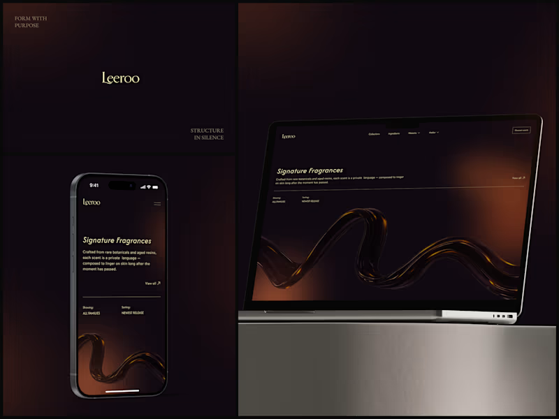
Leeroo - Luxury Fragrance House
How do you design the visual equivalent of a scent?
You can't show smell. So the 3D amber resin ribbon does the work - liquid, warm, moving slowly like something expensive evaporating. That one element replaces every product photo a fragrance brand thinks it needs.
"Crafted from rare botanicals and aged resins, each scent is a private language." The copy already sounds like it smells good. The design just had to stay out of its way.
Dark. Gold. Italic serif. Nothing else.
What's the first luxury brand site that made you feel something?
#WebDesign #UIDesign #LuxuryBrand #DarkUI #3DDesign #Typography #FragranceDesign #Ecommerce #ArtDirection #FigmaDesign
4
1.3K

AI Insight Engine
An isometric data map that looks like it belongs in a command center. It's a thinking tool that looks the way thinking feels: structured, quiet, precise.
+89% efficiency analysis. The data proves itself. The design just gets out of the way.
What's the best dark UI you've seen this year?
#UIDesign #DarkUI #AI #SaaS #MobileDesign #ProductDesign #DataVisualization #AppDesign #MonoType #FigmaDesign
5
1.1K

EV Charging & Vehicle Management App
Second automotive project in my portfolio and honestly one of my favorites.
There's something satisfying about designing for physical products. You're not just making screens, you're connecting a real object (a car) to a digital experience.
The whole app revolves around one moment: you plug in your EV and want to know "how long till its ready?" So I made that the hero of every screen.
Charging percentage, time remaining, real-time status. Front and center, no hunting for it. Then the secondary layer has vehicle stats, driving patterns, speed data with graph visualisations for people who actually want to geek out on their efficiency.
Chose a green palette for obvious reasons - clean energy, sustainability, all of that. But it also just works really well on dark backgrounds, and the 3D car renders (including a Porsche 911 GT3 which was fun to work with) pop against it beautifully.
#IoT #MobileAppDesign #UIDesign #Automotive #EV #DataVisualization #Innovation #DigitalExperience #CleanTech
5
1.1K

Fitness Tracking App - Workout & Progress UI/UX
3 workouts. 1.2kg lifted. 45.3min training. 1200kcal burned. 85% weekly progress.
Numbers. That's all fitness apps really are at the core. But the difference between an app people open once and an app that becomes part of their morning routine is how those numbers make them feel. Accomplished or overwhelmed. Motivated or guilty.
This design bets on calm discipline. Olive green palette, soft rounded progress rings, generous spacing. No screaming neon, no aggressive "CRUSH YOUR GOALS" energy. The whole vibe says "you showed up today, here's where you're at." The onboarding asks one question at a time - how many times a week do you plan to work out? Just pick a number. Skip all and start. No 12-step setup interrogation before you even get to see the app.
That "Welcome, Mary" dashboard is probably my favourite screen. Daily goals laid out as circular meters that fill up quietly as you go. Not gamified, not competitive, just... yours. Sometimes the most radical design choice is restraint.
#MobileAppDesign #UIDesign #UXDesign #HealthTech #Fitness #ProductDesign #DigitalExperience #iOS #Wellness #AppDesign
1
5
983

Fitness & Workout Tracking App
Most fitness apps try to do everything. Track your food, count your steps, log your sleep, remind you to drink water, basically become your entire personality. This one takes a different approach - it focuses purely on workout discipline and progress tracking, and does it really well.
The onboarding walks users through goal setting step by step before they ever see a dashboard. That was intentional. When someone opens the summary screen and sees their 3 workouts, 12kg lifted, 1000 kcal burned - those numbers mean something because the app already knows what they're working toward.
Went with a deep olive green palette which is kind of unconventional for fitness apps (everyone defaults to electric blue or neon orange). But it gives the whole experience this grounded, focused energy. Like the app is saying "we're here to work, not to hype you up." The 3D elements add a layer of visual interest without competing with the data, which should always be the star of the show in a product like this.
#MobileAppDesign #UIDesign #UXDesign #HealthTech #Fitness #ProductDesign #DigitalExperience #iOS #Innovation
6
979

fitness training app
85% weekly progress. 3-day streak. The data is motivating. The design makes it feel earned.
Green on dark olive isn't just a palette. It's borrowed from the environment where this training happens - trails, parks, the outdoors. The phone resting on a rock in the mockup isn't a prop choice. It's the brand world.
Consistency is the design. The user learns the pattern once and reads every sport the same way.
The day streak circles are the most satisfying element. Your brain wants to complete the row. That's not gamification. That's just good UX.
#MobileDesign #UIDesign #FitnessApp #DarkUI #ProductDesign #HealthTech #AppDesign #DataVisualization #UXDesign #Figma
4
651

Voltix - Fintech Mobile + Web
Two screens, one system.
Fintech product concept across mobile and desktop. The hard part isn't making each screen look good on its own - it's making sure a user who checks their phone at lunch and opens the desktop later feels like they're in the same place.
#Fintech #MobileDesign #UIDesign #ProductDesign #ResponsiveDesign
3
477

Smart Lighting Control App - IoT / Smart Home
The UI should feel like the light itself
What if adjusting your lamp felt less like tapping settings and more like dimming a real switch. The circular brightness control mirrors the glow, the 3D lamp renders show you exactly what you're changing before it changes, and the whole interface sits in darkness so the light is the only thing that pops.
My personal fav detail is the color picker on the saturation screen. You just tap a color and watch the lamp respond. The people who use smart home apps at midnight don't want to think. They want to feel.
#SmartHome #IoT #MobileDesign #UIDesign #DarkUI
4
446

Social Film Editing App
Frame by frame. That's not just the tagline, it's the entire interaction model.
Designing a creative tool is a paradox. The interface has to be powerful enough for serious work and invisible enough to not interrupt the creative flow. The second someone notices the UI, you've failed.
The dark interface isn't a trend choice here. When you're working with footage, light, shadow, and color grading, the tool has to disappear. Olive and warm amber tones against black create a palette that feels cinematic before the user touches anything.
"Craft the mood, frame by frame." The app does exactly what it promises. The design just stays out of the way.
#MobileDesign #UIDesign #ProductDesign #AppDesign #DarkUI #CreativeTools #FilmEditing #UXDesign #InteractionDesign #DigitalProduct
4
602

Music Streaming App - Audio Player UI/UX
Threw out the Spotify template and started from scratch. What if a music player actually felt like listening to music?
Built the now-playing screen around a spinning disc with a color-shifting gradient ring that reacts to album artwork. Playlist view uses rich artwork cards instead of the standard vertical scroll list - feels more like flipping through vinyl at a record store than browsing a database. Even the mini player shows the artist's photo instead of just a text label, because why not.
Because music is personal and the UI should remind you there's a human behind the track, not just an algorithm.
Honestly, this is the project I open when I need to remind myself that design doesn't always have to solve a business problem. Sometimes it just has to make someone feel something.
#MobileAppDesign #UIDesign #UXDesign #MusicApp #CreativeDirection #DigitalExperience #iOS #ProductDesign #AppDesign #Innovation
2
6
825