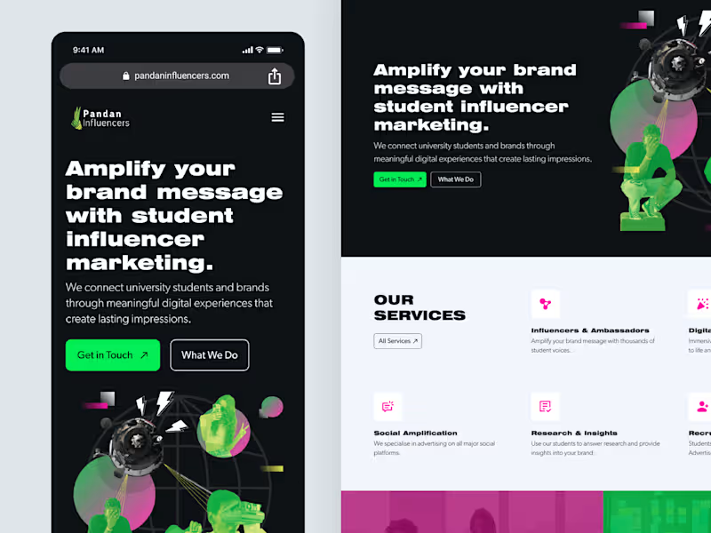
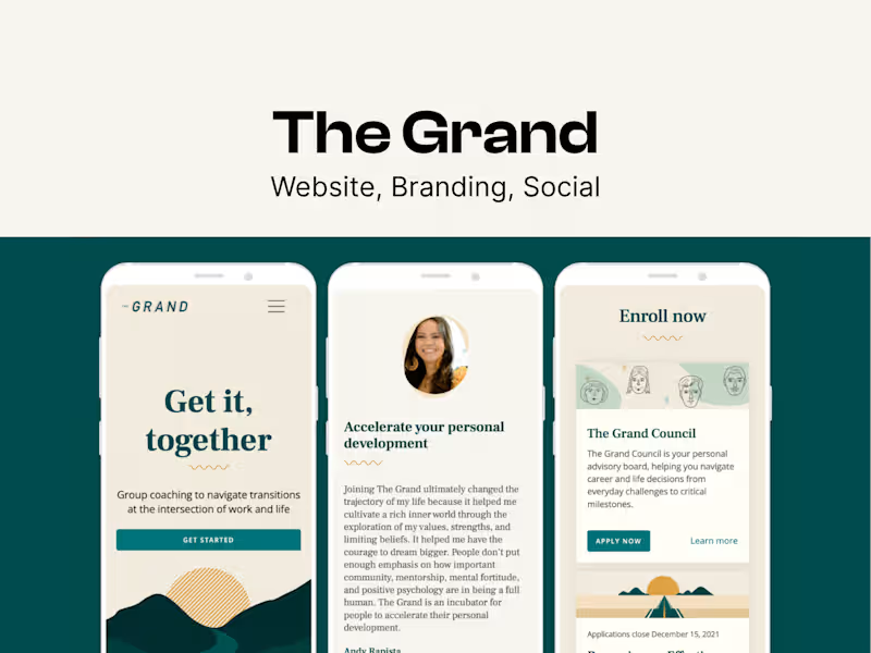
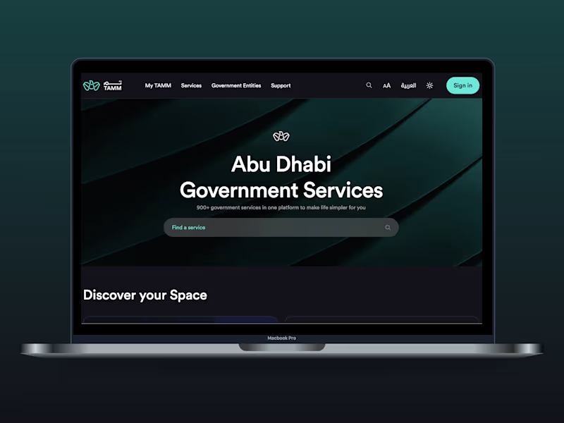
Projects in BantingProjects in Banting🔔 Contra's display options are a bit limited, so I've linked direct previews below to give you a full view of my ux research, branding, and web design work at The Grand: https://miracelso.webflow.io/works/the-grand
Research & Ideation: It all started with user research. To guide our design decisions, I dove deep into understanding the primary personas who used our legacy products. I analyzed user feedback and observed how people were interacting with these tools in real-world settings. Collaborating with the product team, I led the ideation and development of what would become The Grand Council.
We kicked things off with a brainstorming workshop that sparked some great ideas, and I carefully mapped out the user journey to make sure the experience was intuitive and seamless.
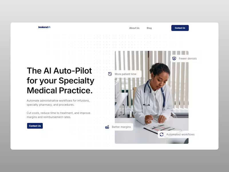
Marketing & Design: I also played a key role in the lead-up to our big product launch. Partnering closely with a marketing team, we rolled out a comprehensive social media campaign designed to drive potential users to our freshly updated website that I had spearheaded.
Our efforts paid off. We converted an impressive 30% of members within the first month of launch. It was a powerful reminder of how effective product design not only enhances usability but can also amplify marketing impact.
Beta Launch: To validate our approach, we ran extensive testing with two small user groups, and the feedback was incredibly encouraging. Those insights helped us refine the product and ultimately led to the successful launch of The Grand Council.
Design System: Before we started scoping out the Member Platform and Coach Platform, I strongly advocated for creating a design system. The goal was to standardize components and design patterns to create a cohesive and high-quality user experience. This evolution aimed to make the platform more adaptable, scalable, and user-friendly, ensuring it meets the needs of both current and future product developments. Hot Noonchi's Brand Identity and Visual Language
Short overview
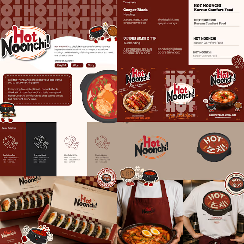
Hot Noonchi is a playful Korean comfort food brand concept built around warmth, familiarity, and a slightly cheeky personality.
I developed the brand identity as a complete visual system — combining expressive typography, a warm food-inspired colour palette, mascot elements, supporting graphics, packaging, and environmental applications to create a brand that feels memorable, approachable, and full of character.
The challenge
The goal was to create a Korean food identity that felt playful and contemporary without relying too heavily on predictable K-food visual clichés. I wanted the brand to feel comforting and casual, while still having enough structure to remain recognizable across packaging, signage, apparel, and promotional materials.
Creative direction
The visual direction balances bold, rounded typography with warm reds, charcoal, cream, and toasted neutral tones inspired by Korean comfort food.
Supporting illustrations, stamps, checkerboard details, and mascot characters add personality while giving the identity a flexible graphic language that can expand across different touchpoints.
My role : Brand Designer · Visual Identity · Art Direction · Packaging Design