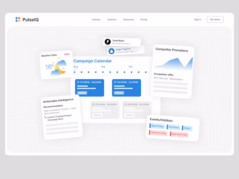
UX-led product design & dev agency for b2b saas and AI
UX-led product design & dev agency for b2b saas and AI
Technical Specialist & 3D Visualization Expert
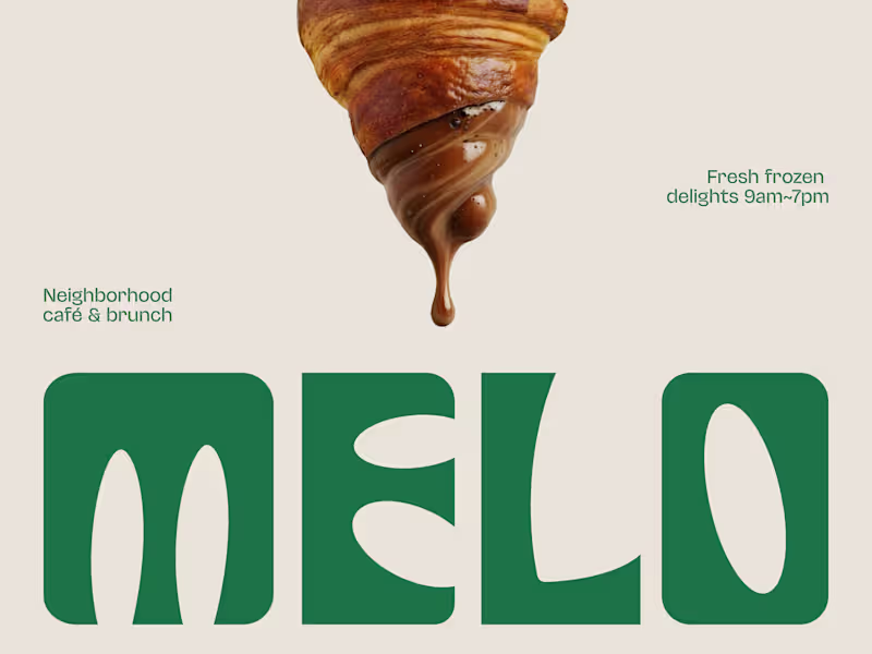
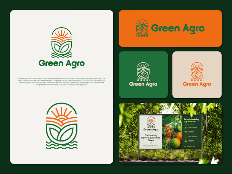
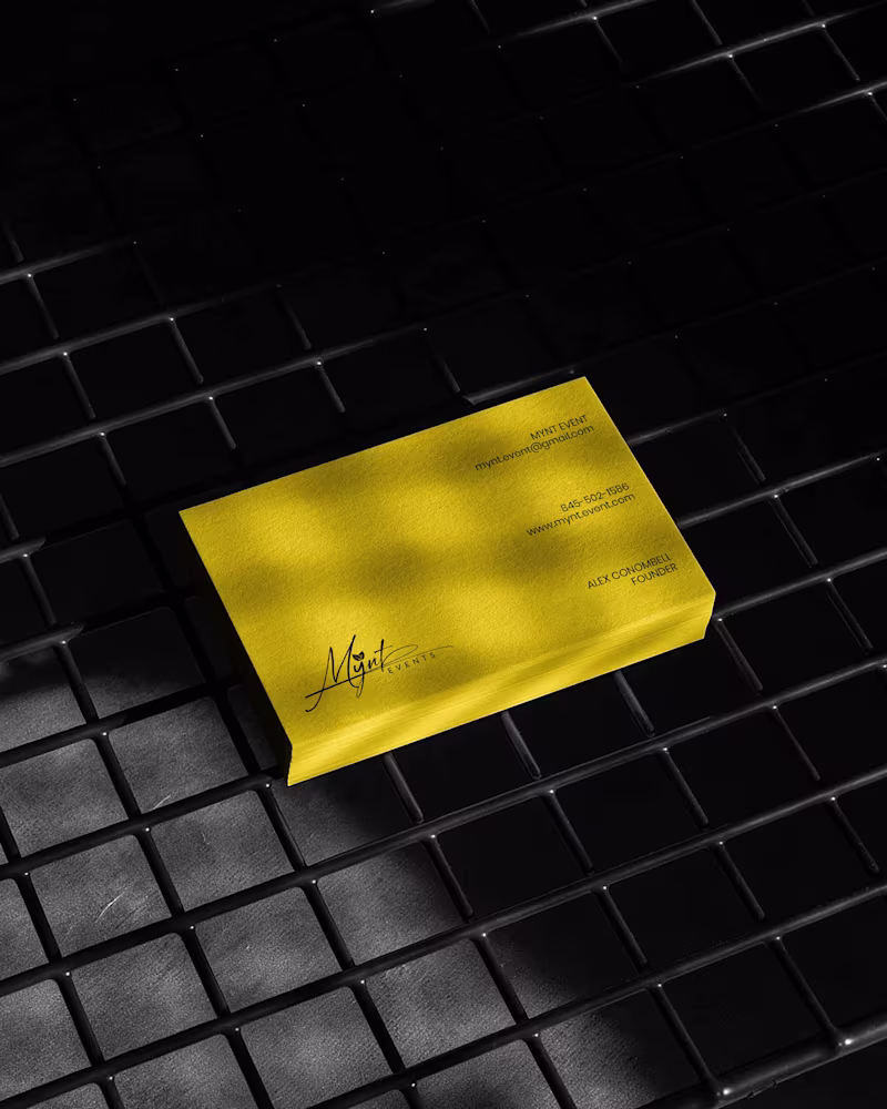
Branding & Visual Systems Specialist
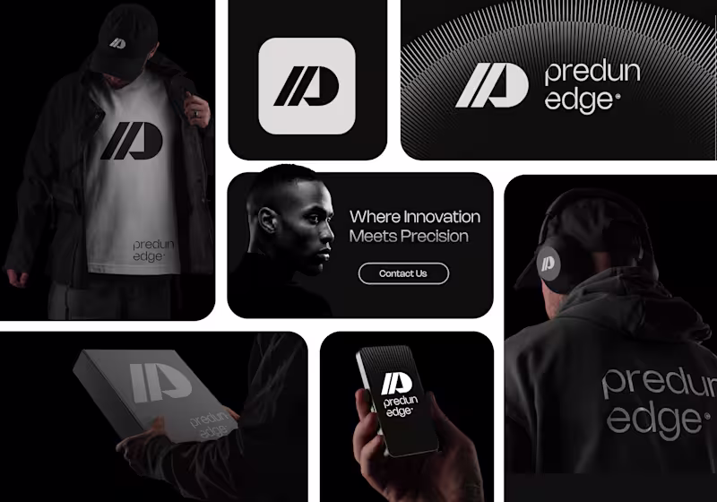
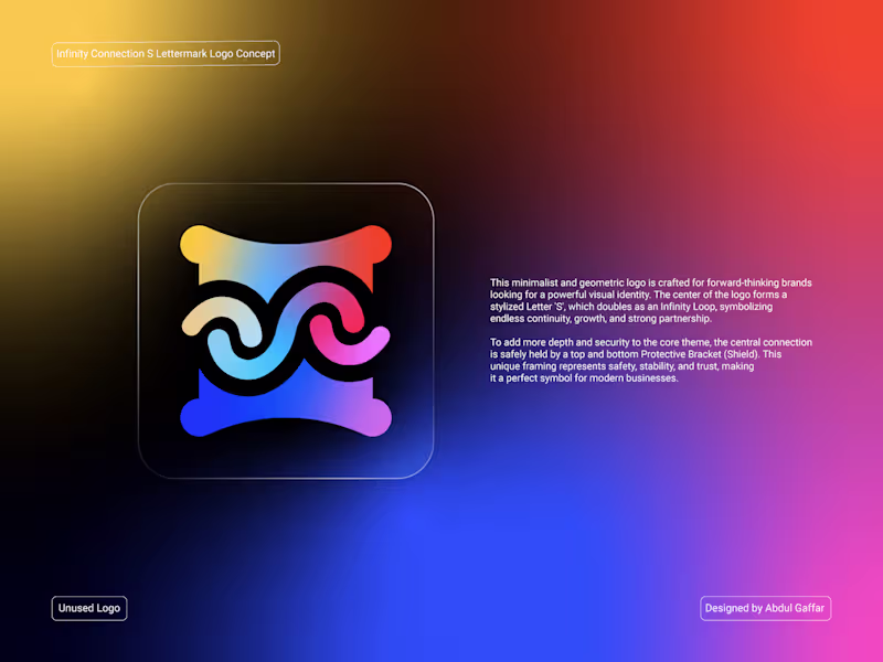
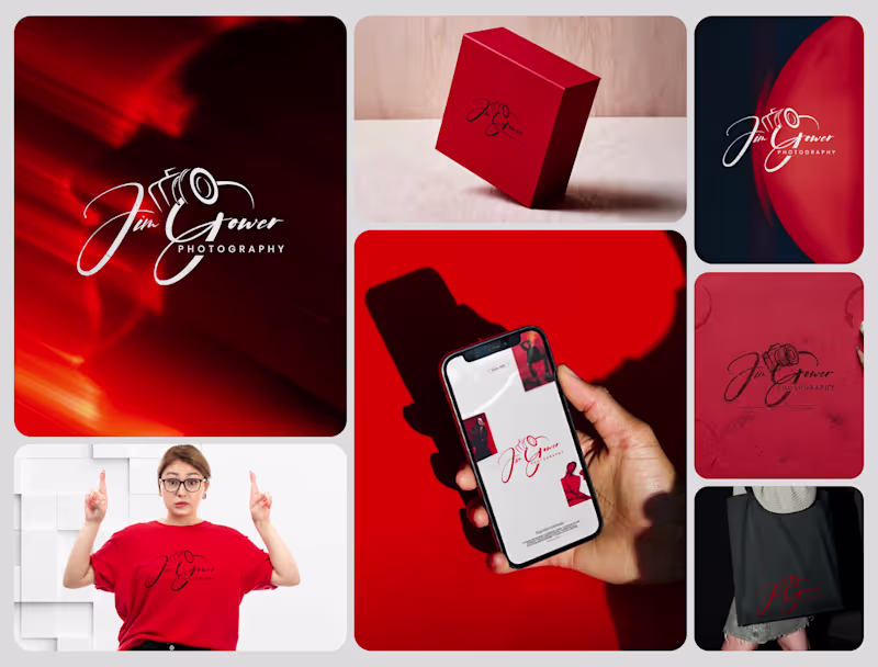
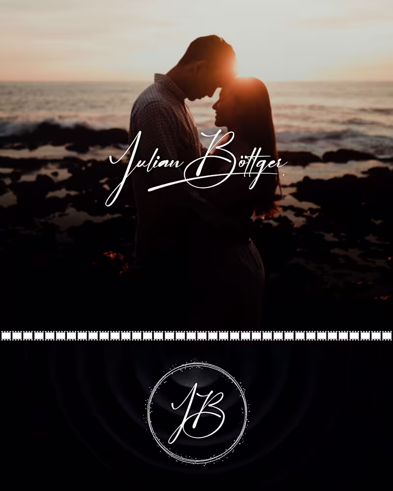
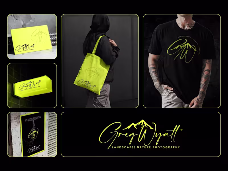
Logo & Brand Identity Designer
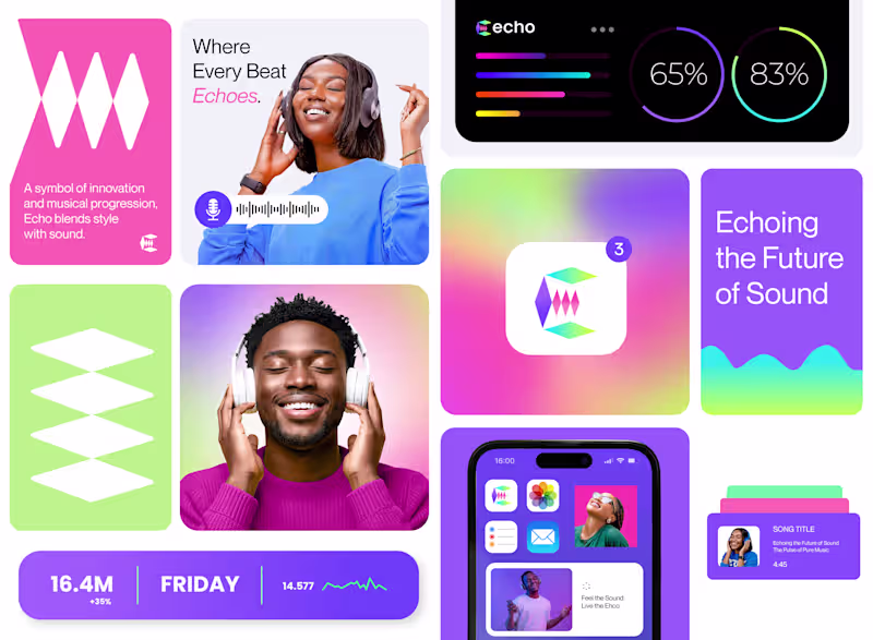
Design Authority & Creative Team Lead
Design Authority & Creative Team Lead

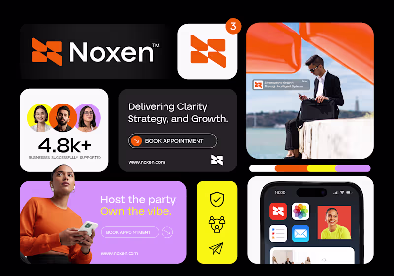
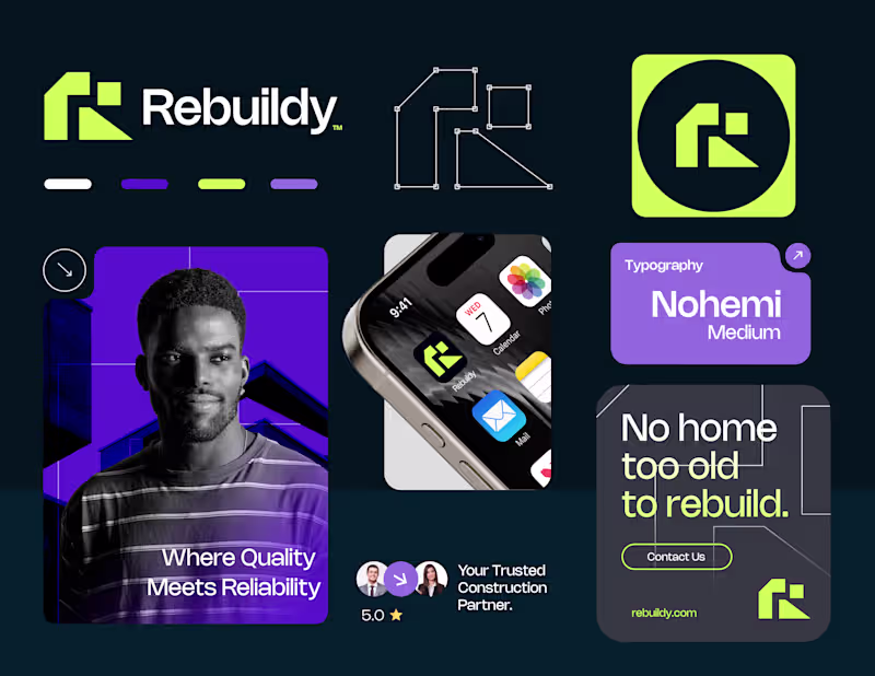
The designer that you can trust.
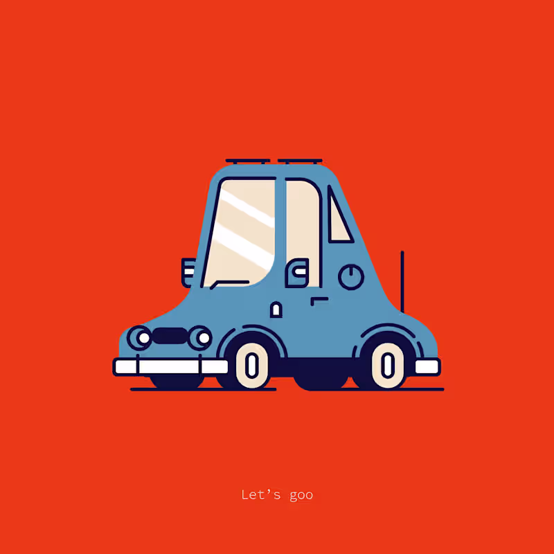
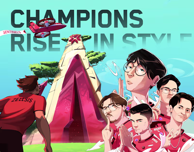
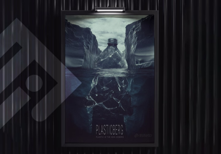
CGI & VFX Artist for brands, games & film projects
Product explainer designer - storyboarding to final output!
New to Contra
Product explainer designer - storyboarding to final output!