
Google-Certified UX Designer for Mobile Apps & Web
Google-Certified UX Designer for Mobile Apps & Web


Growth-focused UI/UX Designer

Growth-focused UI/UX Designer

What if your outfit was decided by the weather? ☀️🌧️
Designed Layer Day — an AI-powered mobile app that recommends what to wear based on real-time weather conditions, humidity, and daily plans.
Instead of guessing, users get:
• Smart layer suggestions
• Occasion-based outfit filtering (Office, Party, Casual)
• Lightweight vs breathable recommendations
• Clean, card-driven UI for quick decisions
Focused on:
– Clear hierarchy
– Warm, weather-inspired color system
– Friendly AI microcopy
– Scannable outfit cards for fast selection
From concept → UX strategy → high-fidelity UI.
If you're building a smart lifestyle or AI-driven product, let’s craft something users love to open every morning.
1
3
258

Fintech App UI Designed for Trust & Clarity
Designing fintech products isn’t just about aesthetics — it’s about building confidence.
For this project, I designed a modern mobile experience for a MENA-focused financial app, balancing simplicity, trust, and usability across onboarding to dashboard.
What I focused on:
• Clean, trust-driven onboarding experience
• Strong visual hierarchy for financial data
• Friendly yet professional UI language
• Clear CTA flows for conversion
• Dashboard that simplifies complex information
Every screen is crafted to reduce friction and increase user confidence — especially important in finance.
If you're building a fintech product and need design that actually converts, let’s talk.
1
3
261

Healthcare is complex. Your product shouldn’t be.
Designed AdvocateU — a healthcare advocacy app focused on clarity, trust, and guided user journeys.
Most healthcare products overwhelm users with information. This approach flips that — simplifying decisions through structured onboarding, human-centered visuals, and clear next steps.
What’s inside:
• Dual user flows (Patient / Advocate)
• Trust-first onboarding experience
• Calm, accessible visual system
• Conversion-focused CTA hierarchy
If you’re building in healthcare or any complex domain, clarity isn’t optional — it’s your growth lever.
Need a conversion-focused product or landing page? Let’s talk.
3
236

Healthcare Advocacy Mobile App — UI/UX Design
Designed a modern, trust-driven mobile experience for a healthcare advocacy platform focused on simplifying patient support and decisions.
The interface emphasizes clarity, emotional connection, and ease of use—helping users navigate sensitive healthcare situations with confidence.
What I did
• Defined visual direction aligned with trust and accessibility
• Designed clean, minimal UI with strong hierarchy
• Structured content to reduce cognitive load
• Applied soft gradients and human-centric visuals
Outcome
A clear, user-friendly experience that builds trust and improves usability for patients and families.
Tools
Figma, Adobe Photoshop
Looking for similar work?
I design scalable, conversion-focused digital experiences for startups.
Let’s collaborate.
0
242

Creative Brand & UI/UX Designer 🎨✨
- $1k+
- Earned
- 1x
- Hired
- 5.0
- Rating
- 15
- Followers
Creative Brand & UI/UX Designer 🎨✨


Your go-to partner for turning startup ideas into reality!
- 5.0
- Rating
- 16
- Followers
Your go-to partner for turning startup ideas into reality!



UX Researcher, UI Designer - Solving User Problems
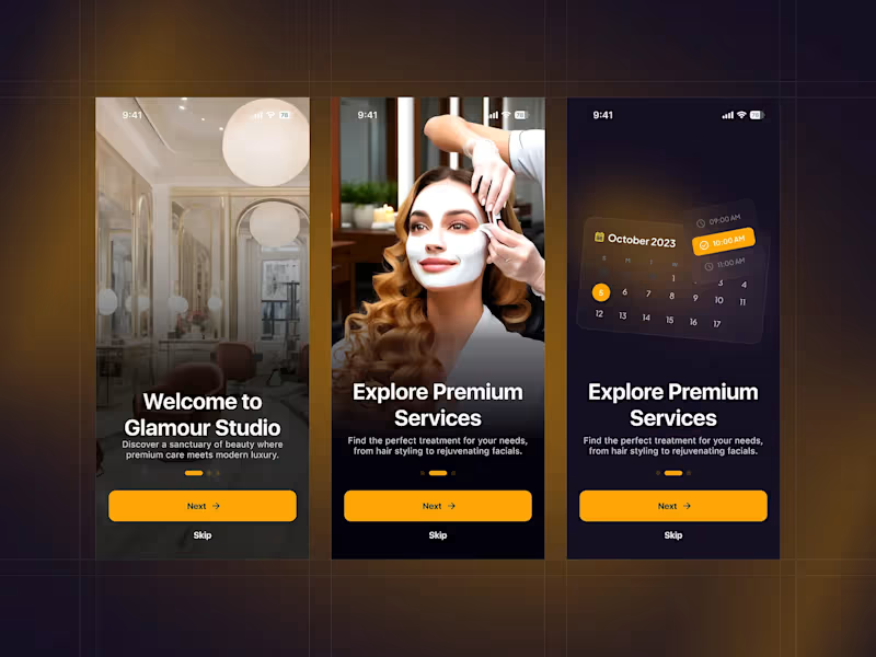
A premium mobile experience designed for modern beauty and wellness services. This concept focuses on creating a luxurious first impression while guiding users smoothly through service discovery and booking.
The onboarding experience highlights:
↳ Elegant, high-end visuals that reflect a premium salon atmosphere
↳ Clear and engaging messaging to introduce services and value
↳ Smooth step-by-step onboarding flow for better user guidance
↳ Integrated scheduling preview to showcase easy appointment booking
↳ Strong call-to-action with a clean and minimal interface
↳ The design blends warm tones, soft gradients, and refined typography to evoke a sense of luxury and ↳ comfort—ensuring users feel confident and relaxed from the very first interaction.
Tools used: Figma
Style: Elegant, modern, luxury-focused
Feedback and thoughts are always appreciated! 💬
3
2
194

👋 HI Design lover's this is the food delivery app onboarding ui ux design concept hope you guys love this.
2
167
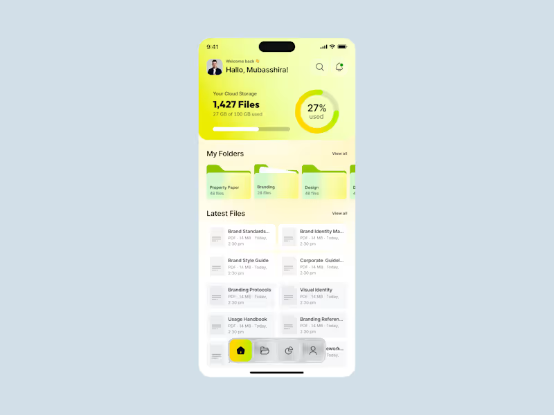
A modern cloud storage experience designed to make file management feel simple, organized, and effortless. The concept combines a clean mobile interface with a vibrant visual identity, giving users quick access to their files, folders, and storage insights in one place.
brings storage usage, folders, and recent files together in a single view. A lightweight onboarding experience introduces the product without adding friction, while the simplified navigation makes core actions easy to reach.
The visual system uses bright gradients, rounded components, generous spacing, and clear typography to create a friendly yet polished product experience.
The final concept creates a more approachable way to manage cloud files on mobile, balancing functional organization with a distinctive visual identity.
The result is a clean, intuitive interface where users can quickly understand their storage, access important files, and navigate their content with minimal friction.
0
20
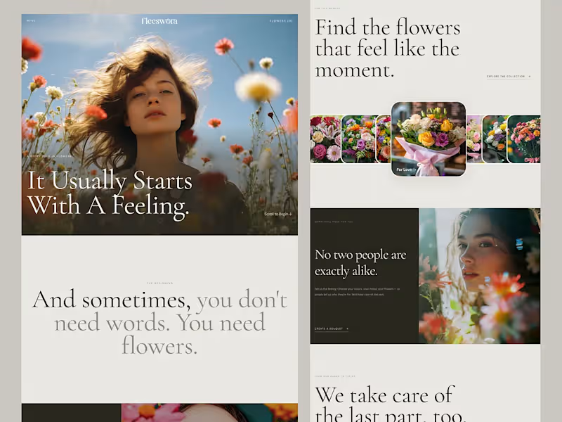
Figma to lovable by connecting MCP
One prompt. One Figma file. A working website. 👀
So, what did I actually do here?
I analyzed how AI interprets UI designs, how it understands layer names, and how naming conventions affect the generated output.
Then I structured my Figma file accordingly and gave Lovable a single prompt.
And honestly? It nailed it.
No complicated back-and-forth. Just a better-structured design and a smarter workflow.
Live preview: https://fleeswora.lovable.app/
This experiment reminded me that AI-assisted design isn’t just about writing better prompts. It’s also about preparing our designs so AI can understand them.
Designers, are you optimizing your Figma files for AI yet?
2
131

Experienced UI/UX Designer, 7 yrs professional


Grow my UX UI/web design abilities a little more each day
Grow my UX UI/web design abilities a little more each day

Quest Dashboard That Makes $
This client runs a gamified neighborhood app. When I joined the project, people loved the idea but skipped most events, so sponsor and ticket revenue stayed flat.
I began with a simple UX review of the sign‑in flow and first screen. The key issue: actions were hidden under icons.
I redesigned the layout with large event cards and direct “Join Event” buttons. UX point: clear visual hierarchy so eyes go from stats to events to chat. Early numbers show more event joins.
Need a dashboard like this? DM me.
4
3
168

UI/UX Designer boosting sales & user growth with design
- 1x
- Hired
- 5.0
- Rating
- 12
- Followers
UI/UX Designer boosting sales & user growth with design

Billiards Website Landing Page Design
I recently completed a modern, user-focused landing page design for a billiards equipment brand (Kuwait Pro Center).
The design follows UX laws, uses a dark premium theme with gold and green accents, and highlights categories, featured products, services, and brand trust sections.
I handled the full UI/UX layout, visual design system, and responsive structure in Figma — making it ready for development.
Tools Used: Figma, UX Design Principles, Visual Hierarchy, Grid Layout.
Deliverable: Fully designed Figma landing page.
0
61


UI/UX Transformation: Mista Oud
We turned a generic website into a luxury digital storefront.
The challenge: Make the brand's online presence match their premium product.
Before: Low impact, scattered focus. After: High contrast, clear narrative, and a streamlined path to purchase.
Strategic design isn't just about looks—it's about converting visitors into customers.
#Rebranding #UIUXDesign #Ecommerce #LuxuryBranding #WebDesign
0
40
