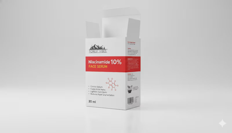
Indian Client Work Niacinamide 10% Face Serum Multiple Style Package Design. Here, I have designed several packages of Niacinamide 10% Face Serum for my Indian client. From here, the client has finalized a design and is selling their product by printing that package. From here, you can get your design ideas if you want, and those who want to package such products can contact me. I am here for you. You can design labels for your products, and if you want, you can get your company's full branding done by me. If you want to get ideas about my designs, you can check out my entire portfolio, so if you need this service, be sure to contact me.
2
2
201
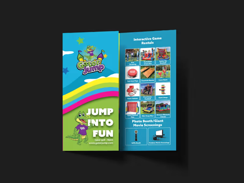
I designed a strategic, high-impact tri-fold brochure for Gator Jump, an event rental company transitioning its focus toward large-scale corporate clients, churches, and schools. The primary challenge was balancing a wide product catalog—Inflatables (Bounce Houses, Slides, Obstacle Courses), Games, Photo Booths, and Giant Movie Screens—while distinctly guiding the viewer’s attention toward the premium, high-ticket items ideal for corporate events.
To solve this, I applied a strict visual hierarchy on the A4 tri-fold canvas. Obstacle Courses, Slides, and Games were given prominent placement with large, dynamic visuals on the most visible panels (front cover and center-fold), while secondary services like Bounce Houses and Photo Booths were positioned strategically on the back and side panels to ensure visibility without competing for the spotlight.
Visually, the client adored a specific rainbow gradient color palette, so I used it as the structural backbone of the design—allowing the colors to flow seamlessly across the front and back panels. This creates a cohesive, energetic brand experience and transforms the brochure from a simple price list into a professional statement. I paired this with bold, modern typography inspired by the Azo Sans family (avoiding their old website fonts as requested) to ensure high readability against the colorful backdrop.
All required functional elements were integrated seamlessly: the logo and contact details on the front, categorized product grids inside, and a QR code, email, phone number, and the specific brand messaging on the back. The result is a print-ready, visually striking tri-fold brochure that captures the excitement of large events while maintaining the premium credibility needed to attract corporate clients.
0
197


A4 Travel & Tourism Brochure Design
Designed a modern A4 brochure for a travel and tourism campaign, featuring a clean editorial layout, engaging destination photography, and well-structured content. The design was created to showcase travel experiences while maintaining strong visual hierarchy and brand consistency. The final artwork was delivered as a fully print-ready file with proper bleed, margins, and high-resolution output for professional printing.
Services: Brochure Design, Editorial Design, Print Design, Layout Design, Print-Ready Production
Tools: Adobe InDesign, Adobe Photoshop, Adobe Illustrator
0
23
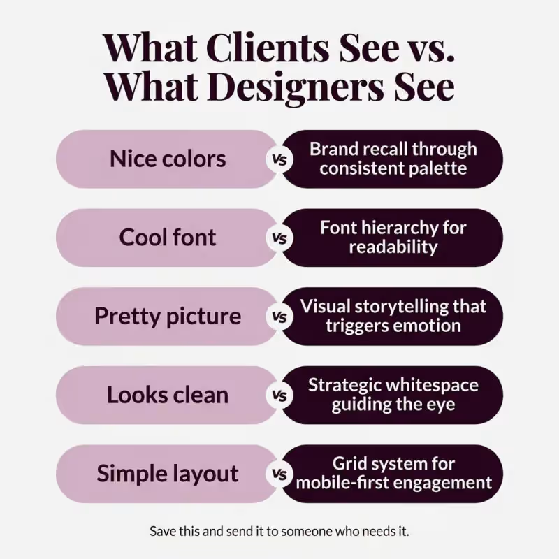
Stop calling it just a nice design.
Every design choice your designer makes has a reason.
You just never asked why.
Here is what is really going on.
You see nice colors. Your designer sees brand
recall built into every post.
You see a cool font. Your designer sees a hierarchy system
that controls where eyes land first.
You see a pretty picture. Your designer sees storytelling that
triggers emotion in under 2 seconds.
You see a clean look. Your designer sees whitespace
engineered to guide attention to the CTA.
You see a simple layout. Your designer sees a grid system
optimized for the screen you are reading this on right now.
The difference between a design that gets scrolled past
and one that stops the thumb?
Strategy you cannot see. But your audience feels.
Next time your designer delivers something simple,
look again. There is nothing simple about it.
Save this. Send it to someone who needs to hear it.
2
2
218
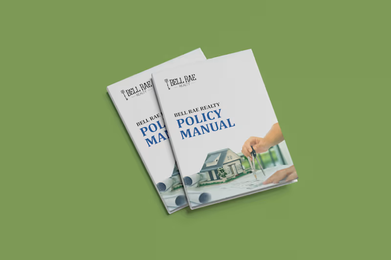
Bell Rae Realty – Corporate Policy Manual & Real Estate Employee Handbook Design
Project Overview
Developed a comprehensive, corporate policy manual and internal operational handbook for Bell Rae Realty. Designed to serve as an authoritative standard operating procedure (SOP) and onboarding document, the publication translates corporate governance, company values, and operational guidelines into a polished, structured, and easily navigable editorial format.
Key Deliverables & Features
Executive Cover & Brand Presentation: Created a clean, trustworthy cover featuring the company’s logo, prominent typography hierarchy, and context-driven real estate imagery to establish an authoritative corporate tone.
Structured Table of Contents / Appendix: Designed a dual-column index layout with dot leaders, clean page numbering, and an introductory banner image for seamless section navigation.
Mission & Core Values Layout: Arranged brand philosophy and core organizational pillars using a balanced two-page spread, incorporating branded blue icon containers, clear paragraph styling, and supportive workplace photography.
Clean Real Estate Visual Language: Implemented a corporate blue and white color system, subtle divider lines, and architectural/team imagery to reinforce professional credibility and brand consistency.
Grid Architecture & Production Setup: Built using a modular multi-column grid system, parent/master pages, baseline grid alignment, and accurate margins/bleeds for dual-purpose print production and interactive PDF distribution.
Role & Scope
Editorial & Publication Layout Design
Corporate Typography & Hierarchy Structuring
Table of Contents & Document Architecture Setup
Photo Masking, Color Balance & Asset Integration
Print & Digital Pre-Press Preparation
Tools Used
Adobe InDesign
Adobe Illustrator
Adobe Photoshop
1
165