Motion Designer/ Generative Visual Artist
- $10k+
- Earned
- 38x
- Hired
- 5.0
- Rating
- 143
- Followers
Motion Designer/ Generative Visual Artist


Your Next Great Content

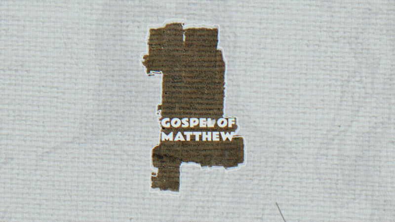
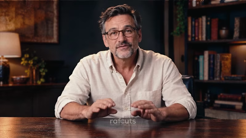
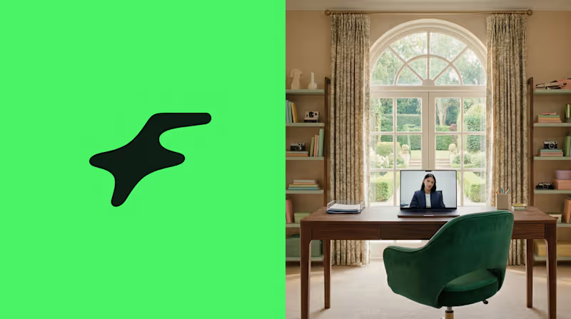
Another example of just how far we've come with the evolution of AI.
AI is evolving faster than ever. Every day, it's getting better at recreating human faces, voices, and expressions.
And soon, it might become so realistic that we may not even need to step in front of a camera anymore.
But that raises a bigger question.
How do we preserve the emotions and authenticity that only a human touch can bring?
This is where the "Heart" clashes with the "Brain." Human creativity versus artificial intelligence.
But perhaps this clash isn't about deciding which one comes out on top.
Perhaps it's about discovering how far we can go when human creativity and artificial intelligence coexist.
2
3
135
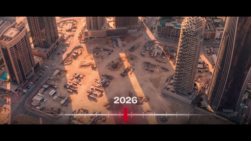
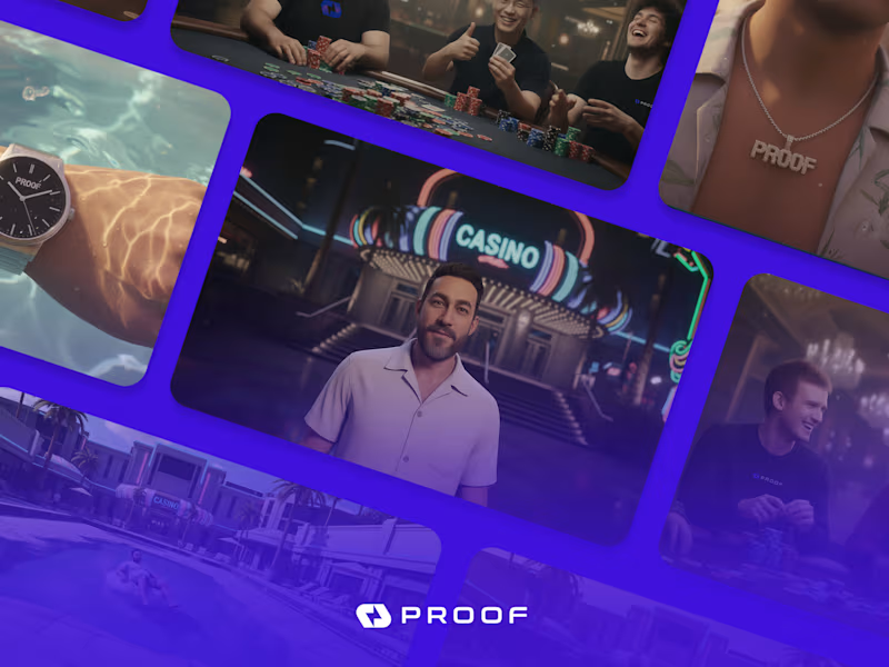
AI is booming nowadays, but so is the creativity of the minds who are behind it.
This one was a big challenge-constructing almost everything through AI generation, just enough to not make it look AI-generated. Hundreds of prompts at work, thousands of hours invested, and don't know how many nights were passed awake, with only one thought in mind...
"Can I make AI keep up with the creative intelligence that I, a human with limitless potential like every other human, possess?"
3
4
481

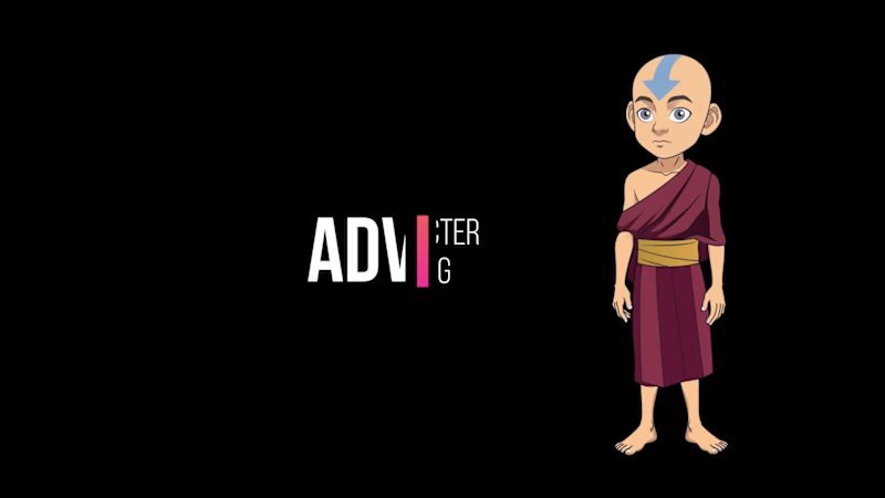
Humanizing vector drawings

I’m excited to share a look into my latest character project built in Rive. Unlike static illustrations, these vector assets are designed for the modern web—fully scalable, lightweight, and ready for real-time interaction.
6
20
1.3K
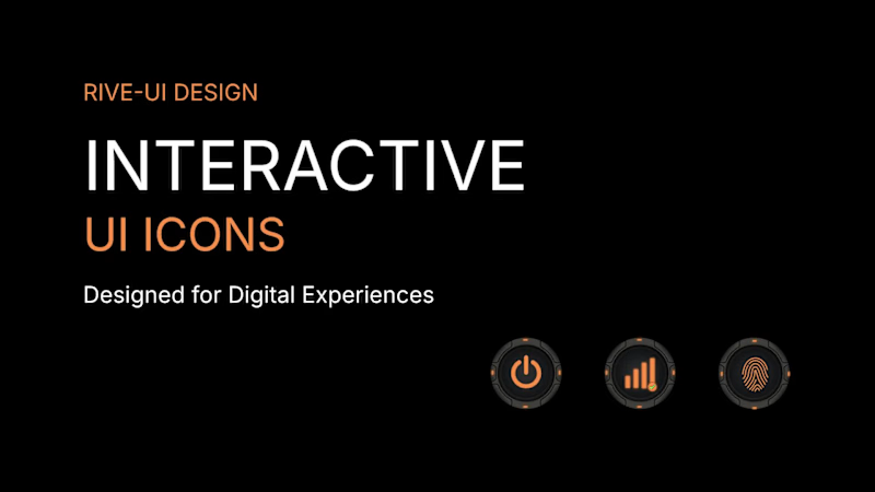
From Static Designs to Interactive UI Experiences ⚡
I’ve been working on a futuristic UI icon pack in Rive, exploring how clean vector shapes, consistent visual language, and subtle details can bring a digital interface to life.
The goal: create visually consistent icons that can fit naturally into modern dashboards, SaaS products, and technology interfaces.
I focus on:
Clean, scalable vector artwork
Consistent icon systems
Rive-ready assets for interactive experiences
Thoughtful details that support great UI design
Looking for custom vector icons or Rive-ready UI assets for your next product?
Let’s connect and build something great.
#Rive #VectorDesign #UIUX #IconDesign #FreelanceDesigner
3
270


Logo & Brand Identity Designer
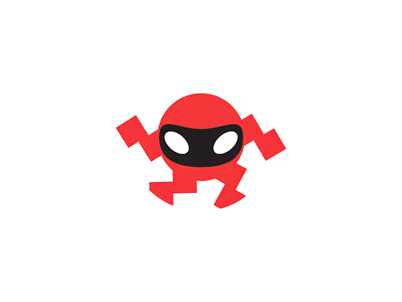
Robot Mascot – Futuristic Gaming & Technology Logo Design.
A bold futuristic robot mascot logo featuring a stylized robotic face, expressive eyes, and dynamic angular shapes. The energetic geometric form creates a playful yet powerful appearance, suitable for gaming companies, esports teams, robotics, AI platforms, technology startups, apps, and digital entertainment businesses.
1
207

Game Guard logo, Game Lock Logo, Gaming Logo, Lock Logo, Game Logo.
#securegame #cybergame #keyplay #gameshield #gamingvault #gamer #locklogo #gamelocklogo #gameguardlogo #game #lock #safegame #securitygame #padlockgame #gamegurd #gamelock #gaminglogo #gamelogo
2
208
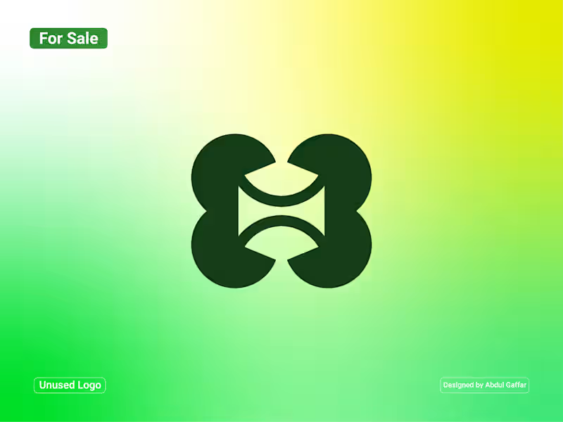
H Lettermark Logo.
A distinctive H lettermark created through four bold, rounded geometric shapes. The symmetrical composition uses carefully balanced curves and negative space to form an abstract interpretation of the letter H. Its interlocking structure creates a sense of connection, harmony, and continuity, while the smooth shapes give the design a clean and contemporary appearance.
The concept is suitable for technology companies, creative studios, architecture firms, fashion labels, consulting businesses, and modern corporate ventures.
Unused Logo for Sale: This logo concept is available for purchase. If you're interested in using it for your business, feel free to contact me.
2
113
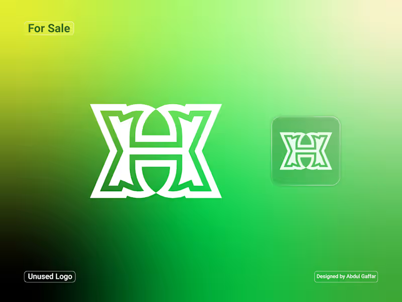
Abstract H Lettermark Logo.
A bold and distinctive H lettermark created through a combination of interlocking geometric shapes and symmetrical forms. The design features a layered structure with clean outlines and balanced proportions, giving the symbol a strong architectural appearance. The vibrant green gradient adds a fresh, modern touch, while the compact emblem version makes it adaptable across different applications.
Suitable for technology companies, architecture studios, construction businesses, creative agencies, engineering firms, and modern corporate ventures.
Unused Logo for Sale: This logo concept is available for purchase. If you're interested in using it for your business, feel free to contact me.
3
136

Hi there
I’m MD: Shahidul Islam. Working as a UI/UX Designe
- 13
- Followers
Hi there
I’m MD: Shahidul Islam. Working as a UI/UX Designe
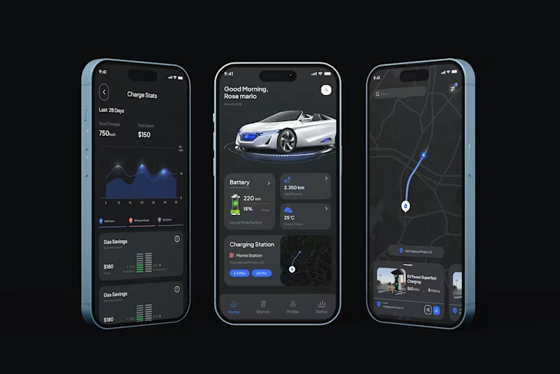
Electric Car Mobile App
Hello,
Hope you're doing well. This is a, Electric Car Mobile App. Let me know what you are thinking about the design and don't forget to press the "L" button 😎
2
109

Architect | AI Design & Visualisation Expert | Part-time Cat
- 12
- Followers
Architect | AI Design & Visualisation Expert | Part-time Cat
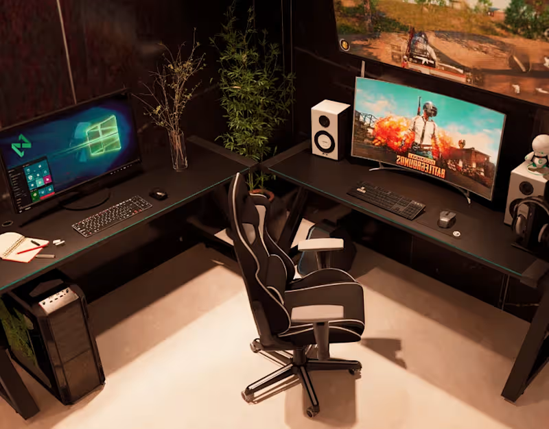
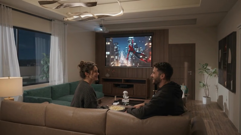
The project is a small interior competition project.
For this project, we tested Kling AI, Nanobanan Pro and ElevenLabs.
Stay tuned guys, more work from this project is coming.
Let me know your thoughts on this work. TIA
0
9
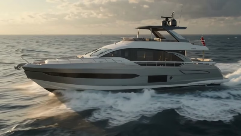
Hi guys,
Simply testing some AI work.
Which video style better represents the ultimate yachting experience?
Do you prefer the relaxing, elegant vibe of the Soft Cinematic edit or the high-energy thrill of the Action Movie Style?
2
123

This Mumbai project holds a special place in our hearts. ❤️
We learned so much throughout this journey, from creating panoramic views and immersive virtual tours to achieving top-notch rendering quality.
And of course, credit goes to our amazing client, who challenged us to push our limits and deliver our best work.
Every project teaches us something new, and this one will always be a memorable milestone in Nfas Design's journey.
What do you think of the results? We'd love to hear your thoughts!
0
58

Business grad, experienced at planning and visual content
Business grad, experienced at planning and visual content

Vibe-coded a website where you can create a room for 2-4 people to log the shows you have watched together. The idea came from a simple place: I wanted to keep track of all the shows my friend and I watched together. Later decided to expand on that.
https://our-watchlist-xi.vercel.app/
(https://our-watchlist-xi.vercel.app/)No login required. Would love any feedback.
0
67


modernlogos,branding,craftingbold,memorablevisuals,identity.
modernlogos,branding,craftingbold,memorablevisuals,identity.
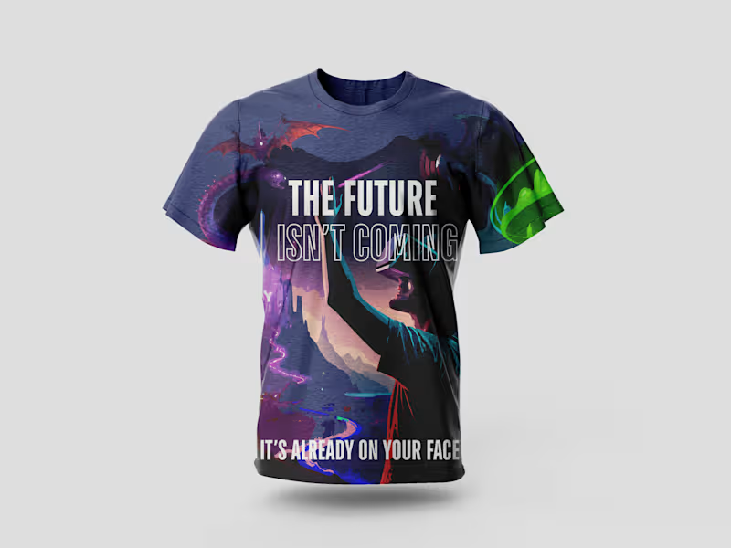
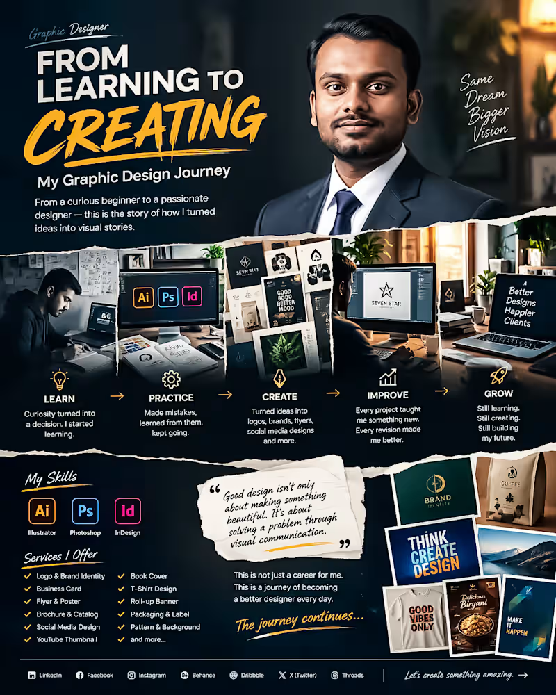
From Learning to Creating. My Graphic Design Journey 🎨
Every designer has a beginning.
Mine started with curiosity, uncertainty and a simple decision: I wanted to learn how to turn ideas into communication.
At the beginning I didn't know everything. I made mistakes struggled with typography, colors, layouts, software and countless small details that experienced designers make look easy.
I kept learning.
Step by step I improved my skills in Adobe Illustrator, Photoshop and InDesign. I started creating logos, branding materials, flyers, social media designs, packaging, thumbnails, posters and many other visual projects.
The biggest lesson I have learned is this:
Good design's n't only about making something beautiful. Good design is about solving a problem through communication.
Every project has taught me something. Every revision has made me better. Every difficult brief has pushed me to think creatively.
Today I’m still learning, still experimenting and still improving.
My journey isn't finished—. Thats what makes it exciting.
I’m building my career one design, one project and one client relationship at a time.
This is not a career, for me. This is a journey of becoming a designer every day.
If you're also building something from zero remember:
Start where you are. Learn what you don't know. Keep creating. Don't stop.
🚀 The journey continues.
#GraphicDesigner #GraphicDesign #DesignJourney #CreativeJourney #DesignerLife #AdobeIllustrator #AdobePhotoshop #AdobeInDesign #BrandIdentity #LogoDesign #FreelanceDesigner #CreativeDesigner #DesignPortfolio #VisualCommunication #Freelancing
0
60
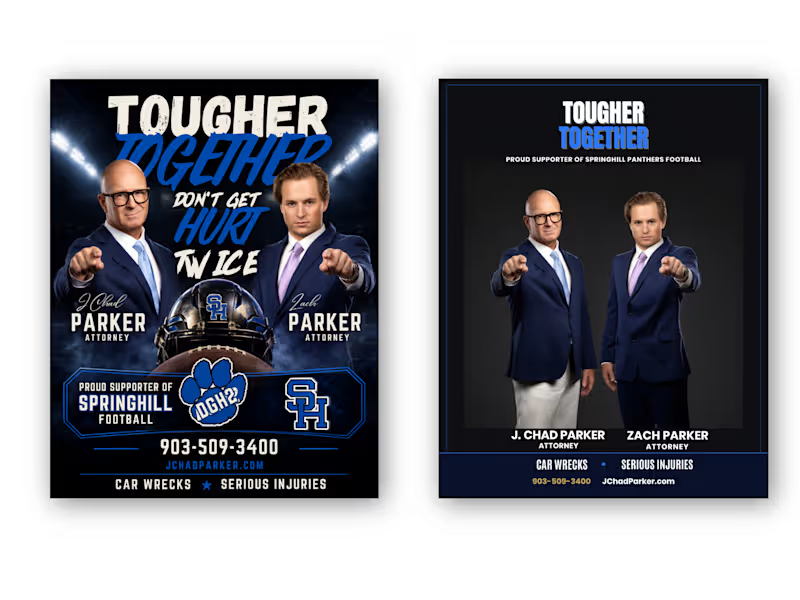
From Cluttered to Clear — Attorney Football Supporter Flyer Redesign
Client: “We have all the information we need, but the flyer doesn't communicate it clearly enough.”
My response:
“I’ll restructure the visual hierarchy, simplify the layout, strengthen the typography, and make the attorneys and contact information easier to recognize—while keeping the football-supporter identity.”
Result:
A cleaner Before → After transformation with stronger hierarchy, improved readability, better visual balance, and a more professional attorney-focused presentation.
Client Problem
The original flyer had strong content, but the overall design felt visually crowded and overly promotional. Too many elements competed for attention, making it difficult to immediately understand the attorneys, their names, services, contact information, and football sponsorship message.
BEFORE — Client's Problem:
The original concept contained all the necessary information, but the visual hierarchy was weak. Multiple headlines, images, football graphics, logos, and contact details competed for attention.
AFTER — My Solution:
I transformed the layout into a more structured and professional composition with a clear hierarchy, stronger typography, improved spacing, focused imagery, and easier-to-find contact information.
Final Result
The goal wasn't simply to make the flyer look different. The goal was to make the information easier to understand, strengthen the professional presentation, and preserve the client's football-supporter identity.
I redesigned this attorney promotional flyer by solving a common communication problem: too much information competing for attention.
The original design had strong imagery and messaging, but the hierarchy was crowded. I reorganized the content, strengthened typography, improved spacing, created a clearer information structure, and balanced the football-supporter theme with a professional legal identity.
The result: a cleaner, more focused flyer that communicates the message faster while keeping the original brand personality.
Tools: Adobe Photoshop, Adobe Illustrator
Service: Flyer Design • Graphic Design • Print Design • Layout Design • Advertising Design
Focus: Visual Hierarchy • Typography • Information Architecture • Branding • Readability
Hashtags
#GraphicDesign #FlyerDesign #FlyerRedesign #BeforeAndAfter #DesignCaseStudy #AdobeIllustrator #AdobePhotoshop #PrintDesign #AdvertisingDesign #Typography #VisualHierarchy #Branding #CreativeDesigner #AttorneyMarketing #ProfessionalDesign
0
43