


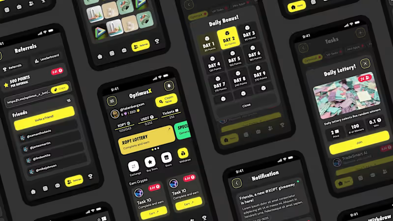
The goal was to move away from the old cluttered design and create something more effective and modern.
What changed? I switched to a sleek Dark Mode with bold yellow accents to give it a vibe. I also cleaned up the layout, making the balances easier to read and the navigation much more intuitive. Now, the app feels professional, organized, and way more user-friendly.
I’m really happy with how this transformation turned out. Which version do you prefer? Let me know your thoughts! 👇
0
156

