
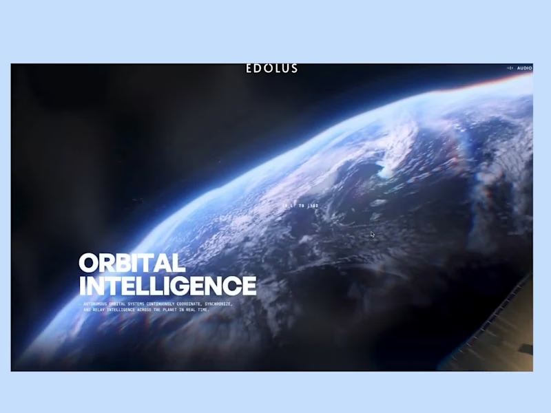
Edolus explains AI infrastructure by taking you on a journey. It starts with Earth from orbit, then drops through the clouds into a glowing chip node, then closes in on a 3D server blade you can see inside. The black and gold palette, the sound, and the smooth camera moves make a technical product feel cinematic.
Big shout-out to Viktor Oddy (https://x.com/viktoroddy) for building this. The scale, the lighting, and the pacing are excellent.
0
47
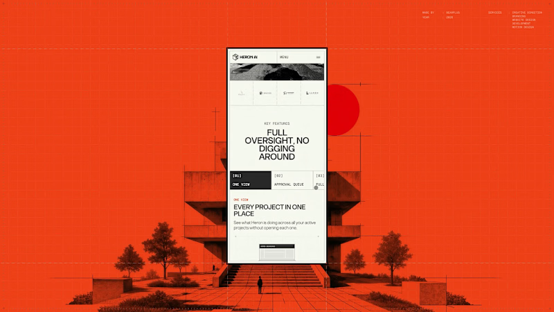
The Heron Dashboard page had to make an agent's work legible after the fact, which is a different job to explaining what the agent does.
The hierarchy leads on time saved rather than activity volume. Heron's positioning rests on hours lost to repetitive modelling, so the product reports back in the same unit, supported by model health, active and pending item counts, and a feed of agent actions. The second half of the page covers contextual code questions, answered against a specific layout and occupancy rather than quoted in isolation.
Mobile treated density as the core problem. The four headline figures are kept grouped so the summary survives a portrait screen, and tabular content is restructured into stacked cards rather than compressed into scrollable tables.
3
143
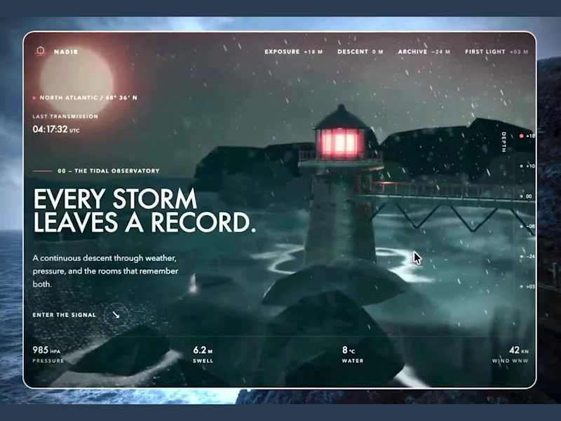
Nadir starts at a lighthouse in the middle of a storm, with rain falling and the lamp glowing red. Then you scroll and descend through a copper tunnel into a deep archive of glowing capsules. The depth gauge, the live weather readouts, and the glass panels make the whole descent feel like a real instrument. It’s atmospheric storytelling done well.
Big shout-out to Rishabh Joshi for building this. The mood, the lighting, and the details are stunning.
2
170
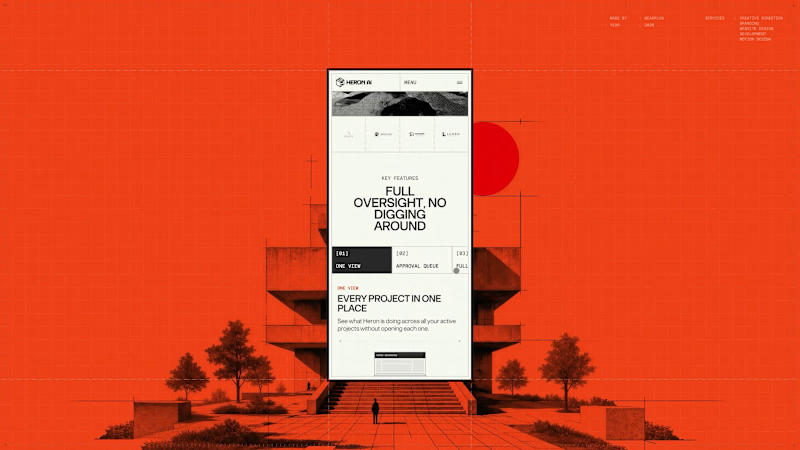
Very little of the Heron site is layout, which makes responsive a design problem rather than a build task.
The hero depends on a cursor drag, the preloader on a datum line moving up a full elevation, the explanation on a four-beat scroll sequence, and the whole visual system on architectural linework that fails when scaled down.
Each of those was re-solved for mobile. The hero interaction was rebuilt for touch and reframed to portrait. The scroll sequence was re-timed for shorter distances. Drawings were recropped so the relevant part of the plan is shown at a readable size instead of the whole drawing at an unreadable one. Motion weight was reduced to hold performance on mid-range devices without dropping any of the beats that carry the story.
Since most traffic arrives on mobile, this version had to stand on its own rather than gesture at the desktop experience.
1
136
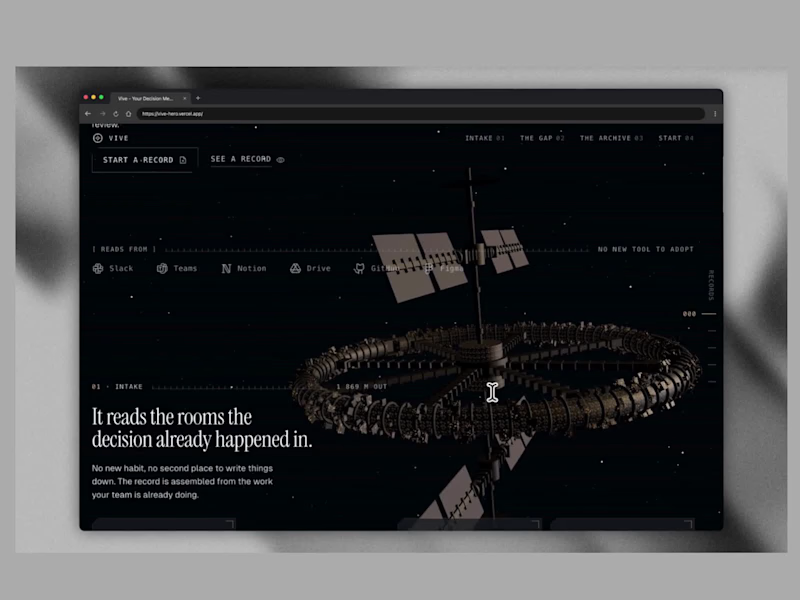
Vive tells its story by flying you through a space station. Scroll and the camera moves from a ring floating in the dark into long, glowing corridors of archive panels, with the copy changing at every stage. A decision-memory tool is a hard thing to show, and this makes it feel cinematic and easy to follow.
Big shout-out to Rishab for building this. The camera work, the lighting, and the storytelling are excellent.
🔗 https://vive-hero.vercel.app
(https://vive-hero.vercel.app)💻 https://github.com/rishabdesigns/viv (https://github.com/rishabdesigns/vive)
8
6
425
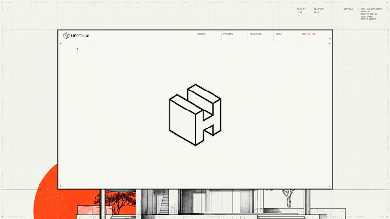
Page transitions on Heron are treated as view changes rather than document loads. Motion exits one page and continues into the next, with no hard reset and no white flash between states.
The reasoning is product-led. Heron runs inside Revit, Rhino, ArchiCAD and SketchUp, where switching context means panels updating around a drawing that stays put. A site built to sell that experience shouldn't behave like a set of separate files.
The transition also gives us somewhere to hide load time, which keeps the heavier interactive sections feeling immediate on slower connections.
1
1
177
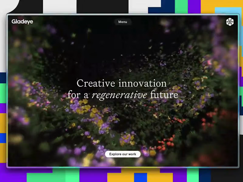
Gladeye’s homepage is a dark 3D meadow made of thousands of tiny flowers. They drift, bloom, and shift in and out of focus as you move, behind a simple line about a regenerative future. It’s calm and quiet, and the visuals match the message.
Big shout-out to Gladeye for building this. The depth, the color, and the soft motion are beautiful. 👏
🔗 gladeye.com
2
171
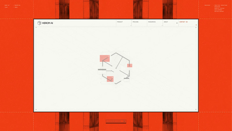
The About hero is a three-state sequence that does the identity work and the product explanation at the same time.
It opens on a hexagonal floor plan drawn in full detail, with walls, fixtures and dimension strings. Red blocks then resolve over sections of the layout, marking the kind of issues Heron is built to catch. Finally the plan lifts into an isometric view and folds into the Heron wordmark's symbol, with the dashed hexagon beneath the mark matching the original building footprint exactly.
The mark was constructed from the plan rather than drawn separately and rationalised later, which is why the transition holds. It also means the About page opens by demonstrating the product loop before any copy about the founders appears.
2
3
246
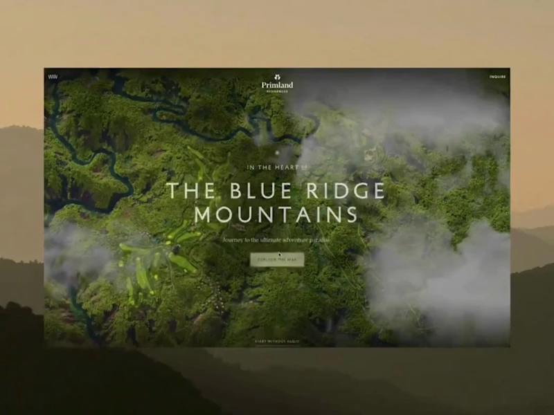
Primland puts a whole mountain resort on one interactive 3D map. You start high above the Blue Ridge Mountains with clouds drifting through the valley, then pick a pin and fly down to the lodge, the pool, or the mountaintop restaurant. The terrain, the trees, and the smooth camera moves make you want to book a trip.
Big shout-out to Robert Borghesi (https://x.com/dghez_) for building this. The scale and the attention to detail are impressive.
6
22
961
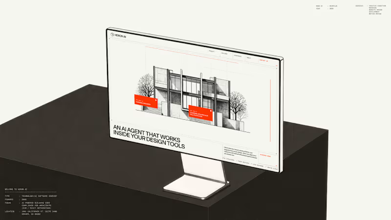
Heron AI is an agent that reviews architectural models and flags building code problems. The hardest part of the brief was making that legible in the first few seconds.
We built the hero as a small interaction instead of a statement. The visitor drags across a black and white building sketch and violations surface where they drag, annotated with real IBC clauses. It puts the person in the agent's position for a moment.
Everything after that section can then talk in normal product language, because the core idea has already landed without needing to be described.
4
4
558
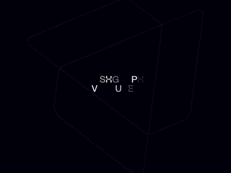
Hashgraph Ventures opens on a glowing crystal floating over a dark ocean. Scroll and it shatters, pulling you down into a glowing crater under the water, and the journey ends with the logo rebuilt out of particles. The lighting, the water, and the sound make it feel more like a short film than a website.
Big shout-out to Thom for building this. The atmosphere and the way the scene changes as you scroll are incredible.
0
138
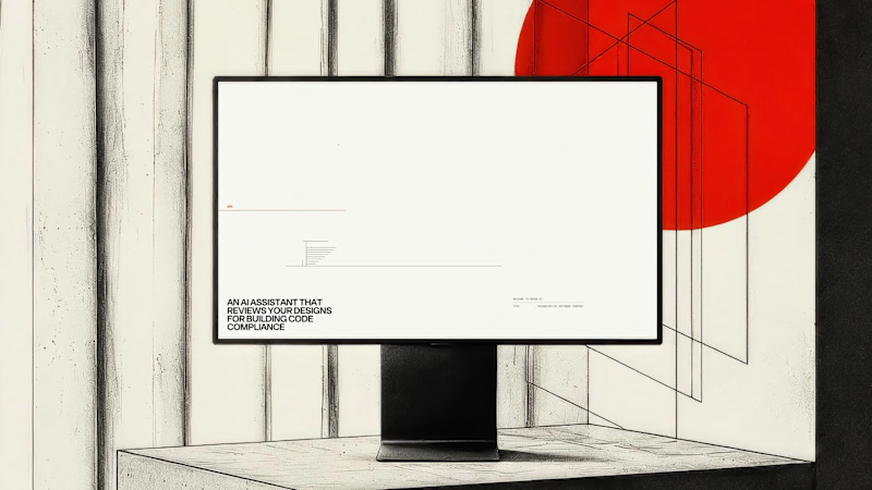
Heron runs inside Revit, Rhino, ArchiCAD and SketchUp, so the site had to read as an instrument rather than a brochure from the first frame.
The preloader replaces the progress bar with a drawing in progress. A red datum line moves up an architectural elevation carrying the percentage value, and the building is drawn in line by line as loading completes. Supporting information sits in the margins in the same register: live cursor coordinates, a project spec card covering type, founding year, focus and location, and a numbered system boot sequence.
Functionally it covers asset loading for the interactive hero, so the drag-to-reveal behaviour responds immediately once the page lands. Editorially it sets the frame before a single line of marketing copy appears.
8
13
740
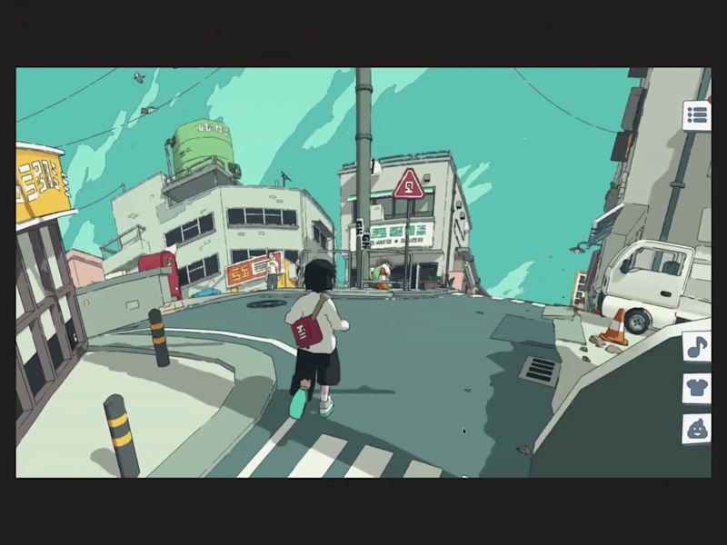
Messenger by Abeto doesn’t feel like a website. It’s a playable 3D world in your browser. Run a courier through a hand-drawn neighborhood, chat with the locals, deliver messages, and change your outfit along the way. The illustrated look, the teal skies, and the small details on every street make it feel like stepping into an animated film.
Big shout-out to Abeto for building this. It’s a masterclass in what Three.js and WebGL can do. 👏
🔗 https://messenger.abeto.co
0
125
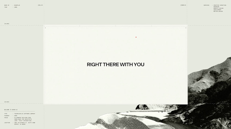
Agent products resist normal product marketing. There's no single interface to screenshot and the category vocabulary has gone generic, so a feature list communicates almost nothing.
We built Heron's explanation as a four-beat scroll that runs the agent's actual loop. The model appears and is watched. Violations surface with plain language and a real IBC clause. An edit is applied after approval. The system learns the firm's standards.
Pacing was the main design problem. Each beat needed enough scroll distance to register as a separate action, without the section becoming so long that people bail before the payoff. The sequence carries the technical detail that would otherwise sit in a spec table.
4
11
720
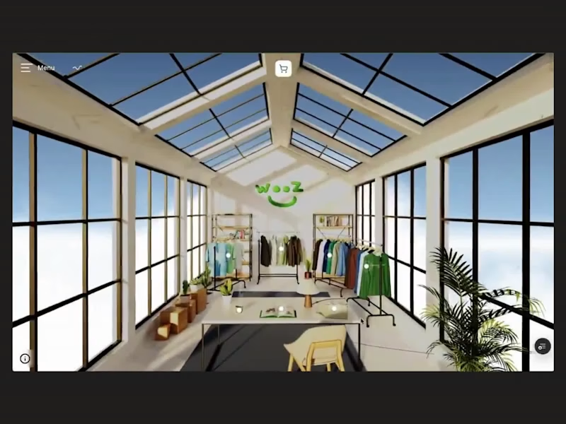
Wooz turns online shopping into a walk through a real store. Look around a bright, glass-roofed room, click a rack to move in close, then open a product and spin a 3D model of the tee while you switch colors. It works like a real shop, and it’s the kind of experience that makes you want to browse.
Big shout-out to Joël Mi (https://x.com/JolMik) for building this. The space, the lighting, and the product interaction are so well done
2
0
136