
Graphic Designer | UI Specialist


Corporate Presentation Catalog Design
I designed a modern and professional corporate presentation catalog, ensuring full alignment with the brand’s identity and visual language.
The design process focused on preserving corporate colors, consistency, and brand integrity, while creating a clean and impactful layout that effectively communicates services and company vision.
Special attention was given to typography, spacing, and visual hierarchy to enhance readability and deliver a strong corporate impression. The result is a structured and visually engaging catalog that reflects professionalism and strengthens brand perception.
Key Highlights
Brand-consistent design approach
Effective use of corporate colors
Clean, modern, and professional layout
Strong visual hierarchy and readability
Structured presentation flow
0
184
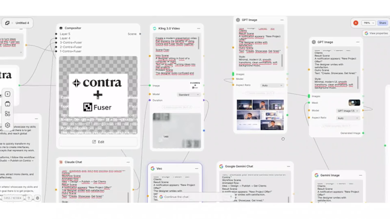
This video represents how I transform ideas into real, client-ready projects by combining two powerful tools: Contra and Fuser Studio.
My goal is simple:
To show not just what I design, but how I think, create, and deliver value.
I also created this video to demonstrate what I’m قادر of producing with Fuser Studio — from interface design to interactive prototypes and visual experiences.
With Fuser Studio, I quickly turn concepts into functional and visually engaging designs.
With Contra, I present these works to a global audience and connect with potential clients.
This video highlights my workflow:
From idea → to design → to real opportunities.
It’s more than a showcase —
it’s a reflection of my process, creativity, and the way I approach every project.
2
6
548