Freelance Graphic Designers in Agra
Sign Up
Post a job
Sign Up
Log In
Filters
2
Projects
People
Gureesha Singh
Agra, India
Visual design for authors, coaches & bold creatives
$1k+
Earned
7x
Hired
4.2
Rating
60
Followers
expert
Follow
Message
Visual design for authors, coaches & bold creatives
0
Book Cover Design Portfolio 2025
0
10
0
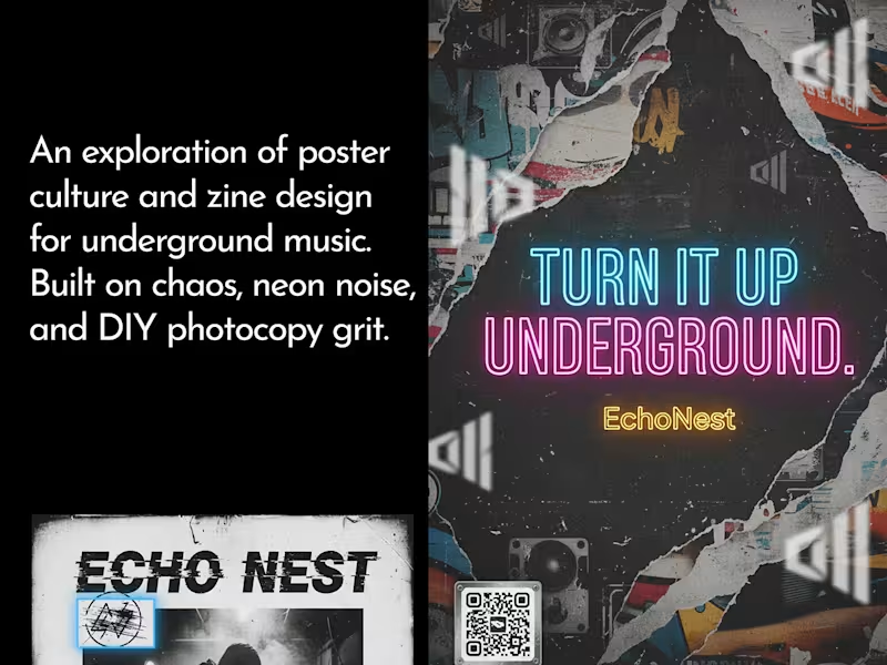
Bold Poster & Zine for Indie Underground Music
0
1
0
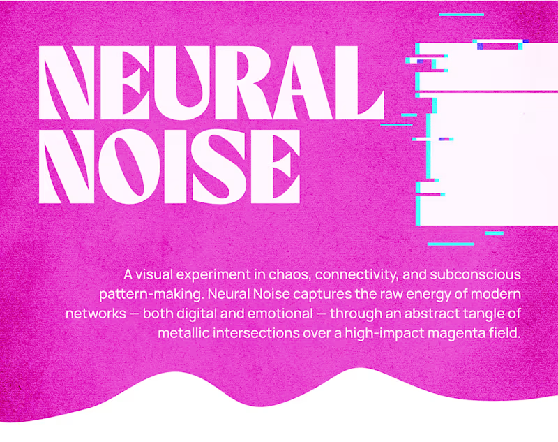
Abstract Brutalist Poster Design - Magenta & Metallic
0
3
1
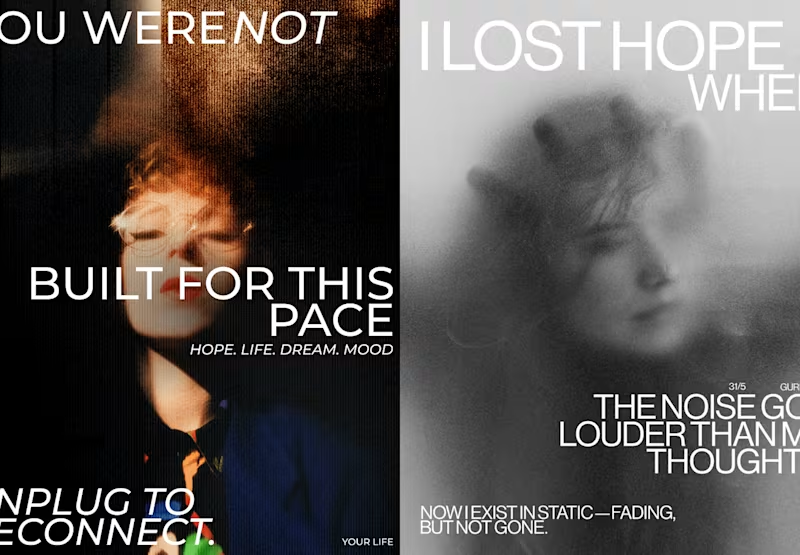
BOLD POSTER DESIGN SERIES — VISUALS THAT PUNCH
1
7
Graphic Designer
(8)
Follow
Message
Anu Kumari
Agra, India
Brand & Marketing Designer for consistent social + print.
26
Followers
expert
Follow
Message
Brand & Marketing Designer for consistent social + print.
9
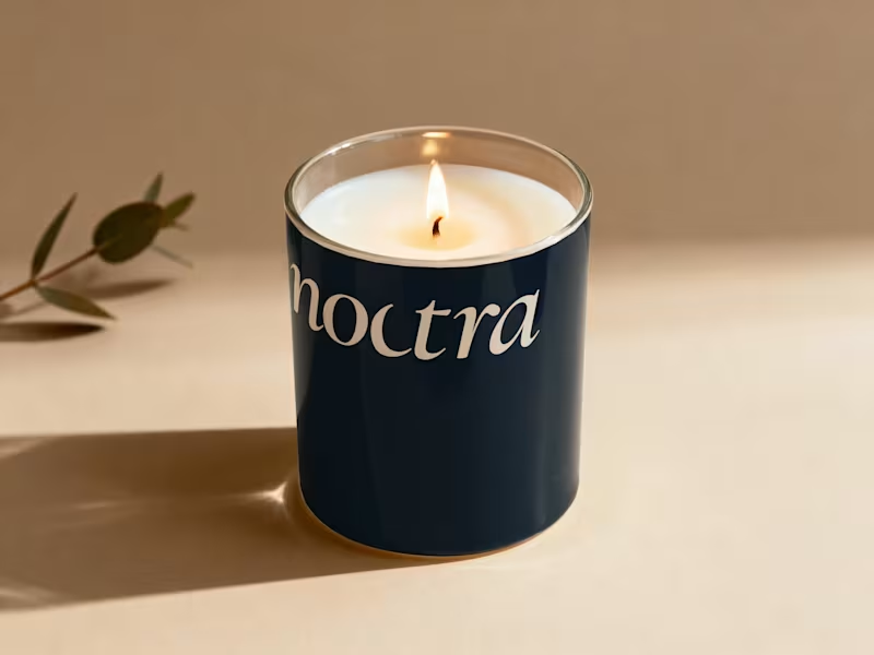
Most coffee brands compete on intensity. Bold colors, aggressive typography, slogans built around hustle and momentum. Even premium specialty brands tend to lean on origin stories, roasting data, and café culture aesthetics. Noctra is a specialty coffee brand built for the quiet hours — the moments between dusk and dawn when the world slows down and you finally have time to just exist. In a market that shouts energy, speed, and productivity, Noctra whispers something different: stillness is not emptiness. Darkness is not absence. And a good cup of coffee deserves more than a rushed morning. The goal was to build a brand that feels like the last hour before sleep or the first hour before the world wakes — warm, intentional, and deeply present.
6
9
214
3
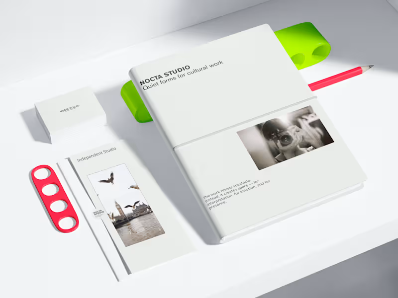
NOCTA STUDIO — Brand Identity & Editorial System NOCTA STUDIO is a conceptual brand identity project for an independent cultural studio working with artists and filmmakers. The identity is built around emotional restraint, clarity, and a system-driven approach to typography and layout. The goal was to create a flexible visual language suitable for editorial, print, and digital applications. This project demonstrates my approach to minimal branding and content systems. Services Brand identity design Editorial design Visual systems for social & digital Print & digital mockups Check my full work https://www.behance.net/anukumari4567
3
162
4
Minimal Brand Systems for Tech, Beauty & Food 🙌 This project explores minimal brand systems designed for clarity, consistency, and long-term use. The focus is not on decoration, but on building flexible visual foundations that scale across industries. The work covers technology, beauty, and food brands, unified by a calm, restrained design approach. Objective To design brand visuals that: Reduce visual noise Communicate purpose clearly Adapt easily across digital and physical touchpoints Each concept prioritizes structure, typography, and balance over trends. This project is a personal exploration of system-driven branding and minimal visual communication. Feedback and professional critique are welcome.
4
237
3
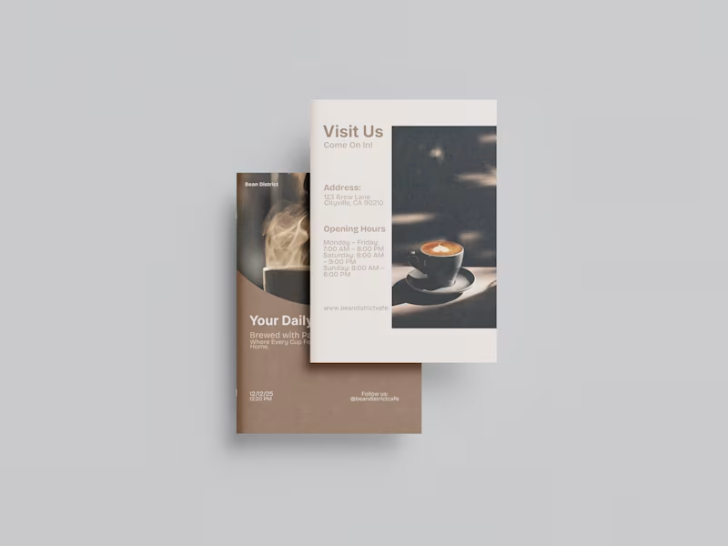
Brochure design for a cafe brand. “A minimal, modern brochure design featuring clean lines, balanced layouts, and a refined aesthetic that reflects the café’s warm, contemporary atmosphere.”
3
230
Graphic Designer
(8)
Follow
Message
asif raeen
Agra, India
Pixel-perfect graphics & video narratives
expert
Follow
Message
Pixel-perfect graphics & video narratives
0
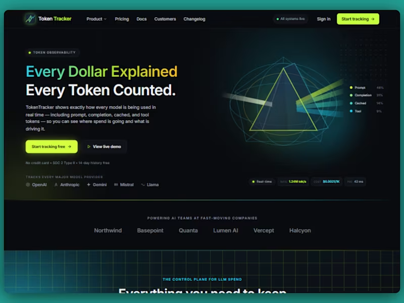
Here is my entry for #wonderchallenge I built TokenTracker TokenTracker is a B2B SaaS concept for production AI teams. It helps them understand model spend, routing, latency, and prompt-level usage in one place, so they can see where costs are coming from and make better decisions about which model to use to reduce cost and increase efficiency. It solves a common problem for teams shipping AI features: once they start using multiple models, it becomes hard to tell why costs are rising or which requests are driving the bill. This app brings that visibility into a single, clear product experience. I built it as a high-fidelity multi-page design project all in Wonder. I first defined the product direction, narrowed the idea to what could be built and currently possible in Wonder, created the design system and branding foundation, and then designed each page section by section using Wonder’s tools and chat keeping brand consistency across the pages . The final result is a polished concept that feels close to production. For the app I have built following pages — Home page Pricing page Documentation page User Dashboard Project Link https://app.wonder.so/asif-raeen/files/019f2b3f-bdd7-76e3-a6af-b7d2963a31e9 (https://app.wonder.so/asif-raeen/files/019f2b3f-bdd7-76e3-a6af-b7d2963a31e9)Product Walkthrough https://app.usebubbles.com/wyPwxqhPTXX4UmUmYoUKcR/token-tracker-product-walkthrough (https://app.usebubbles.com/wyPwxqhPTXX4UmUmYoUKcR/token-tracker-product-walkthrough)X post link https://x.com/asifraeen_/status/2073718478125809781?s=20 (https://x.com/asifraeen_/status/2073718478125809781?s=20)LinkedIn post link https://www.linkedin.com/posts/asifraeen_wonderchallenge-ugcPost-7479486155676078080-NPfr/
0
32
1
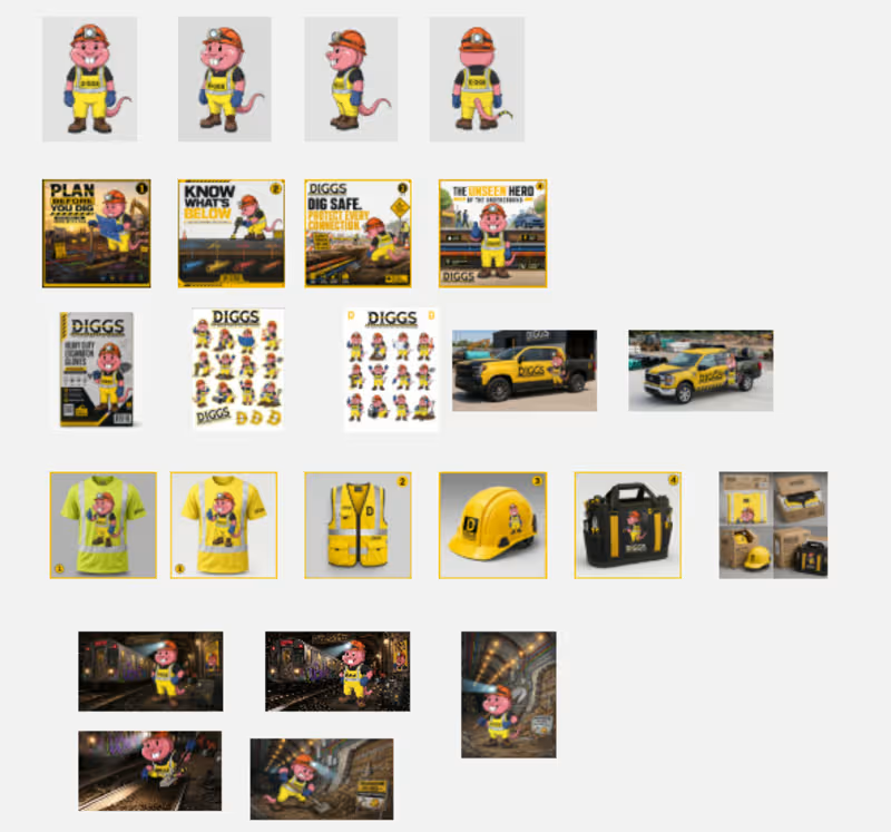
DIGGS — The Unseen Hero of the Underground I developed the core concept myself and used AI as a creative partner to refine, iterate, and expand the idea into a complete brand identity. What is DIGGS? DIGGS is the brand mascot for an underground construction and utility company. It embodies the people who work beneath our feet—building, maintaining, and protecting the essential infrastructure that keeps cities moving. Inspired by their resilience, teamwork, and challenging work environment, DIGGS is confident, dependable, and approachable, turning unseen underground work into a proud and recognizable brand identity. Why a Mole-Rat? The mole-rat wasn't chosen because it looks cute—it was chosen because it belongs underground places. Its ability to thrive in dark, confined environments mirrors the daily reality of underground construction crews. By making an overlooked animal the face of the brand, DIGGS shines a light on the unseen professionals whose work quietly keeps cities running.. Assets Created To build a complete and consistent brand identity, I created following assets: Mascot turnaround — DIGGS illustrated from four different angles with a consistent character identity. Social media campaign — A four-slide educational carousel and a branded office poster. Sticker packs — Two sticker collections featuring DIGGS in different poses and expressions, along with the company logo and 4. favicon. Vehicle branding — Two branded company vehicles demonstrating real-world application. Merchandise — Four work-related branded products (workwear and gear), including realistic retail packaging. Promotional content — A hero scene of DIGGS at work, later used as the basis for a short animated introduction video. Additional illustrations — Two cinematic scenes showing DIGGS working inside underground tunnels. Creative Workflow Concept Development: I first brainstormed the mascot concept independently, defining the brand story, personality, audience, and purpose. This led to the idea of DIGGS, a mole-rat representing underground workers. Character Design: After researching the characteristics of mole-rats and the construction industry, I wrote detailed prompts and used Recraft Exploration mode to generate multiple mascot concepts. From the initial concepts, I selected the strongest design as the official mascot. Character Consistency: Using the selected mascot as the master reference, I generated turnaround views from multiple angles to establish a consistent character model. Brand Identity: I designed a custom DIGGS wordmark and favicon in Recraft V4.1 Vector, creating a unified visual identity for the brand. The mascot reference images, logo, and favicon became the core brand assets for the project. I used them as locked references in every prompt to keep DIGGS visually consistent across all outputs, including marketing materials, merchandise, packaging, promotional illustrations, and other brand applications. This ensured a unified and recognizable identity throughout the entire project without losing the identity. Project Link: https://www.recraft.ai/project/144238a8-2ebb-4b72-9b58-eb71d9ef7907 (https://www.recraft.ai/project/144238a8-2ebb-4b72-9b58-eb71d9ef7907)Project Walkthrough: https://app.usebubbles.com/jK95KRzqr7auxHaJU3etaT/recording-jul-02-2026 (https://app.usebubbles.com/jK95KRzqr7auxHaJU3etaT/recording-jul-02-2026)X post: https://x.com/asifraeen_/status/2072668838144131075 (https://x.com/asifraeen_/status/2072668838144131075)LinkedIn post: https://www.linkedin.com/posts/asifraeen_excited-to-share-diggs-a-brand-mascot-i-ugcPost-7478435820924755969-oyT1/
2
1
142
1
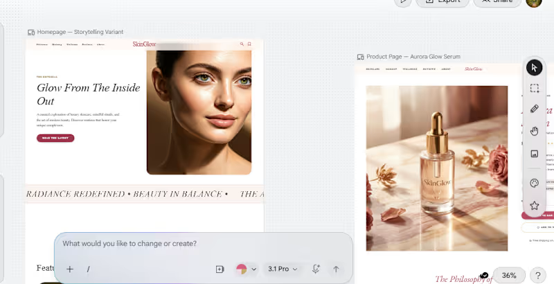
Project: SkinGlow Prototype link: SkinGlow on Stitch (https://stitch.withgoogle.com/projects/9256027226045462713) What I built SkinGlow is a luxury skincare and beauty editorial prototype designed as a modern content + commerce experience. It includes seven key pages: Home, Blog Archive, Blog Single Post, Shop, Skincare Category, Product Page, and About Us. How I used Stitch I used Stitch as a core part of my design workflow to move from concept to prototype through multiple rounds of iteration. I first explored direct prompt-based generation, then used the redesign workflow to create a stronger visual direction, and finally refined the prototype using a more structured prompt and visual references to improve clarity, consistency, and brand cohesion. Workflow and process My goal was to create an interface that feels alive, editorial, and polished while maintaining a strong beauty-brand identity across every screen. In the early prompt-generated versions, I was able to get decent typography and color consistency, but spacing between sections and components often felt uneven, and some layouts did not fully follow the intended structure. To improve the overall quality, I switched to the redesign approach and generated a visual reference for the website. That step produced a much more refined and professional-looking result, with stronger brand consistency, better visual balance, and a clearer art direction. However, when translating that visual direction back into a prototype, some of the color and theme consistency became less reliable. I then combined both approaches: detailed prompt writing, image-based reference guidance, and repeated refinement inside Stitch. That process helped me push the project further and arrive at a result that better represents the intended brand, layout system, and editorial feel. What this project demonstrates This submission shows Stitch as part of a real creative workflow rather than a one-step output. I used it to explore visual directions, iterate on layouts, compare generation methods, and refine a multi-page prototype into a more polished experience. Feedback on using Stitch One of the strongest parts of Stitch for me was how quickly it helped generate ideas and visual directions. The redesign workflow was especially useful for producing high-quality references with stronger aesthetic polish and brand identity. The main challenge was consistency between stages of the workflow. Prompt-based generation gave me better control over typography and color systems, but spacing and layout consistency still needed work. Redesign produced more visually polished outputs, but converting those into a prototype could sometimes reduce consistency in theme and visual system. Overall, Stitch was most effective when used iteratively, with structured prompts, reference images, and multiple refinement passes rather than relying on a single generation. LinkedIn post https://www.linkedin.com/posts/asifraeen_googlestitch-uidesign-uxdesign-ugcPost-7468190556339412992-03IE/ X post https://x.com/asifraeen_/status/2062422333135147161?s=20
2
1
84
0
Product Mock-Up Design for PoD Services
0
6
Graphic Designer
(6)
Follow
Message
Jitendra Sharma
Agra, India
Creative Branding & Packaging Design Specialist

Follow
Message
Creative Branding & Packaging Design Specialist
0
I will design the logo for your brand identity
0
5
0
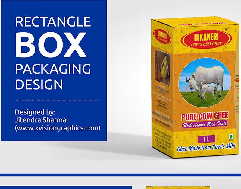
GHEE BOX PACKAGING DESIGN: Behance
0
3
0
Social Media Poster | Web Banner Design :: Behance
0
1
View more →
Graphic Designer
(3)
Follow
Message
Mohammed Suhaib
Agra, India
“Book covers for horror & children”
Follow
Message
“Book covers for horror & children”
0
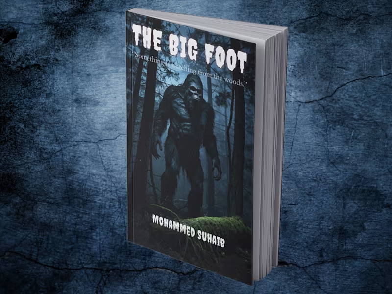
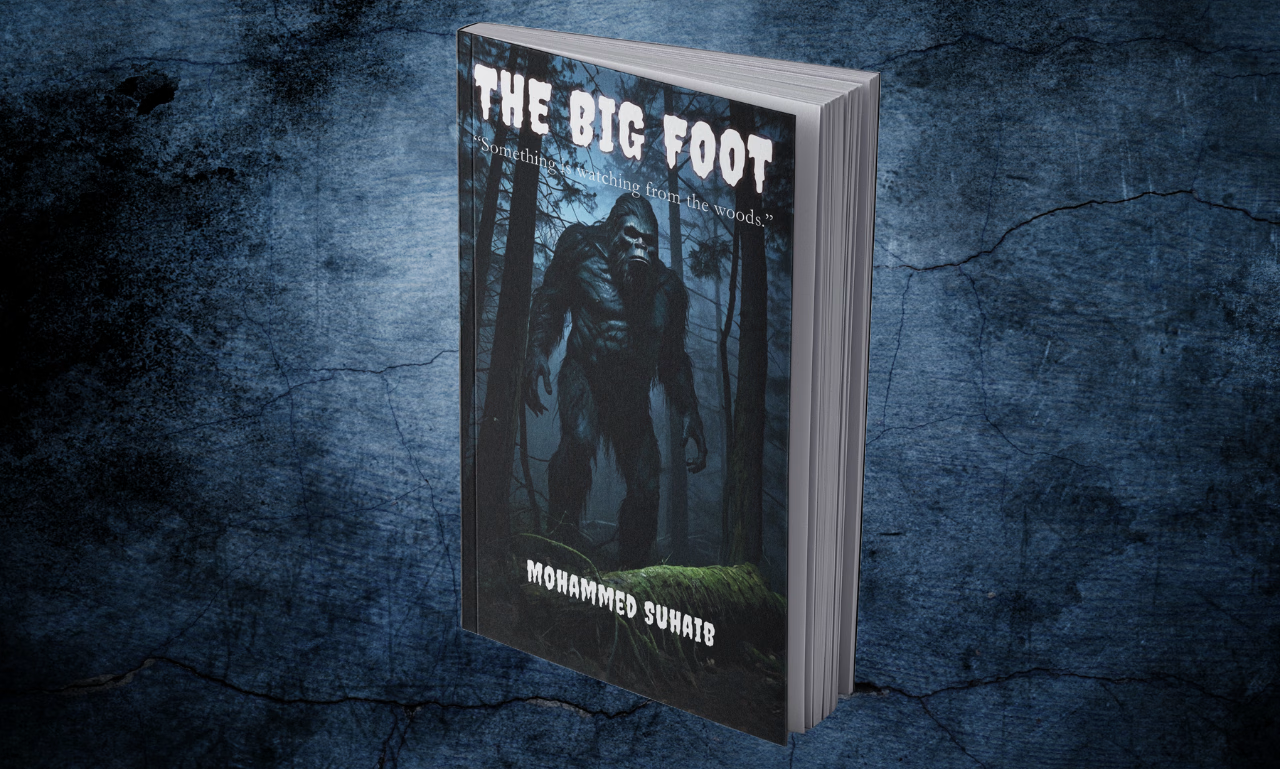
Bigfoot Horror Book Cover Design
0
5
0
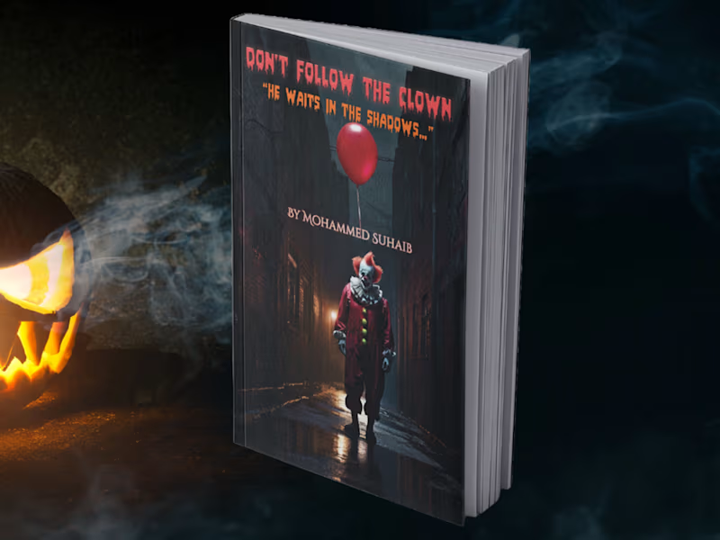
Don’t Follow the Clown Book Cover Design
0
0
0
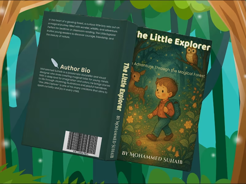
The Little Explorer Children's Book Cover Design
0
2
View more →
Graphic Designer
(2)
Follow
Message
Ashutosh Shakya
Agra, India
Good design is good business.
Follow
Message
Good design is good business.
0
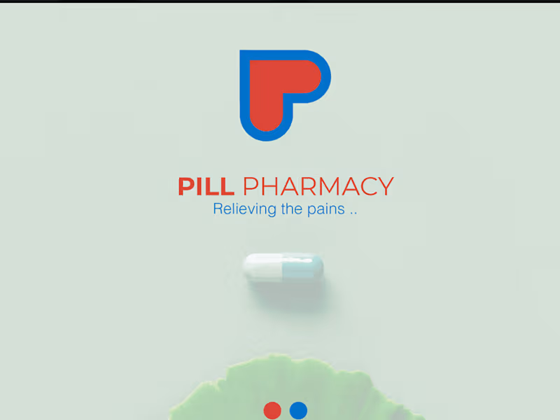
Pill Pharmacy Brand identity
0
6
0
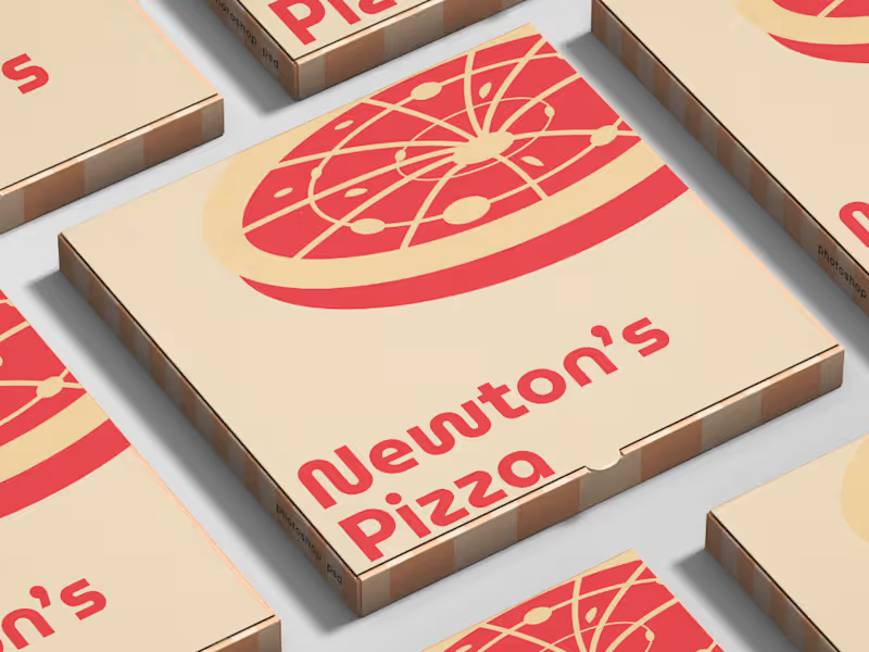
Newton's Pizza Brand Identity
0
14
0
Logo Design for Buttercup Solutions
0
5
0
Brand Identity for an Electric Car
0
8
Graphic Designer
(4)
Follow
Message
Chaitanya biswas
Agra, India
Committed to deliver a high-quality service
Follow
Message
Committed to deliver a high-quality service
0
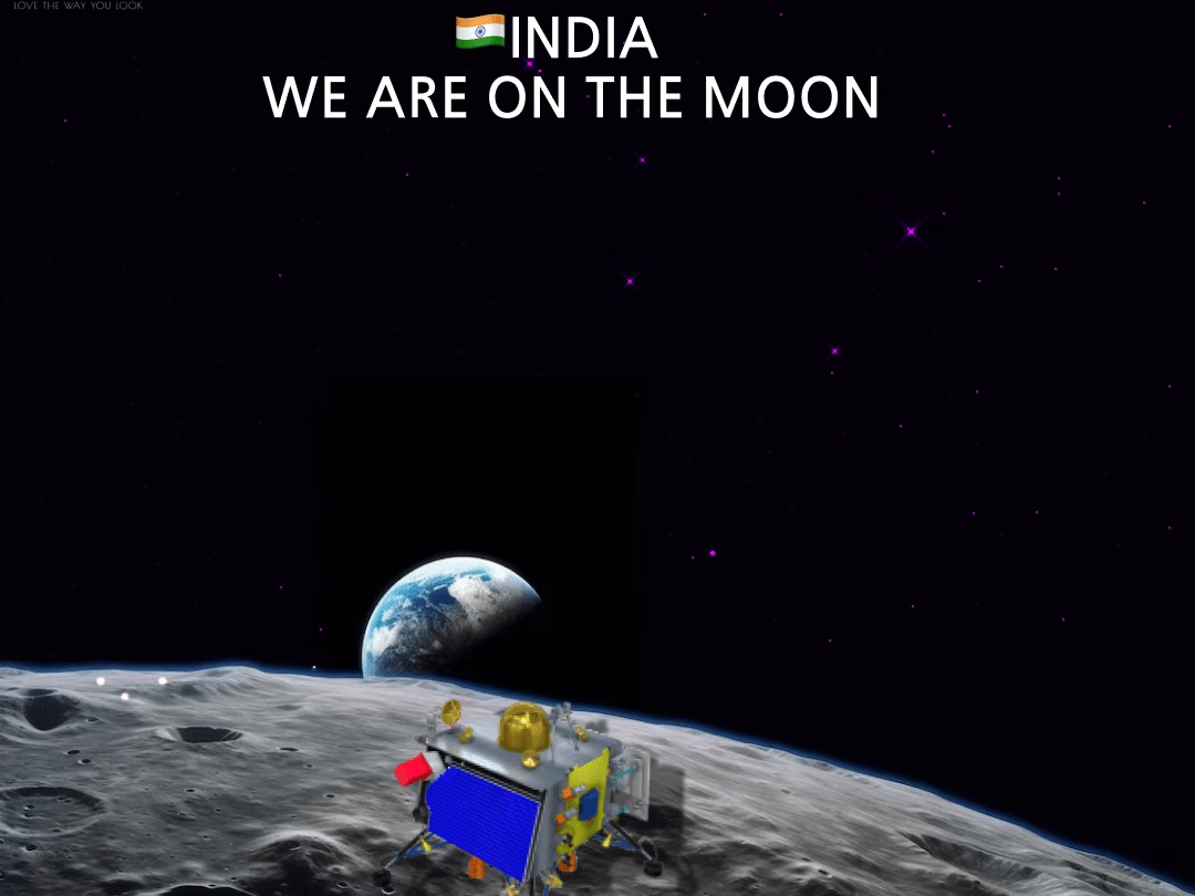
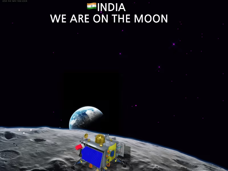
Havin on Instagram: “Chandrayaan 3 successful.
0
4
0
Cerebrum 2k23 @ Anand on Instagram: ”#cerebrum2k23 #cerebrum #s…
0
10
0
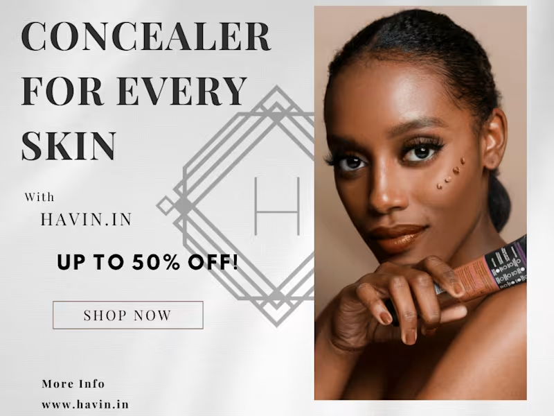
Havin (@havin.in_) • Instagram photos and videos
0
6
View more →
Graphic Designer
(2)
Follow
Message
Tanisha Jain
Agra, India
Design & data expert driving creative, data-led success.
Follow
Message
Design & data expert driving creative, data-led success.
0
LOGOfolio By TanishaJain - Tanisha Jain
0
0
0
Vanss Aluform – Sustainable Construction Brand Identity Designed a modern, eco-driven brand identity for Vanss Aluform, a construction and aluminum formwork company focused on sustainable growth. The logo integrates architectural forms with leaf elements to represent structural strength and environmental responsibility. Developed a green-centric color system supported by neutral tones and natural textures to reinforce the brand’s commitment to innovation and sustainability. Delivered a scalable identity applied across business stationery, safety gear, site signage, and digital platforms. A clean, future-forward visual system built for the evolving green construction industry.
0
45
0
Avviare International versity – Academic Brand Identity Designed a distinguished crest-based logo and brand system for Avviare International versity. The identity blends classical academic heraldry with modern refinement to convey prestige, legacy, and global ambition. Developed a deep red and gold color palette, monogram mark, and scalable visual system applied across stationery, campus signage, merchandise, and digital platforms. A cohesive, premium identity built to position the university as authoritative, aspirational, and future-ready.
0
47
0
Designed a strategic and scalable brand identity for Peepal Network, a full-spectrum consulting company. The logo merges a tree and a networked globe to symbolize interconnected growth, global perspective, and structured problem-solving. Built a refined monochrome visual system with modern sans-serif typography to convey authority and clarity. Delivered a complete identity direction including logo design, color palette, typography, and corporate mockups for digital and print applications. A minimal yet powerful brand system designed for long-term scalability and cross-platform consistency.
0
56
Graphic Designer
(1)
Follow
Message
Explore people