PROJECT TYPE
Online course landing page setup and launch preparation using Systeme.io (http://Systeme.io).
CLIENT PROBLEM / BUSINESS CHALLENGE
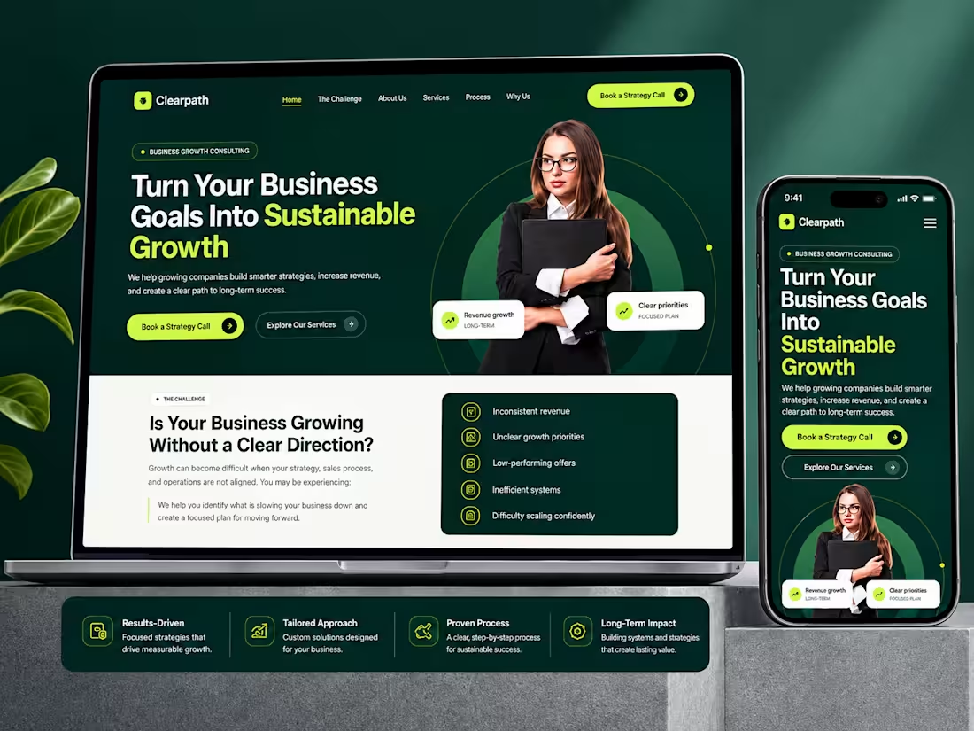
The course content and marketing messaging were already prepared, but they needed to be turned into a professional landing page that clearly presented the course and guided potential students toward enrollment.
The main challenge was organizing the available information into a page that was easy to understand, visually engaging, and structured around the course offer rather than simply placing the supplied content onto a webpage.
WHAT I DID
I structured the course information into a complete landing page experience inside Systeme.io (http://Systeme.io), focusing on clear presentation, visual hierarchy, and a straightforward enrollment journey.
The page included:
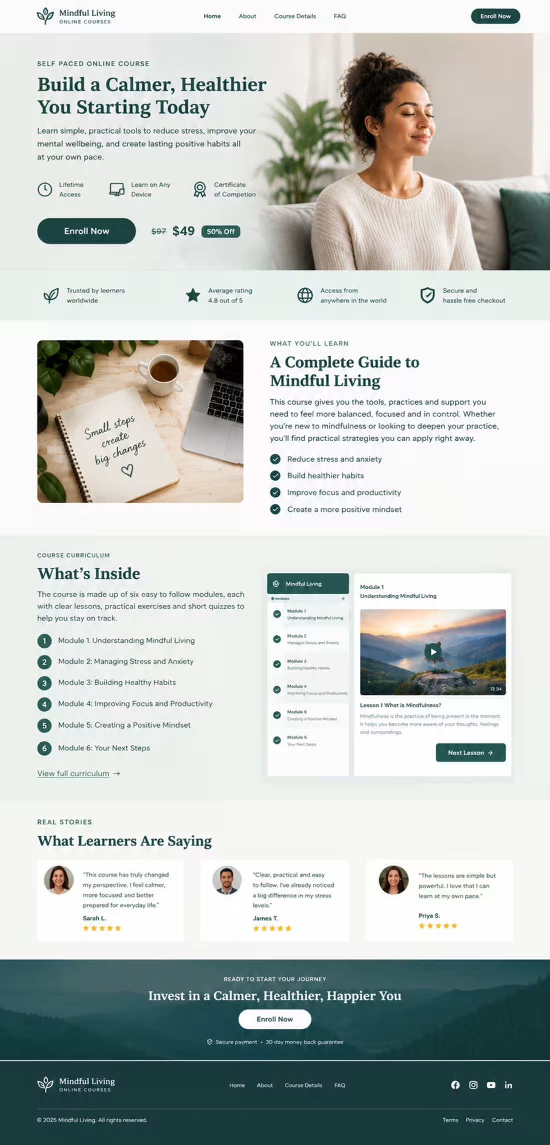
• A focused hero section introducing the course and its main value
• Clear course benefits and learning outcomes
• Course curriculum and module previews
• Visual previews of the online learning experience
• Strong and strategically placed enrollment calls to action
• Pricing and offer presentation
• Learner testimonial sections
• Supporting trust and value indicators
• A final enrollment section encouraging visitors to take action
• Consistent typography, spacing, imagery, and branding throughout the page
• A responsive structure designed for a professional online course launch
I organized the page so visitors could quickly understand what the course offers, what they would learn, what is included, and how to move forward with enrollment.
RESULT / OUTCOME
The completed landing page concept presents the course as a professional online learning product rather than simply displaying course information.
The structure gives visitors a clear journey from the initial course introduction through benefits, curriculum, learning experience, social proof, and the final enrollment call to action.
0
19
CONVERTING LANDING PAGE DESIGN — E-COMMERCE & AFFILIATE
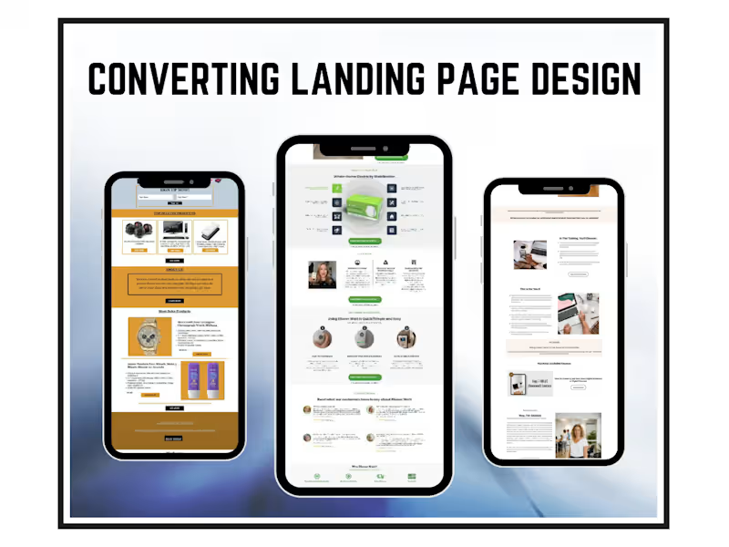
These landing pages were designed across different business models — e-commerce stores, affiliate product offers, and digital course sales — each built with one goal in mind: convert visitors into buyers.
The designs feature benefit-led headlines, clean product and offer sections, strategic call-to-action placement, social proof through testimonials, and trust-building elements like founder introductions and feature breakdowns. Every layout is structured to guide the visitor toward a single decision without distraction.
Mobile-optimized, visually consistent, and built around the specific audience each offer is targeting. No generic templates every page reflects the brand and the offer it's selling.
2
233


Career & Life Coaching Website | Systeme.io (http://Systeme.io)
The Client's Problem
The client needed a professional coaching website that could clearly communicate her Life & Business Coaching services, introduce her personally, build credibility, and guide potential clients toward booking a consultation.
What I Did
I designed and structured the Systeme.io (http://Systeme.io) website around the client's coaching journey.
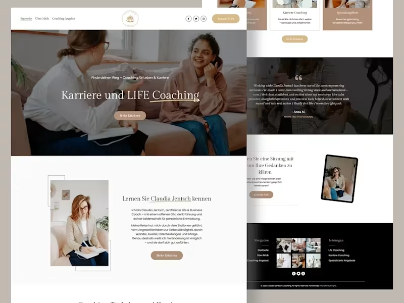
The homepage leads with a clear “Karriere und LIFE Coaching” message, followed by the coach's introduction, coaching services, specialization areas, client testimonial, consultation CTA, and supporting visual content.
I also focused on creating a calm, premium visual direction that matches the personal and professional nature of the coaching brand while keeping the navigation simple and the key actions easy to find.
The Result
A polished coaching website that gives visitors a clear understanding of the coach, her services, and the next step toward working with her.
3
214
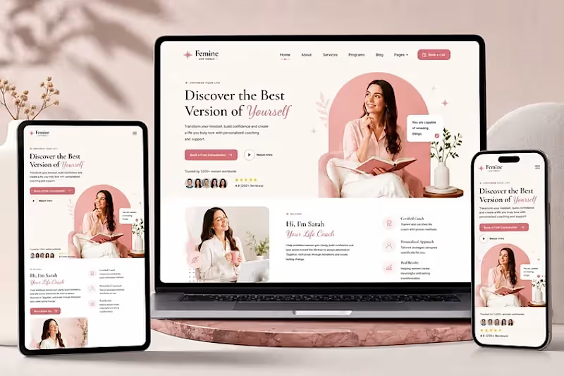
The Client's Problem
The coaching brand needed a professional website that could present its personal coaching offer clearly, build trust with potential clients, and make it easy for visitors to take the next step.
What I Did
I designed and structured this Systeme.io (http://Systeme.io) coaching website around a clear client journey. The homepage uses a strong hero section, prominent booking CTA, coach introduction, service information, trust elements, and responsive layouts across desktop, tablet, and mobile.
The goal was to make the brand feel professional and approachable while keeping the path from discovering the coach to booking a consultation simple.
The Result
A polished, responsive coaching website that presents the offer clearly and gives visitors a straightforward path toward working with the coach.
3
205
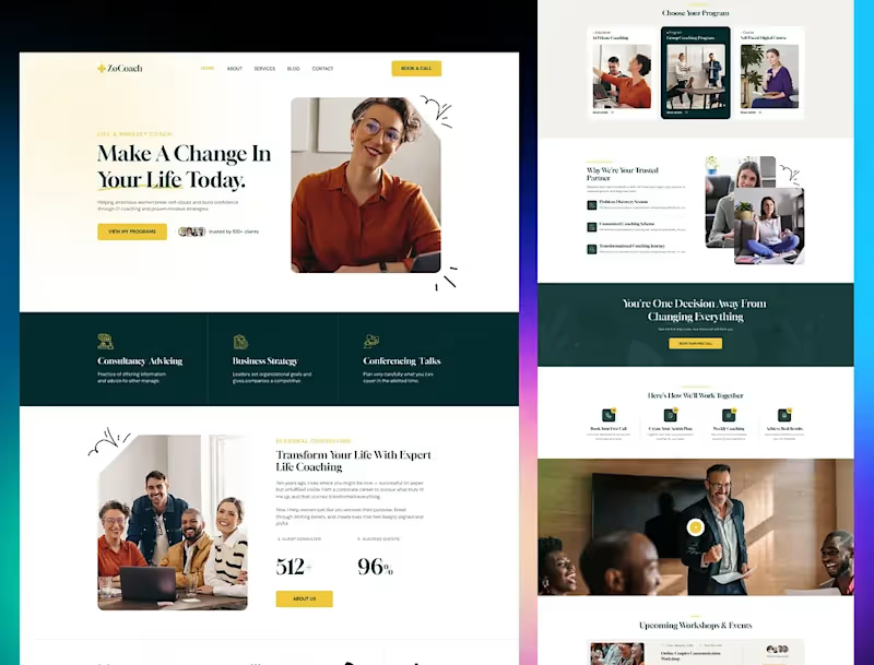
A coaching website should do more than explain what you offer. It should make the next step obvious.
This Systeme.io (http://Systeme.io) website was designed for a coaching brand with one clear goal: turn visitors into coaching clients.
From the strong hero section and clear “Book a Call” CTA to the program cards, trust section, client results, workshops, and step by step process, the page takes visitors through the journey from “What do you offer?” to “I’m ready to work with you.”
The structure matters just as much as the visuals.
A beautiful coaching website that doesn't guide visitors toward an action is just a pretty website. This one is built around the customer journey.
3
171
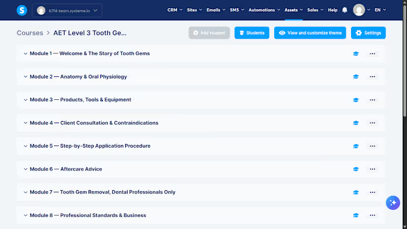
This is what a properly structured online course looks like behind the scenes.
This Systeme.io (http://Systeme.io) build is for a professional Tooth Gem training course, organized into 8 clear modules that take students from the fundamentals all the way through application, aftercare, removal, and professional standards.
Instead of throwing all the content onto one long page, the course is broken into a logical learning path that makes it easier for students to follow, learn, and progress through their training.
The goal isn't just to upload course content.
It's to turn supplied information into a structured learning experience that students can actually navigate.
4
332