
UX/UI Designer and AI Automation Expert
- $•••••
- Earned
- 2x
- Hired
- 5.0
- Rating
- 18
- Followers
UX/UI Designer and AI Automation Expert



Product & Web Design
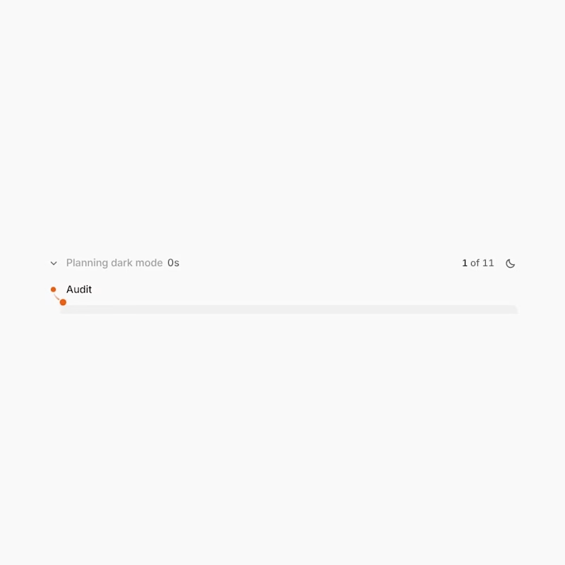

Designify: a brand identity for AI-native design.
Designify takes a single sentence and turns it into a complete brand. Its own identity had to carry that same idea: it starts simple and stays consistent wherever it goes.
The mark
A forward-leaning form set at 73.6°. That angle became the backbone of the whole system: the slashes, the engravings and the grid all follow it.
The colour
One confident orange (#FF4D00) against warm ink and paper. Nothing else.
The visuals
Every image in this series was generated in code from the mark's own geometry: contour lines, engravings and thousands of flowing strokes. None of them touch the mark. No stock photos, no templates.
Ideas move. The shape holds.
Would love to hear what you think 👇
0
52
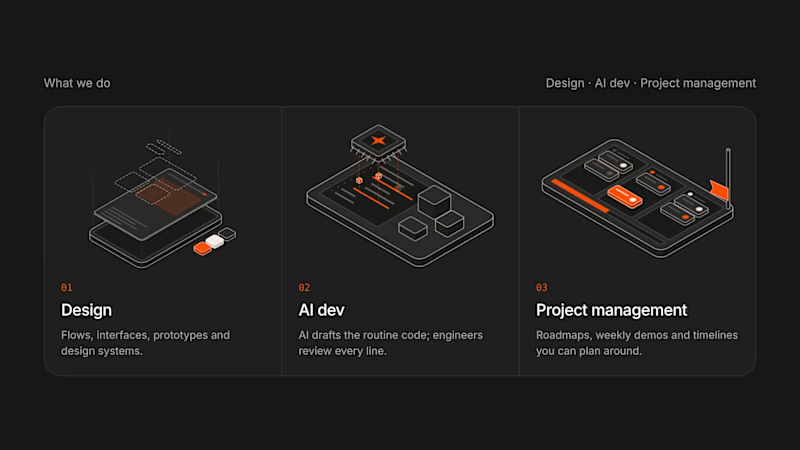

Conversion-focused design & dev for B2B SaaS and AI startups

Conversion-focused design & dev for B2B SaaS and AI startups


Hey everyone!
I've been building a lot of complex SaaS platforms and high-conversion landing pages for clients lately, and I wanted to take a step back and create something specifically for us—the designers, 3D artists, and creative agencies.
Today, I’m releasing a brand new, multi-page portfolio template, and I’m giving it away completely for FREE.
I designed this with a strict focus on a minimal, clean, and highly editorial aesthetic. It mixes heavy, structural geometric typography with fluid signature font overlays to give it a bold, high-ticket feel that builds trust with clients instantly.
What’s inside the file:
Complete Ecosystem: Home, Work, About, Services, FAQ, and a Contact page.
Framer CMS Powered: Easily manage your case studies and projects. The bento-grid layouts update automatically as you add new work.
Built-in Forms: A clean, ready-to-use project brief form to capture client leads.
Premium Interactions: Optimized scroll and appear animations that feel expensive but load instantly.
100% Responsive: Painstakingly adapted across desktop, tablet, and mobile breakpoints.
🔗 Links:
Live Preview: https://bolddot.framer.website/
Remix for Free: https://framer.link/vaKtY8V
------
I’d love to hear your honest feedback on the layout and animations! If you end up using this for your own portfolio, please drop your live link below in the replies—the DesignSense team and I would love to see what you build with it.
Happy building! 🚀
4
4
860


User Interface Designer | Web UI's | Product Design
User Interface Designer | Web UI's | Product Design


I am Professional UI/UX and WEB Designer
I am Professional UI/UX and WEB Designer
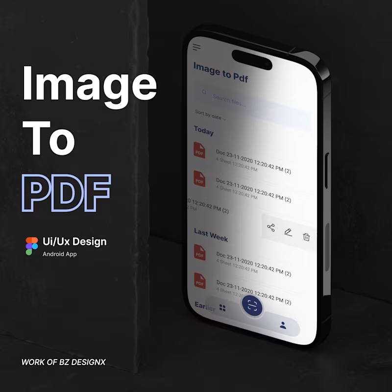
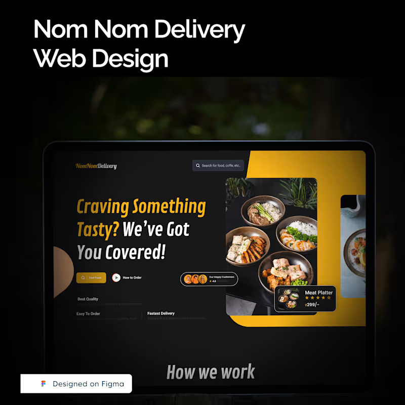
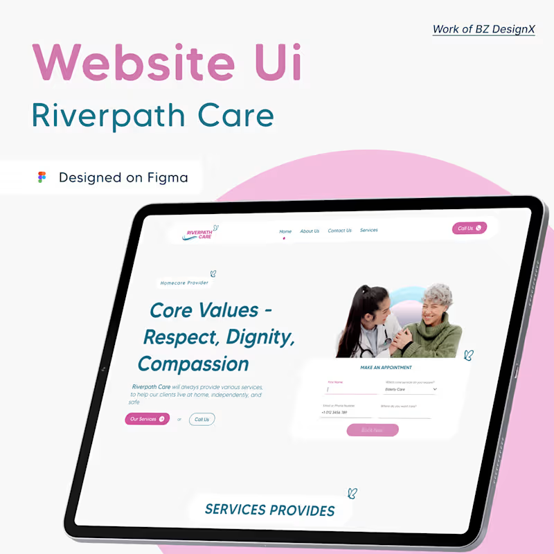


Figma Pro: Custom Web & App Designs That Impress
Figma Pro: Custom Web & App Designs That Impress

Lead-Gen Landing Page for Construction Services
A complete end-to-end UI design for a roofing business, optimized for conversion and mobile users. Designed in Figma with a focus on high-impact visuals.
https://www.upwork.com/freelancers/~01be5d3ac1feb15a61?p=2014316015435747328
0
44


HardStop — Minimal Dark Mode Night Focus Mobile App UI Design
HardStop is a minimal, dark-mode first mobile app UI designed to help users stop doom-scrolling at night by blocking distracting apps.
The goal was to create a serious, calm, and protective user experience instead of playful or gamified UI.
This project includes:
✔ Start Session Screen (Set blocking duration)
✔ Blocked Apps Management Screen
✔ System Blocking Overlay Screen
Design Focus:
Dark, sleep-friendly color palette
High contrast and legible typography
Minimal visual noise
Strong primary CTA
Clean UX with disciplined layout
Perfect for:
🌙 Focus Apps
📵 Digital Wellbeing Tools
😴 Sleep & Night Mode Experiences
📱 Productivity Apps
Designed fully in Figma following modern iOS design principles.
0
69


Fully Custom Million Dollar Framer Sites
- $1k+
- Earned
- 2x
- Hired
- 5.0
- Rating
- 16
- Followers
Fully Custom Million Dollar Framer Sites


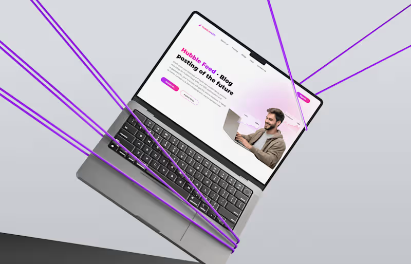


Up-to-Date UI/UX Design for User Clarity
Up-to-Date UI/UX Design for User Clarity

View more →