
Motion Design tailored to your business

Motion Design tailored to your business

When in doubt, remember why you started!
For me it was the love for animation but also the decision to stop the fear and just try. With the risk of failing.
5 years later, the path of motion design and animation is still the best choice I could have made.
I'm grateful to have found the Contra community, to be able to share and get inspired, meet new people and be able to do work that I truly love.
More about the project here
(https://hermina.carbonmade.com/ursa-major-1)Inspired by a tiny postcard (https://www.aguasfurtadas.com/product/ilustracao-ursa-major-ana-hoo) by Ana Vieira
Music by Alexandru Suciu
2
4
335

Does frame by frame animation as a skill still fit in the world as we know it today with everything all about AI?
I did this short animation back in 2023 inspired by the illustration of this house made by Ana Vieira, a Portuguese artist who's work has a great balance between simplicity and warmth.
This was done just before AI started to get more attention. And I'm still left wondering.
#framebyframe #2Danimation
4
18
291


Good morning Contra community!
Here's one of my ideas for this challenge created with Rive.
An interactive card to have in your pocket in any hotel. Using Data binding and a few micro interactions I created a small collection of services that hotels offer. Maybe laundry should get on the list as well.
4
390
Arts & Entertainment(2)

Award-Winning Brand Designer & Creative Director

Arts & Entertainment(3)

Graphic and Web designer, teacher and hardcore wanderlust.
New to Contra
Graphic and Web designer, teacher and hardcore wanderlust.
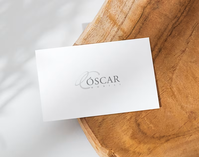
Óscar Mobili
~ Logo design
Óscar Mobili is a Portuguese furniture manufacturer with a tradition dating back to 1977, specialising in bespoke furniture and tailored solutions for architects, designers and brands.
For their logo, I developed an elegant and understated identity that reflects the brand’s connection to craftsmanship, quality and attention to detail. The symbol is built around the initial O, complemented by refined typography to create a timeless visual language that feels equally at home in classic and contemporary contexts.
The result is a distinctive yet discreet identity, designed to let the craftsmanship behind the brand take centre stage.
0
73
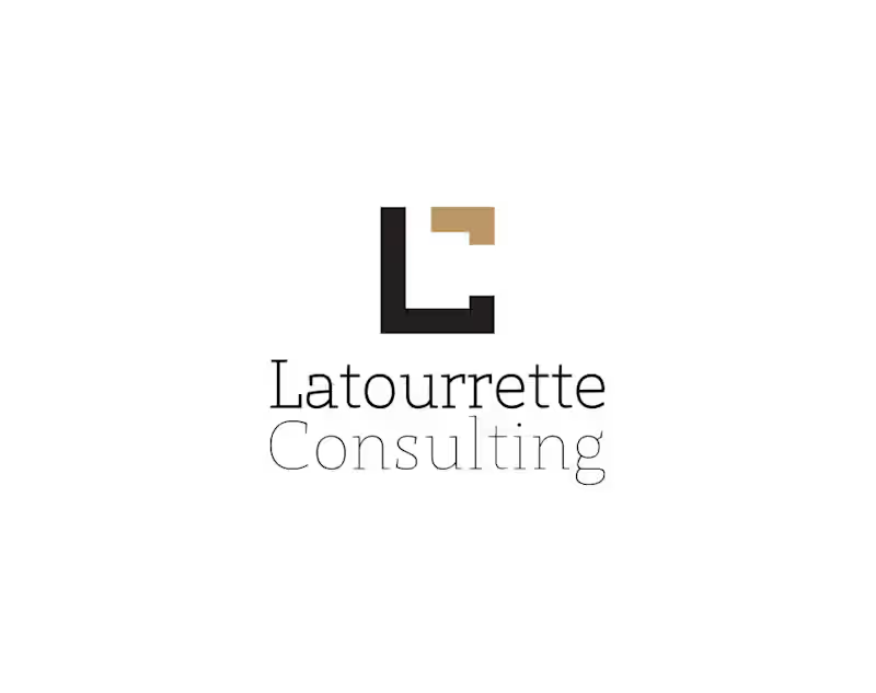
Latourrette Consulting
~ Logo design
Latourrette Consulting works at the intersection of technology, information and business transformation.
For their logo, I developed a clean and structured visual identity built around the company’s initials. The geometric symbol combines the L and C into a single compact mark, reflecting precision, structure and a contemporary approach to consulting.
The result is a simple, professional and distinctive logo designed to work consistently across different applications.
0
73
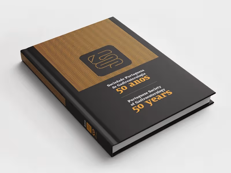
Arts & Entertainment(1)