The network for creativity
Join 1.25M professional creatives like you
Connect with clients, get discovered, and run your business 100% commission-free
Creatives on Contra have earned over $150M and we are just getting started



The network for creativity
Join 1.25M professional creatives like you
Connect with clients, get discovered, and run your business 100% commission-free
Creatives on Contra have earned over $150M and we are just getting started





Related posts

Light or dark, which one wins? ☀️🌙
Same site, two moods. Warm stone and lacquer red, or the same build after dark.
Both are hand-built with a 3D paper crumple, real physics, a stick-figure film drawn in code, and a receipt that gets a bicycle kick. 🔊 Sound on.
Tell me which you'd ship: light or dark? 👇
26 voted
59%
18 voted
41%
44 votes
Closed

I really like how the light version looks, but it has some legibility issues. Since readability is more important for users than visual appeal, I think the dark version is the better option.
BTW, I initially voted for the light version, but after analyzing both options more closely, I changed my mind 😄

Next intelligence. A brand you can feel.
Ice blue, deep black and refracted glass bring texture, depth and a sense of touch to an invisible technology. An identity designed to be recognised. And felt.
Brand identity and visual direction for Niwos, a platform that brings AI agents together as a digital workforce.
Five modules. One W. A simple idea at the heart of the identity: working as one.
I’ve really enjoyed working on this project with Muhammed. His trust in my design judgement and openness to new ideas gave me the creative freedom to explore fully.
Here’s hoping this is just the first chapter of an exciting journey with him and his team.


👍 nicely done

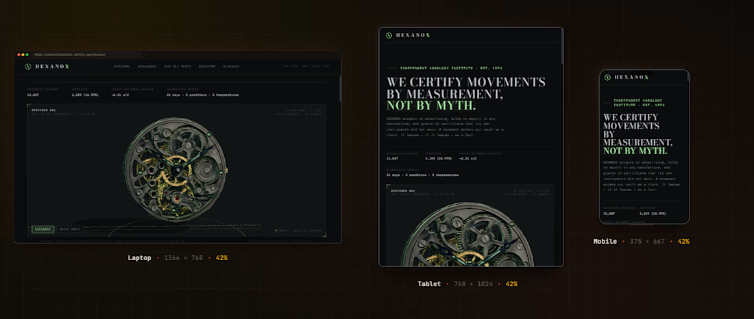
A watch movement lifted from one photograph into 3D. HEXANOX is an independent horology institute. We certify mechanical movements by measurement, amplitude, beat error, positional variance, to tolerances your eye cannot see.
I built this project to test A watch movement lifted from one photograph into 3D. HEXANOX is an independent horology institute. We certify mechanical movements by measurement, amplitude, beat error, positional variance, to tolerances your eye cannot see. The core engineering challenge was sustaining uncompromised 60 FPS rendering using Three.js (GLB 3D) while handling continuous user interaction without framework overhead.
WHAT I WAS TESTING:
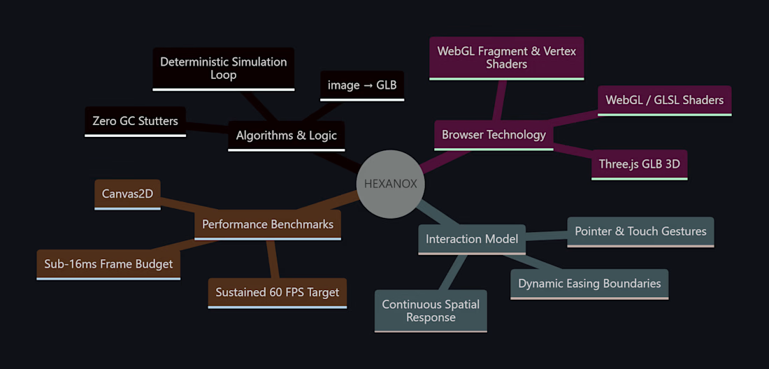
I focused on two core engineering benchmarks:
Precision implementation of image → GLB under continuous interactive user input
Sustained 60 FPS render performance and zero-dependency browser execution
THE TECHNICAL SIDE:
Engineered directly in the browser with Three.js (GLB 3D), WebGL / GLSL Shaders, Canvas2D, Image → GLB. The application runs without third-party frameworks or build-step dependencies, using hardware-accelerated rendering and custom event loops to achieve zero-latency response.
Everything executes in the browser using Three.js (GLB 3D), WebGL / GLSL Shaders, Canvas2D, Image → GLB. No third-party frameworks, no heavy runtime bundles, and zero external tracking.
WHAT I LEARNED:
Balancing the mathematical rigors of image → GLB with tactile browser interaction required tuning event throttling and memory allocation to eliminate all garbage collection stutters.
Finding the sweet spot between mathematical precision and frame budget took careful profiling, but the result runs at a steady 60 FPS even on modest hardware.
TRY IT YOURSELF:
The live build is deployed on Netlify. Open it in your browser, test the controls, and observe the render response times.
If you are building high-performance 3D, physics, or creative web systems and want to collaborate, reach out here on Contra.