The network for creativity
Join 1.25M professional creatives like you
Connect with clients, get discovered, and run your business 100% commission-free
Creatives on Contra have earned over $150M and we are just getting started
Back to feedPost

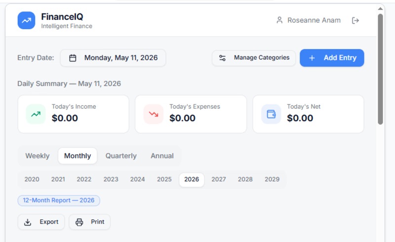
Building a smart financial app on base44. The app is customized to suit the needs of different user categories. see the outcome here: https://spiritual-smart-finance-iq.base44.app


The network for creativity
Join 1.25M professional creatives like you
Connect with clients, get discovered, and run your business 100% commission-free
Creatives on Contra have earned over $150M and we are just getting started
Challenges
View all


Related posts

NEXOR — Creative Digital Agency Website 🔥
NEXOR is a futuristic website concept for a creative digital studio focused on digital products, brand systems, and bold digital experiences.
The goal was to create a memorable first impression while keeping the agency’s services and next steps clear.
Special attention was given to:
• a bold hero composition with oversized typography and futuristic imagery;
• a vibrant orange and black palette that creates a distinctive visual identity 🟠;
• a strong visual hierarchy that balances creative expression with usability;
• clear CTAs for starting a project or booking a call;
• a contact form integrated directly into the hero section;
• responsive mobile layouts that preserve the visual impact 📱;
• a full-screen mobile menu with intuitive navigation and prominent contact options.
The result is an expressive digital experience that combines bold visual storytelling with a clear path to conversion.
Looking to create a distinctive website for your creative agency, digital studio, or technology brand? Let’s build something extraordinary together ⚡


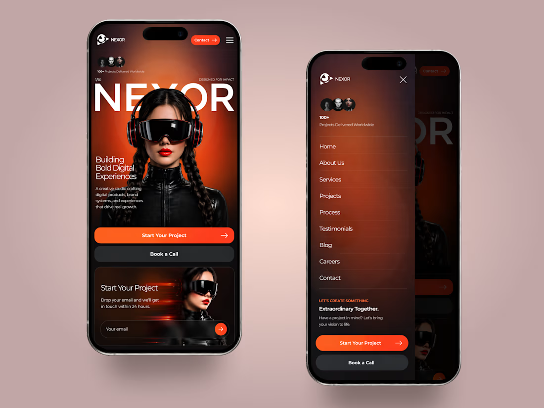
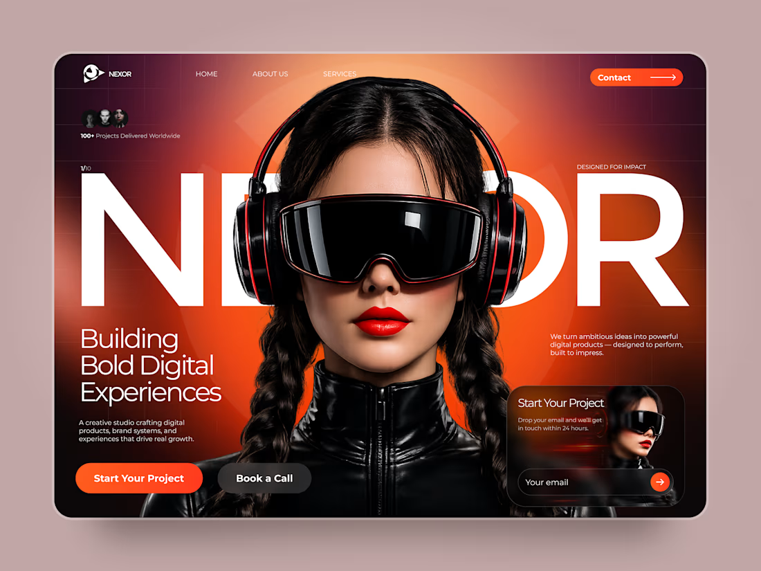
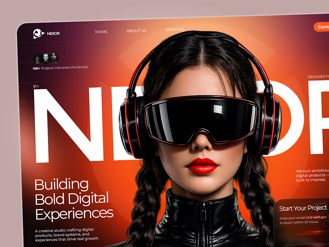

The orange-and-black system has real presence, and the mobile frames show the hierarchy holding together rather than just shrinking. The clear CTA placement is a smart counterweight to the oversized hero type.


I gave ChatGPT the worst café branding brief imaginable.
Just a bunch of rough sketches and a very loose idea.
Then I asked it to turn the whole thing into a real-life café brand.
And somehow, in under 30 seconds, it managed to keep the little details I liked while turning them into something that actually felt cohesive.
Now I’m wondering how far you can push a terrible brief before it stops being terrible.

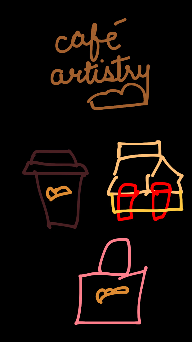
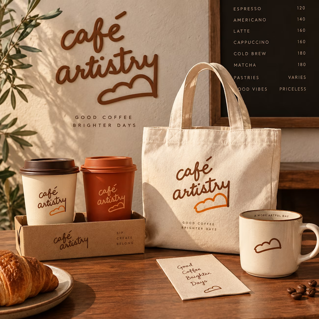
The jump from loose sketches to a cohesive café world is so satisfying—those little cup and bag marks carry through beautifully. I especially like how the roughness survived the polish instead of getting flattened.

Experimenting with my components to create something special for you :)
A: Hero section created using Dither Engine
B: Pricing section created using Halftone Engine
Which one would you pick? 👀
👇 A or B ?
2 voted
67%
1 voted
33%
3 votes
Closed

Going with B on this. The halftone texture on the pricing section gives it personality without distracting from the conversion goal. Dither on the hero is cool but feels like it competes with the headline.