The network for creativity
Join 1.25M professional creatives like you
Connect with clients, get discovered, and run your business 100% commission-free
Creatives on Contra have earned over $150M and we are just getting started
Back to feedPost

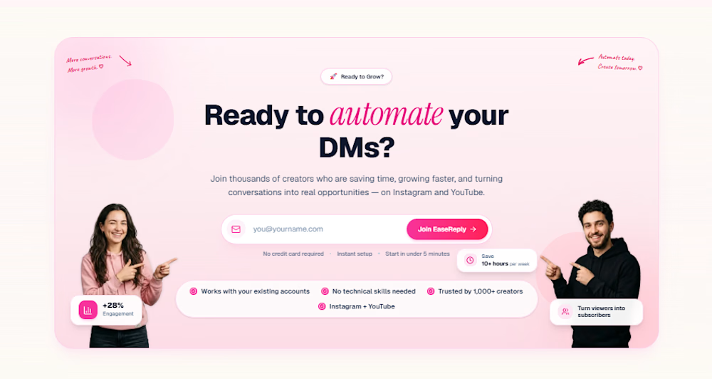
Most SaaS websites explain the product. Few make visitors sign up.
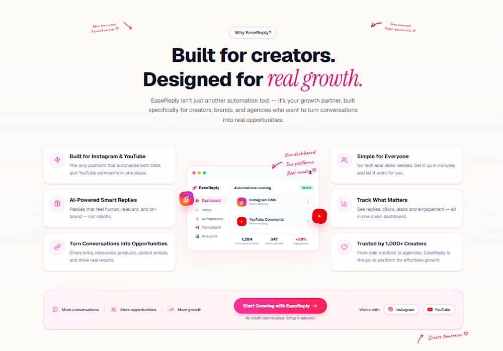
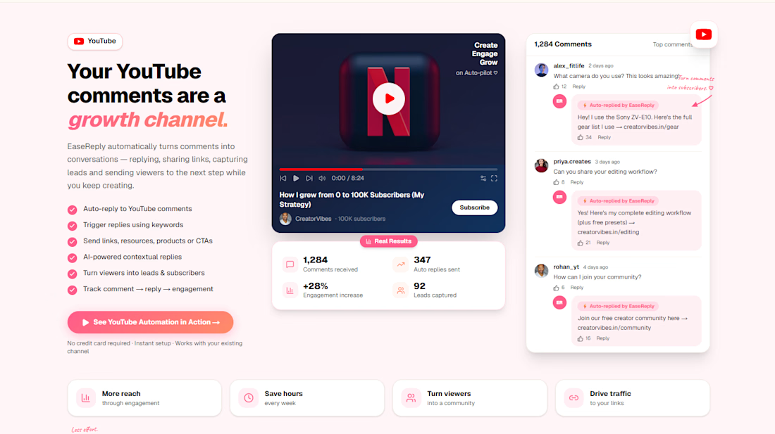
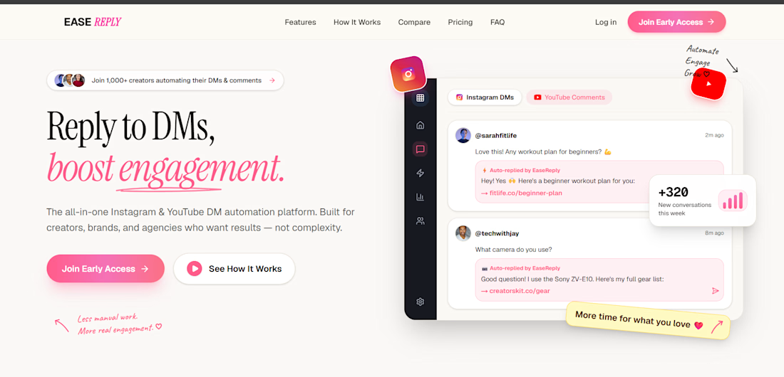
I designed the website for EaseReply, a tool that helps creators.
The goal: a visitor should understand what the tool does in 5 seconds, and know exactly what to do next.
What I focused on:
A headline that says the benefit, not the feature
One main action (start free or book a demo) repeated at the right moments
A product preview near the top, so people see it working before they read anything
Simple sections that go from problem, to how it works, to pricing
Clean, consistent UI that feels trustworthy
Mobile-first screens and fast loading
I use AI tools to move faster, and I make the layout, copy and design decisions myself, so it fits the product and the goal.
Building a SaaS or tool and want a site that gets signups? Send me your current page or idea and who it's for. I'll reply with 3 things I'd change first.


The network for creativity
Join 1.25M professional creatives like you
Connect with clients, get discovered, and run your business 100% commission-free
Creatives on Contra have earned over $150M and we are just getting started
Related posts


Keeping the Halloween-inspired concepts coming! 🕯️✨
This time, we're sharing Ovelle — a luxury candle e-commerce website with warm tones, elegant typography, and a moody editorial aesthetic. Would love to hear your thoughts! 🎃


Officially @Spline - certified. Unofficially, we’ve been 3D-obsessed for years 😉🥇
Feels like the perfect excuse to bring back our interview with the Spline team - 🔗 Link
🎙️ We talked about how we use 3D to make complex B2B products easier to understand, with Elecctro as a real case.
Thank you, Spline, for the badge and for having us 💜
Curious to hear what you think 👇



great work deserves great badges 🏆 congratulations, Lynksen!

If a doctor has to hunt for a patient’s vital signs, the dashboard is getting in the way of care.
Doctors don’t need another dashboard. They need the full patient picture at a glance.
In healthcare, confusing UX isn’t just frustrating. It can delay understanding when every second matters.
DocuVerse brings vital signs, patient metrics, and health trends into one clear view, making complex health data easier to scan and understand.
Less searching. More clarity. Better informed decisions.
That’s what healthcare UX should deliver.
Would you design a healthcare dashboard for more data, or better decisions?


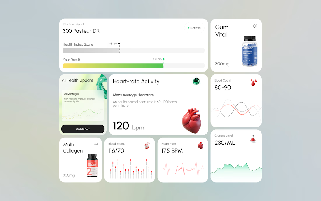
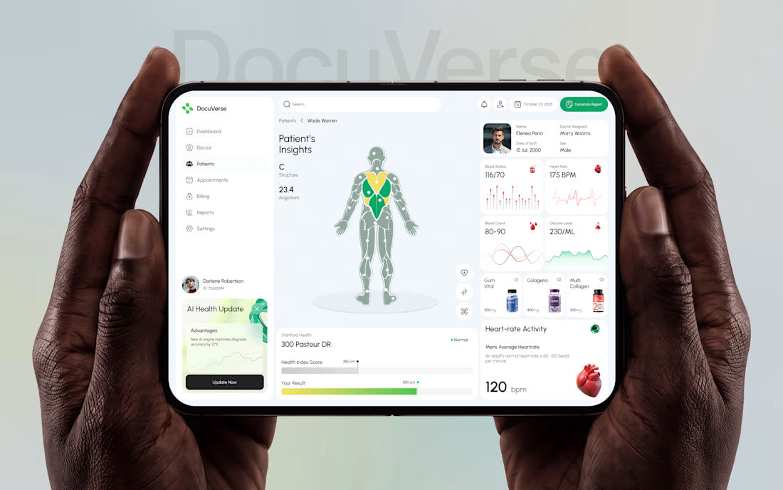

A clearer patient overview can make complex health data feel far less overwhelming. That’s thoughtful UX.


