The network for creativity
Join 1.25M professional creatives like you
Connect with clients, get discovered, and run your business 100% commission-free
Creatives on Contra have earned over $150M and we are just getting started

The network for creativity
Join 1.25M professional creatives like you
Connect with clients, get discovered, and run your business 100% commission-free
Creatives on Contra have earned over $150M and we are just getting started





Related posts

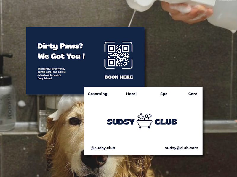
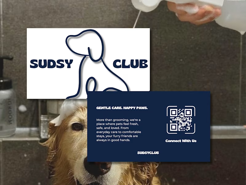
Help me choose! 👀🐶
Which Sudsy Club business card would you pick?
4 votes
Ends in 1d


fun and modern, the dirty paws line is the whole personality of the shop

A grid doesn't have to feel rigid.
With Bento Card, structure and interaction work together.
The grid keeps information organized, while subtle movement adds depth and personality without disrupting the layout.
It's not about making every card move.
It's about making a structured interface feel less static.
Clear structure. A little more character.


PRO 😍

We also design these cards / custom birthday and wedding invitations cards and video/ DM order your Cards