The network for creativity
Join 1.25M professional creatives like you
Connect with clients, get discovered, and run your business 100% commission-free
Creatives on Contra have earned over $150M and we are just getting started


The network for creativity
Join 1.25M professional creatives like you
Connect with clients, get discovered, and run your business 100% commission-free
Creatives on Contra have earned over $150M and we are just getting started



Related posts

Amazing!

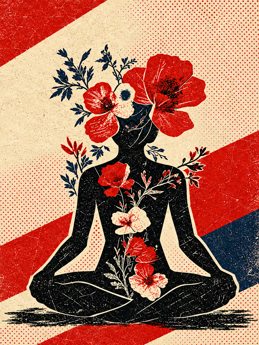
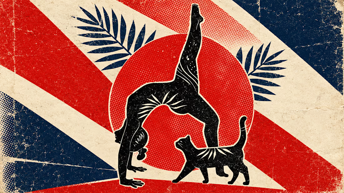
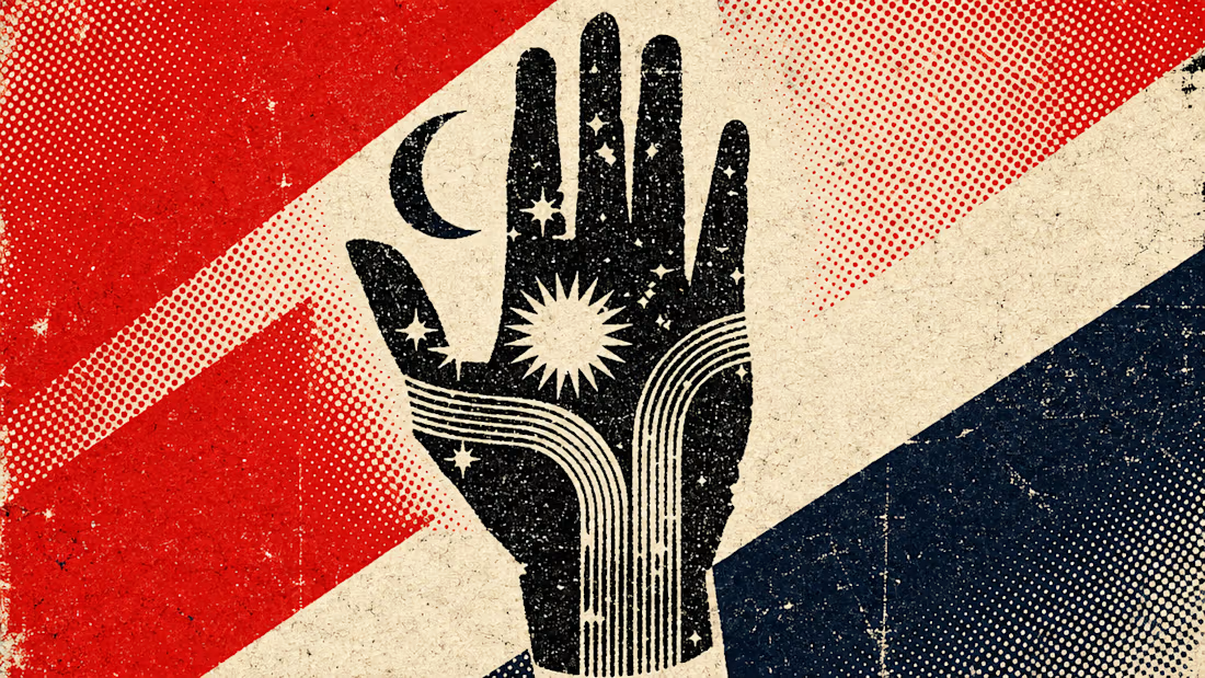
What happens when propaganda designed to erase the self gets pointed at the self instead?
Soviet propaganda spent 70 years trying to erase the individual soul in favour of the collective machine. I pointed that exact visual language at the thing it was built to suppress.
I kept...


We're starting a little experiment at ideapeel.
10 YC startups. 10 website redesigns.
Over the next few weeks, we're picking recently funded Y Combinator startups and looking at their websites through a product and conversion lens.
Not just:
“How can we make this look better?”
But:
Is the product immediately clear?
Does the hero communicate why it matters?
Is the hierarchy helping or slowing people down?
Does the visual direction fit the product?
And is the next step obvious?
For some, we'll redesign the hero.
For others, it might be positioning, product storytelling, UX, or the conversion path.
And sometimes, the right answer might be that we wouldn't change much at all.
We'll share the original, what we noticed, what we'd change, and why.
YC Redesign 01 coming next.
Which YC startup should we put on the list?

Good framing. For the YC list, I'd pick sites where the hero names the category but not the product, because that is where positioning beats layout. Curious whether the fix you land on most is copy or visuals.

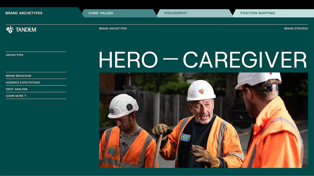
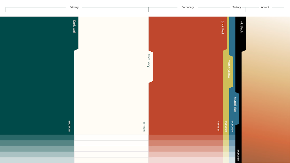
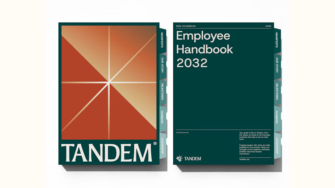
Wrapping up another brand identity project for a workforce management company.
We're currently putting together the full case study, but here's an early look at some of the visuals. Really pleased with how this one has come together!
We explored several distinct creative directions before arriving at the final identity. And there's plenty of interesting work that didn't make the cut.
While we prepare the full case study, I'm thinking of sharing some of those rejected directions and the thinking behind them.
Would you be interested in seeing what didn't make it?