The network for creativity
Join 1.25M professional creatives like you
Connect with clients, get discovered, and run your business 100% commission-free
Creatives on Contra have earned over $150M and we are just getting started
Back to feedPost

Turning Post-Purchase Screens into Revenue Loops 📦
Most grocery apps treat the "Order Details" screen like a dead-end digital receipt.
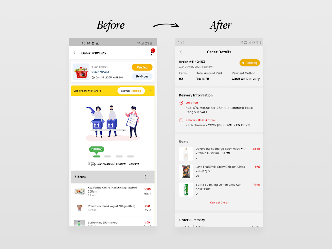
I did this conceptual redesign of Shwapno's app about 2 years ago with one simple goal: turn a passive tracking screen into an active repeat-revenue generator.
The business value of this redesign:
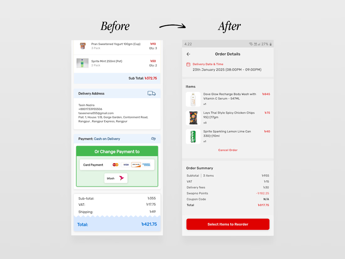
• Built a growth loop: Added a prominent "Select Items to Reorder" CTA to drive repeat business and boost customer lifetime value (LTV).
• Killed the visual fluff: Stripped out a generic stock illustration that wasted 40% of the screen, replacing it with scannable delivery data.
• Fixed the flow: Consolidated confusing "sub-order" clutter and redundant subtotals into clean, digestible information blocks.
Good UI isn't about decorating screens with cute graphics. It's about removing user friction and engineering workflows that drive actual revenue.
I’ll be dropping the rest of this redesign one by one over the coming days. If your product's post-purchase flow is leaking revenue or creating cognitive friction, let's build a layout that actually converts.
The network for creativity
Join 1.25M professional creatives like you
Connect with clients, get discovered, and run your business 100% commission-free
Creatives on Contra have earned over $150M and we are just getting started



Related posts

ZEVA - A Fintech Experience Designed Around Everyday Money
Most finance apps focus heavily on transactions.
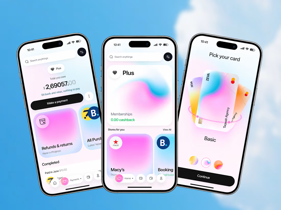
ZEVA explores what happens when financial management becomes part of a broader everyday experience.
The product combines:
• Payment and purchase management
• Outstanding payment visibility
• Refund and return tracking
• Shopping and selected stores
• Cashback benefits
• Card selection
• Personalized card customization
The design challenge was to bring these different behaviors together without making the experience feel overloaded.
The result is a clean, premium mobile interface where financial management, rewards, shopping, and personalization work as parts of one product experience.
Good fintech UX isn’t about adding more features. It’s about making complex financial actions feel easier to understand.
Building a fintech app, payment platform, banking product, or financial dashboard?
Taqwah can help you transform your product idea into a polished, scalable UI/UX experience - from product structure and user flows to high-fidelity interface design.
Start your next product design project with us.



Just shipped: Finally - Build, Automate & Scale Your Work 🚀Built this Work OS landing in Framer - focused on clean pricing sections, dark mode UI, and high-converting layout.
What I did:
Framer build (responsive)
Simple, transparent pricing UI
Dark theme + modern cards
I build same style landing pages + Google Play assets in 2 days, PST hours.
Thoughts? Would love feedback 👇

The Challenge
Many luxury e-commerce brands struggle to capture attention on fast-moving social feeds while maintaining a high-end, sophisticated brand image. Generic ads often fail to stop the scroll or drive intentional clicks.
The Solution
I designed a conversion-focused video ad concept that pairs minimalist aesthetic direction with high-impact copywriting.
High-Converting Hook: Fast visual hierarchy ("NEW ARRIVALS") instantly stops the scroll within the first 2 seconds.
Persuasive Messaging: Tailored copy highlighting exclusivity ("Autumn Essentials") and removing purchase friction ("Free Worldwide Shipping").
Strategic CTA: A seamless transition to an "Explore The Collection" end-card designed specifically to drive click-through rates on Pinterest, Instagram, and TikTok.
Business Impact & Deliverables
Deliverables: 1080p high-definition video ad asset, full messaging strategy, and visual layout design.
Ideal For: High-end apparel, fashion accessories, and DTC e-commerce product launches looking to increase ROAS on paid channels

