The network for creativity
Join 1.25M professional creatives like you
Connect with clients, get discovered, and run your business 100% commission-free
Creatives on Contra have earned over $150M and we are just getting started
Back to feedPost

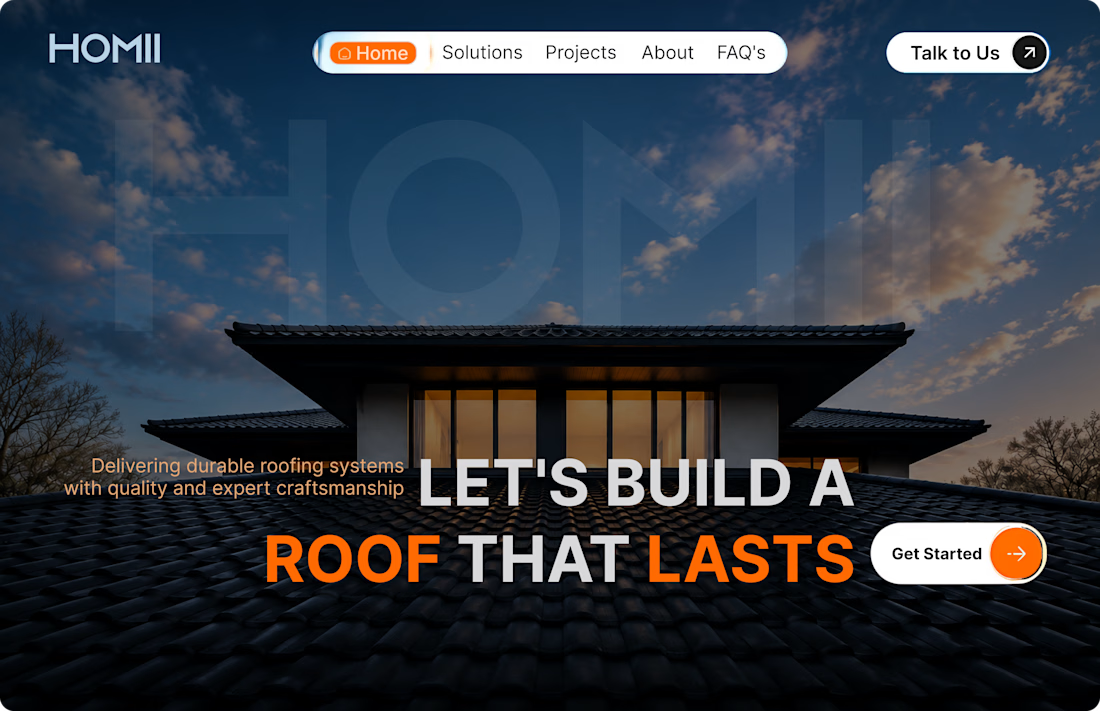
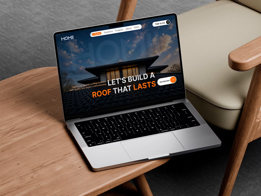
🏠 HOMII – Roofing Company Landing Page Hero Concept
First impressions matter, especially for service-based businesses.
For this concept, I designed a modern hero section for HOMII, a roofing company focused on quality craftsmanship and durable roofing solutions.
Design Goals
Create a bold and trustworthy first impression.
Establish a clear visual hierarchy.
Use strong typography to communicate the core message.
Highlight the primary call-to-action for better conversions.
Balance aesthetics with usability.
Every element—from the navigation to the CTA—was designed to guide users naturally toward taking action while reinforcing the brand's professionalism.
I'm always looking to refine my craft, so feedback is welcome.
Tools: Figma
#ProductDesign #UIDesign #UXDesign #WebDesign #LandingPage #Figma #DesignPortfolio #UIUX
The network for creativity
Join 1.25M professional creatives like you
Connect with clients, get discovered, and run your business 100% commission-free
Creatives on Contra have earned over $150M and we are just getting started











Related posts

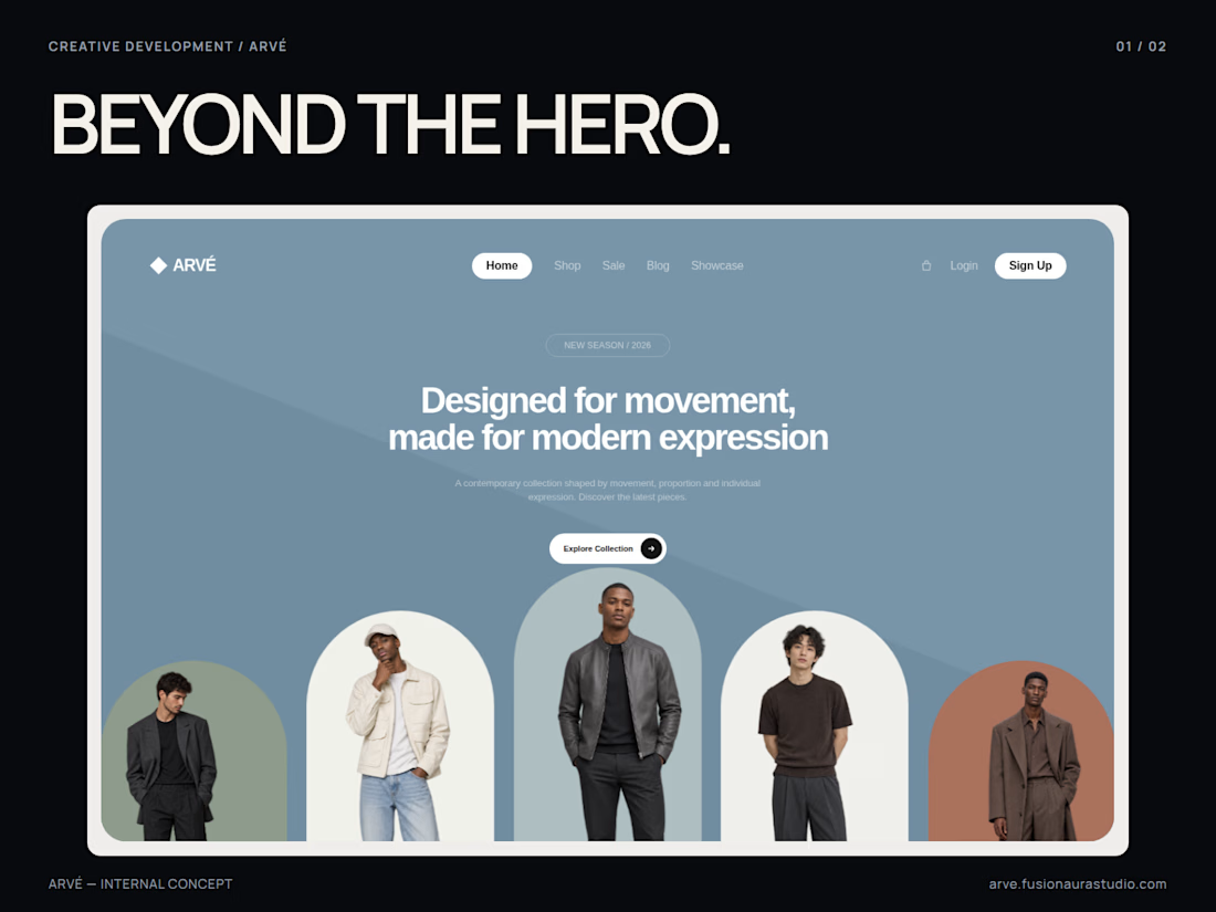
BEYOND THE HERO.
ARVÉ is an internal fashion website concept exploring image composition, proportion and movement.
Five arched image panels establish the hero’s rhythm. The large headline anchors the hierarchy, while a diagonal background plane and cropped imagery create depth. The implementation repositions panels with 1.08-second eased transitions and reflows the navigation below 700px.
Shown here: the actual architectural hero, with its original project identity and imagery.
ARVÉ — INTERNAL CONCEPT
Designed & developed by FusionAura Studio.
Explore: https://arve.fusionaurastudio.com/
Studio: https://fusionaurastudio.com/
#CreativeDevelopment #WebDesign #FrontendDevelopment #ResponsiveDesign

Dear Guest, a week later 🏠
I asked for an outside audit of my #Base44Challenge entry, acted on it, then kept going:
- The guest's essentials (door code, wifi, directions and a button to call the host) now sit on an enamel sign on the roof. Each still follows its postcard's rule: the code only appears on arrival day. After dark, a spotlight lights each compartment.
- The postcards are the heart of the house, so they got the most care: brighter colours, white icons, a real perforated stamp, and each one sits in a terracotta window box that flowers once the guest has arrived.
- The front door has its house number above the arch, a travertine step and a lantern that lights up at night.
- A real person is one tap away: call or WhatsApp the host, separate from the AI.
- When the house doesn't know an answer, the host replies to that guest on their own page. Adding it to the manual for everyone is a separate choice.
- On wide screens the extras live in the bottega next door: a lit shop window with the extras on display.
- The street came alive: slow paper clouds, a cat on the roof, neighbours on the pavement. All of it can be paused.
- The walkthrough now plays on a retro TV, with a new voice and a soft piano underneath.
Host side, no sign-in: https://dearguest.bytelegion.site/host?demo
#Base44Challenge


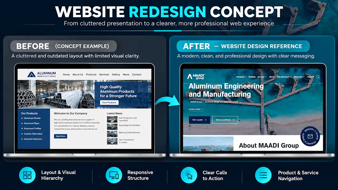
From a basic website layout to a more modern, professional online experience. 💻
For this MAADI Group website redesign concept, I focused on how better structure and visual hierarchy can help an industrial business present its services more clearly.
Here’s what I focused on achieving:
• Improved visual hierarchy: Made the main headline and key information easier to notice.
• Stronger first impression: Used a bold hero section and relevant imagery to create a more professional presentation.
• Clear calls to action: Highlighted the “Get a quote” and “See our products” buttons to guide visitors toward the next step.
• Simplified navigation: Organized the main website sections to make products and services easier to find.
• Responsive design direction: Considered how the layout could adapt across desktop, tablet, and mobile screens.
My goal was to create a design that communicates the business's value clearly while making it easier for potential customers to explore its offerings.
I design WordPress websites and landing pages using Elementor, helping businesses build a stronger online presence.
If your business website needs a redesign, feel free to send me a message.
What do you think makes the biggest difference in a website redesign: the layout, imagery, or user experience?