The network for creativity
Join 1.25M professional creatives like you
Connect with clients, get discovered, and run your business 100% commission-free
Creatives on Contra have earned over $150M and we are just getting started
Back to feedPost

Exactly. Thats the main point.

Voted Big CTA, on a product detail page the add to cart button shouldn't have to compete with anything else for attention. Small CTA reads more editorial but riskier for conversion.
The network for creativity
Join 1.25M professional creatives like you
Connect with clients, get discovered, and run your business 100% commission-free
Creatives on Contra have earned over $150M and we are just getting started





Related posts


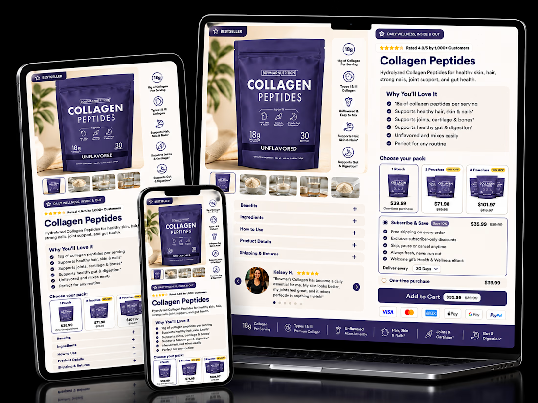

The pack-size tiers sitting right next to Subscribe & Save is the right order. Anyone already comparing 1, 2 or 3-pack is primed to pick a cadence too, so showing both choices together nudges toward the higher-LTV option without it feeling like an upsell.

Nice work!


Expressive is the new scalable.
When producing AI films, I’m now prioritising characters that can express, react, and feel real.
Currently experimenting with expressions before moving into the main movie production.
Because realism isn't just about how a character looks. It's about how they make you feel.
FilmmakingFilm ProductionHiggsfield AIaivideoproduceraivideoproductionaifilmmakingAI Video Production
